The Anatomy of Premium Packaging
Premium packaging is not a collection of luxury effects. It is a system of deliberate choices that support value.

What makes packaging look and feel premium?
Premium packaging is easy to imitate badly. Use black, add gold, pick a heavy serif and specify a soft touch finish. That checklist produces packaging that looks like it is trying, which is the opposite of the goal. Real premium perception comes from coherence: structure, typography, material, information hierarchy and production choices that all belong to the same level of product and the same buyer. When every element supports one idea and nothing looks accidental, quality feels inevitable rather than announced.
The luxury checklist is the wrong model
There is a set of moves everyone reaches for when a brief says premium. Dark palette. Metallic accent. A serif with high contrast. Soft touch lamination so the box feels expensive in the hand. None of those are wrong on their own. I have specified all of them. The problem is treating them as ingredients, as if quality were a recipe you could follow to a result.
What actually happens is that the effects arrive without the discipline underneath them. You end up with a package that has every signal of expense and none of the control. Shoppers read that instantly, even if they could not explain it. It looks like a product that wants to be perceived as premium, which is a different message from a product that is.
I have spent more than 25 years working on packaging across a wide range of categories, and the pattern holds in all of them. The packages that feel most expensive are usually not the ones with the most techniques applied. They are the ones where every choice appears to have been decided by the same person, for the same reason, on the same day.
Restraint is editing, not emptiness
Premium packaging tends to allow space, and people misread why. It is not because white space is fashionable. It is because a brand that is confident about its position does not need every element on the front panel competing for attention. Space is what is left over after someone decided which single message matters most and cut the rest.
That decision is harder than it sounds, because the pressure runs the other way. Sales wants the claim. Legal wants the qualifier. The founder wants the origin story. Marketing wants the badge from the trade show. Each request is reasonable in isolation and together they fill the panel. Then the package says everything, which means the shopper receives nothing in the two seconds they give it.
Restraint is not the absence of content. It is content arranged so that one thing is unmistakably first, one thing is second and the rest waits until the customer picks the package up. The gin bottle we designed for McQueen and the Violet Fog carries plenty of detail, but the front does not deliver it all at once. Editing costs more than adding, which is the argument in why simplicity is expensive.
Typography carries a disproportionate load
If I had to pick one element that decides whether a package reads as premium, it would be the type. Not the typeface, the typography. The typeface is a choice you make in an afternoon. The typography is the proportion, the spacing, the alignment, the relationship between the brand name and the descriptor, and the restraint to use two weights instead of five.
This is why a package can fail while using an expensive typeface, and another can succeed with something entirely ordinary. Set a common sans well, with careful letterspacing at large sizes, a considered optical alignment and a hierarchy that does not shout, and it will outperform an exotic font handled carelessly. Type is where craft is most visible to people who have no vocabulary for craft.
It also works in the negative direction faster than anything else. Bad kerning in a brand name, a stretched logotype, a headline set in a weight that fights the mark, or a body size that forces the back panel to look crowded will undo a thousand dollar material choice in a second. Nobody says the kerning is off. They just say it looks cheap.
Structure makes the promise physical
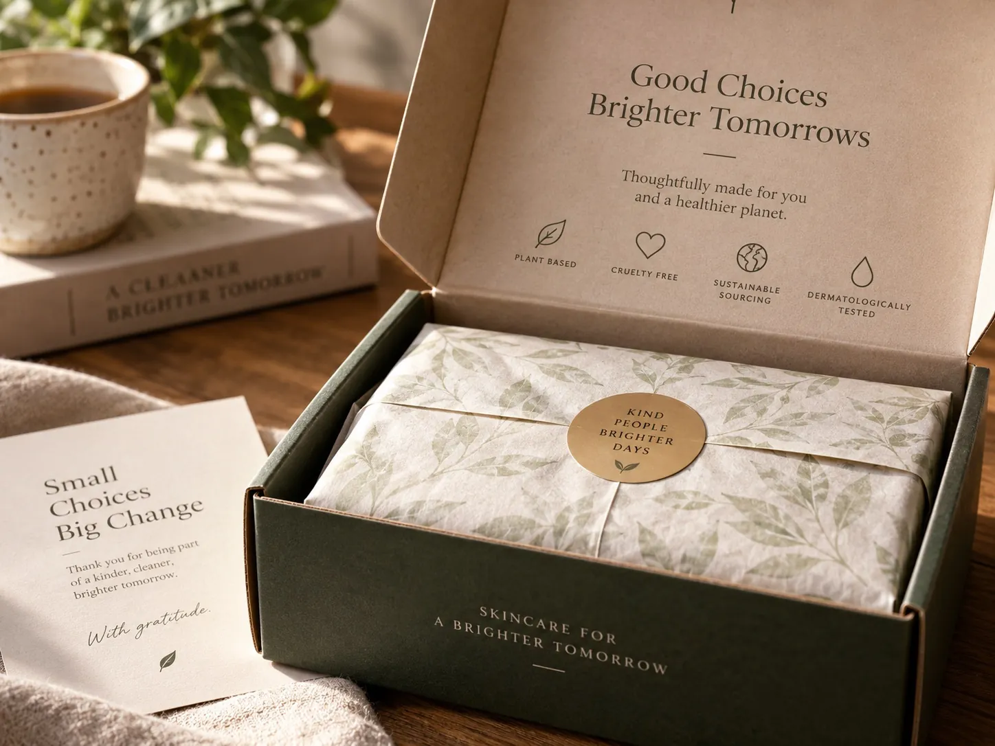
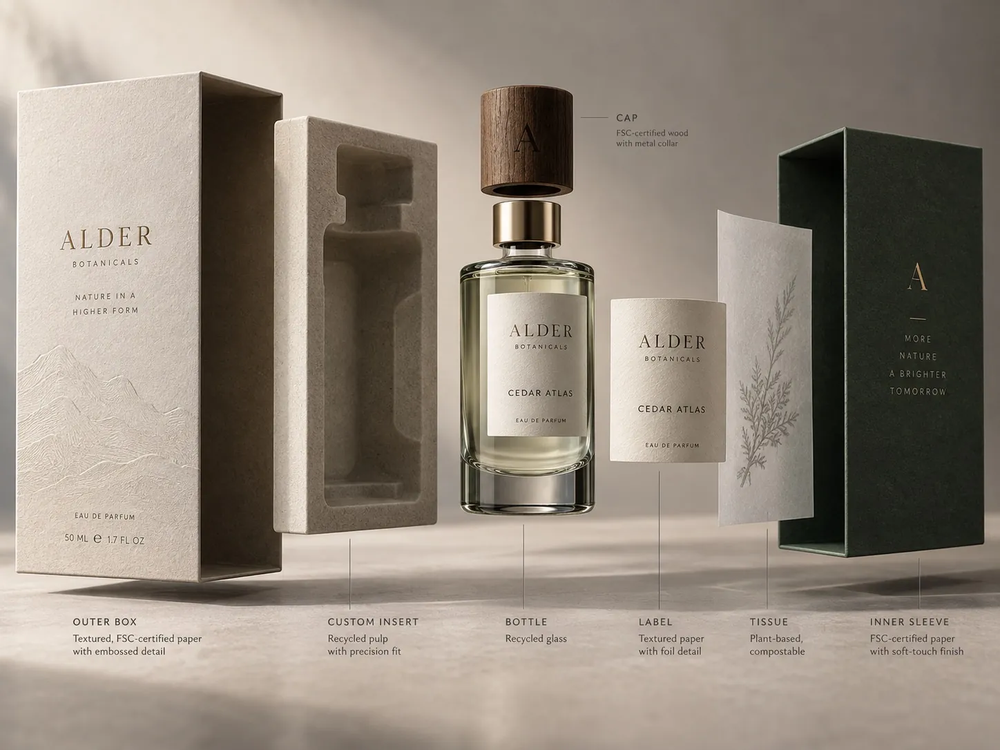
Everything above happens on a surface. Structure is what turns an abstract position into something a person holds. Bottle weight, the resistance of a rigid box lid, a molded insert that keeps the product from rattling, the thickness of a carton, the texture of an uncoated stock. Those are the moments where the brand stops being a picture and becomes an object.
The judgment is fit, not expense. A rigid box on a twelve dollar product reads as confusion or as money wasted on the wrong thing. A flimsy carton on a product priced at a premium reads as a broken promise, and the customer notices at exactly the wrong moment, right after paying. The structure should match the price and the category, and it should match the way the product is actually used.
Practical constraints deserve a seat in this conversation early. Fill line compatibility, case pack, shipping durability, shelf depth and cost per unit will all shape what is possible, and discovering that after the design is approved is how projects lose weeks. In my packaging design work, those limits go on the table in the first conversation, because a beautiful structure that cannot be produced at your volume is not a design, it is a mood board.
Finishes should reward proximity
Foil, emboss, spot varnish, tactile coatings and specialty inks do their best work as a second layer of information. From four feet away on a shelf, the shopper sees the silhouette, the color block and the name. From twelve inches, they see the finish. That sequence is the point. The effect confirms a decision the customer has already started making, and it makes picking the product up feel rewarded.
Used everywhere, those same techniques cancel each other out. If the logo is foiled, the border is foiled, the claim is foiled and the pattern is embossed, nothing is emphasized, because emphasis is relative. The package becomes busy in a way that reads as low cost even though the print bill went up. I have seen brands spend meaningfully more per unit to look meaningfully less expensive.
There is a discipline I use when deciding. Every special finish has to answer one question: what is it directing attention toward, and would the package fail without it. If the answer is that it adds richness generally, I cut it. Richness applied generally is just noise with a higher price per thousand.
Premium has to survive the whole line
Almost every premium package I see presented is the hero. One SKU, one size, photographed well. The real test comes later, when the line has four flavors, a travel size, a value pack and a format that cannot carry the same finish because of how it is produced. That is where the standard either holds or quietly collapses.
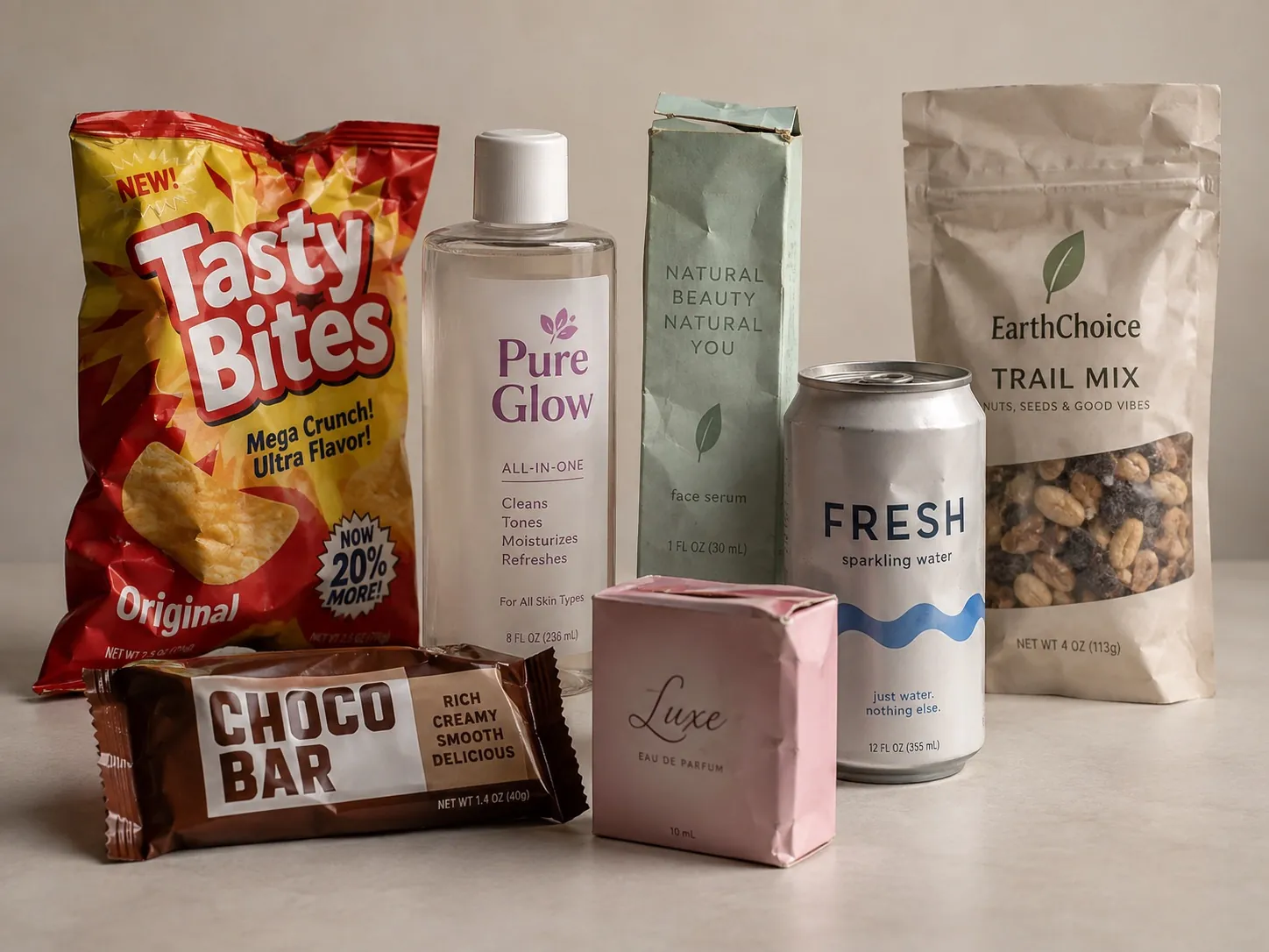
The way it collapses is predictable. The hero keeps the foil and the rigid box. The extensions get a cheaper substrate, a rushed color decision made by a printer under deadline, and a variant name set in whatever weight fit. Now the shelf shows a premium product next to three products that look like imitations of it, and the whole line loses the position the hero paid for. Several of the failures I list in seven packaging mistakes that make products look cheap enter a brand this way.
Preventing that is an architecture problem, solved before the first SKU is finalized. Decide what is constant across every format, what varies by variant and what the minimum acceptable execution is when budget or process forces a compromise. A multi scent system like PyurX Premium Castile Soap only holds together because the variant logic was decided as a rule, not improvised scent by scent.
The context decides what premium means
A package that feels expensive on a shelf and a package that feels expensive in a listing photo are not always the same object. On a shelf, you are competing with neighbors, overhead lighting and a shopper in motion. Material and finish contribute, because the product is physically present and can be picked up. Silhouette and color blocking do most of the early work.
Online, the first encounter is a small image next to other small images, often on a phone. Foil does not exist there. Texture barely does. What survives at that size is contrast, the shape of the container, the legibility of the name and whether the variant is identifiable without zooming. Then the physical experience arrives later, at the unboxing, where structure and finish get their turn.
Most brands now live in both worlds and have to satisfy both. That does not mean two designs. It means one design decided against two viewing conditions, which is a discipline I break down in designing for retail versus ecommerce. The order of decisions changes depending on where the majority of your volume comes from.
What premium is not
Premium is not the same as expensive, and it is not the same as minimal. There are categories where a maximal, dense, highly illustrated package is the premium move, because the buyer reads craft and abundance as the signal of quality. A specialty food, a heritage spirit or a collectible will often reward more surface, not less. Copying a fashion house’s restraint into those categories can read as thin.
Premium is also not a promise you can make without keeping. If the package sets an expectation the product does not meet, you have not raised perceived value, you have engineered a disappointment and paid for it. The packaging should be slightly ahead of what the customer expects for the price, not several steps ahead of what is inside.
And premium is not free. Better structure, better substrate, tighter color control and selective finishes cost more per unit, and they usually require more time in development and on press. The case for spending it is commercial rather than aesthetic. If the position supports a price that carries the cost, it is an investment. If it does not, restraint and excellent typography will take you further than materials will.
How to audit your package this week
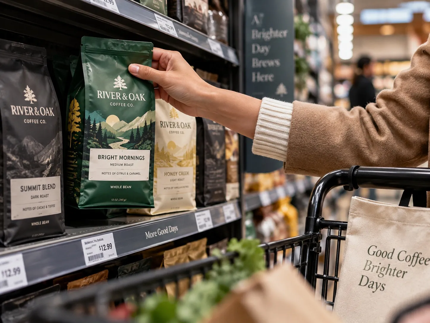
Do the four foot test first. Put your package on a table, step back, and look at it the way a shopper in motion would. Can you identify the brand, the product and the variant in about two seconds. If you have competitors on hand, put them on the same table. Judgments made in isolation are almost always wrong, because customers never see you in isolation.
Then do the opposite test. Bring it to twelve inches and look for what rewards the closer look. If nothing appears at that distance that was not visible from four feet, the package has no second layer. If everything is competing at both distances, you have a hierarchy problem rather than a materials problem, and no finish will solve it.
Finally, lay the whole line out together, including the newest extension and the cheapest format. Ask whether a stranger would believe these came from one brand, made to one standard. Photograph the group and then shrink that photo to thumbnail size on your phone. The problems that survive at thumbnail size are the ones to fix first, because that is where most first impressions now happen.
Key points
- Premium perception comes from coherence across every choice, not from a checklist of luxury effects.
- Typography decides more of the impression than material does, and it fails faster when handled carelessly.
- Structure and substrate should match the price and the category rather than signal expense for its own sake.
- Special finishes work best as a second layer that rewards the customer for looking closer.
- A premium standard is only real if it survives across variants, sizes and lower cost formats.
- Packaging must communicate quickly in the context where the product is actually sold, on a shelf or in a thumbnail.