
Case study · Packaging Design
Itallian Color & Oxi
Professional Hair Color Packaging System
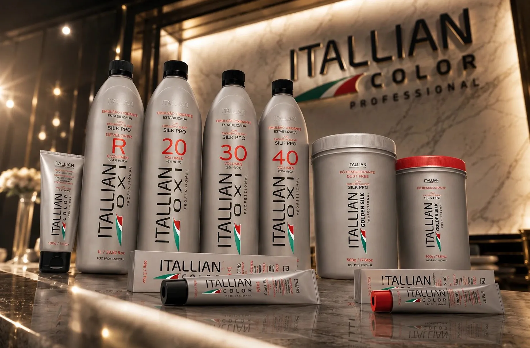
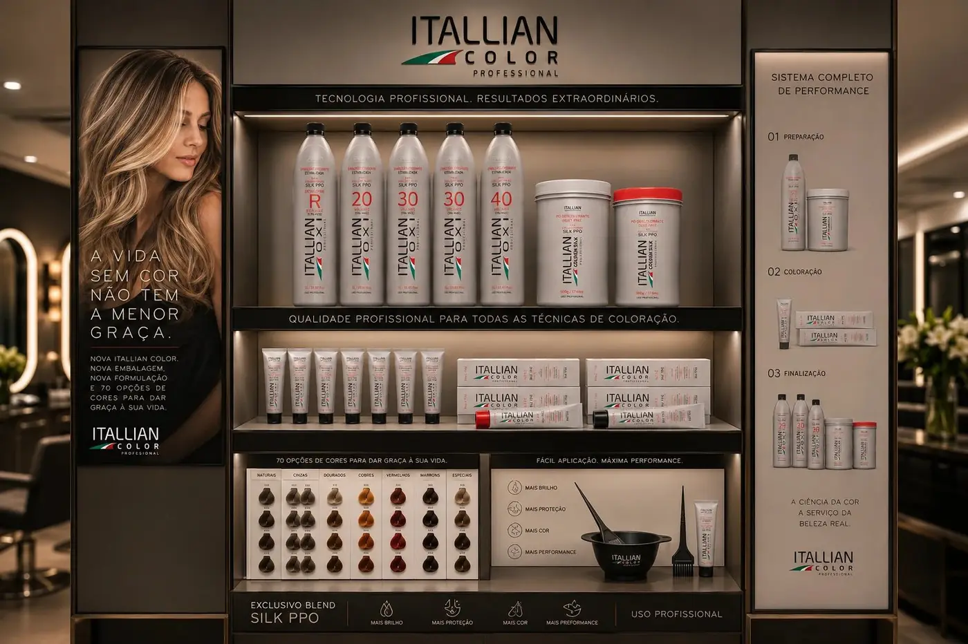
Itallian Color and Oxi is a professional hair coloring range, and colorists do not have time to read fine print between clients. The system is built to be navigated by number rather than by paragraph.
01
The number does the navigating
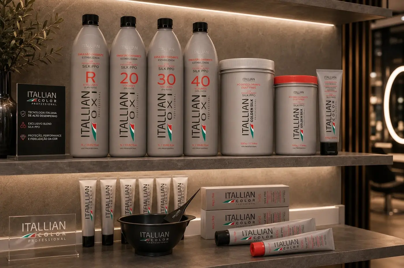
In a salon the decision is fast and physical. Someone reaching across a counter mid appointment needs one piece of information, the volume strength, and everything else on the label is reference material for later. So I gave that number the center of the face at a size that would be absurd in almost any other category, in red against brushed silver where it separates cleanly from a shelf of near identical bottles.
Everything around it is deliberately technical rather than decorative. This is an ingredient-driven category, and trust here comes from precision instead of charm, so the type is set with the flatness of a specification rather than the warmth of a beauty brand. The wordmark runs up the side of the bottle instead of competing for the front, which leaves the face free to do its one job.
02
Keeping a scattered range coherent
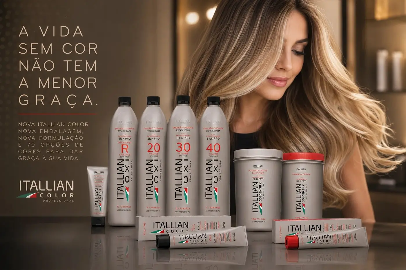
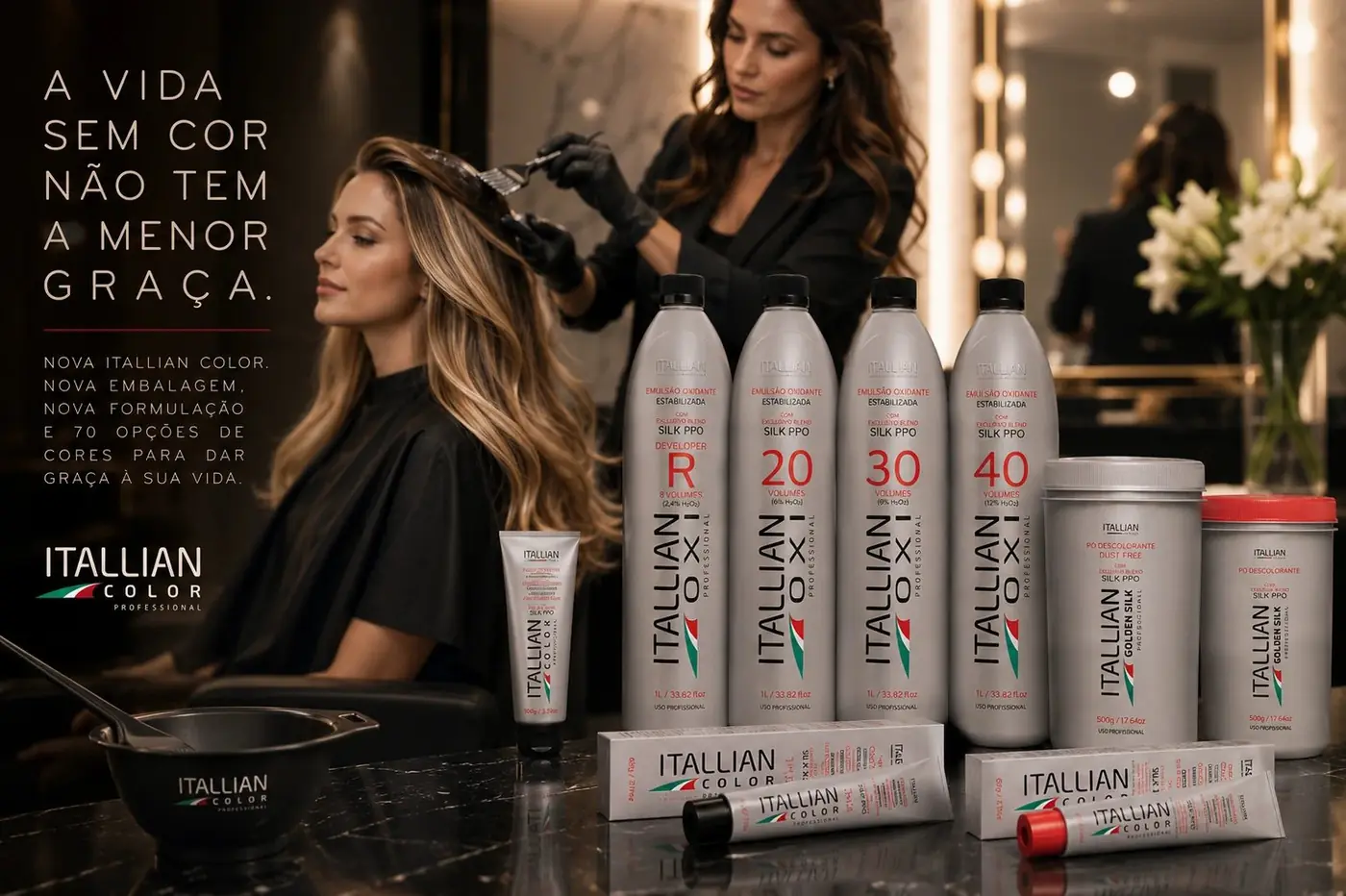
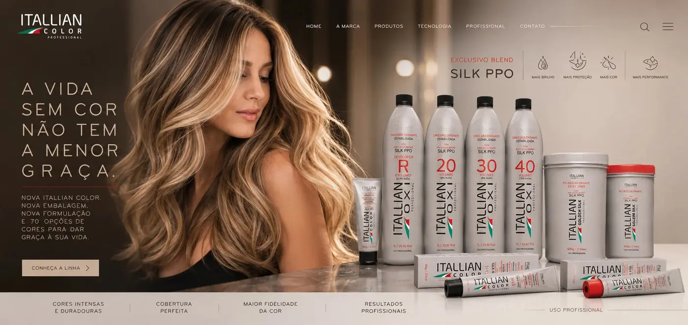
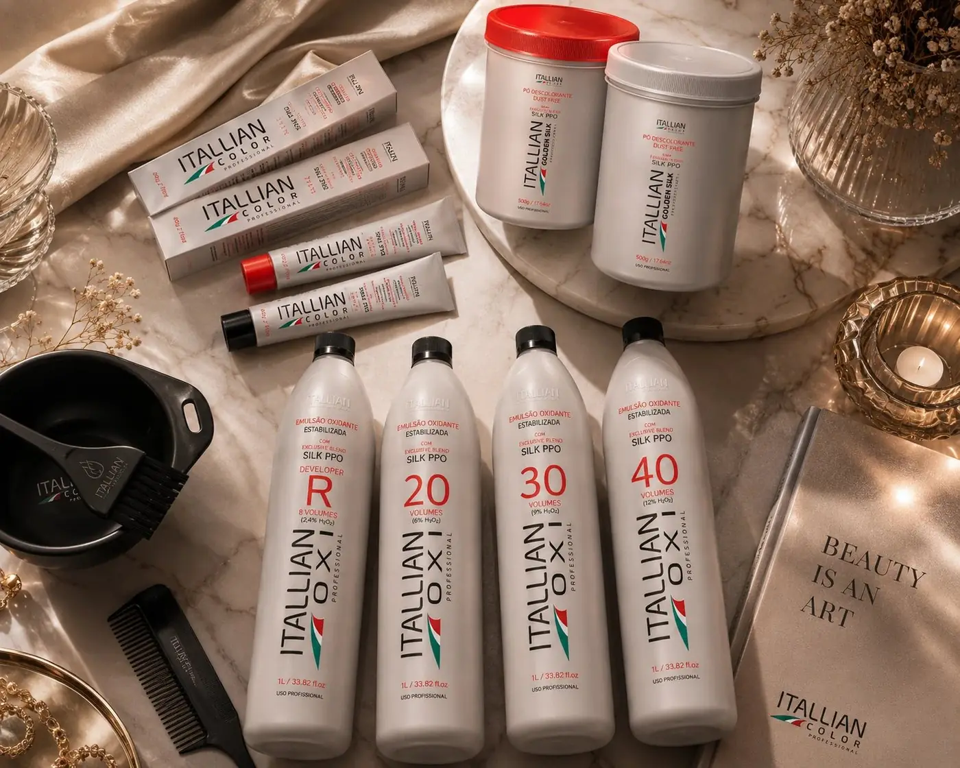
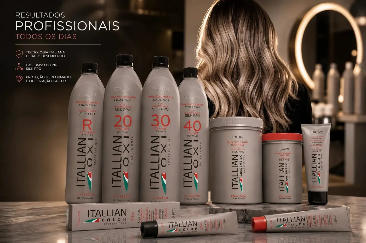
The line covers developers, oxidant emulsions, bleaching powders and color tubes, objects with almost nothing in common structurally. Brushed silver is what holds them together, treated the same way whether the piece is a tall bottle, a wide tub or a soft tube, so a colorist reaching for any part of the range is reaching for something recognizably from the same brand.
The Italian flag mark stays small and identical on every piece. It is the quiet signal of heritage sitting beneath a system that is otherwise purely functional, and keeping it modest matters, because scaled up it would start to read as nationality rather than as a maker's mark. Red carries the rest, in the numerals and in an occasional cap, so the accent belongs to the product rather than sitting on top of it.
The range was shot in warm candlelit styling against marble, which is a useful contradiction. A technical product photographed like a chemistry set reads as commodity. The same product lit like a salon interior reads as something a professional chose on purpose, and that is a claim the ingredient list cannot make by itself.
More work
More projects.





Have a project like this?
Tell me what you are building, changing or launching, and I will help you define the right scope and direction.