
Case study · Packaging Design
Lezzetli Oil
Turkish Hazelnut Oil Packaging
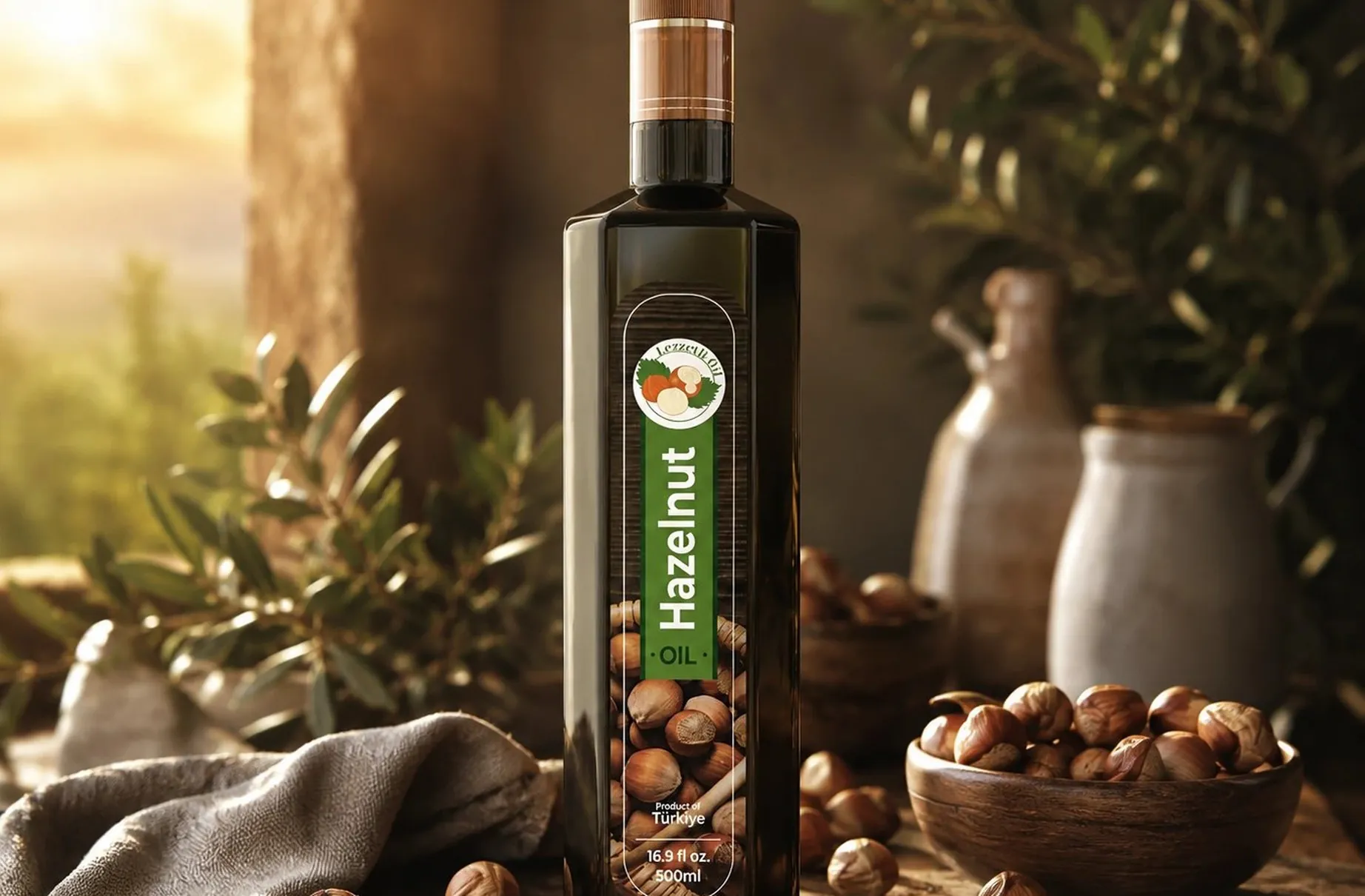
Lezzetli is a cold pressed Turkish hazelnut oil, and the bottle has to argue for its own premium price from across the aisle, well before anyone is close enough to read a word of the label.
01
The argument made from a distance
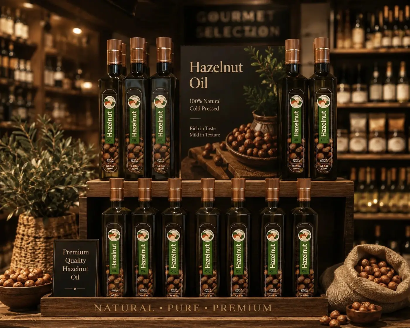
In gourmet oil the decision starts far away from the shelf. A shopper reads silhouette, color and weight long before copy, and by the time they can make out a claim they have already decided whether the bottle is worth walking toward. So the package had to carry its case in that first moment, with form doing the job that typography is too small to do from ten feet.
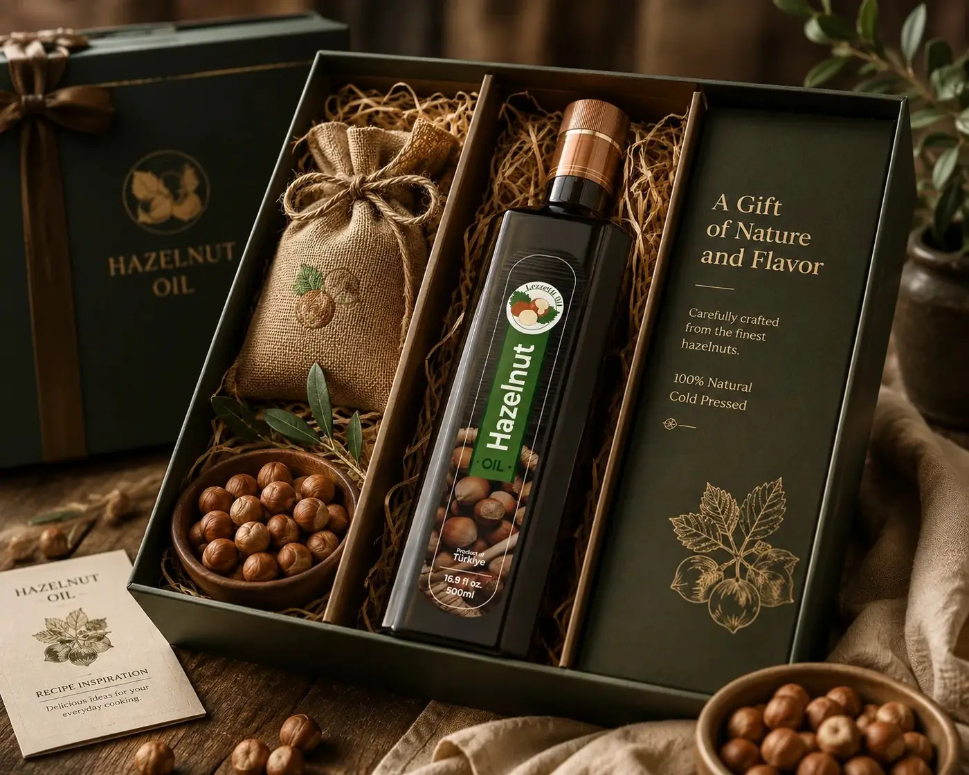
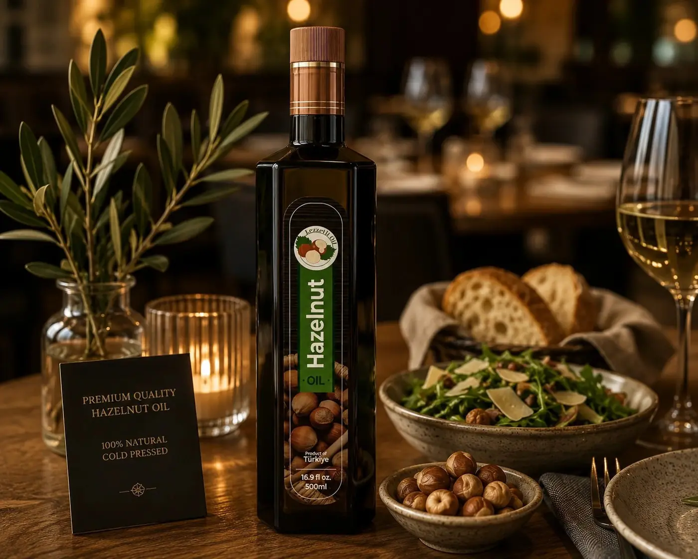
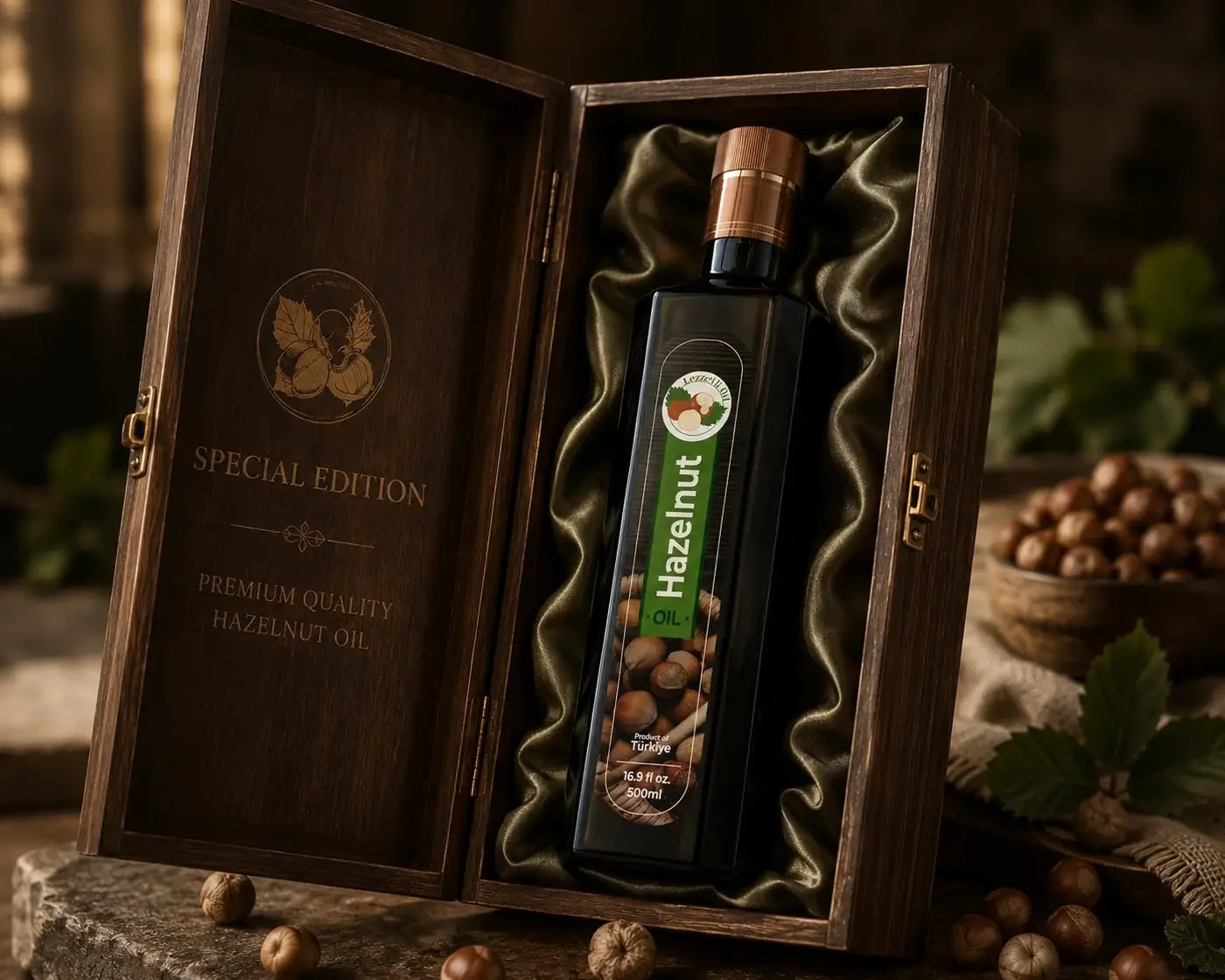
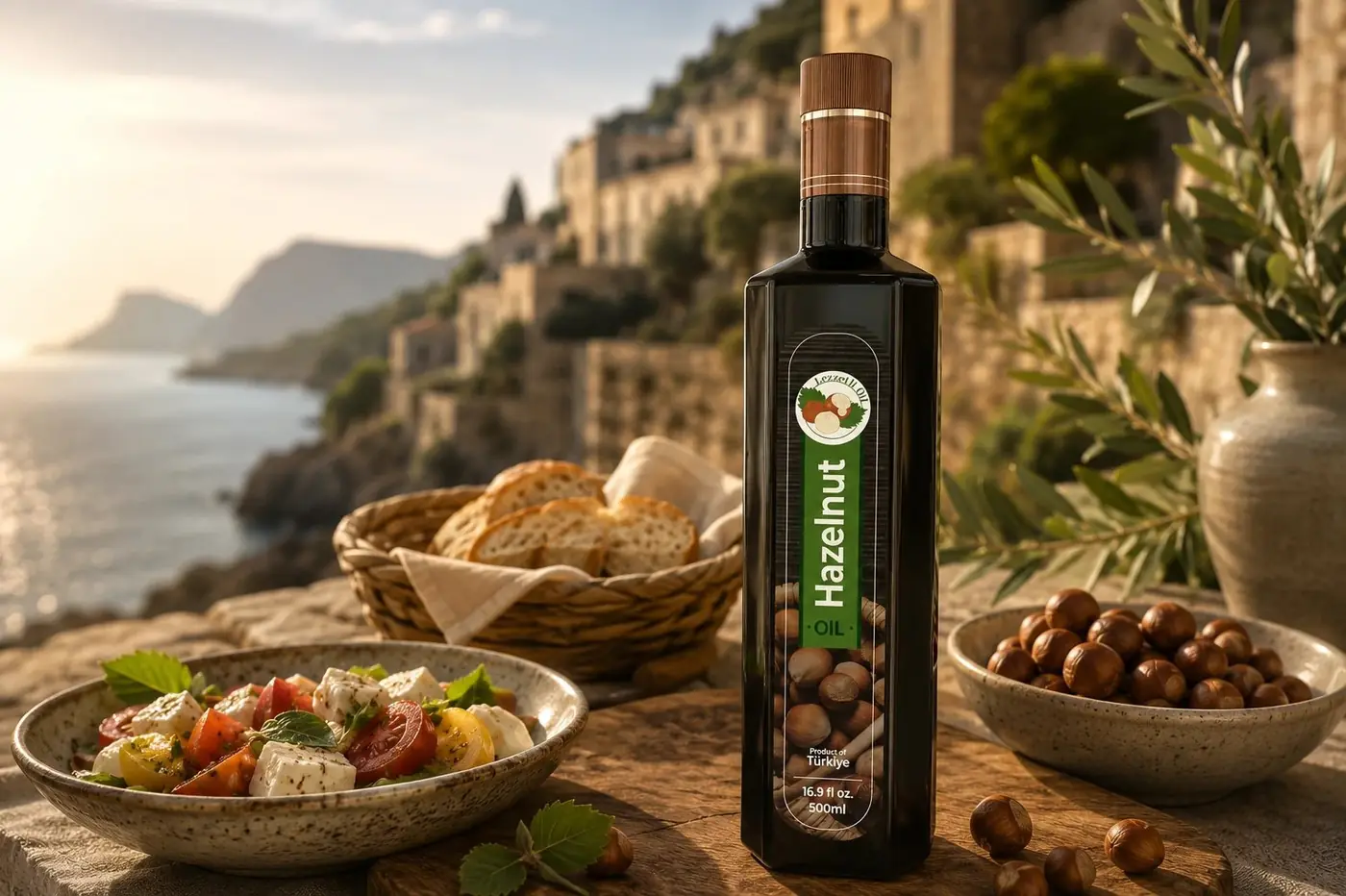
Tall dark glass with squared shoulders already reads as artisanal and imported in that aisle, so I let the label work with the bottle instead of wrapping it. A narrow panel runs the height of the front and leaves generous glass on either side, which keeps the bottle itself as the thing you notice. The green band is the one saturated note in an otherwise brown and gold object, and it marks the brand without needing scale.
02
Letting the ingredient sell the oil
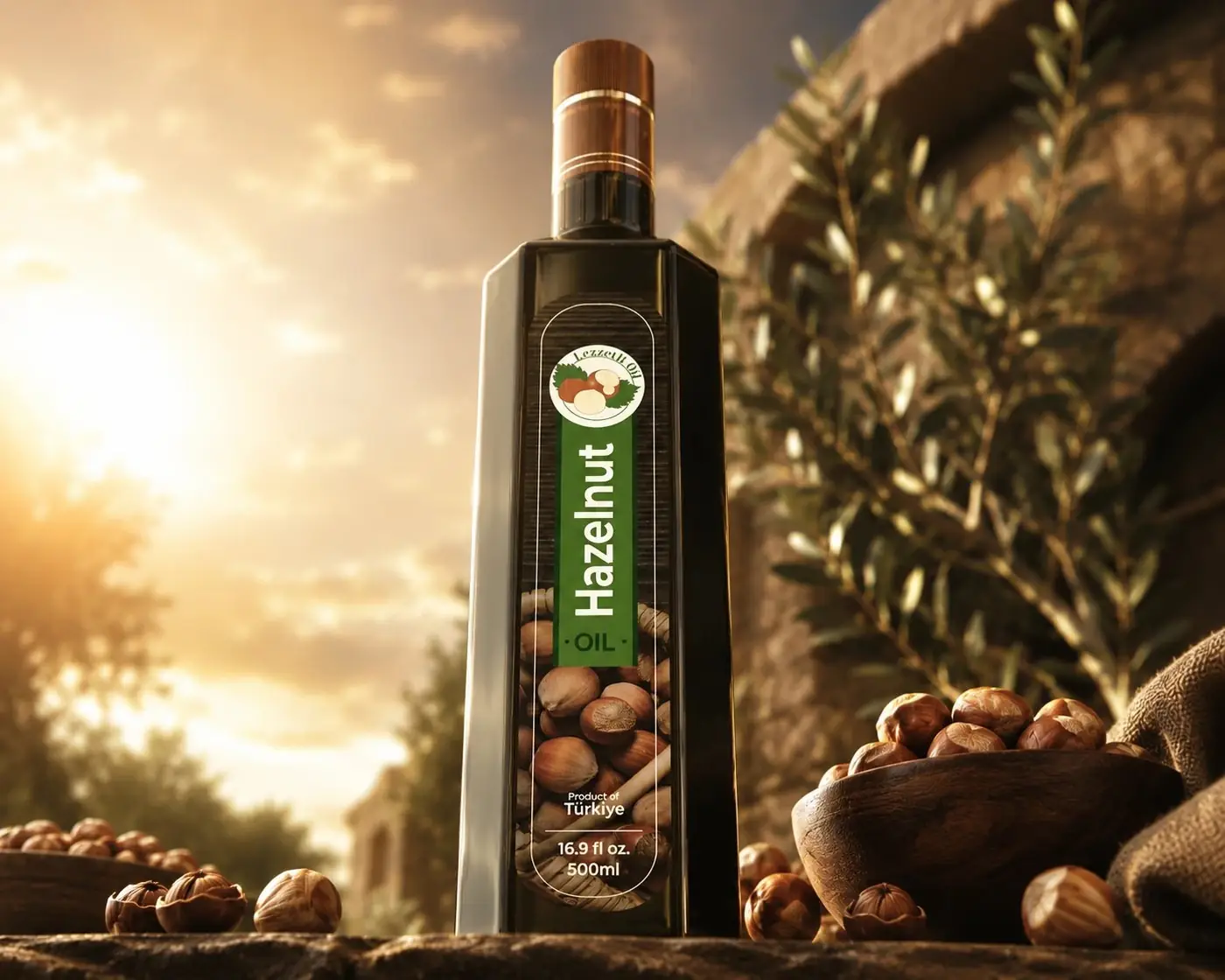
The varietal is set large and vertical, running the length of the panel, while the brand mark stays in a small circular badge at the top. That order of priority is deliberate. Someone who has never heard of Lezzetli still knows exactly what is in the bottle, and the name gets learned on the second encounter rather than demanded on the first.
Type stays restrained throughout, a simple serif for the name and a clean sans for the varietal, because in this category ingredient photography sells harder than any letterform will. The lower half of the panel is given over to hazelnuts shot close and warm, and the bottle is lit the same way, low golden light with rough ceramic nearby. Origin is the entire pitch for a product like this, so the picture has to carry provenance before a claim ever gets read.
More work
More projects.

Have a project like this?
Tell me what you are building, changing or launching, and I will help you define the right scope and direction.