
Case study · Packaging Design
Dioxel
Antiseptic First-Aid Spray Packaging
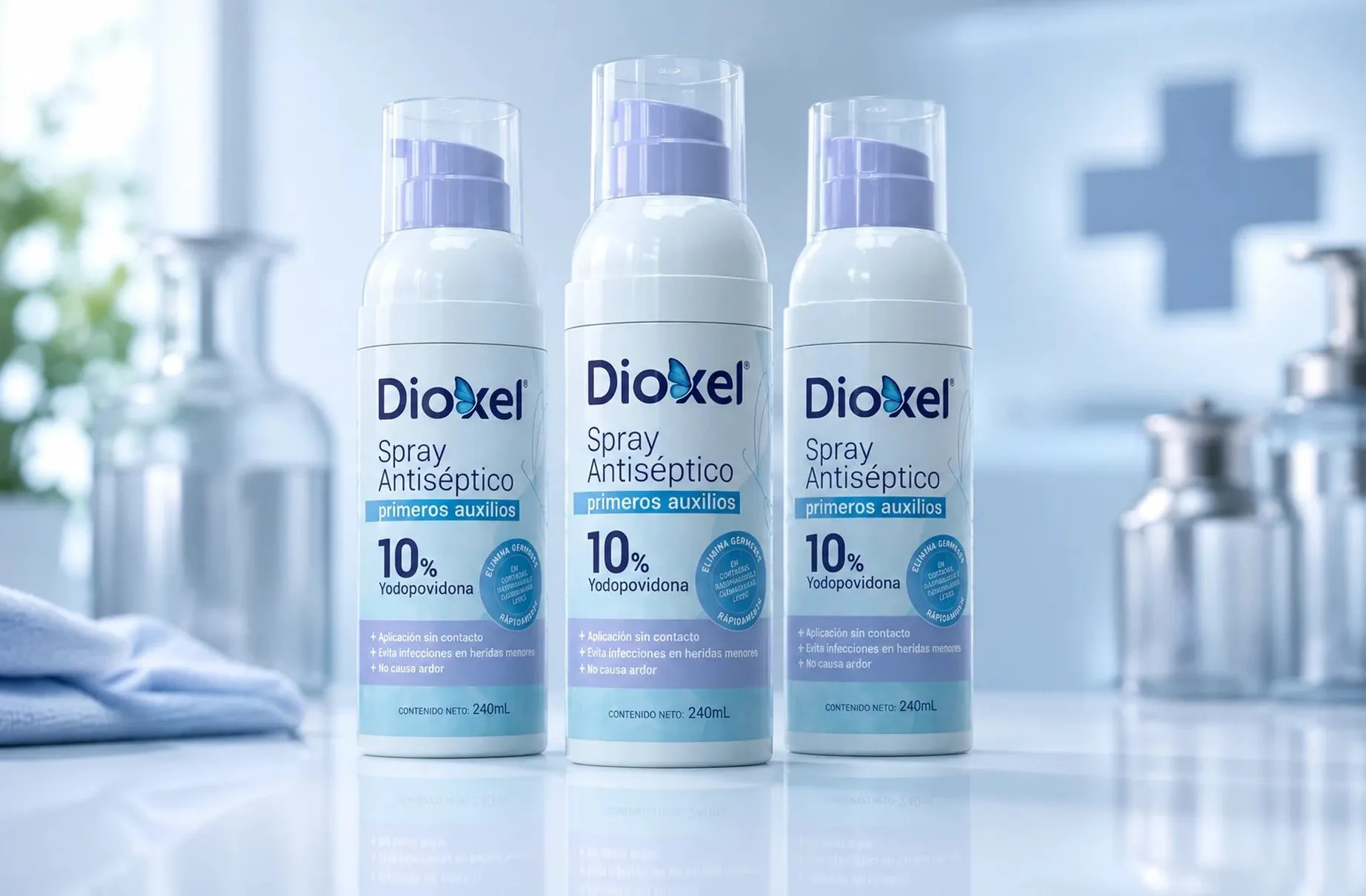
Dioxel is an over the counter antiseptic, which means the label has to earn trust in about two seconds with no pharmacist standing there to explain anything. The packaging is built on that single constraint.
01
A cabinet item, not a hospital one
The category pulls hard toward the clinical. Sterile whites, hard blues, type borrowed from a chart: it reads as authoritative, and it also reads as something you would rather not keep in the house. This product gets picked up by a parent with a child who has scraped a knee, so the tone had to sit closer to care than to treatment.
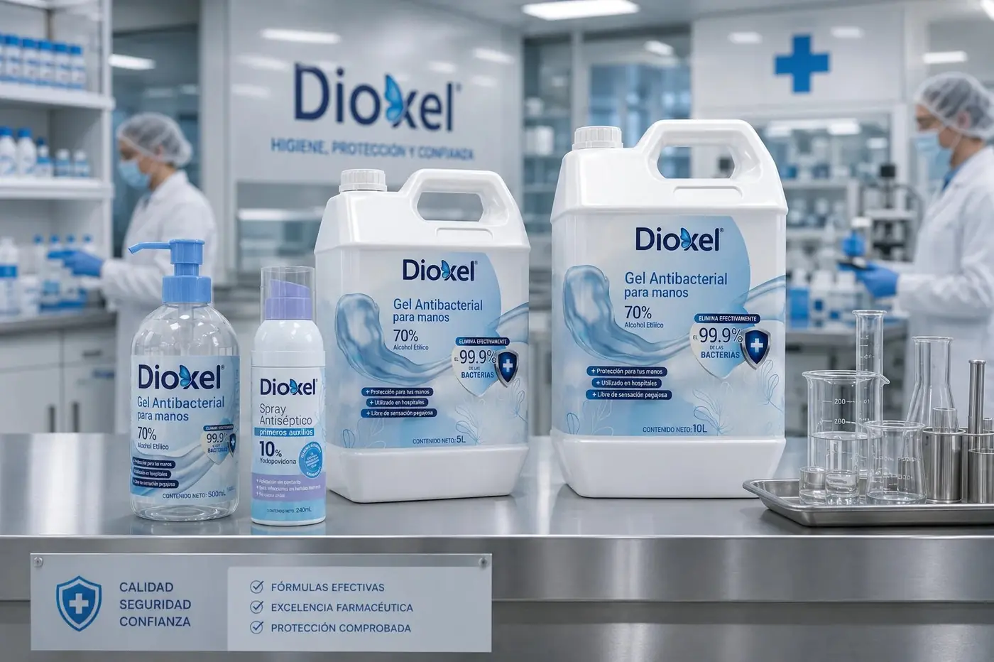
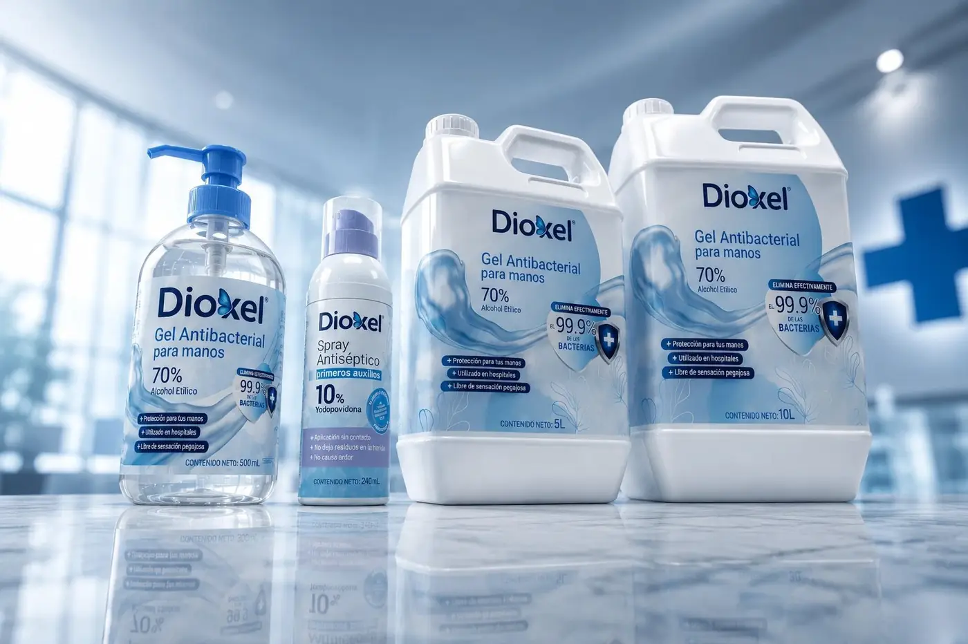
Blue was never really optional, since it is how a shopper identifies a pharmacy product at all. What lavender does is take the chill off it. The two graduate into each other down the bottle, with a soft cross motif held far enough back to register as a category cue rather than a warning, and the whole surface stays pale so the label feels calm in the hand.
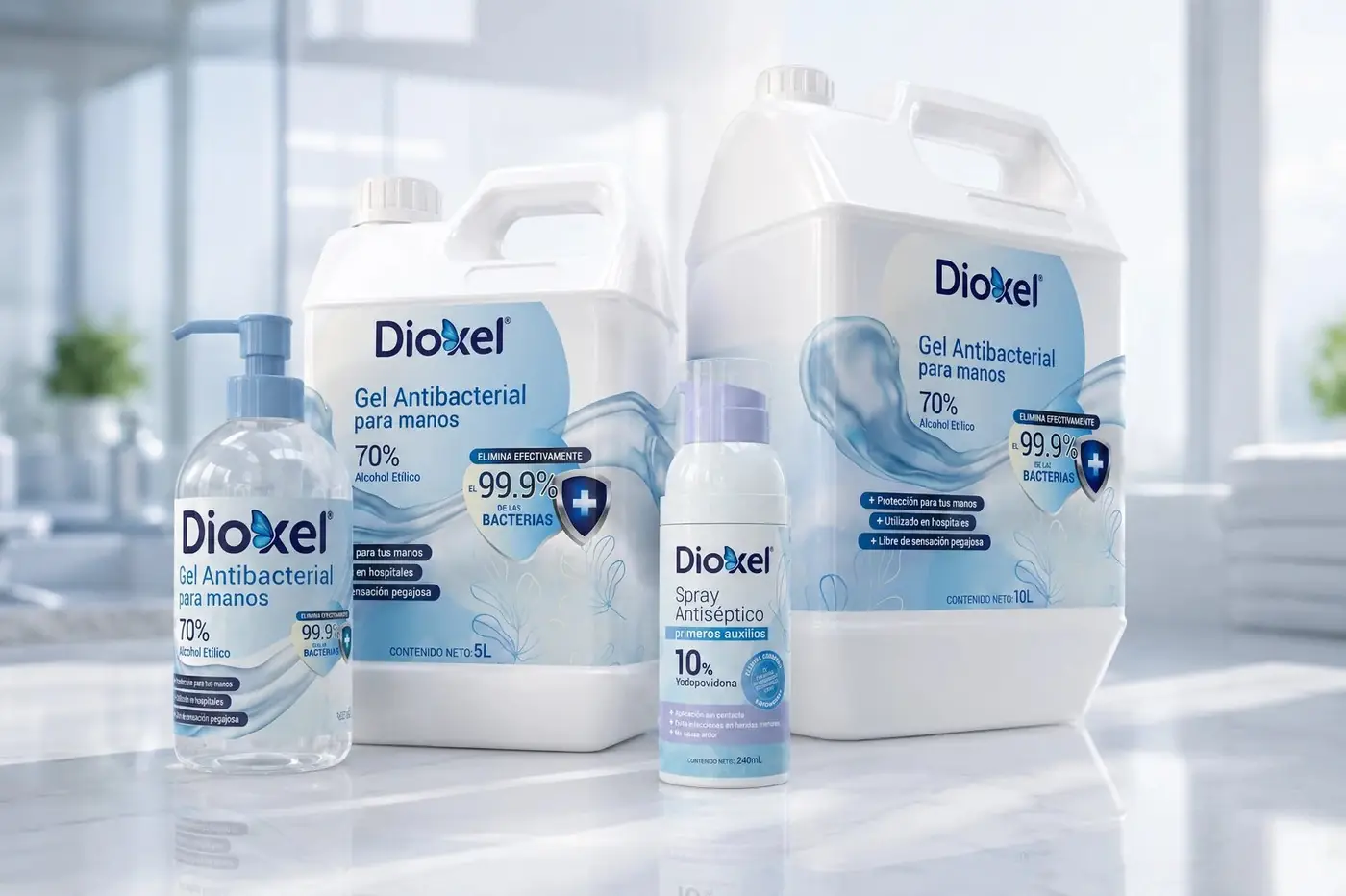
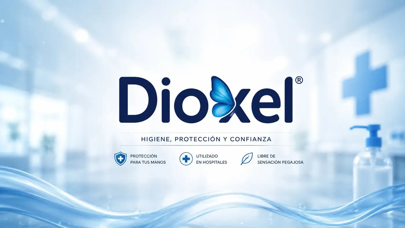
The wordmark is set in an even, rounded sans with a small butterfly resting on the x. That one gesture carries a lot: it is the only part of the pack that suggests recovery rather than intervention, and it gives a name built from technical syllables something human to hold onto.
02
What a shopper reads first
Everything on the front is ordered by what someone needs in the moment they pick it up. The name, then what it is, then the strength. I kept the percentage large because that is the one technical figure people do look for in this aisle, and burying it would have forced a shopper to turn the bottle over and probably to put it down instead.
Below that the benefits run in plain consumer language rather than clinical phrasing. No touch application, no stinging: the customer is not a clinician, and language that talks past her is a way of losing her at the shelf. A round seal handles the germ claim so the promise has somewhere to sit without crowding the reading order above it.
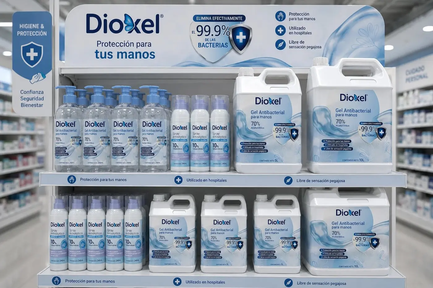
Showing three identical bottles together earns its keep twice over. At retail it reads as a multipack, and in material going out to distributors the same frame argues for consistency, which saves a separate case pack render for a point the photograph already makes.


Have a project like this?
Tell me what you are building, changing or launching, and I will help you define the right scope and direction.