
Case study · Packaging Design
Kiev System K
Frizz Control & Shine Hair Care Line
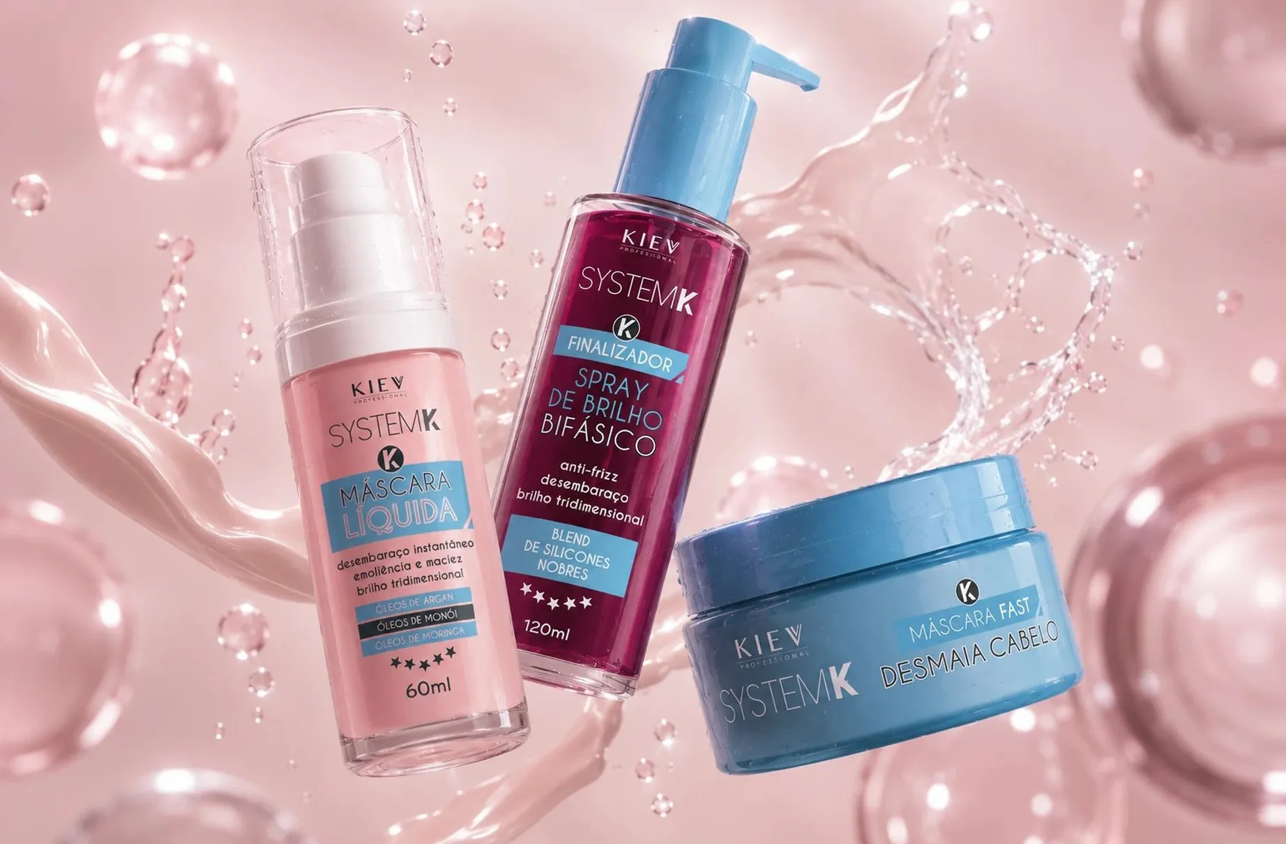
System K is a frizz control and shine range that had to feel gentle and scientifically credible at the same time. Those two signals usually pull against each other, and the identity exists to hold them together.
01
Soft and formulated at once
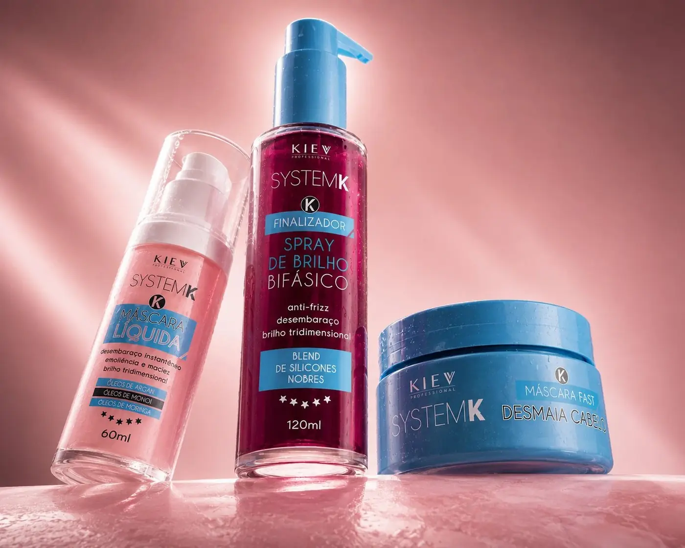
Most of this category picks a side. Clinical packs look effective and cold, soft packs look pleasant and unserious, and neither one tells the whole truth about a product like this. The way through was a pastel gradient running pink to blue, a color move nobody reads as harsh, set against glass and laboratory forms that carry the technical half of the claim. The two signals do not cancel because they arrive from different places, one from color and one from form.
Typography stays out of the way deliberately. A range this soft does not need heavy type competing with the color story, so names are set light and small and the type does hierarchy and nothing else. The gradient is the recognition. Asking the lettering to share that job would have dulled the one thing that makes the line identifiable across a shelf.
02
The fixed point in a shifting system
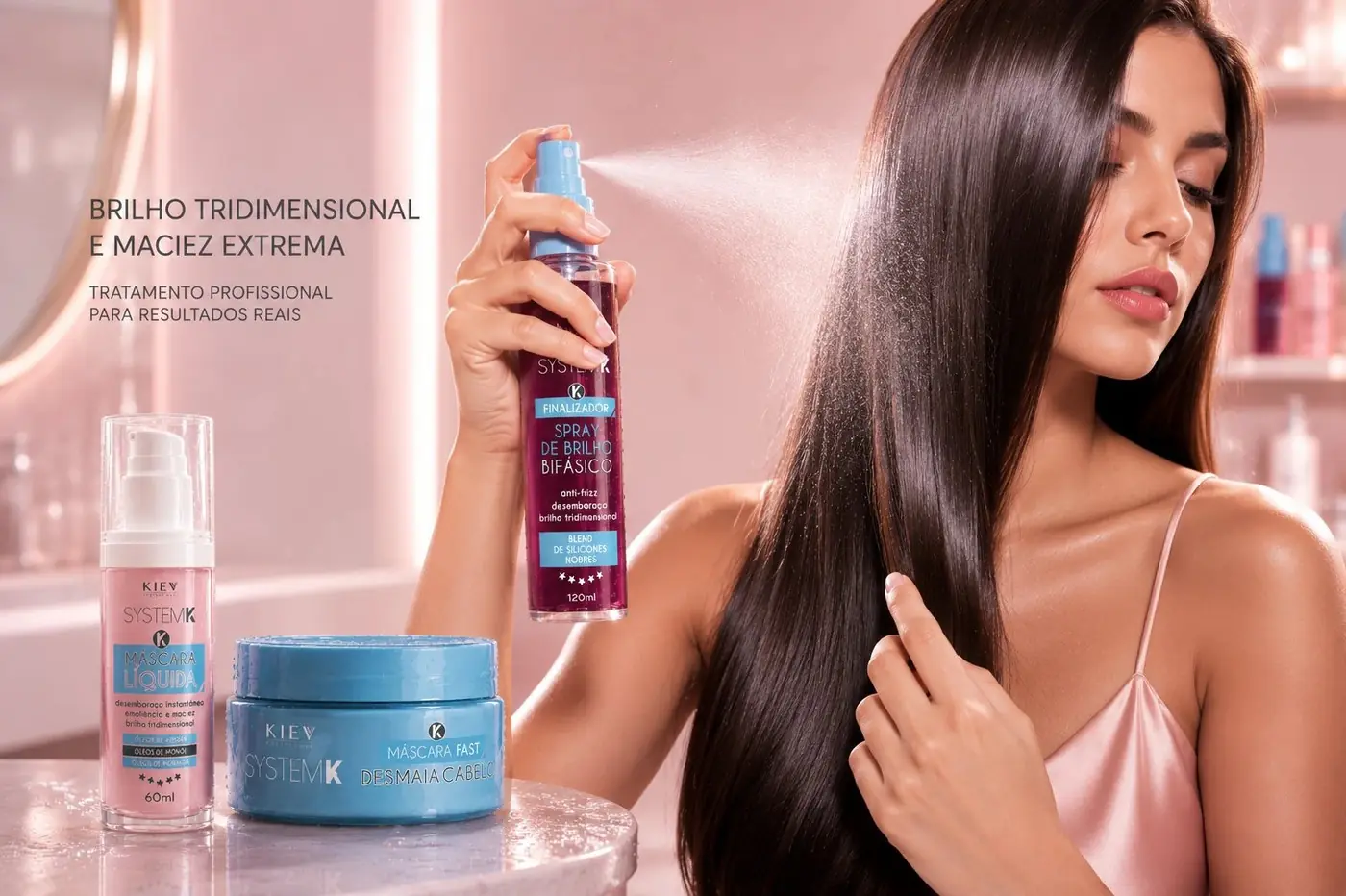
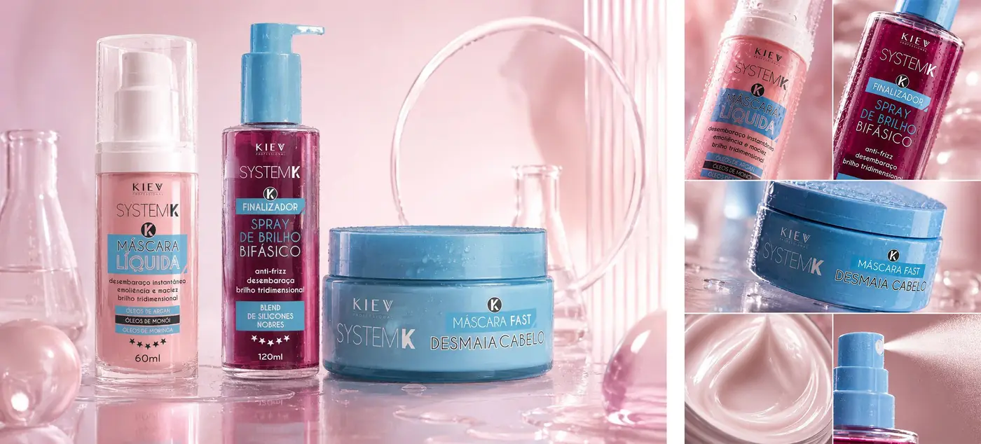
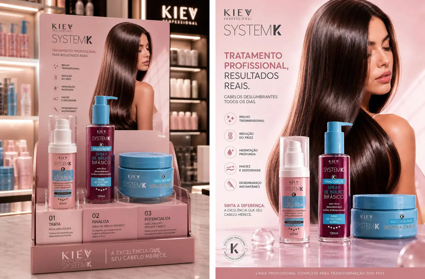
When every pack changes color, something has to stay still. A small circular K badge repeats on every format in exactly the same relationship to the product name, and it is the only element that never moves. That badge is what lets a pale pink pump, a deep magenta bottle and a blue jar read as one range rather than three unrelated products that happen to share a shelf.
The two-phase spray is the clearest case of the pack doing the arguing. I specified a bottle that leaves the separation of oil and liquid visible through the glass, which turns a formulation fact into something a customer can see instead of a line buried in the ingredients. The packaging is not describing the technology, it is displaying it.
The photography stays in that same register, lab glassware under soft pink light, so that science and gentleness are both visible inside a single frame rather than alternating between shots. Separating them would have made the range look like two brands sharing a name, which is the one outcome the whole system was built to avoid.
More work
More projects.





Have a project like this?
Tell me what you are building, changing or launching, and I will help you define the right scope and direction.