

Case study · Packaging Design
Lotus Beauty Co.
Skincare Packaging System
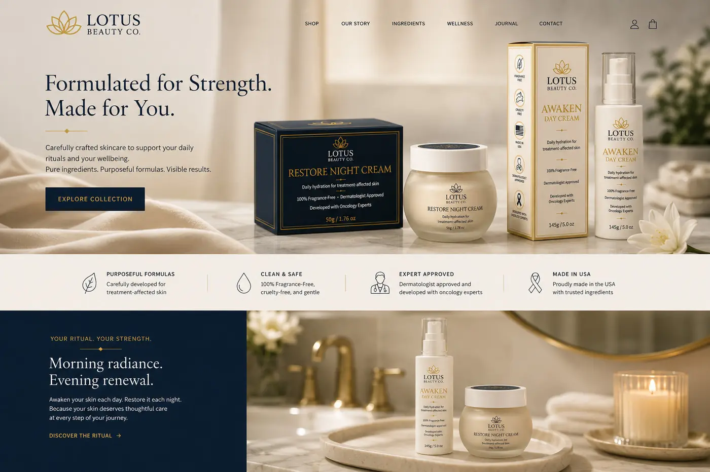
Lotus Beauty Co. makes skincare for treatment-affected skin, an audience for whom reassurance matters as much as beauty does. The system is built on quiet confidence: packaging that earns trust by staying calm rather than by making claims.
01
Reassurance without the pharmacy shelf
Skin that is recovering from treatment is a delicate thing to speak to. Go too clinical and the pack reads as medicine, which is not what anyone wants sitting on a bathroom counter. Go too decorative and it stops sounding credible. The position I worked toward was quiet confidence, built from restrained type, generous space, a tightly controlled hierarchy and a palette short enough that nothing has to shout to be understood.
The lotus anchors it. Drawn as a fine open line rather than a filled symbol, it carries the care in the brand without tipping into sentiment, and it survives the small size a jar lid allows. A serif does the naming, because a serif reads as considered where a clinical sans would read as prescribed. A thin gold rule frames the panel and sets the register: present, never gilded.



02
One family, morning and night
Two products needed to be obviously related and obviously different. The day cream sits in a warm ivory environment, light and open, the way a morning step should feel. The night cream moves into deep navy. That shift happens in the field color alone, with the symbol, the typography and the hierarchy unchanged, so the pair reads as one brand keeping a daily rhythm rather than two products sharing a logo.
Structure is what lets it stretch. A tall carton, a pump bottle and a wider jar are different proportions offering different amounts of room, so I fixed the order of information instead of the layout: symbol, name, the one line that says what the product does, then the supporting detail running down the side. The rhythm survives the change of shape.
That framework is also what makes the system extendable. A single product on a nightstand, a gift set, a retail presentation and a page on the site are all built from the same handful of decisions, which is why the range holds together when a customer meets it out of order. Consistency here is not a styling rule. It is the reassurance doing its work.



More work
More projects.



Have a project like this?
Tell me what you are building, changing or launching, and I will help you define the right scope and direction.