
Case study · Packaging Design
Itallian Sopremo
Premium Color-Care Hair Line
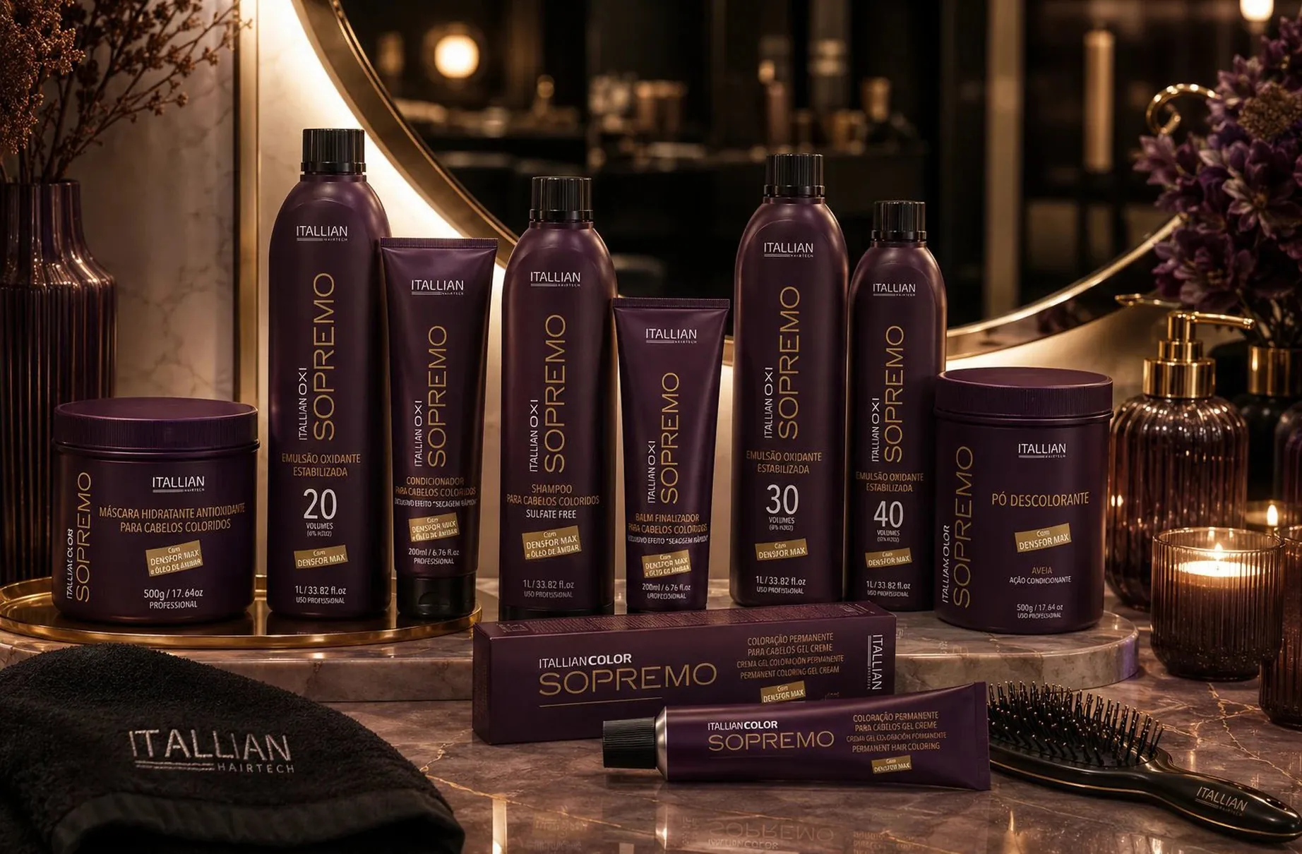
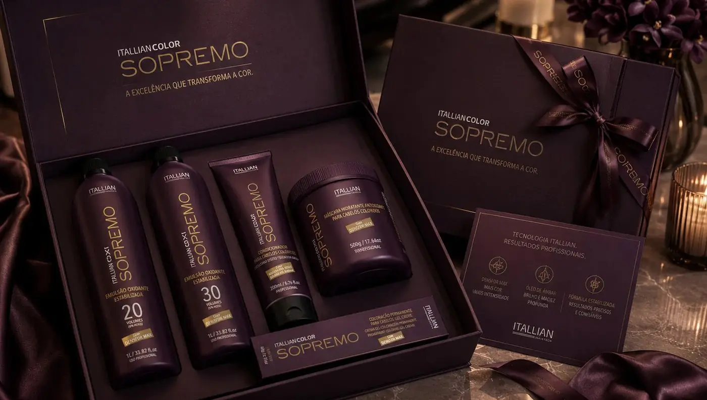
Sopremo had to sit above Itallian's core range on the price list, which meant the packaging itself had to make the argument for the premium. The identity is built on one idea: the step up in price should be visible before anyone picks up a bottle.
01
The color does the arguing first
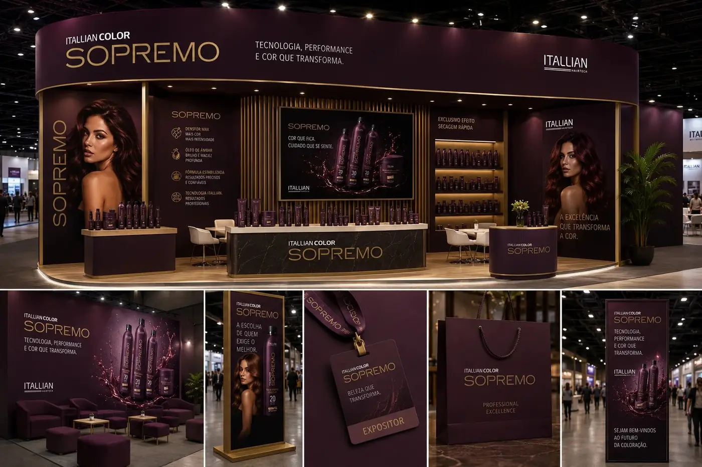
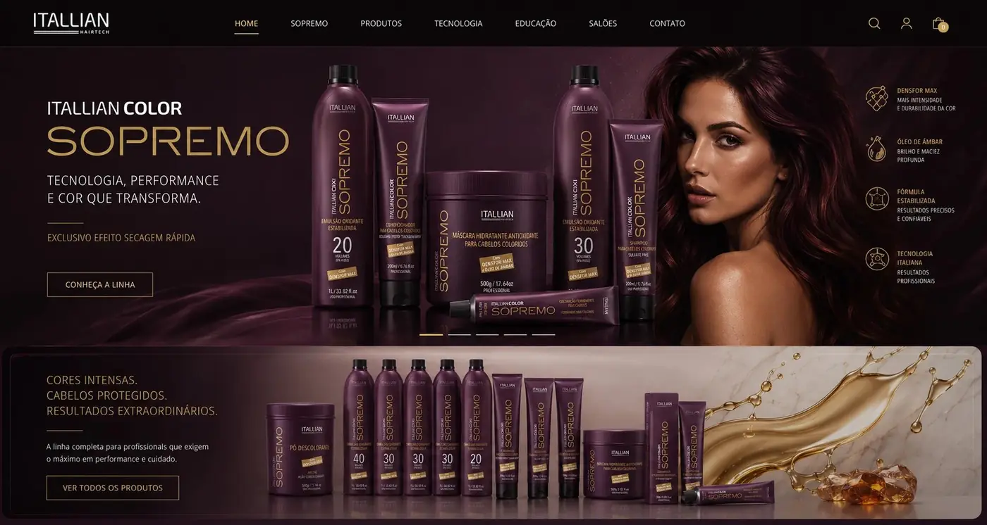
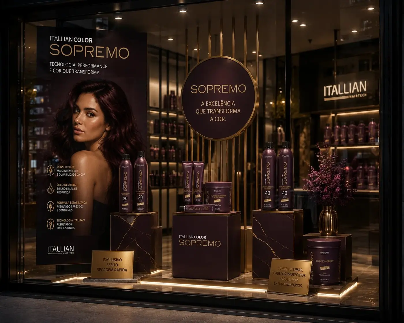
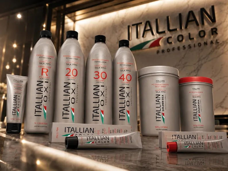
Itallian's house language is silver, and silver is a fine signal of professional competence, but it says nothing about tier. So the first move was to leave it behind entirely. Deep plum with gold is a different register, closer to fragrance than to salon supply, and the moment a Sopremo bottle stands beside a standard one the hierarchy explains itself without a word of copy.
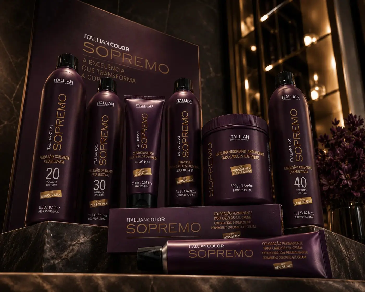
That color shift does most of the perceived value work, so the rest of the drawing could stay quiet. The logotype runs in a metallic gold that behaves like foil, wide and evenly spaced, with the Itallian name small above it. Nothing crowds it. A premium pack that tries too hard reads as a cheaper pack in costume, and I wanted this surface to feel like it had room to spare.
02
A badge the customer can point to
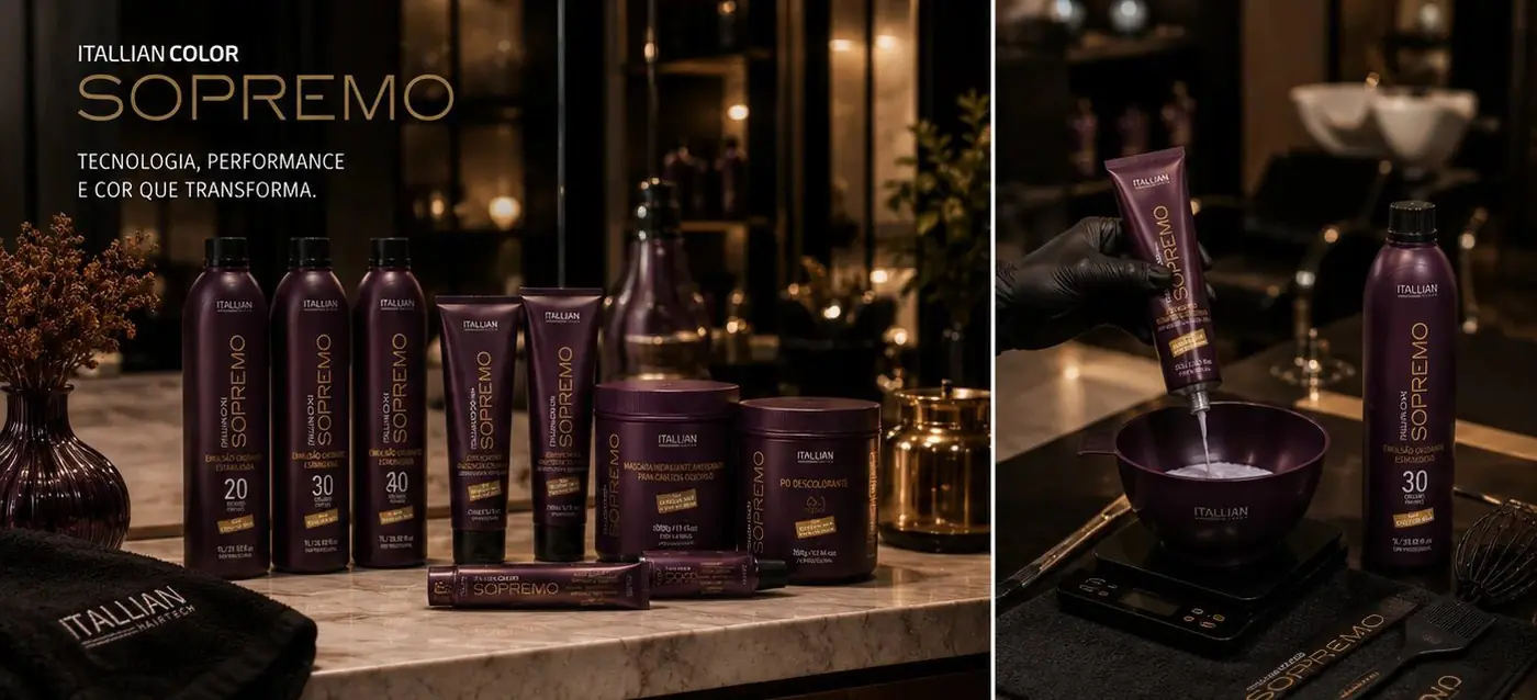
Color on its own is only a mood. Someone paying more wants something specific to attach that money to, which is why every piece in the range carries the same gold Densfor Max seal. It is a small block, always in the same relationship to the product name, working as a recurring badge of proof rather than decoration. You buy the seal as much as the formula.
Holding one layout across the whole range mattered more than varying it. Tubes, jars, bottles and cartons are very different objects, and if each one solved its own typography the line would read as a group of products rather than a tier. Same architecture, same intervals, only the descriptor changing underneath.
The photography had to keep the same company as the packs. I shot the range together on dark marble under warm gold light, closer to the way a fragrance line gets shot than a salon product, because that is the shelf Sopremo has to be measured against if it is going to justify what it costs.
More work
More projects.




Have a project like this?
Tell me what you are building, changing or launching, and I will help you define the right scope and direction.