
Case study · Packaging Design
KYM Beauty
Hair Spray Trio Packaging
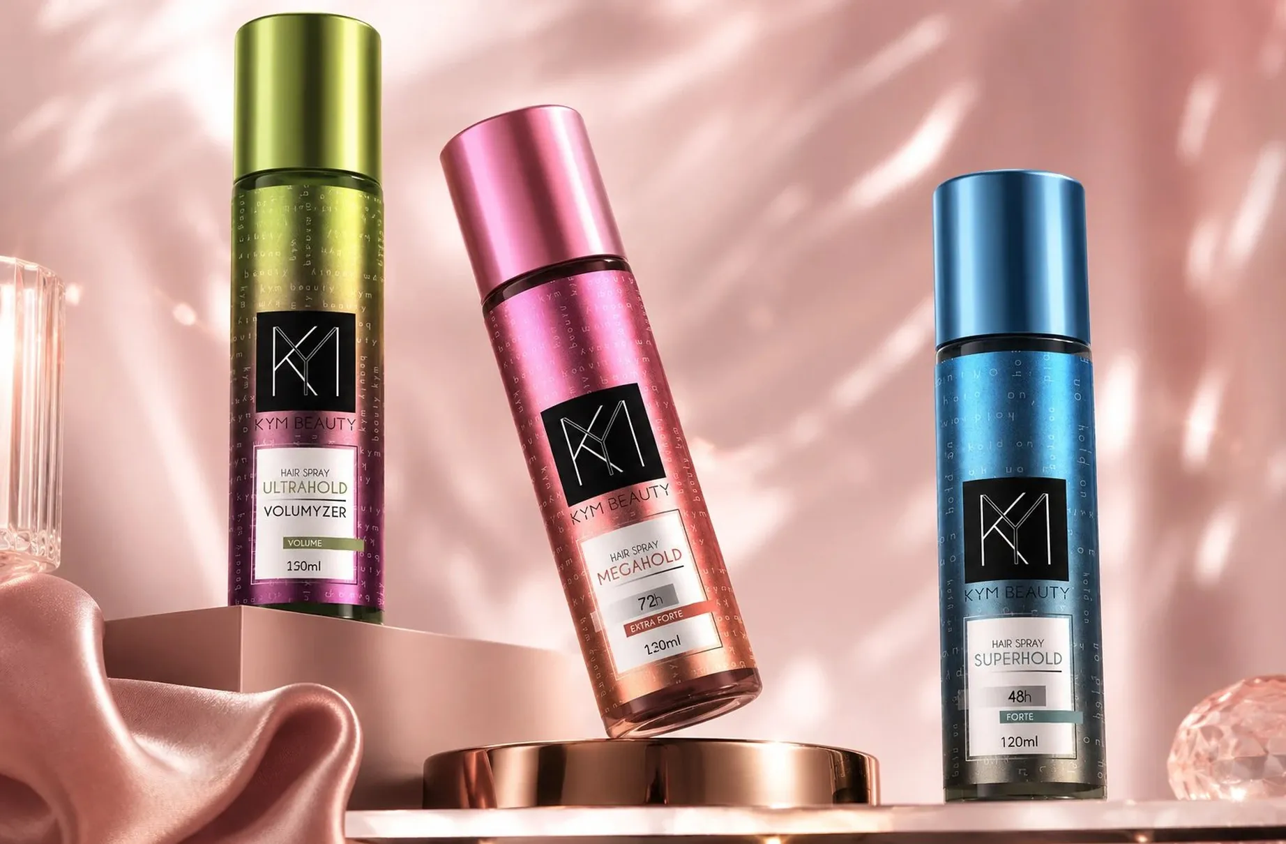
KYM Beauty's three hairsprays differ only by hold strength and duration, which on paper is a dull technical spec sheet. The packaging turns that difference into something a customer can shop by feel, in the second it takes to reach for a can.
01
Shopping by color, not by copy
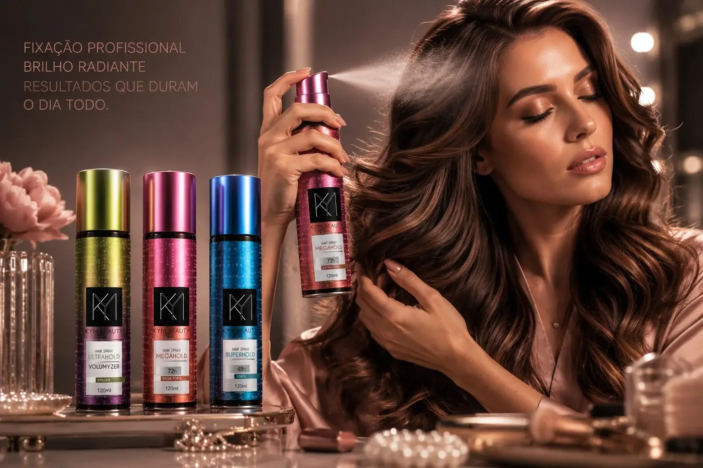
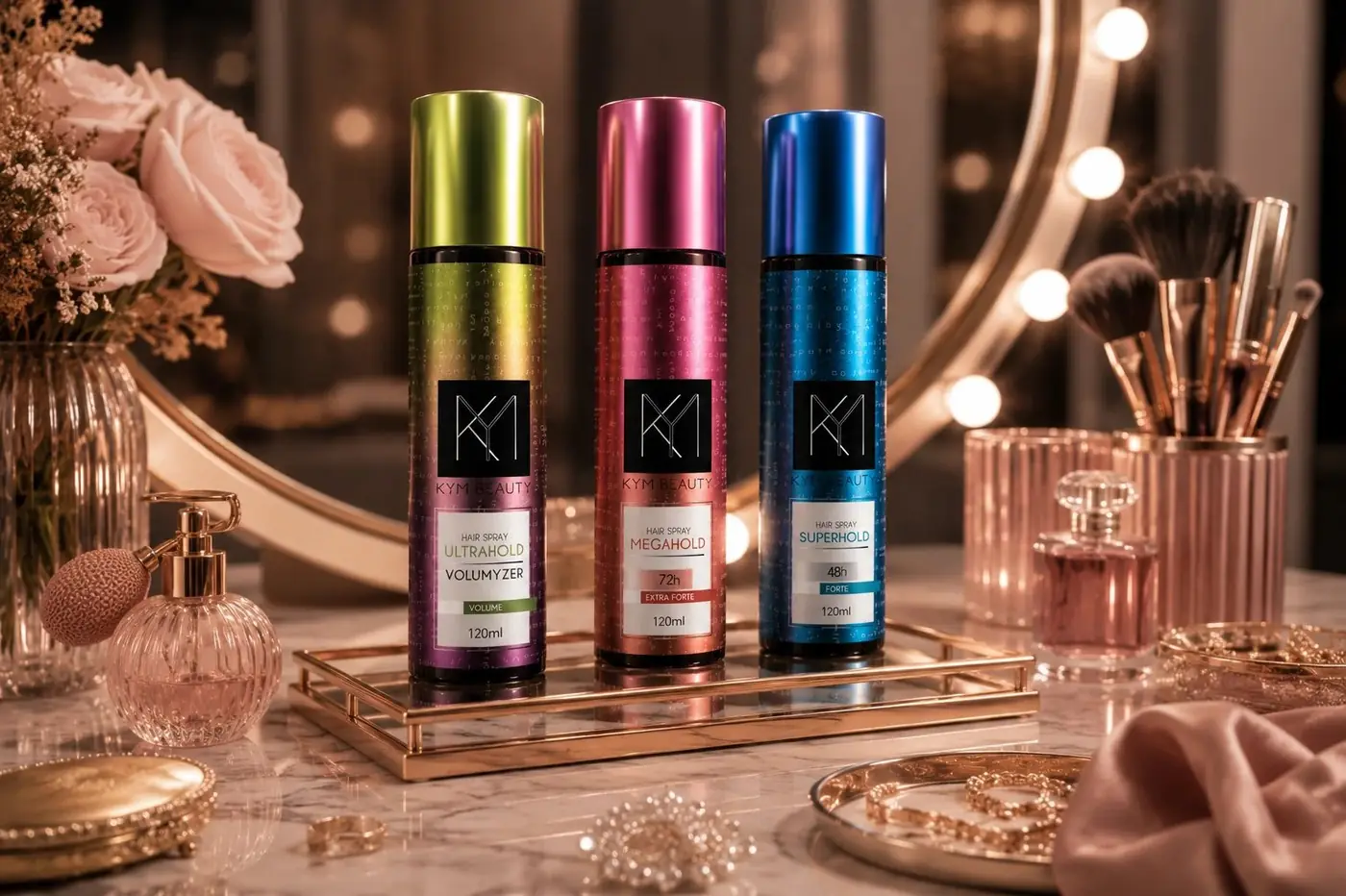
Hold level is the entire decision in this category, and it usually ends up buried in small print near the base of the can where nobody standing at a shelf will ever read it. So each strength got a metallic gradient of its own, green gold through pink copper to blue teal, running the full height of the can. Color carries the information from three feet away in a way a duration claim never will.
The monogram stays identical across all three, and that was the point. I wanted the gradient to be the variable customers learn to shop by, because a logo that shifts with every product teaches people nothing and quietly costs the brand its own recognition. It sits inside a black square, drawn as thin connected lines, giving every can one hard-edged constant in the middle of all that shimmer.
02
A trio that still reads as one
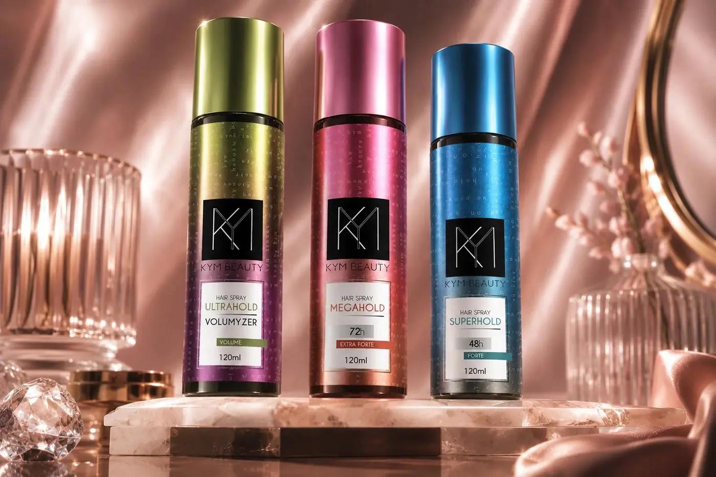
Beneath the gradient the wordmark repeats as a faint pattern across the body, low enough in contrast that you find it with the can in your hand rather than from across the aisle. That shared surface is what ties three very different colors into a set, and it does the job a second logo would otherwise have been asked to do badly.
Each cap picks up the top of its own gradient, so the trio reads as a family from above, in a basket or a bathroom drawer, as clearly as it does head on. The hold name and the duration sit together in a small white panel, set plainly and large enough to settle any doubt at arm's length once color has already narrowed the choice.
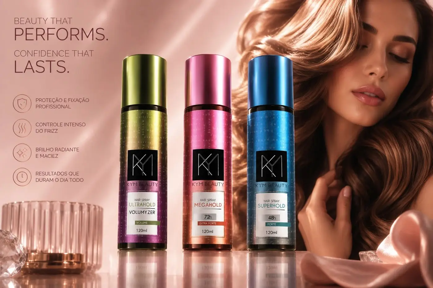
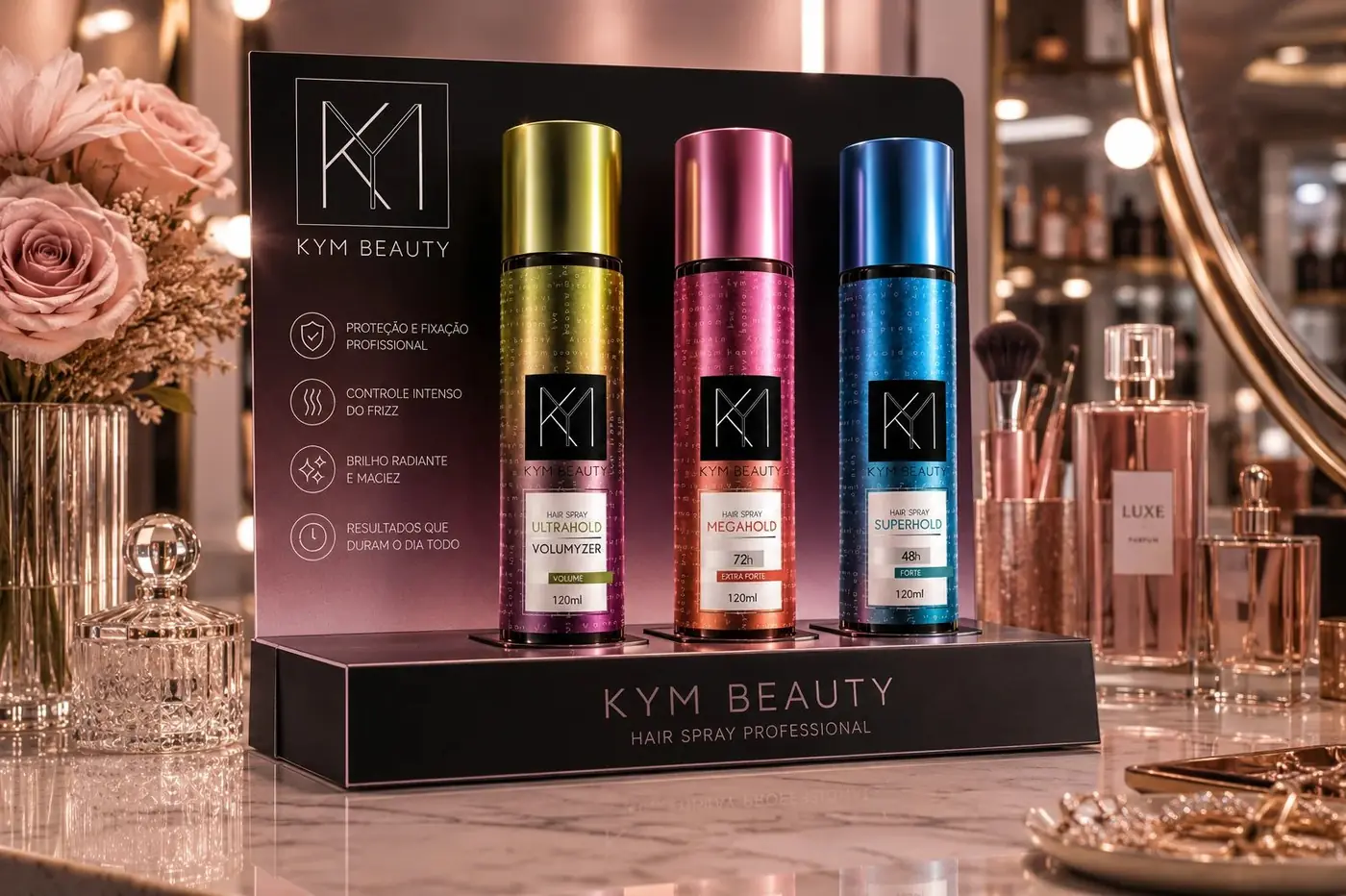
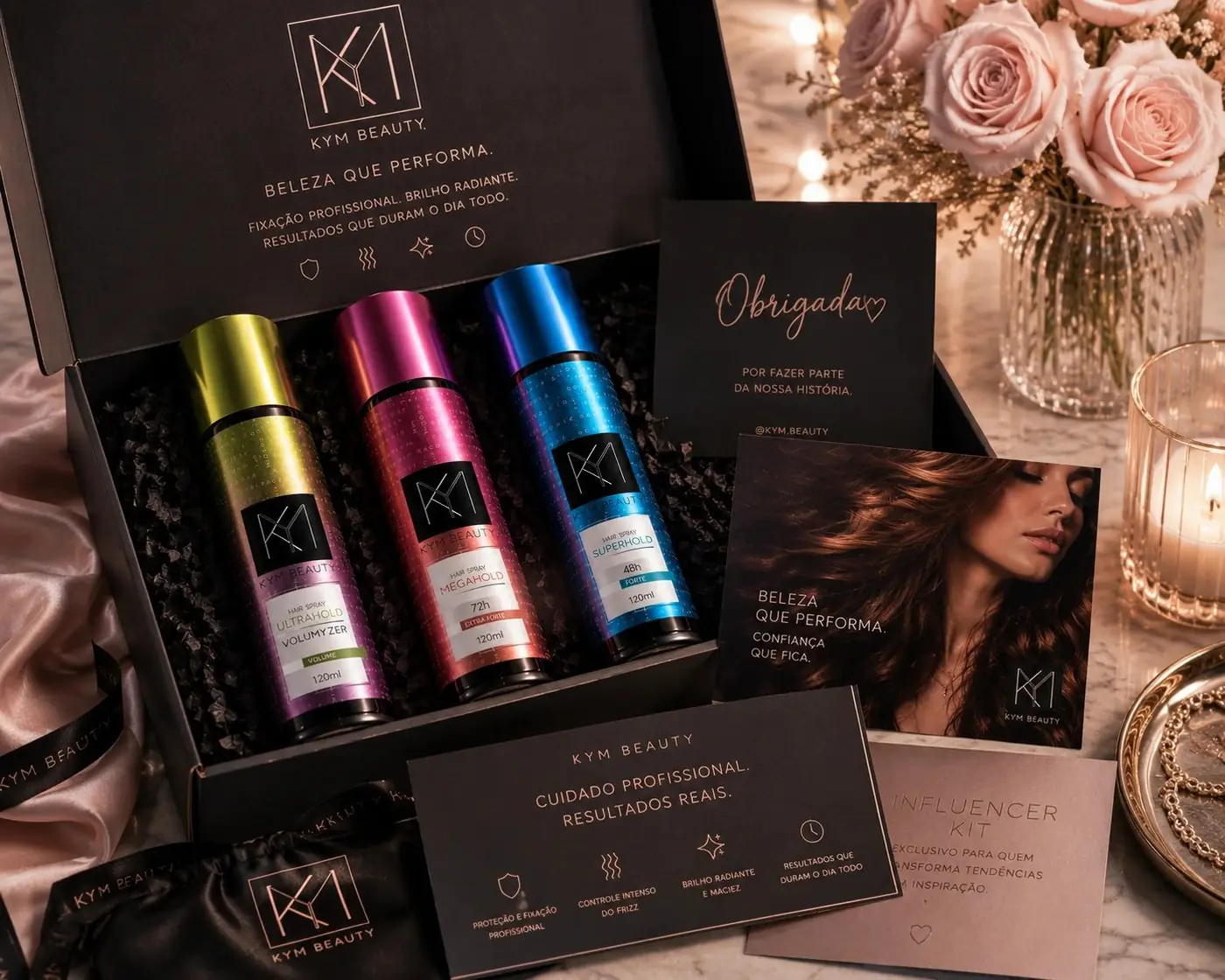
The set was styled in soft sunlit pink with satin and cut glass, which supplies something the formula cannot. A hold and duration chart is a purely functional argument, and functional arguments do not sell hairspray on their own. The photography adds the warmth the ingredient list has no way of expressing, and the two together give a technical product a shelf presence worth reaching for.
More work
More projects.

Have a project like this?
Tell me what you are building, changing or launching, and I will help you define the right scope and direction.