
Case study · Packaging Design
Awesomen
Men's Grooming Line Packaging
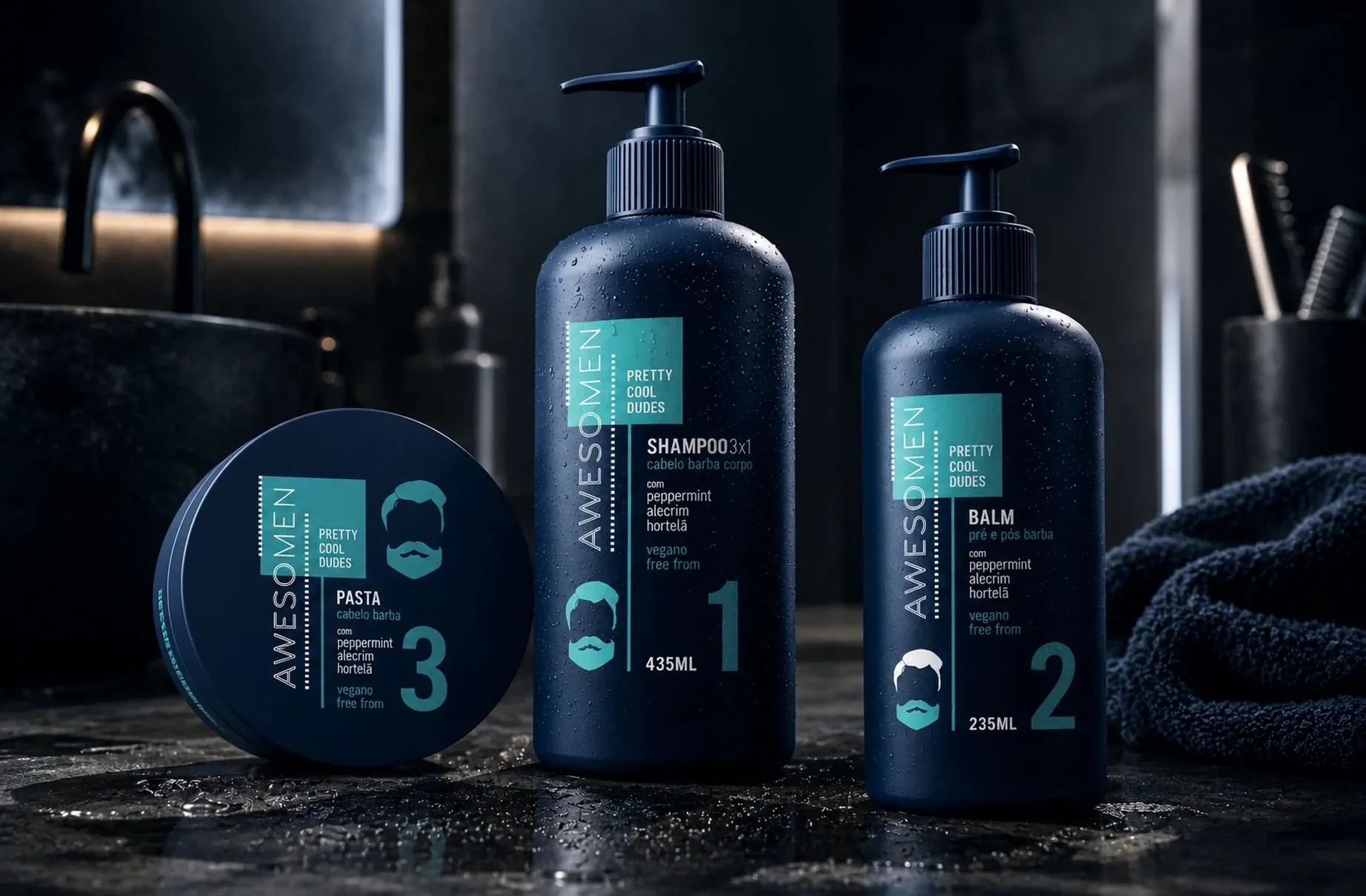
Awesomen is a men's grooming line, and it needed to feel like a routine rather than a shampoo with a masculine label on it. Pretty Cool Dudes was built as a numbered system from the first sketch.
01
A routine with a running order
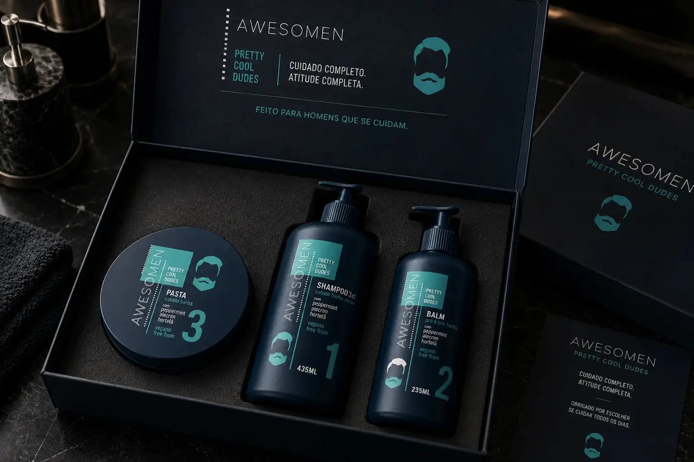
The number is the idea. Each product carries a 1, a 2 or a 3 set large near the base, so the pack tells you the sequence before you have read a single word of the name. That turns three separate purchases into one habit, and it removes the guesswork in a category where most men are not especially sure what is supposed to go on first.
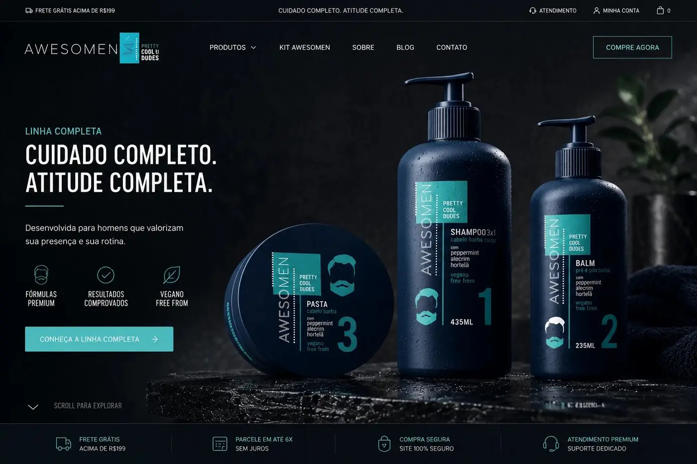
Everything around the number stays deliberately identical. One navy base, one teal panel, one minimal bearded face, held in exactly the same relationship on every container even though the shapes refuse to match: a tall pump bottle, a shorter one, a flat tub lid. Keeping the panel and the icon locked in place is what makes three different geometries read as one family when they stand together.
02
Letting the label stay quiet
The wordmark is a heavy, slightly condensed sans that reads as confident without tipping into aggressive, which in this category is a narrow lane to hit. Grooming for men tends to go apologetic or go shouting, and neither one wears well on a bathroom counter you look at every morning. Running the name vertically up the panel edge keeps the front face calm and lets the number land first.
The vegan and free from lines sit small and low in contrast on purpose. They are there for the customer who goes looking, and effectively invisible to everyone else, so ingredient copy never competes with the mark for the second it gets on a shelf. A claim does not have to be loud to be found.
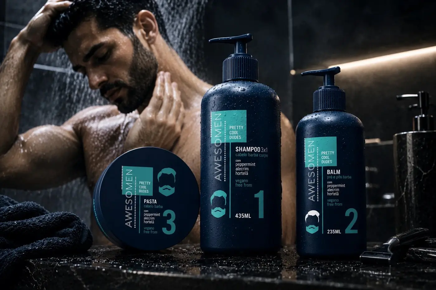
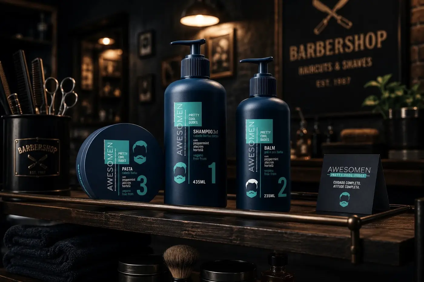
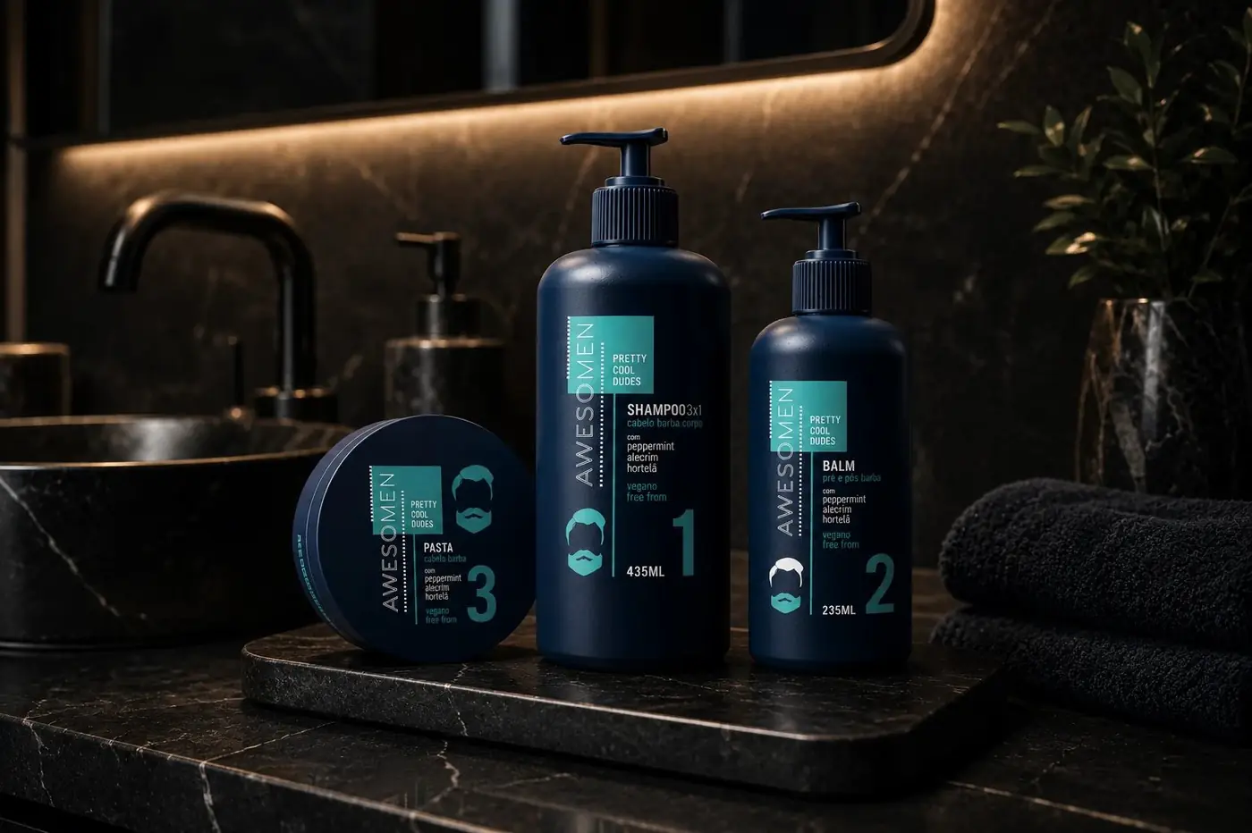
I shot the three together on dark stone under cool light with steam rising, because this category sells on mood as much as on formula, and the mood here should be a spa moment a guy would admit to enjoying. Keeping all three in one frame also makes the same argument the numbering makes. This is a set, not a bottle.
More work
More projects.

Have a project like this?
Tell me what you are building, changing or launching, and I will help you define the right scope and direction.