
Case study · Packaging Design
Critter Omitter
Novelty Gift Box Packaging
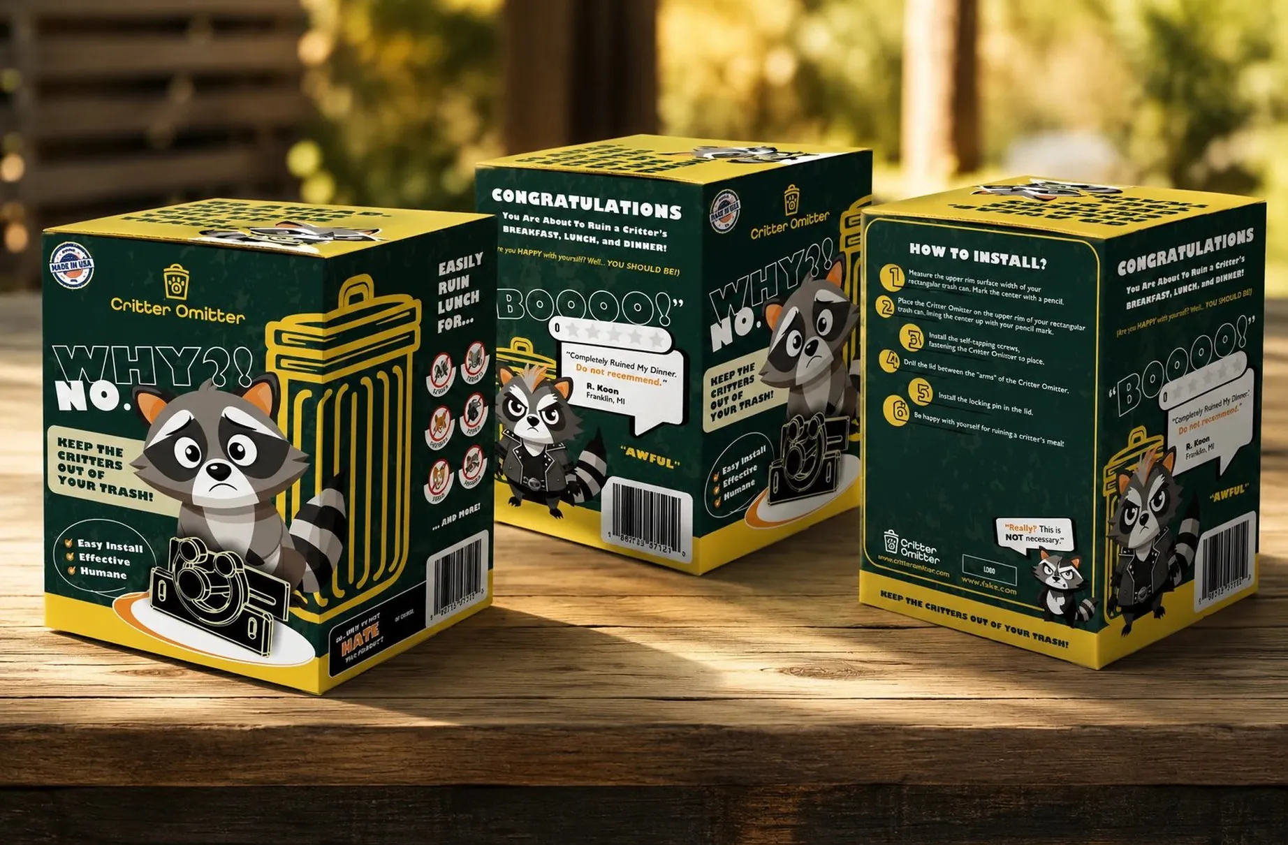
Critter Omitter is a gag gift dressed as a piece of real hardware, and the whole system is built on one rule: the joke cannot show itself until the box is already in somebody's hands.
01
The joke has to stay hidden
Most novelty packaging gives itself away on the front panel, which spends the best moment the product will ever have. A gag only pays if the person finds it themselves, so the design problem here was never how to be funny. It was how to stay convincing long enough for the funny part to arrive.
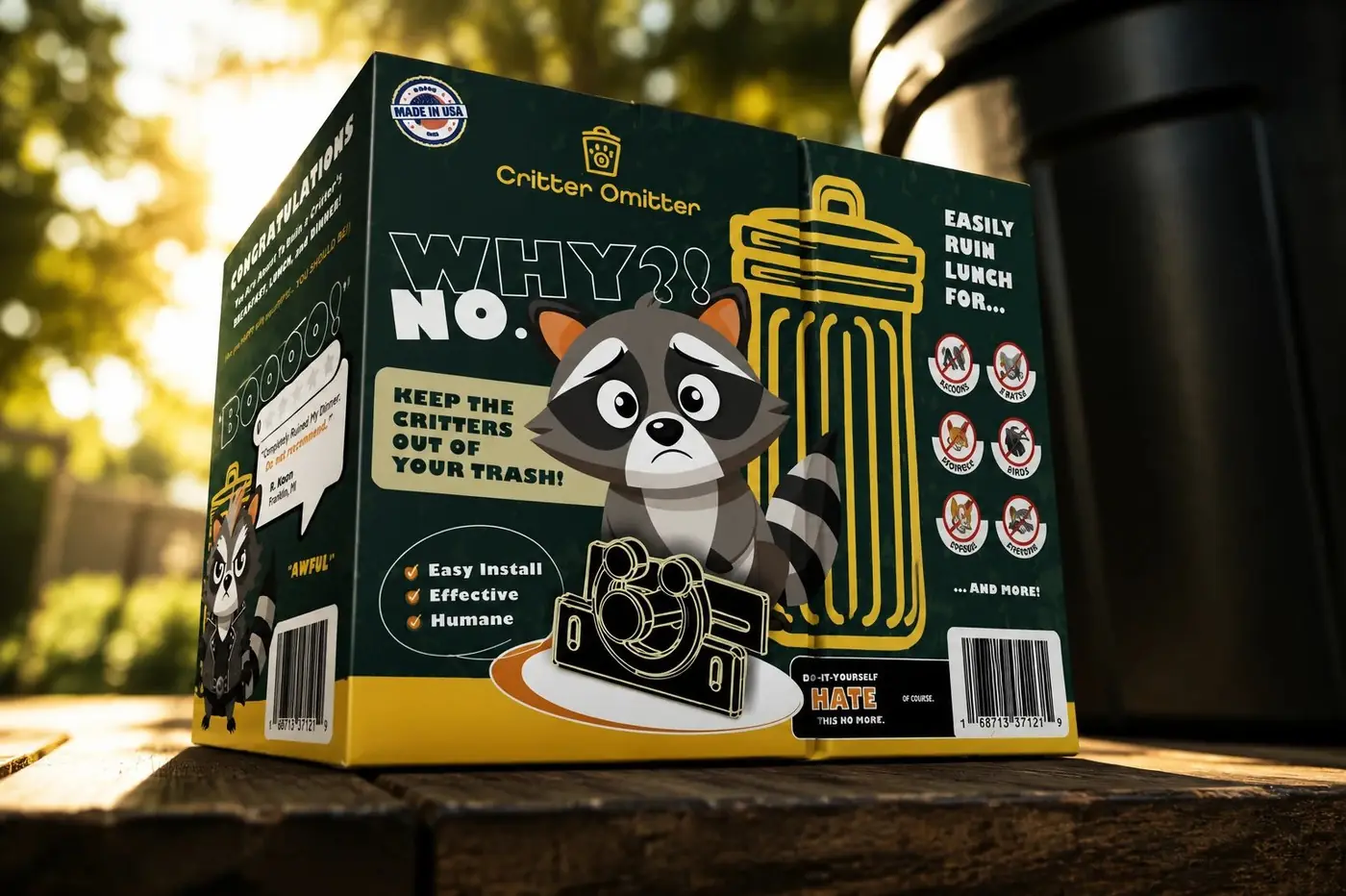
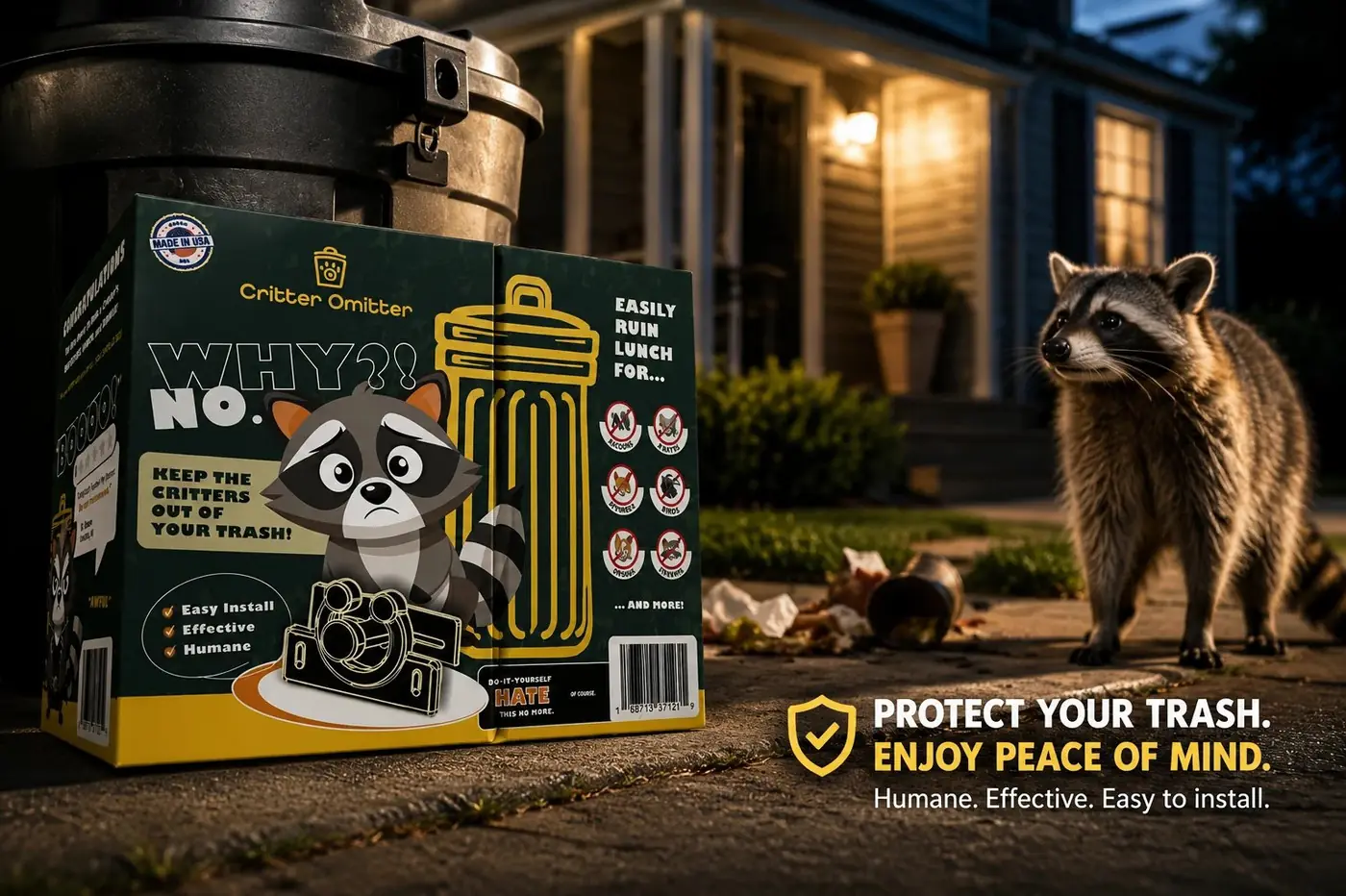
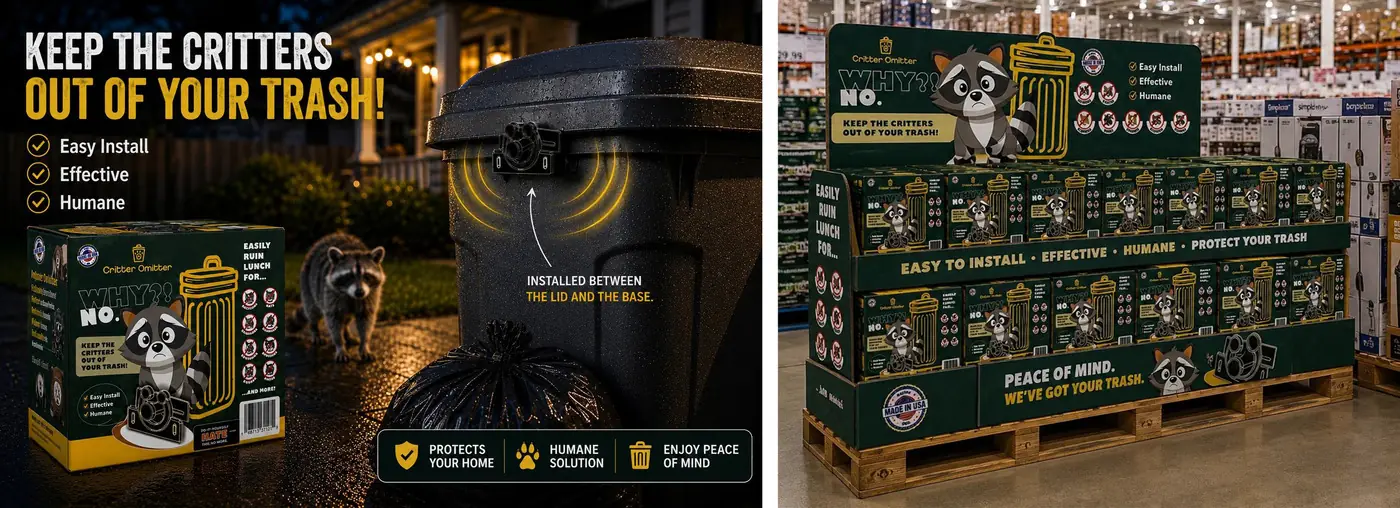
So the pack borrows every convention of an actual hardware product. A clean product shot, a numbered install sequence, a short feature checklist, a barcode, the whole apparatus of something you would pull off a shelf without thinking twice. Nothing on the front is winking. Green and gold read as utility rather than comedy, and that misdirection is doing the real work.
02
The turn happens in the hand
Turn the box over and the whole thing recontextualizes. "Congratulations, You Are About To Ruin A Critter's Breakfast, Lunch, and Dinner" lands harder because it arrives in exactly the confident voice the front panel established, and because by then the customer has already accepted the object as a product. Even the install steps stay useful right up to the last one, which asks you to be happy with yourself.
The raccoon carries everything the type refuses to. I drew him annoyed, defeated and thoroughly unimpressed across the panels, because a flat or generic mascot would have signaled cartoon before the copy got its chance. The lettering stays bold and straight-faced throughout, with no comic flourishes anywhere, so the humor comes from the writing and from an animal's face instead of from letterforms trying too hard.
The detail that gets the biggest reaction is the fake one-star review, set precisely where a genuine review badge would sit on legitimate packaging. It works because the placement, the scale and the styling are all correct. Borrow the form of something credible and the joke needs no help from the design at all.




Have a project like this?
Tell me what you are building, changing or launching, and I will help you define the right scope and direction.