
Case study · Packaging Design
MaxTite D-Limonene
Industrial Cleaner Packaging
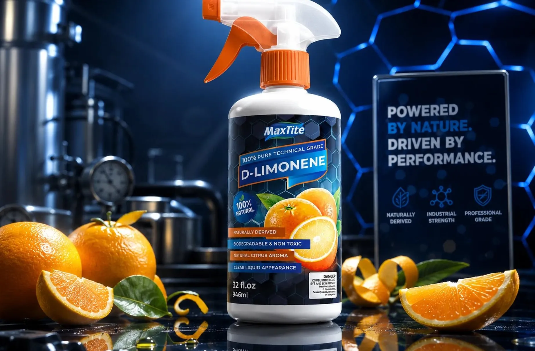
MaxTite D-Limonene is an industrial strength solvent distilled from orange peels, and both of those facts have to be believable on the same label. That tension became the entire design brief.
01
A solvent that admits its origin
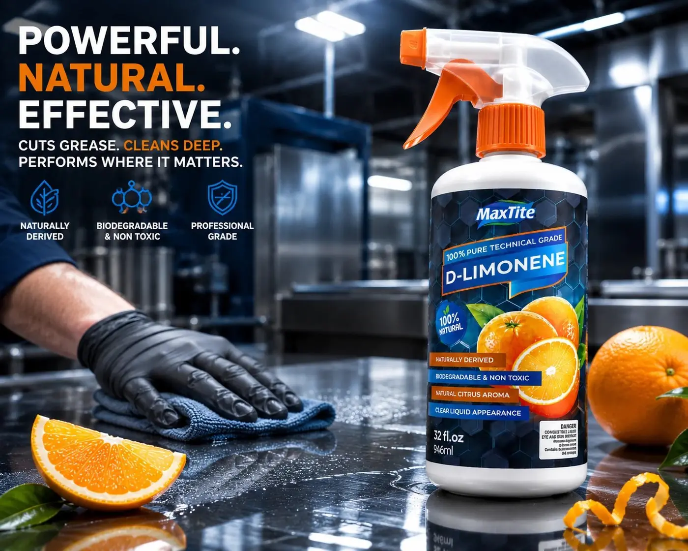
A buyer shopping for a degreaser wants proof it performs like a chemical, and a buyer drawn to a plant derived product wants proof it really is one. Those two instincts normally pull a label in opposite directions, and the usual solution is to pick a side. Being both is the actual advantage of this product, so hiding either half wastes the reason it exists.
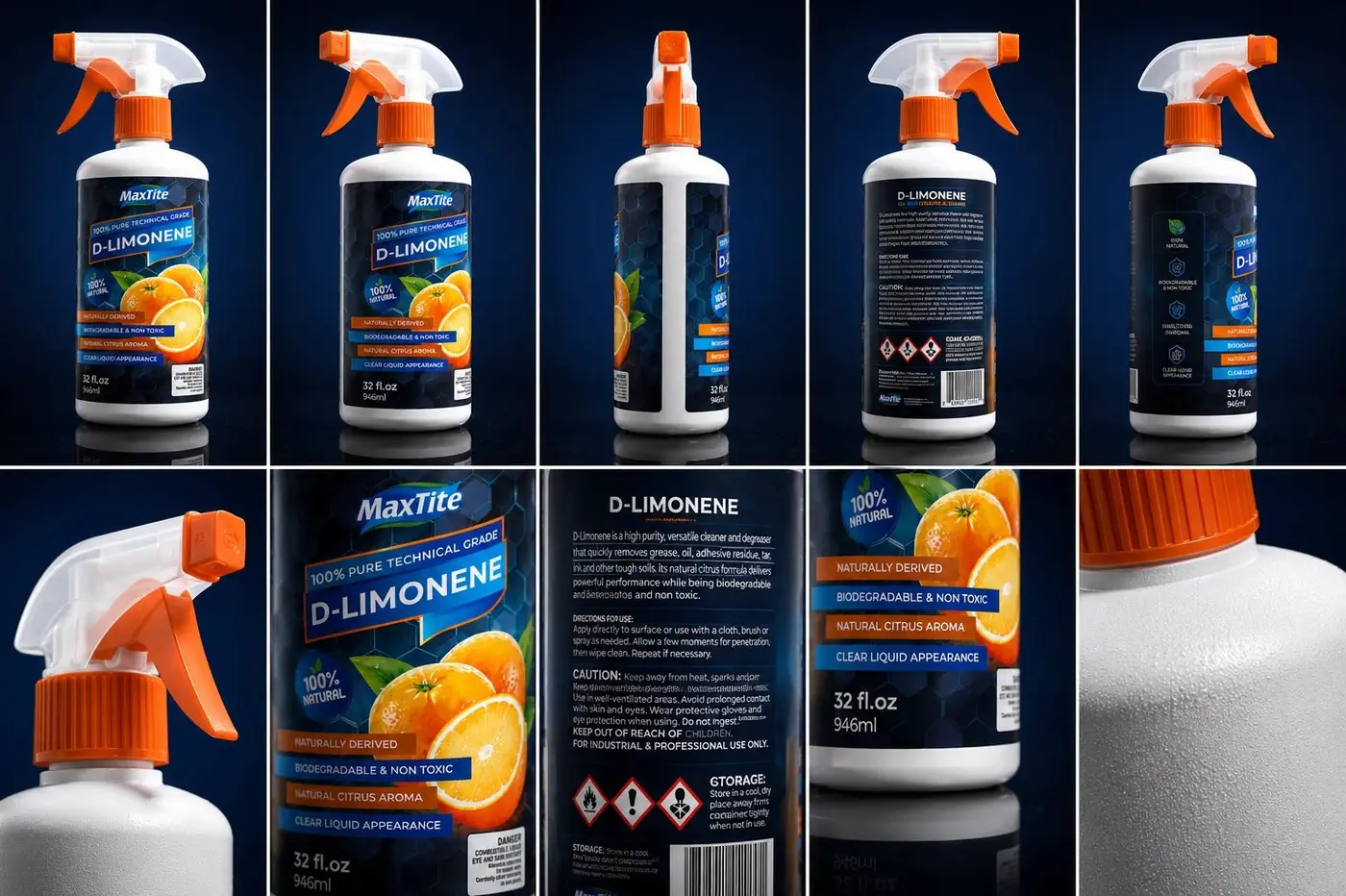
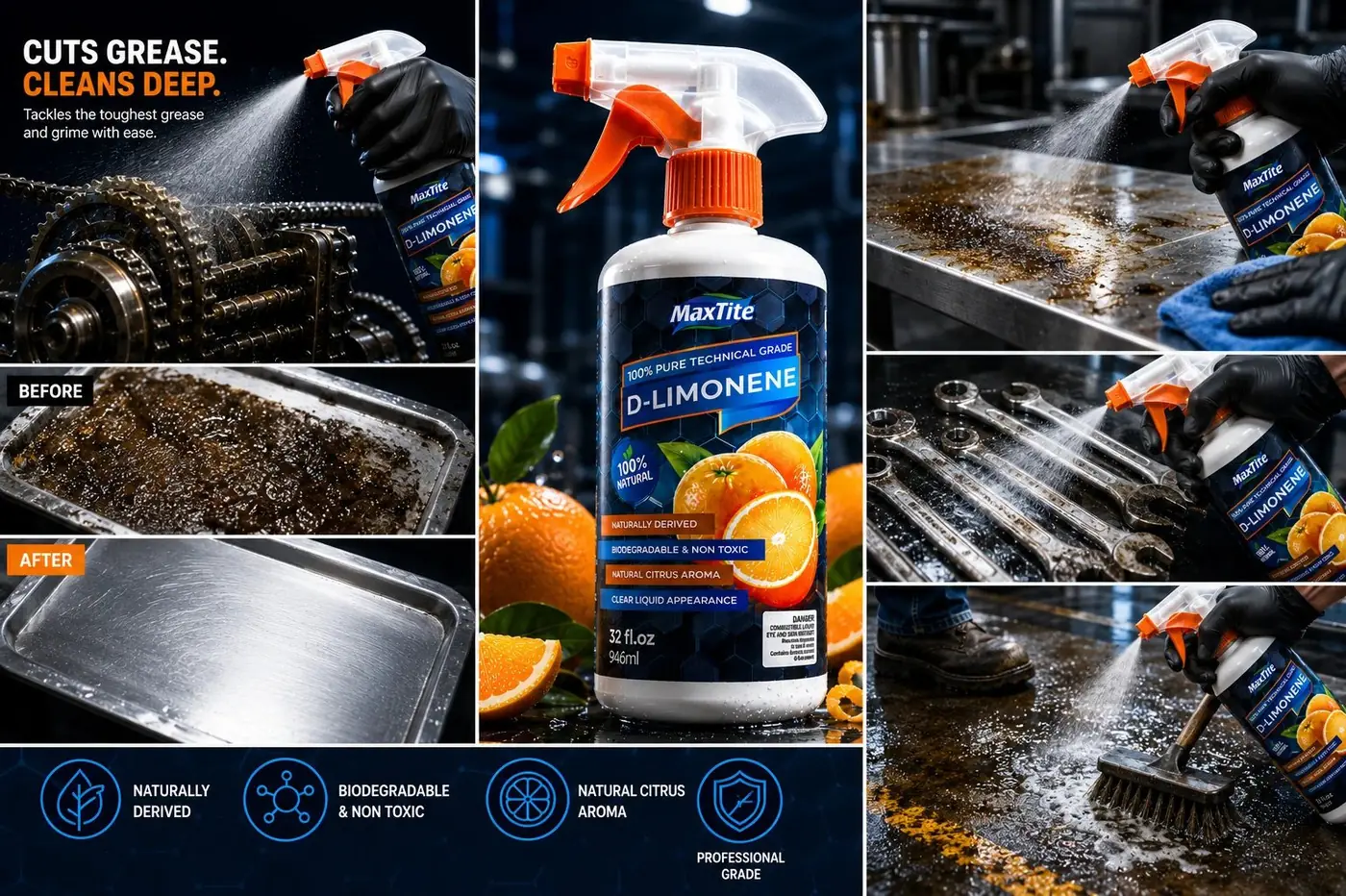
The dark navy hexagon field does the technical work. It reads as scientific without any of the usual chemical cliches, and it gives the front panel a surface that feels engineered rather than printed. Real orange and peel photography then sits inside that same frame, lit to match, so the fruit reads as a specification rather than a decoration.
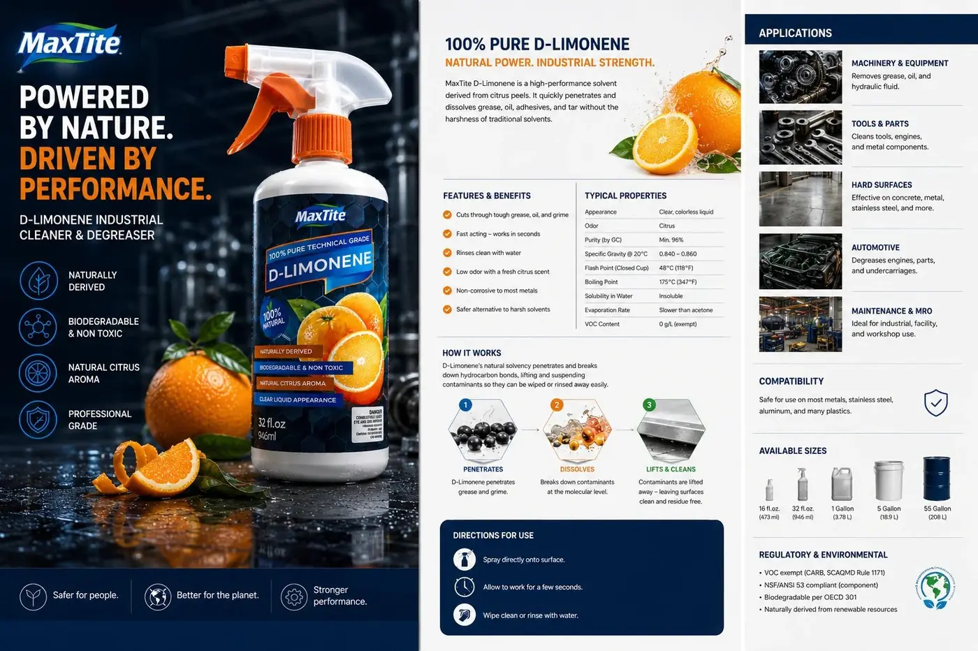
The tagline is the hinge between the two halves. "Powered by Nature. Driven by Performance." runs bold in white on blue and is the only line on the panel that explains rather than claims. Set any smaller it would have read as a slogan, and a slogan would leave the contradiction sitting there unresolved.
02
Making the required copy behave
Hazard and composition text is where labels in this category usually come apart. Giving it a clearly bordered zone and designing it like any other block on the panel means it is complete and legible without looking bolted on at the last minute. Handled that way it stops undercutting the premium feel and starts contributing to it, because visible care with required information reads as competence.
Blue keeps ownership of the surface, and orange is rationed to the fruit, the trigger and a short stack of callout bars. That restraint is what lets the citrus register as information about origin rather than as a flavor cue, which is a real risk when the source material is a fruit and the next shelf over is full of cleaners selling scent.
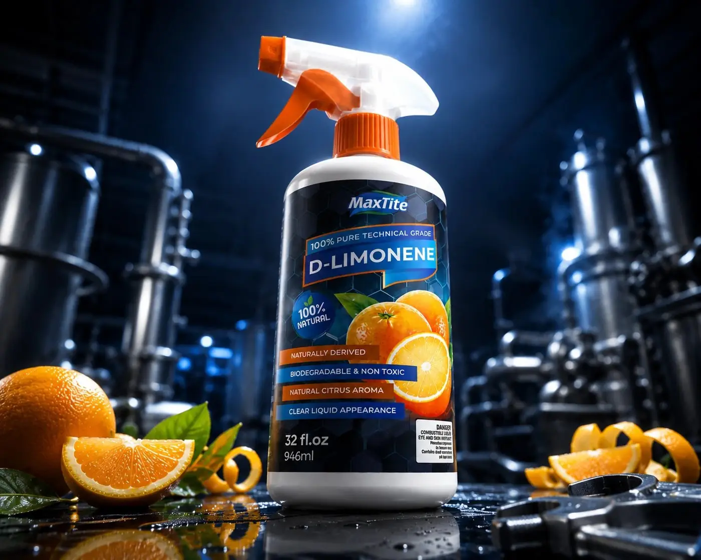
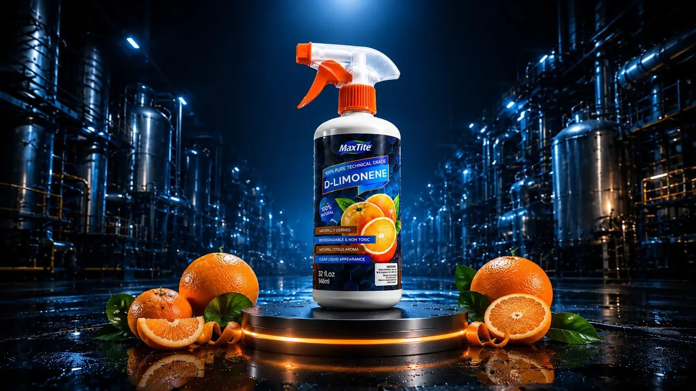
The hero shot follows the same rule. Putting the bottle in front of gauges and steel tanks with peel curls in the foreground hands a buyer both proofs in a single frame, and it does it without the label having to argue for either one twice.
More work
More projects.

Have a project like this?
Tell me what you are building, changing or launching, and I will help you define the right scope and direction.