
Case study · Packaging Design
SonicMelt
Pet-Safe Ice Melt Packaging
SonicMelt is a pet safe ice melt sold in a category where every product claims to work faster for less. The identity is built on the one question a customer can actually answer standing on their own driveway: is this safe under a dog's paws.
01
Selling the paw, not the salt
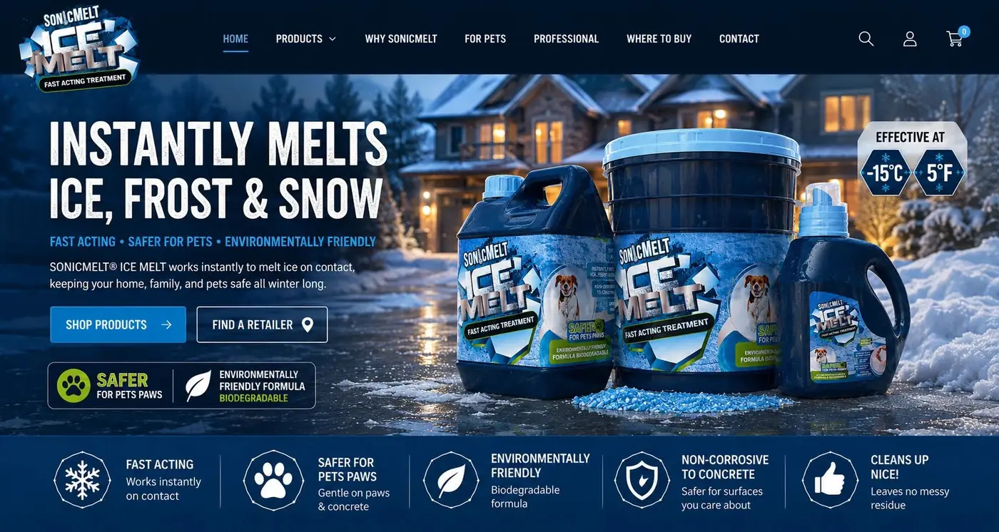
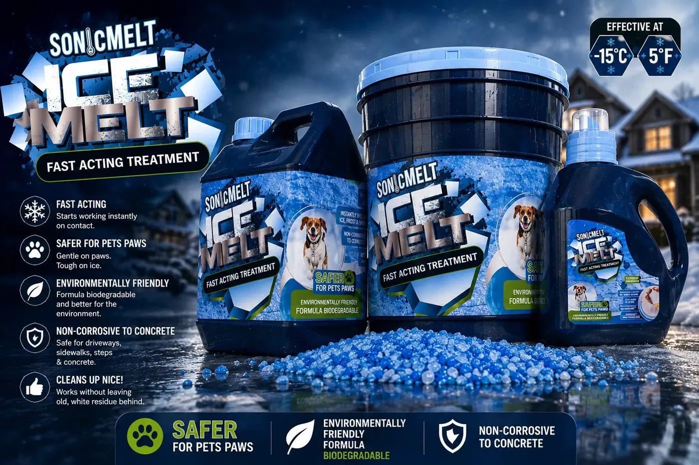
Ice melt is a commodity, and commodities fight on numbers nobody can verify in a hardware aisle in February. Competing on melting power would have put SonicMelt in a price argument it had no reason to win. So the whole brand pivots to a promise a pet owner feels before they think about it, safer for pets' paws, and every other element on the pack is there to support that one claim.
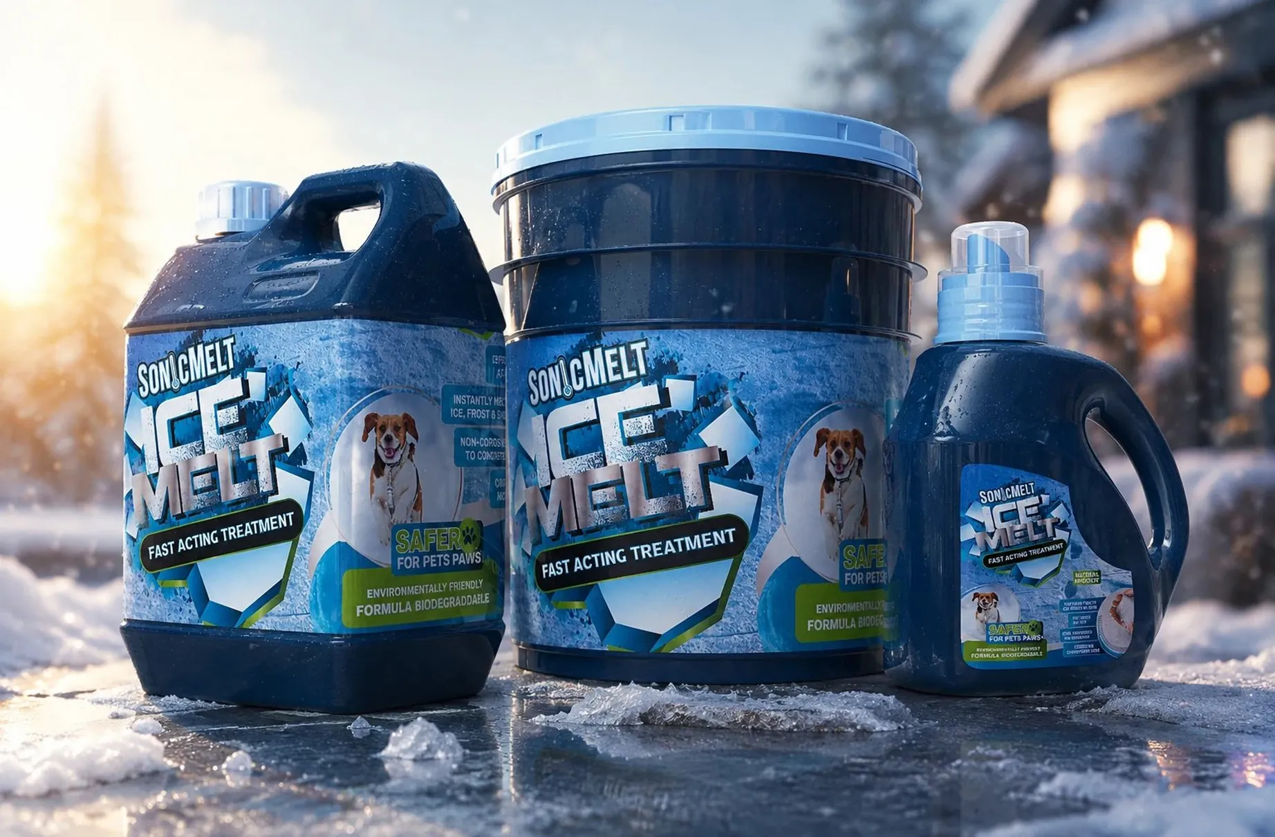
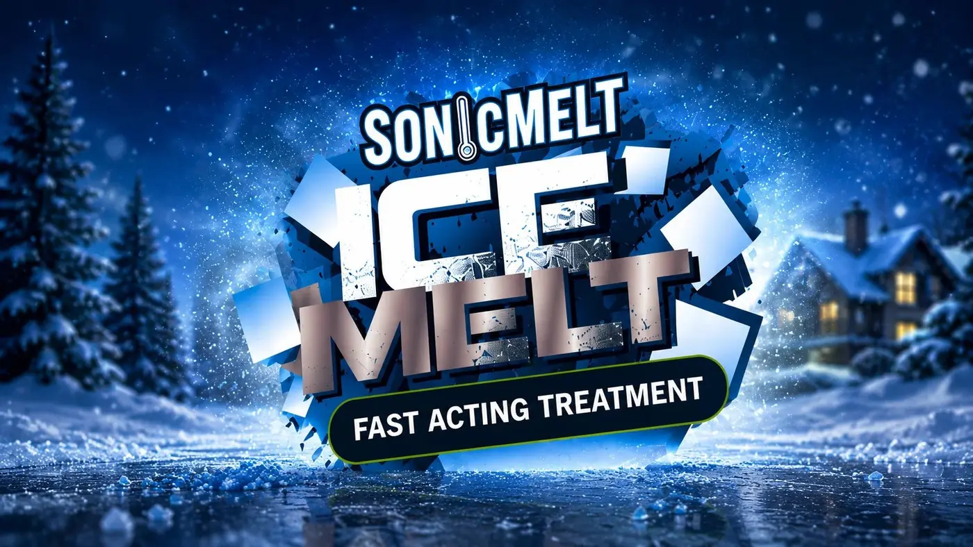
The wordmark carries the category so the messaging does not have to. A sharp icy face with a jagged break struck through it says ice without spending an icon on the idea, and the blue fractal field plus a "Fast Acting Treatment" banner settle the basic question of what the product does. That is the entry ticket, not the argument. Clearing it quickly is what frees the rest of the panel.
02
One argument at three sizes
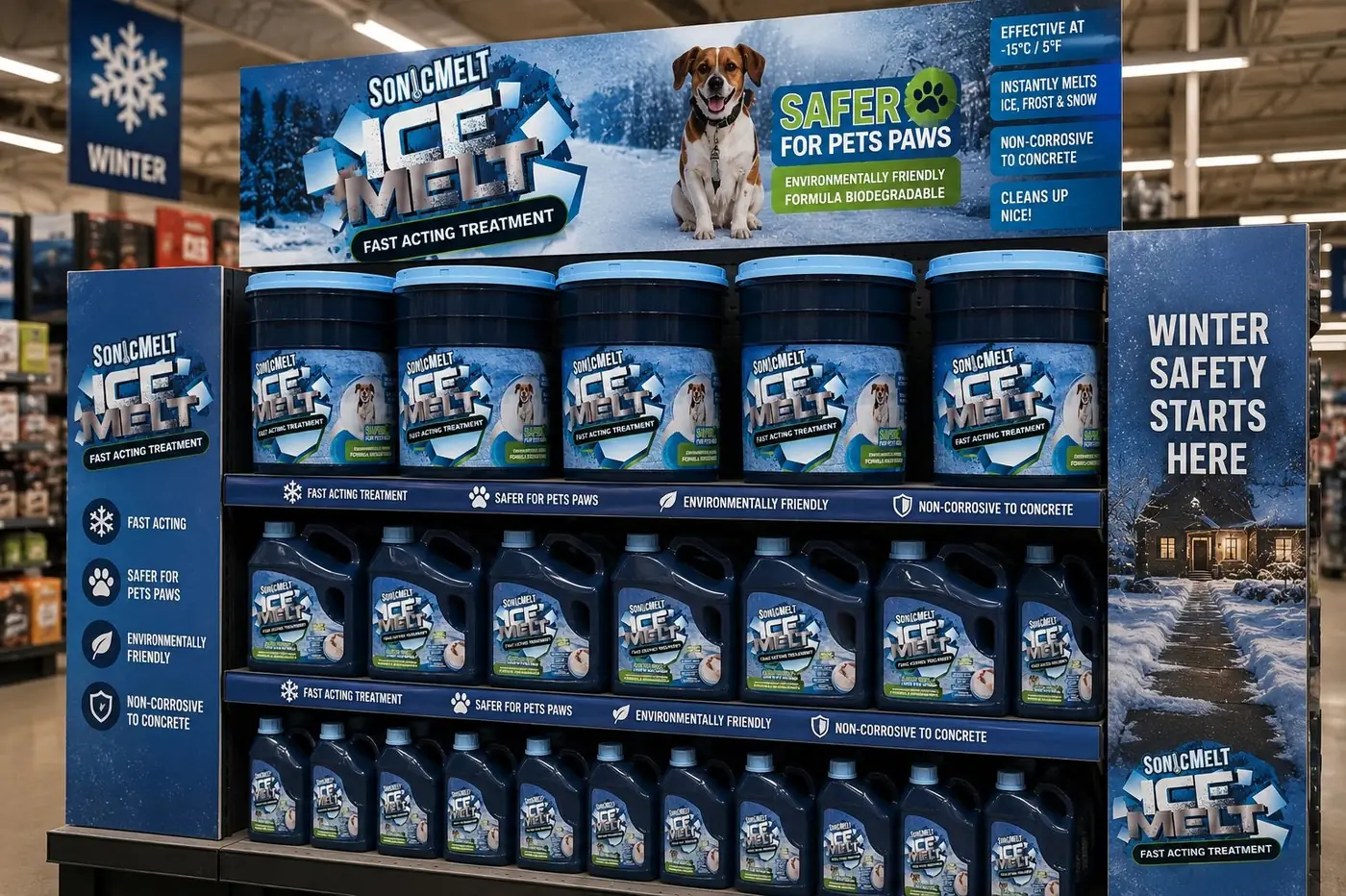
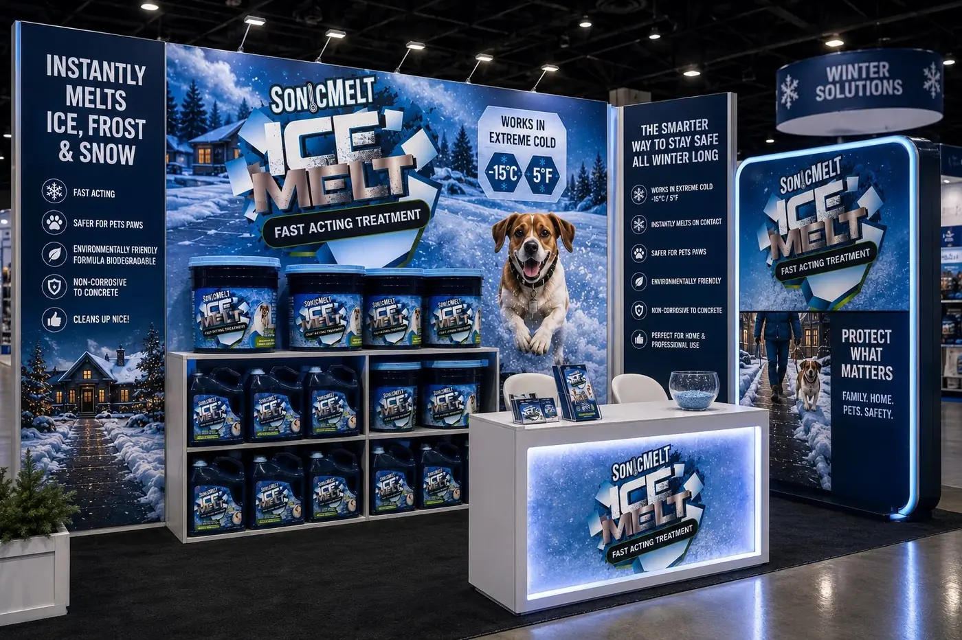
The argument itself is a dog in a circular badge, looking straight out at whoever is holding the jug. A photograph does something no claim can, because it puts a specific animal in front of a specific decision. The badge repeats at every size rather than appearing only on the premium format, since a safety promise that shows up on some packs and not others stops being a promise and becomes a feature.
Green does the second half of that work. Keeping the pet safety and environmental lines in a consistent green band gives them a color of their own inside an overwhelmingly blue system, which means they hold their position instead of dissolving into the ice graphics around them. It is a small allocation of surface doing a large amount of persuading.
The range runs jug, bucket and spray cap bottle, three shapes with very different label areas. What survives the shrink is the order: name, category, dog, green band. On the small bottle almost everything else falls away and that sequence still reads, which was the real test. The photography holds the same logic, shot on ice with a real dog in frame at every size.
More work
More projects.



Have a project like this?
Tell me what you are building, changing or launching, and I will help you define the right scope and direction.