
Case study · Packaging Design
Yama DekapColor System
Professional Hair Color Remover
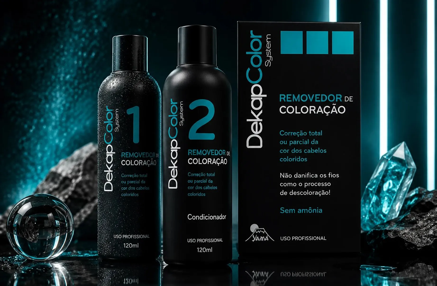
DekapColor System is a professional hair color remover, and the packaging has one job ahead of every other: to look like a salon tool instead of a drugstore box, because that difference is exactly how it is priced and sold.
01
Priced like a professional tool
Everything in this pack is arguing about where the product belongs. A color remover sold into salons is trusted differently and charged for differently than one picked up off a supermarket shelf, and the visual register decides which of the two a stylist believes she is holding. So the brief I set myself was clinical rather than friendly.
Matte black bottles with teal as the only other color get there fast. Teal reads as laboratory instead of beauty aisle, it stays cool where a warmer accent would have softened a product this strong, and against black it holds its legibility at the sizes a small bottle forces on you. "Uso Profissional" appears on every piece, because professional-only positioning is not a detail here, it is the basis of the trust the whole thing runs on.

02
Two bottles, one procedure
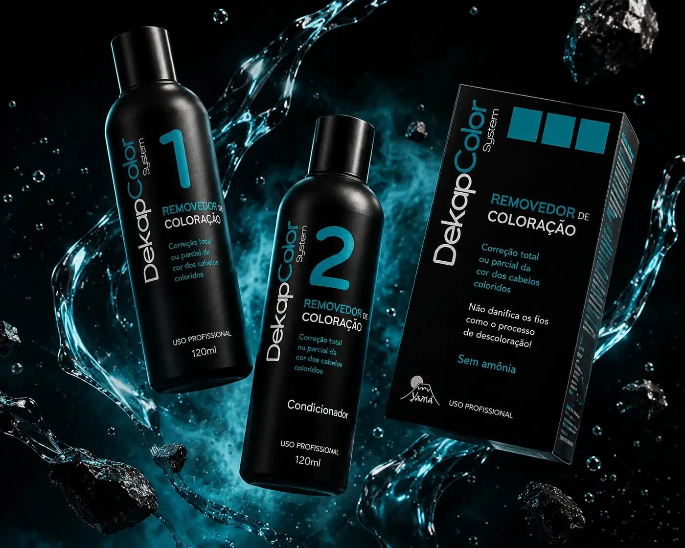
The numerals are the system. Each bottle carries a 1 or a 2 large enough to be read across a station, so a stylist partway through a service follows the two-step process by glancing at a bottle rather than stopping to reread instructions with gloves on. Sequence is the product, which is why sequence became the loudest thing on the label.
The box matters for the opposite reason. Two loose bottles are two items a distributor can separate, while one box makes them a single unit that gets stocked and bought as a procedure. It holds the same black ground with three teal squares at the top, the one place the identity allows itself a graphic gesture.
Photographing the bottles wet, against raw mineral and crystal, closes the argument. The droplets and the cold light do reassurance work that the ingredient claims can only put into words, and a stylist takes in that atmosphere well before reading a line of the copy.
More work
More projects.



Have a project like this?
Tell me what you are building, changing or launching, and I will help you define the right scope and direction.