

Case study · Packaging Design
Kiev Cauter K
Keratin Repair Hair Care Line
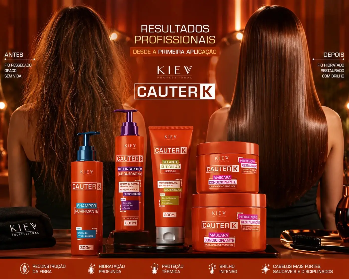
Cauter K is a five step keratin repair routine, and the name points straight at cautery, which means heat. The whole design problem was making that read as recovery rather than damage.
01
Heat that reads as repair
Orange was the obvious color and also the risky one. Used flat and high contrast it goes to warning, to caution tape, to something nobody wants near their hair. So the base is orange on orange, one tone of the brand color laid over another, which gives the packs warmth and depth without the alarm that hard contrast brings. The heat lives in the temperature of the color, not in its volume.
The wordmark is bold and slightly industrial, squared at the shoulders, because the promise here is structural: keratin being rebuilt, a fiber being sealed. Softening the type would have turned the range into a comfort product and undersold what it actually does. Keeping the Kiev name and the Cauter K lockup identical on every piece lets five different steps stay recognizable as one method.


02
A routine you can follow by color
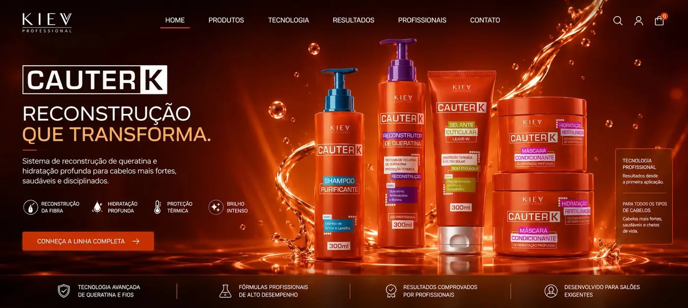
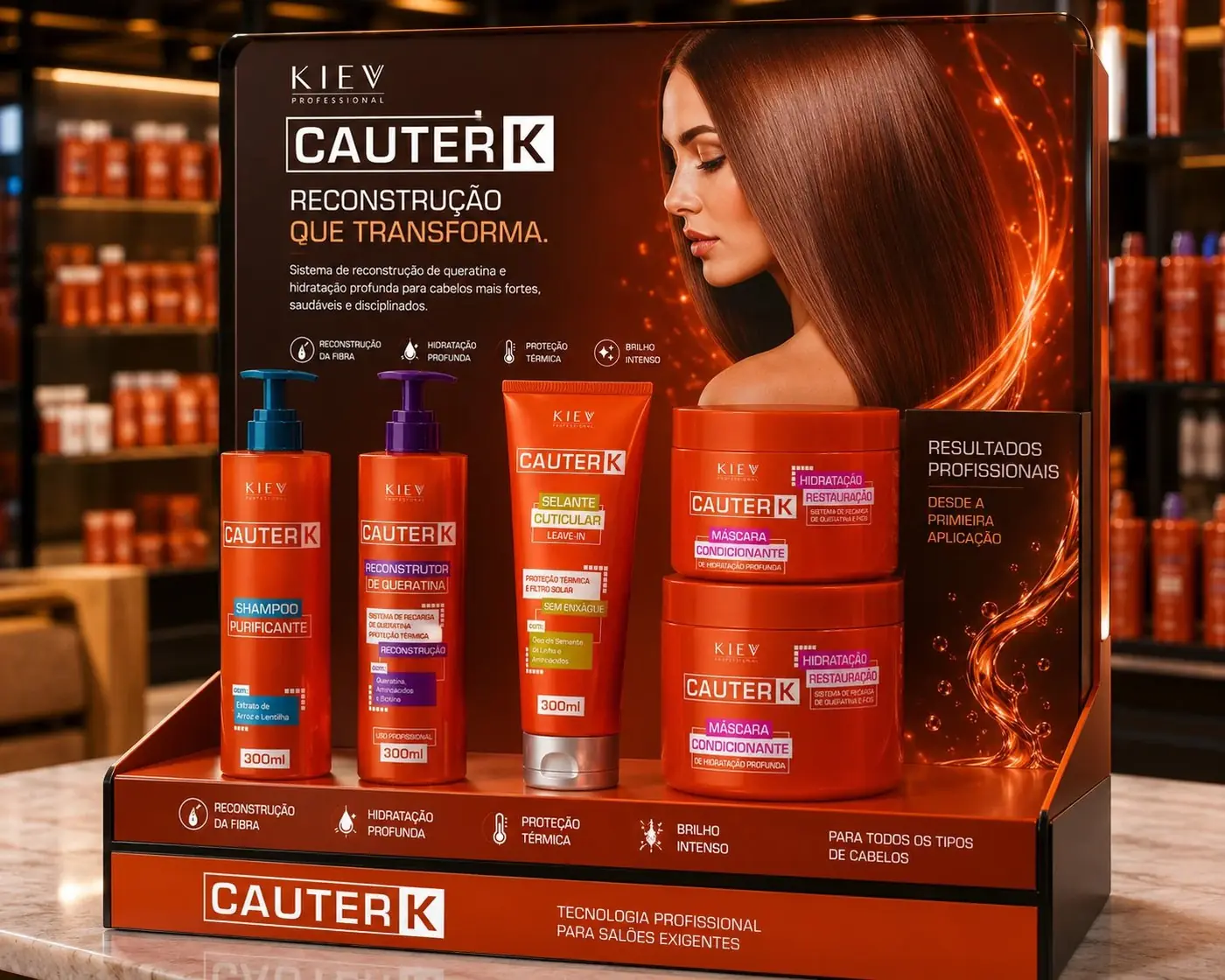
The real usability problem is sequence. Nobody wants to reread five labels at every visit, so each step carries its own colored band across the pack: a cool blue for cleansing, purple for reconstruction, lime for the leave-in, pink for the masks. Nothing else changes. Because the band is the only variable in the system, it becomes the thing the eye goes to first.
That decision also protects the shelf. With the base held constant, the five pieces read as a family from across the room and resolve into separate steps only when you are close enough to use them. Color is doing the instruction work that copy would otherwise have to do in small type.
The photography follows the same reasoning as the packs. I shot the range against a fiery orange gradient rather than the clean white this category defaults to, deliberately energetic instead of clinical, because the emotional pitch here is transformation and a sterile lab shot would have quietly argued for a different product entirely.
More work
More projects.





Have a project like this?
Tell me what you are building, changing or launching, and I will help you define the right scope and direction.