
Case study · Packaging Design
PyurX Premium Castile Soap
Three-Scent Packaging System
PyurX makes castile soap, a humble category where most shoppers reach for whichever bottle is cheapest. The packaging system exists to make three near-identical bottles feel like a choice somebody made on purpose.
01
Making the choice feel deliberate
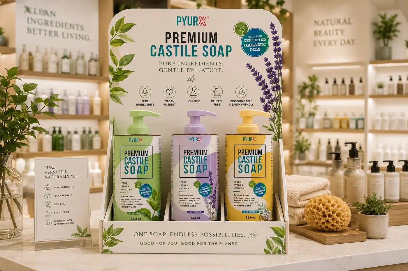
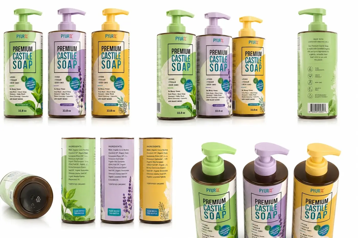
On a shelf of interchangeable bottles the instinct is to shout, and shouting is exactly what makes a product look like it is competing on price. I went the other way. One shared lockup, one fixed layout, and then the smallest possible set of things allowed to change between the three scents.
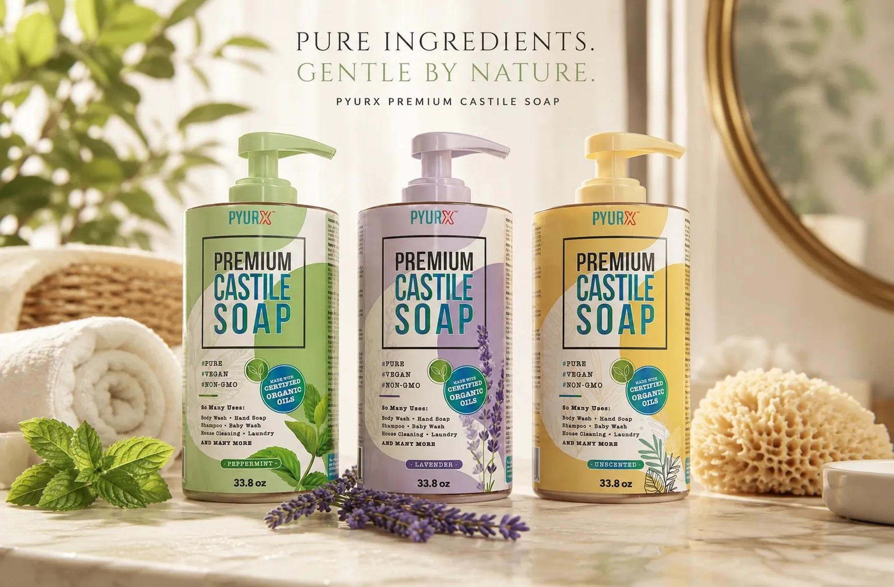
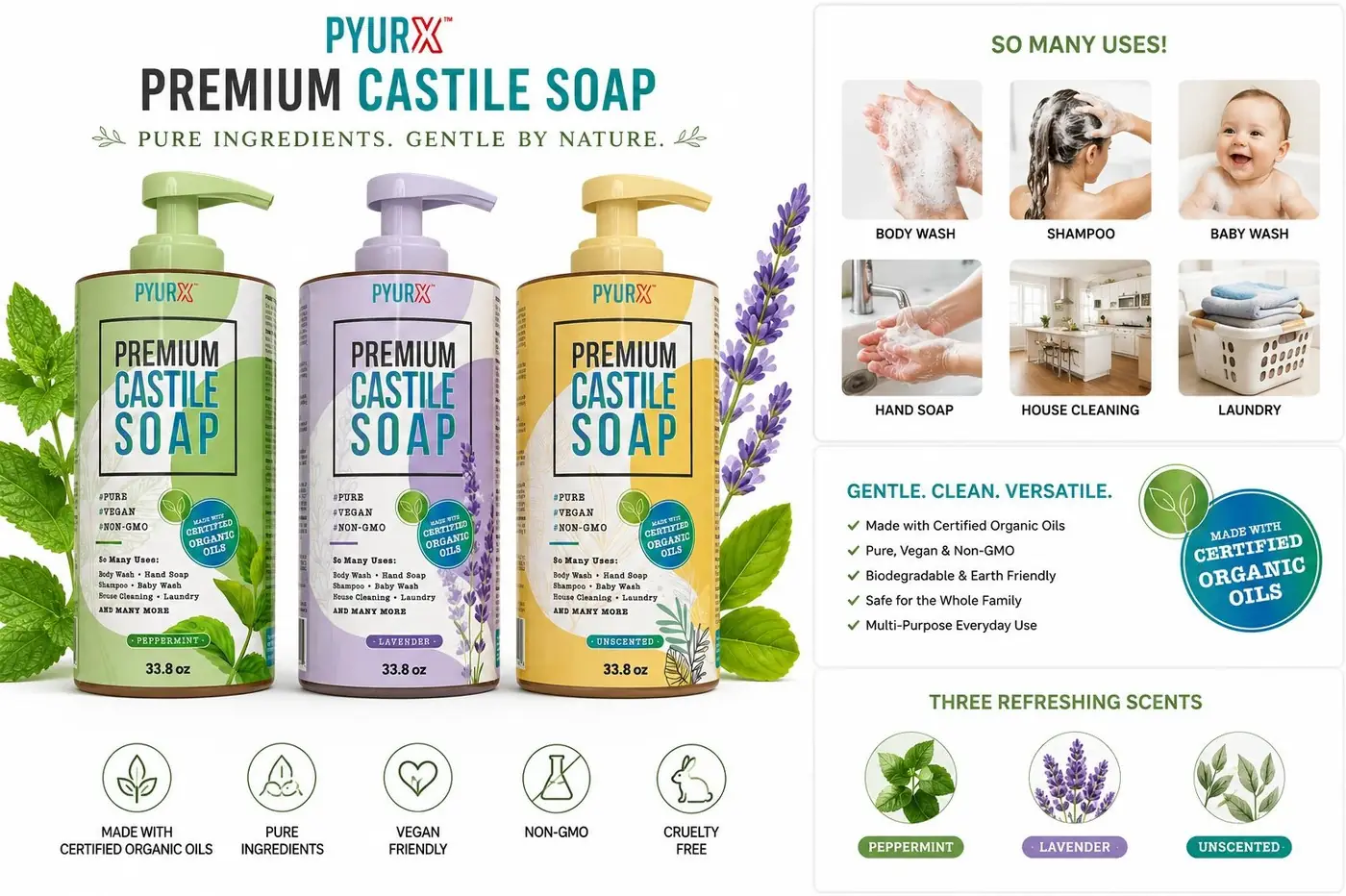
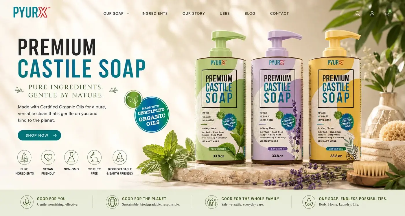
What changes is color and a single plant. A soft sweep of green, lavender or warm yellow rises behind a white field, and the matching botanical illustration grows up from the lower corner of the label, so scent is identifiable before a word is read. The pump carries the same color, which means the variant still declares itself from a shelf where the label is turned away or half hidden.
02
Turning one soap into a staple
A thin ruled frame holds the product name and does the only structural job the label needs, keeping the three-line stack of type contained so it reads as one unit rather than three competing lines. The tagline sits above in quiet letterspaced capitals. Everything else on the front I kept deliberately small, since claims that dominate a label tend to sound defensive.
Low on the front, a short block explains what the soap can be used for around the house, and that block is the commercial argument in miniature. Nobody buys a large bottle of a single-purpose product and nobody restocks one, so the pitch had to move the soap out of one category and into the position of something kept under the sink and replaced without thinking.
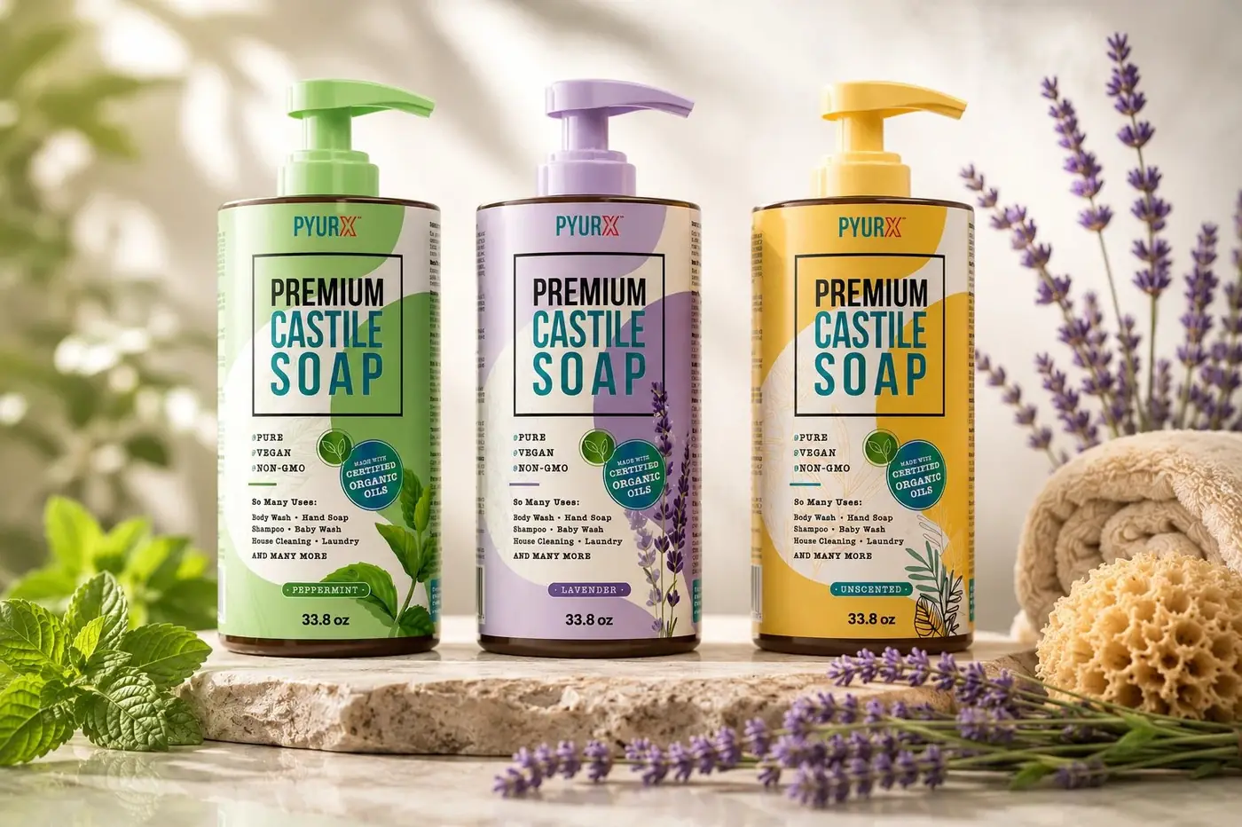
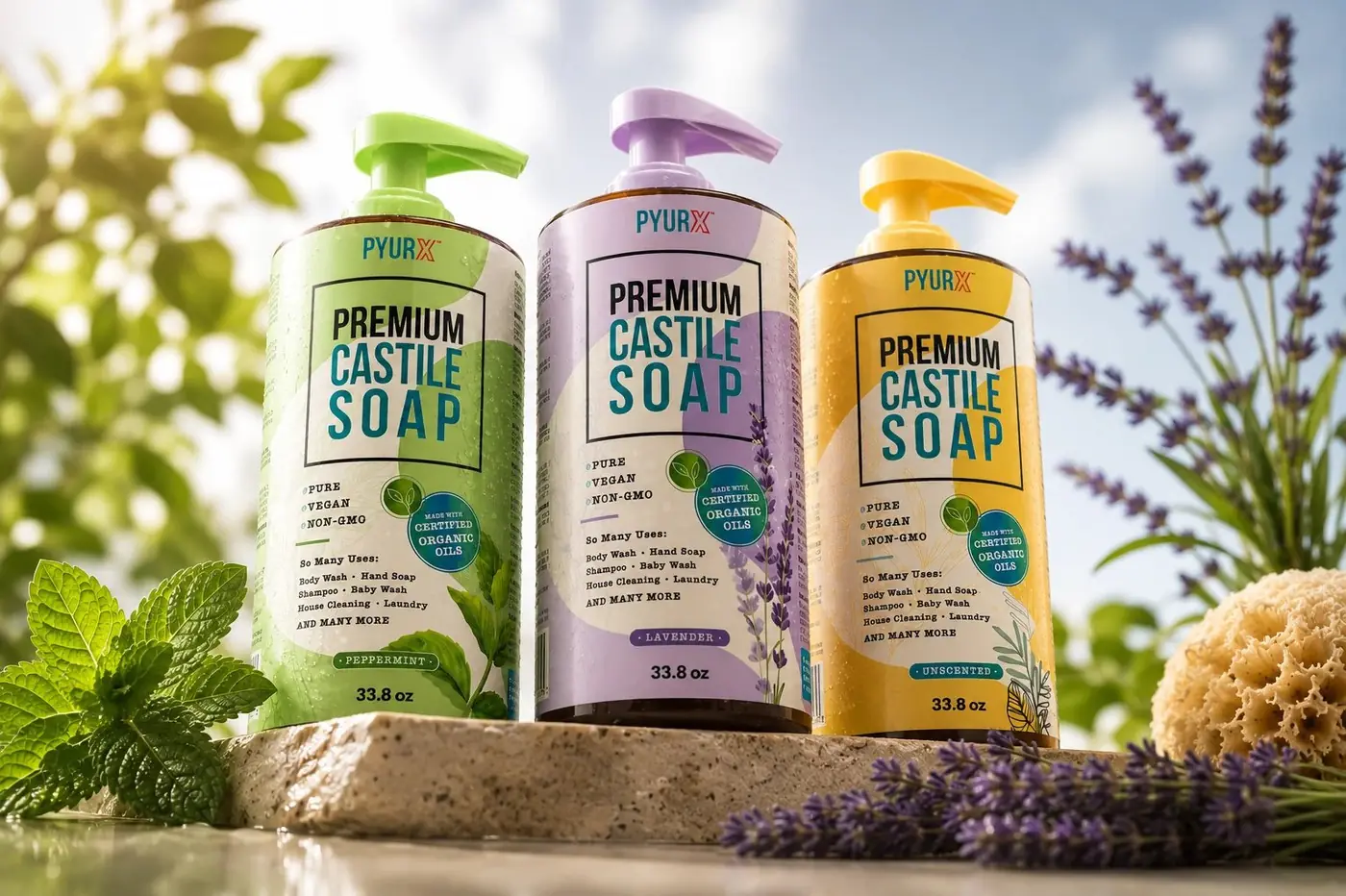
The three bottles were shot together in bright daylight with real mint, lavender and a natural sponge, in a room that reads as a bathroom somebody lives in. The whole proposition rests on pure and natural, and photography borrowed from the cleaning aisle would have undone the restraint of the label in a single frame.

More work
More projects.

Have a project like this?
Tell me what you are building, changing or launching, and I will help you define the right scope and direction.