
Case study · Packaging Design
Yamasterol Cachos
Curly Hair Care Product Line
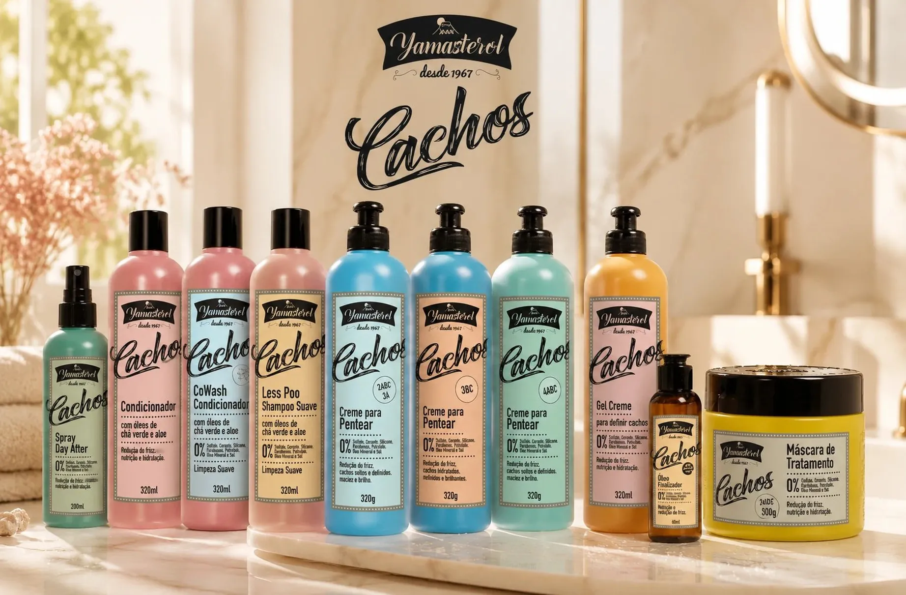
Yamasterol Cachos is a curly hair care line, and the whole range is built on heritage in a category that almost always sells itself as brand new.
01
Heritage against a category of newness
Curl care is usually presented bright, modern and close to clinical, as though the formula had been invented last season. That framing works for a launch and works against a routine. A full curl regimen asks for real commitment from the person following it, and commitment comes more easily to something that feels proven than to whatever arrived on the shelf most recently.
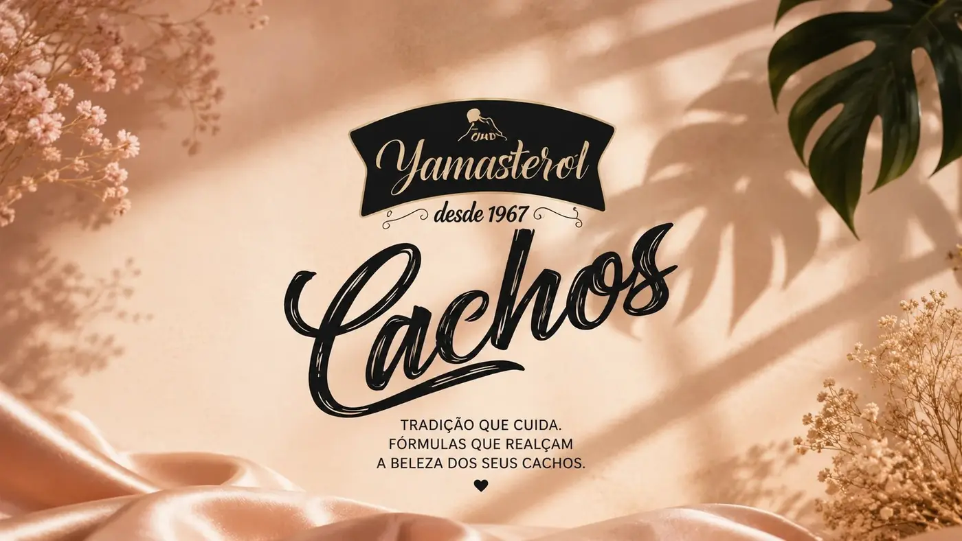
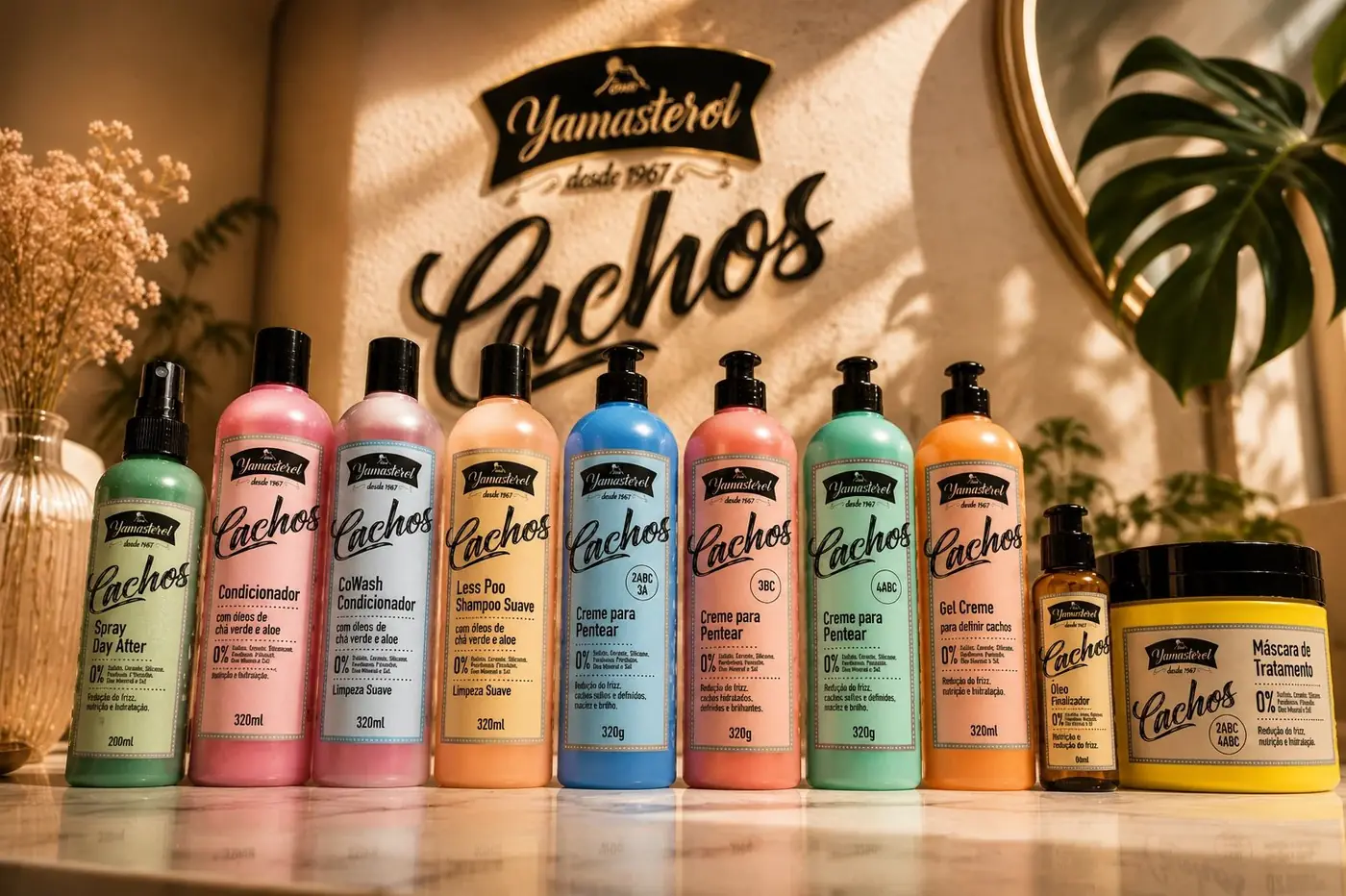
So the line went the other way, toward a vintage apothecary look: a hand lettered script and a black banner mark with "desde 1967" set small underneath between two thin flourishes. The lettering has the confidence of an old pharmacy sign without the fussiness, and it stays identical on every bottle in the range. That repetition is what makes the products read as one established formula in several forms rather than a set of separate launches.
02
Color that answers a shelf question
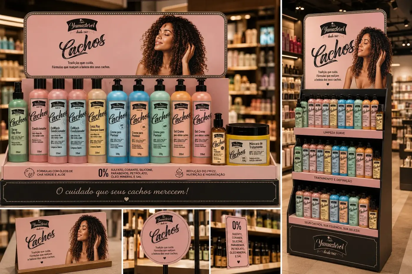
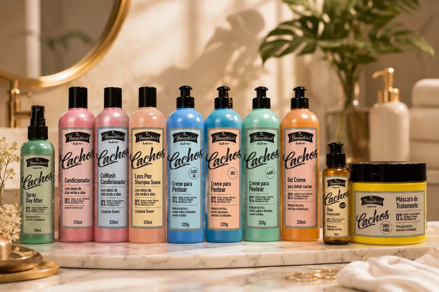
Differentiation had a harder job here than telling shampoo from conditioner. Someone standing in front of the range needs to find the product made for their own curl pattern, and getting that wrong is the difference between a repeat customer and a bottle that sits unused in a cabinet. The pastel coding therefore works on two levels at once, sorting the product types and marking the curl types inside them.
Each label is a soft colored panel inside a thin ruled border, which stops the pastels from going weak and gives the full display a rhythm of framed cards. The curl pattern sits in a small circle near the product name, quiet enough to leave the vintage character undisturbed and placed exactly where a hand reaching for a bottle is already looking.
The styling follows the same reasoning. Photographing the range together in a warm, gilded bathroom by candlelight rather than under the even light the category prefers keeps the setting in agreement with the labels, because the promise here is a ritual that has been trusted for a long time, not a product that just appeared.
More work
More projects.



Have a project like this?
Tell me what you are building, changing or launching, and I will help you define the right scope and direction.