
Case study · Packaging Design
Absorbable
Vitamin C 500mg Supplement Packaging
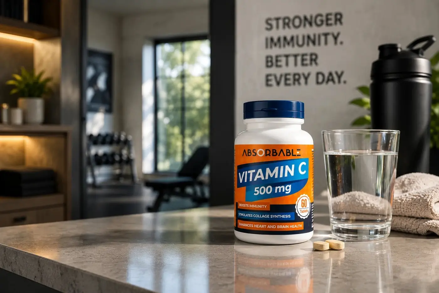
Absorbable had a vitamin C formulation as good as any market leader and no shelf presence to show for it. The label had to win a decision that gets made in about half a second of scrolling.
01
Color arrives before words
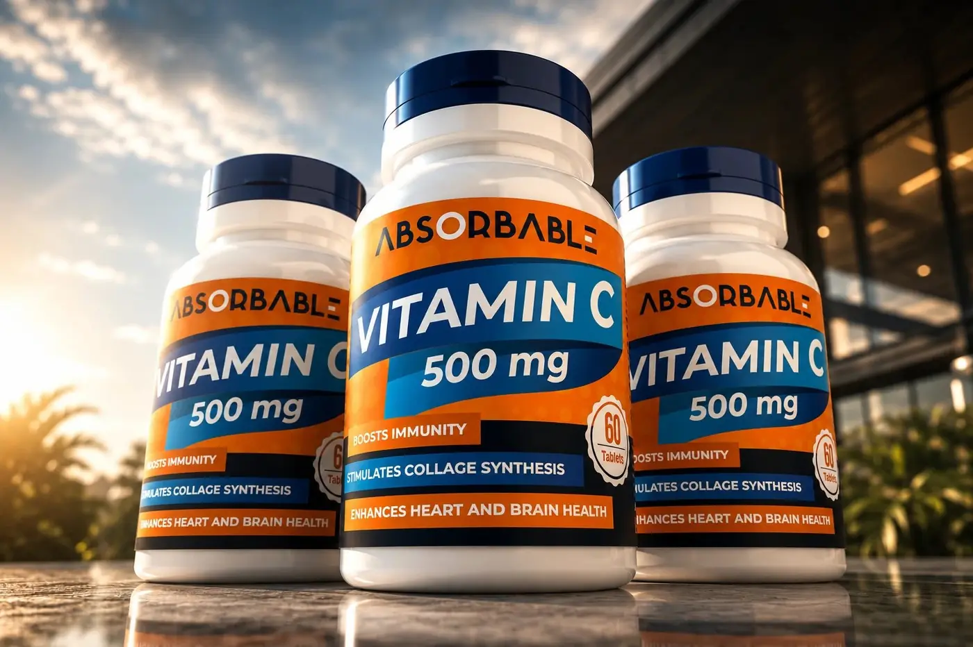
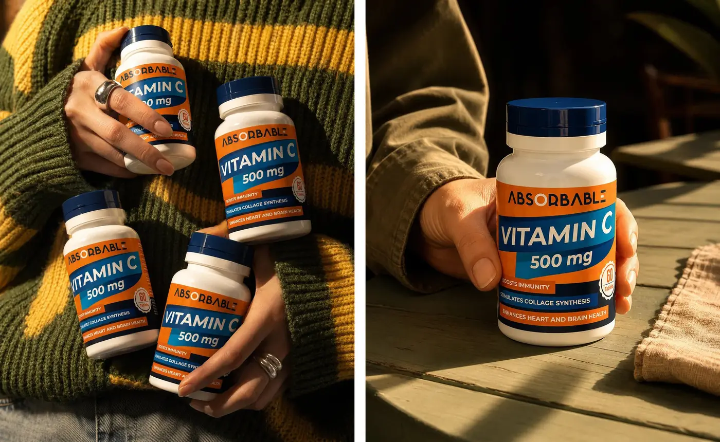
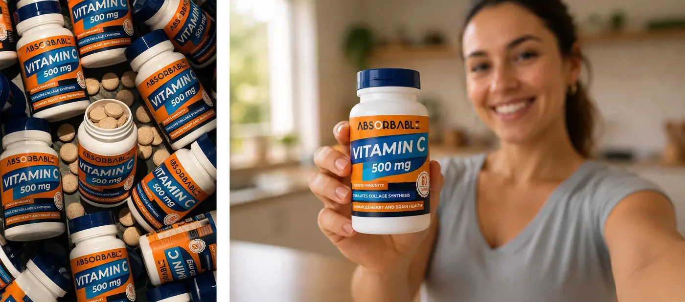
The supplement category, online or on a shelf, is a wall of white bottles making identical claims. Shoppers there do not read first, they pattern match, hunting for the signal that tells them they are even in the right aisle. That is the problem the label had to solve before a single claim could do any work at all.
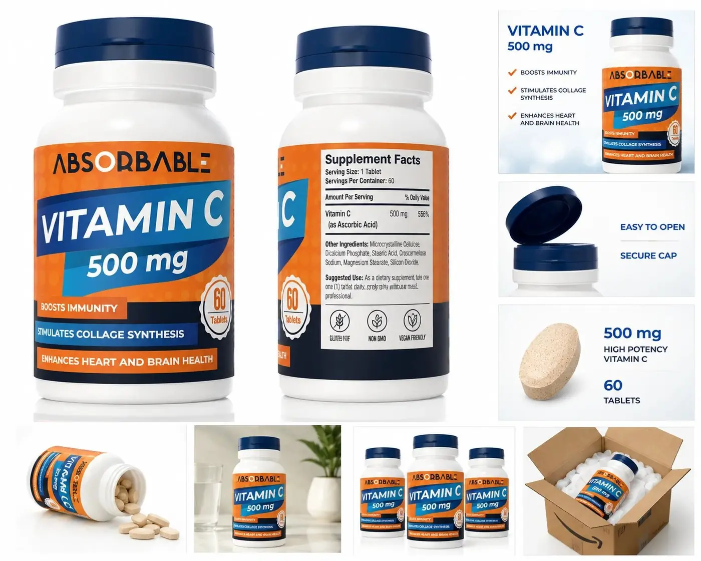
So the citrus orange field is not decoration, it is the shortest route to the word the buyer is already searching for. Navy supplies the counterweight, a deep band cutting across the orange to carry the product name, with the milligram figure set larger than anything else on the bottle because that is the first conscious question anyone asks. The count sits nearby in a small stamped seal, answering the second.

02
Every element answers an objection
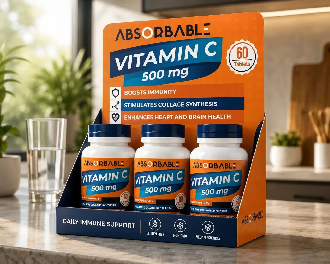
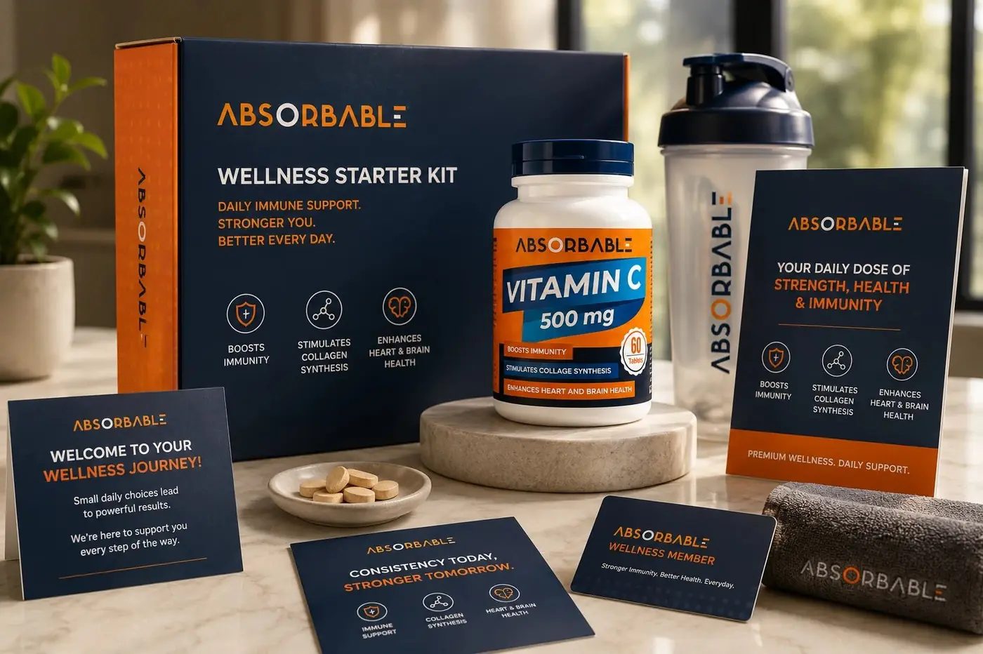
Benefits run as three high contrast strips across the lower half, one line each, because this buyer scans a label the way they scan a nutrition panel: looking for the single row that applies to them, not reading a paragraph. Keeping them as separate bars rather than a stacked list means each claim survives on its own at thumbnail size, which is the size that actually decides things.
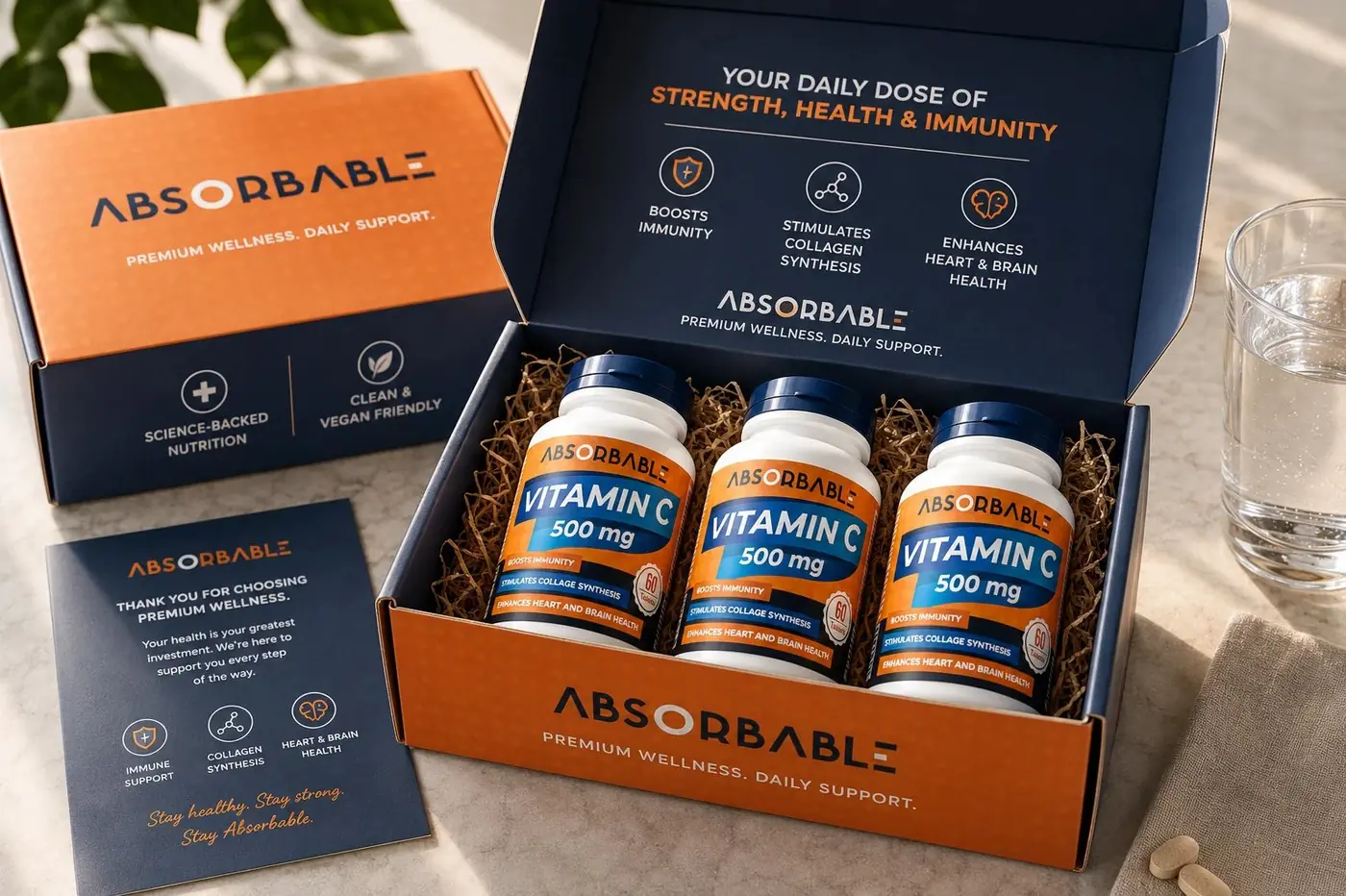
Nothing on the front is there to look nice. There is no salesperson in a marketplace listing, so the label has to do the trust building itself, and an element that answers no question gets cut. The wordmark is the one place I allowed a flourish, a final letter broken into strokes so the name carries a small mark of its own.
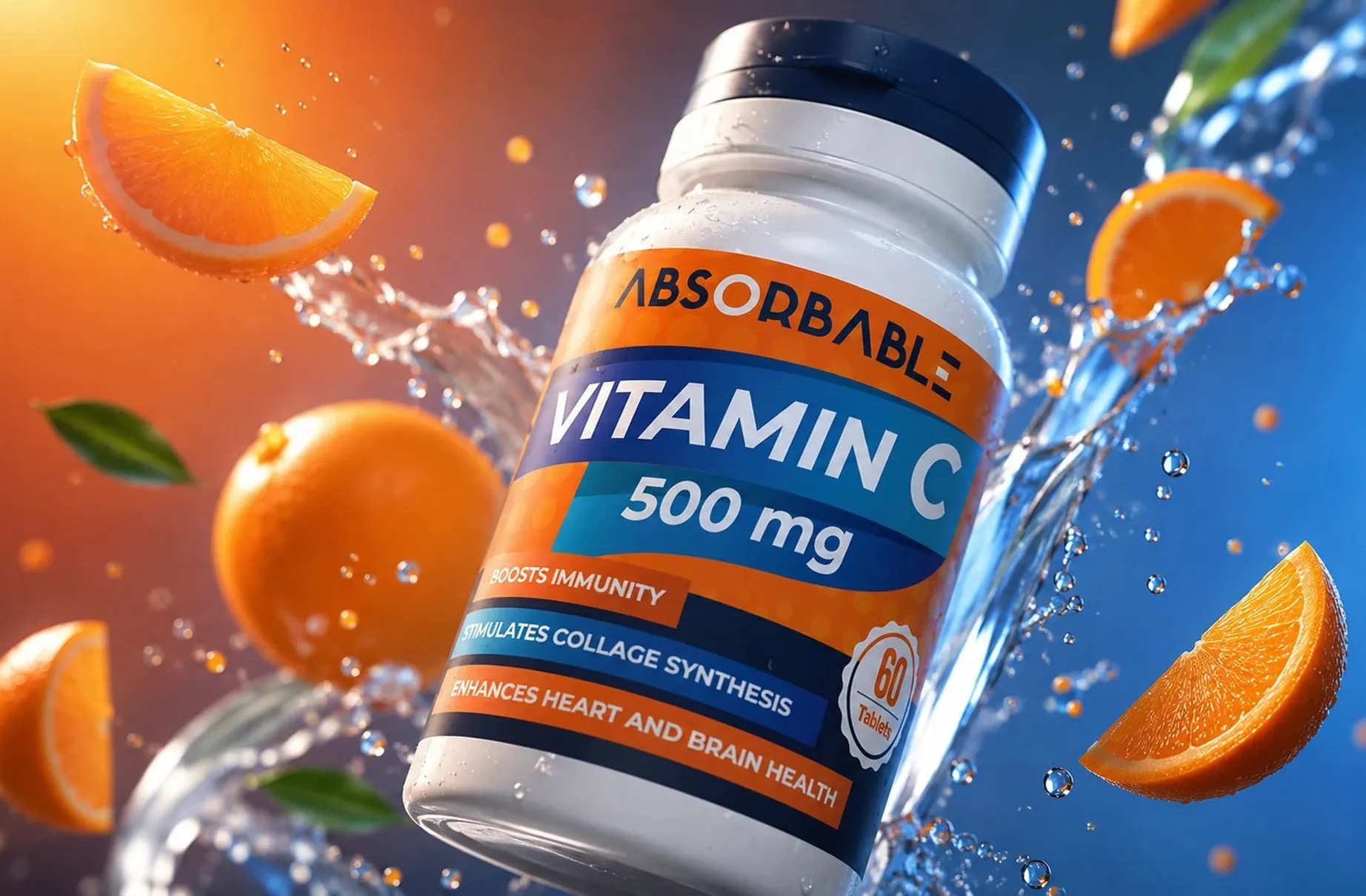
The hero image never existed as a photograph. It was built as a photoreal render, bottle caught mid splash with fruit and water, which is exactly what a launching brand needs: marketplace ready imagery before the first production run exists, and revisions that cost time instead of a reshoot.
More work
More projects.


Have a project like this?
Tell me what you are building, changing or launching, and I will help you define the right scope and direction.