
Case study · Packaging Design
My Rustic Roots
Sourdough Baking Tool Packaging
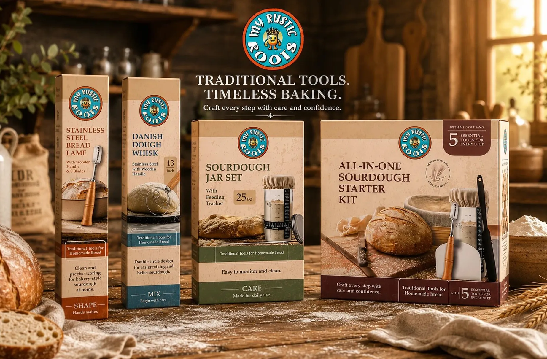
My Rustic Roots makes four separate sourdough tools that all belong to one process. The packaging is built so that buying any one of them makes the other three obvious.
01
Four boxes, one process
The quiet risk with a tool line is that a customer picks up the bread lame, takes it home, and never learns the rest of the range exists. A badge announcing that this is part of a collection would not have solved it, because nobody reads that line. The packaging had to make the connection structurally rather than claim it.
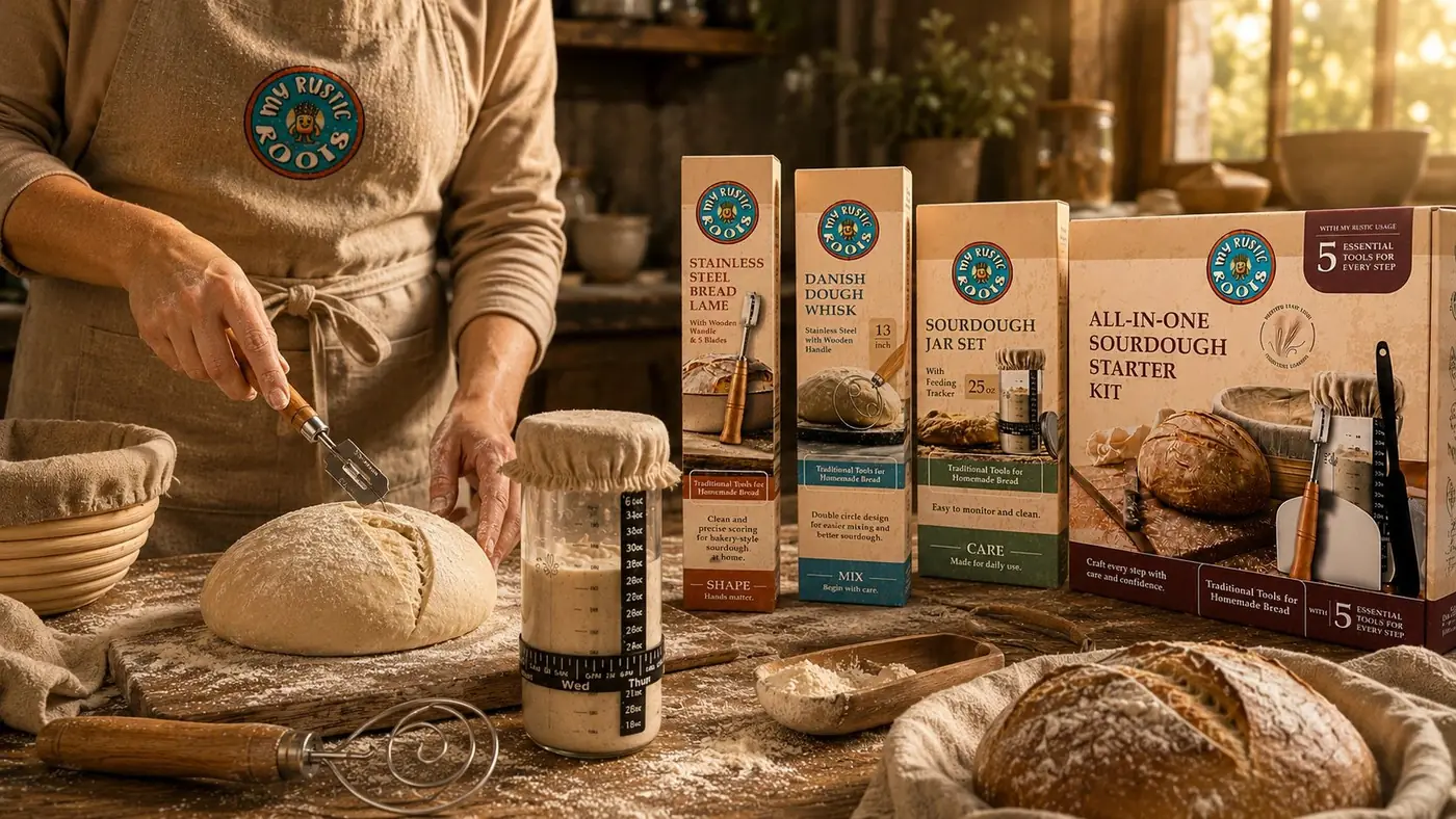
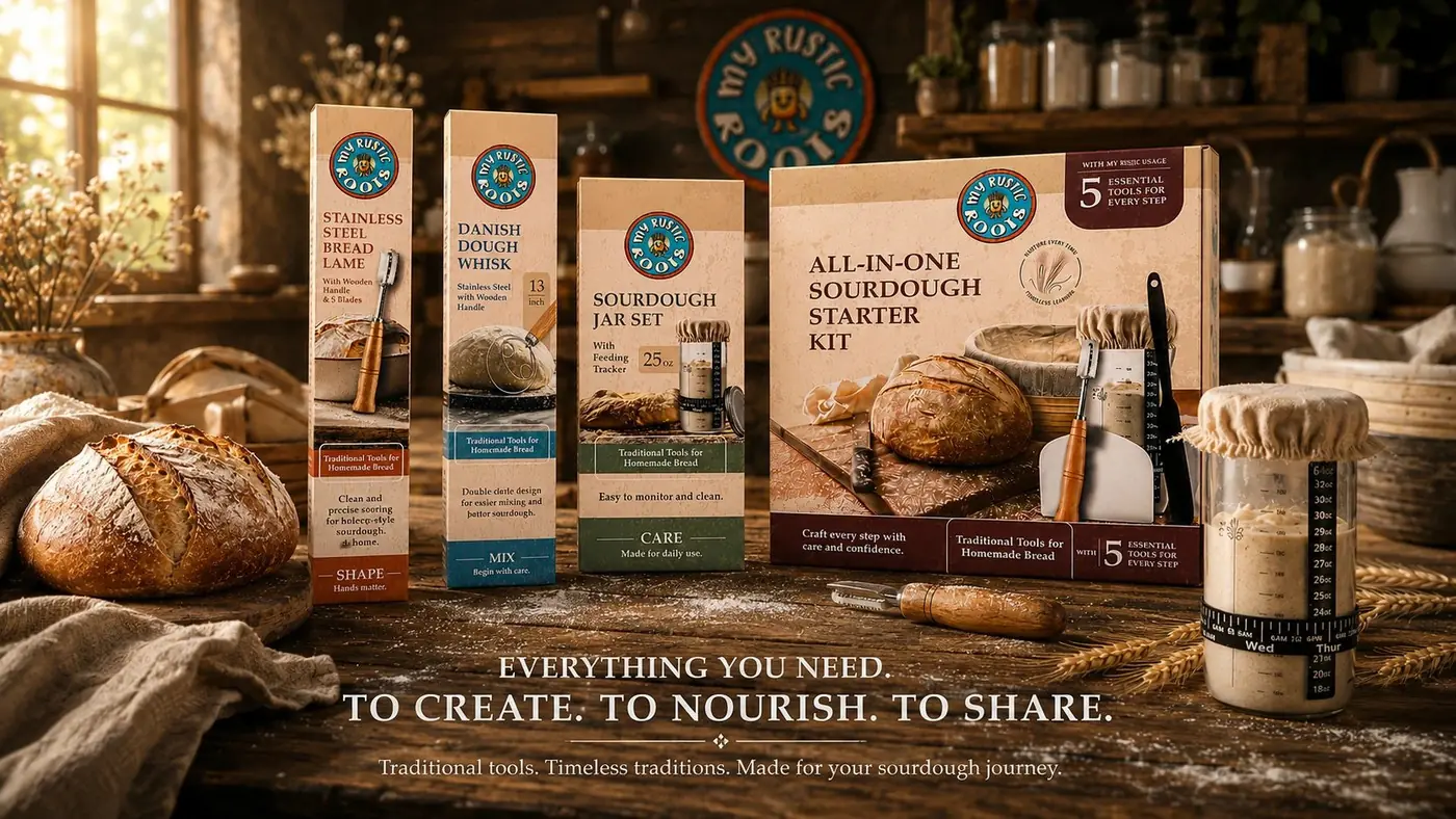
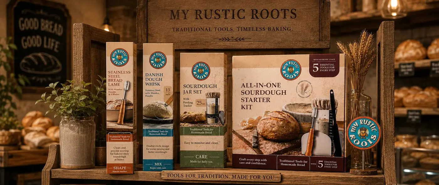
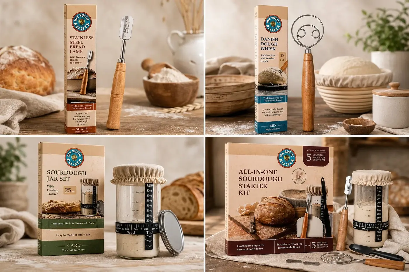
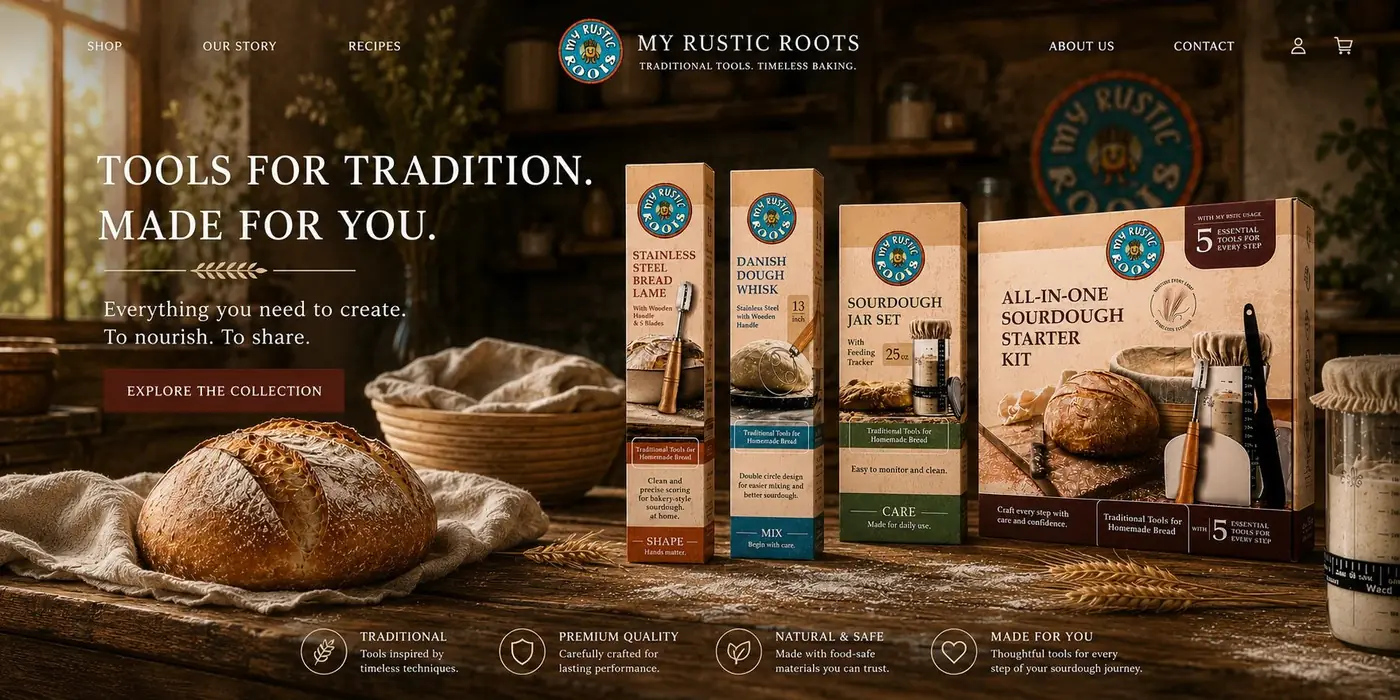
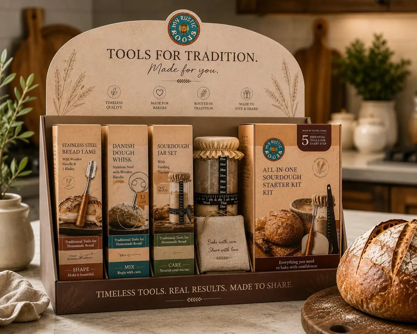
What I built instead was a color-coded footer band running the full width of every box, each one naming the point in the sourdough process that tool belongs to. Shape, mix, care. One word set large with a short rule and a half line of encouragement under it, in terracotta, teal or olive. Once someone has seen two of these boxes, the third band is a question they can already answer before they reach for it.
02
A kitchen, not a catalog
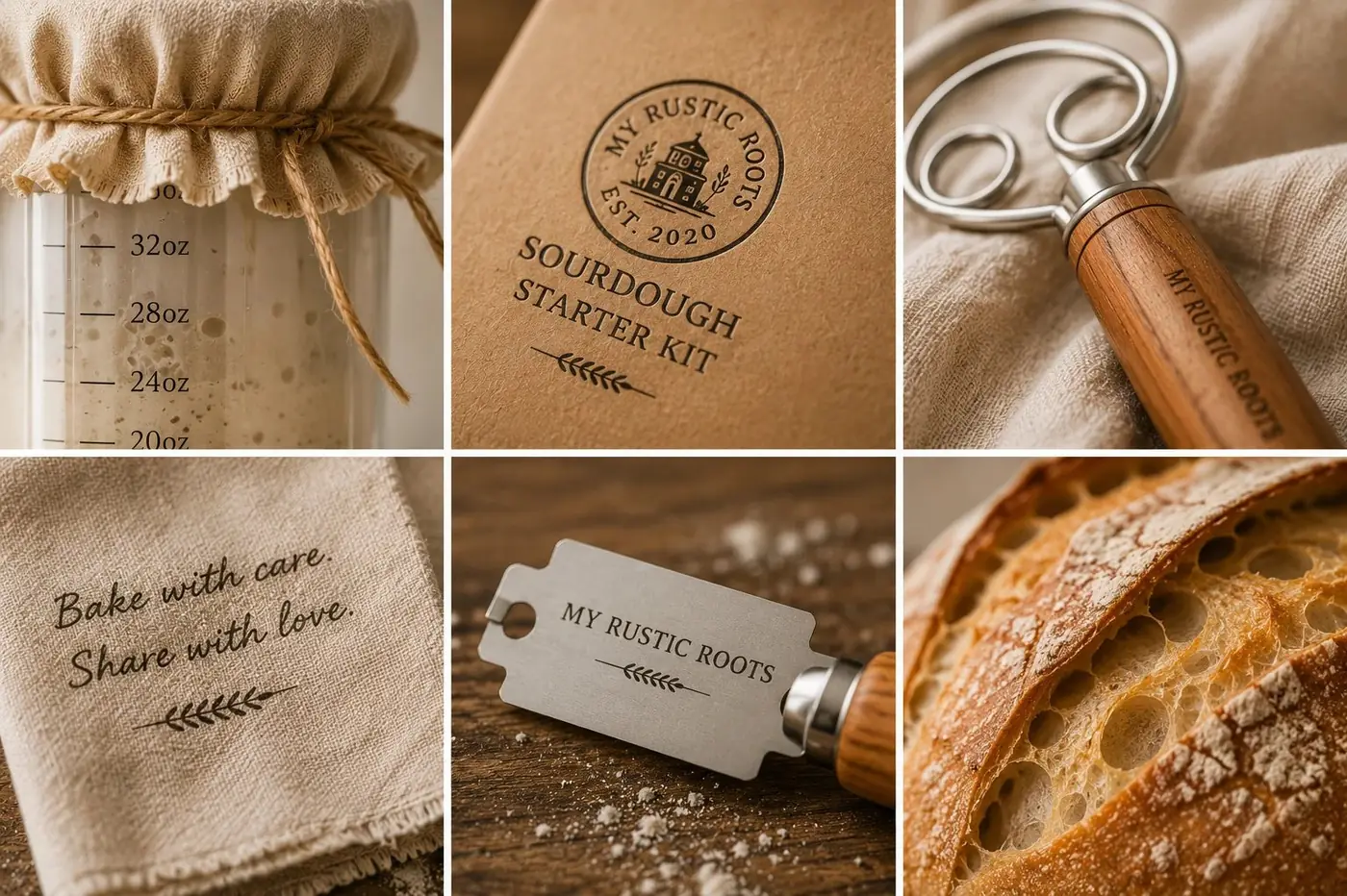
Warm tan carries every face, close enough to kraft that the boxes look like something already living on a counter rather than retail stock. The sun mascot inside the roundel is the one piece of the system allowed to be funny, and it earns that, because sourdough instruction has a way of getting solemn and this brand is for people making bread on a Saturday morning.
I set the step labels in a simple, confident sans, since the whole system depends on those words reading from a few feet away in a crowded aisle. Product names take a warmer serif above them, and the all-in-one kit gets the deepest color of the four, which lets it read as the entry point without needing to say so.
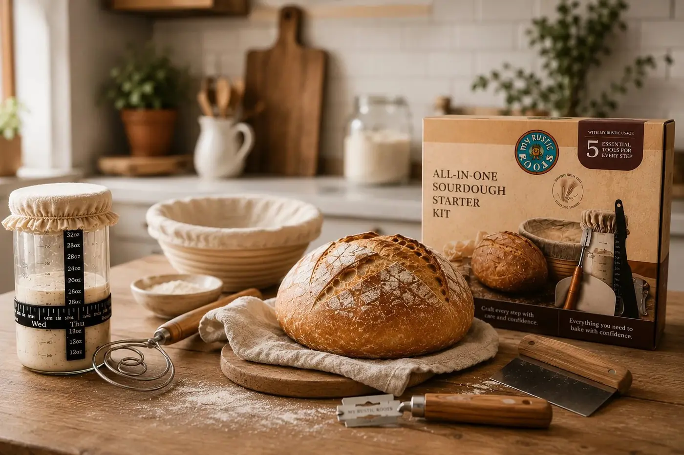
Every box was photographed on real flour-dusted wood, with wheat stalks and a cut loaf nearby rather than a sweep of blank white. The promise here is the ritual and not the utensil, so the pictures had to look like a kitchen somebody actually bakes in, because a clean studio shot would have sold the tool and lost the reason anyone wants it.
More work
More projects.

Have a project like this?
Tell me what you are building, changing or launching, and I will help you define the right scope and direction.