
Case study · Packaging Design
Machin Energy
Green Apple Rush Energy Powder Sticks
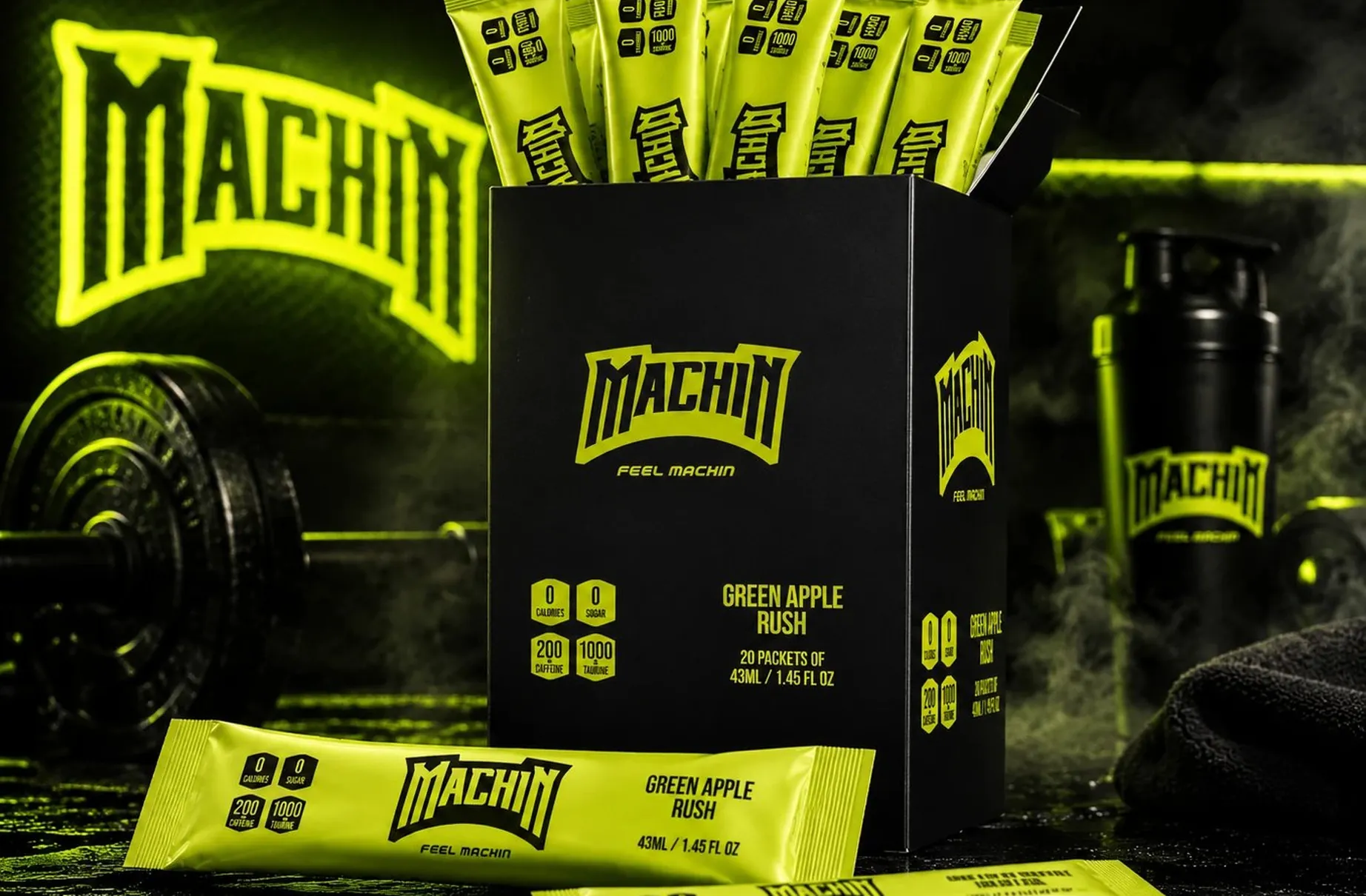
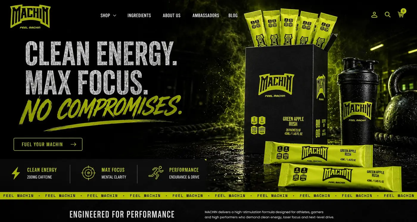
Machin sells a green apple energy powder in single serve sticks, and its buyer is not shopping for a flavored drink. The whole system is built to read as a functional spec first and a beverage second.
01
Selling the dose, not the flavor
Someone reaching for this already knows what they want out of it, so the milligrams lead. I framed each figure inside its own hexagon badge and gave that cluster the position a flavor name usually holds, because a number set in a badge reads as a specification rather than a claim. The flavor still gets named. It just arrives after the thing the customer actually came for.
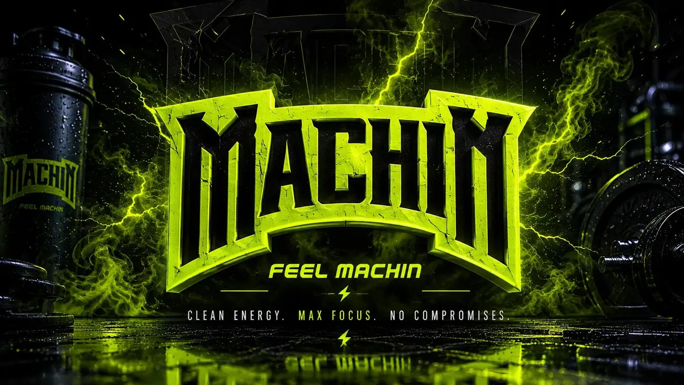
The wordmark pulls hard in the other direction. It is distressed and arched, closer to something painted on a gym wall than anything printed on a drink, because this product is bought on identity as much as on ingredients. Feel Machin sits under it in one small line, which turns the name into a state of mind instead of a label. That tension between a rough mark and clinical badges is the brand.
02
What survives at stick pack size
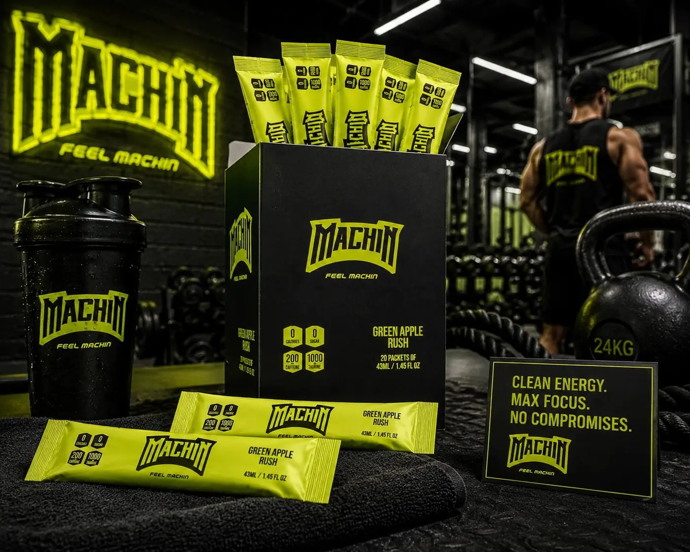
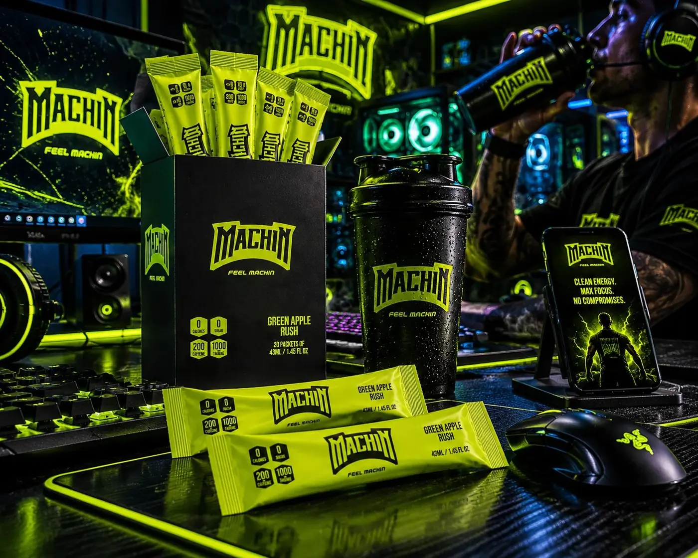
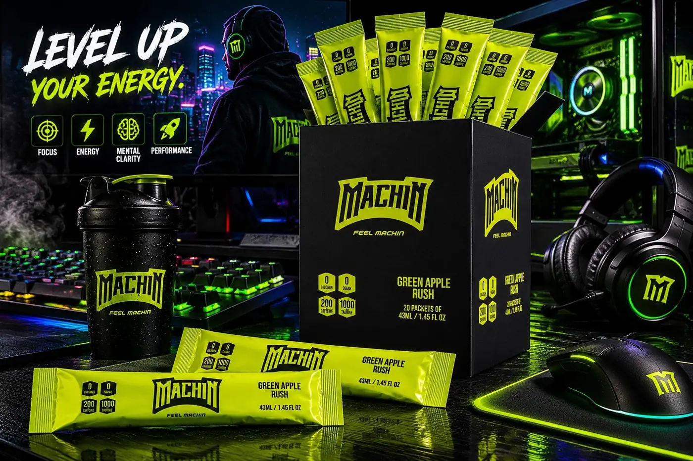
The system runs on a single inversion. The carton is matte black with lime as the only light in it, and the sticks flip that, lime ground with the mark and the badges knocked out. Two states and no third, so a box and the twenty sachets inside it are recognizably the same product without either one having to repeat the other.
A stick is a hard surface to design for. It is narrow, glossy, and held at arm's length for about two seconds while someone tears the top off. An arched wordmark fits that width better than a horizontal one, and the badges compress into a short row at the left end without giving up legibility.
I shot the box and the sticks against a gym floor with plates and neon in frame, because this buyer needs to recognize the room before he recognizes the product. The setting is doing as much selling as the label. Put the same pack on a clean white sweep and half the argument disappears.


Have a project like this?
Tell me what you are building, changing or launching, and I will help you define the right scope and direction.