
Case study · Packaging Design
MaxTite Vinegar
Home & Garden Multi-Purpose Cleaner Line
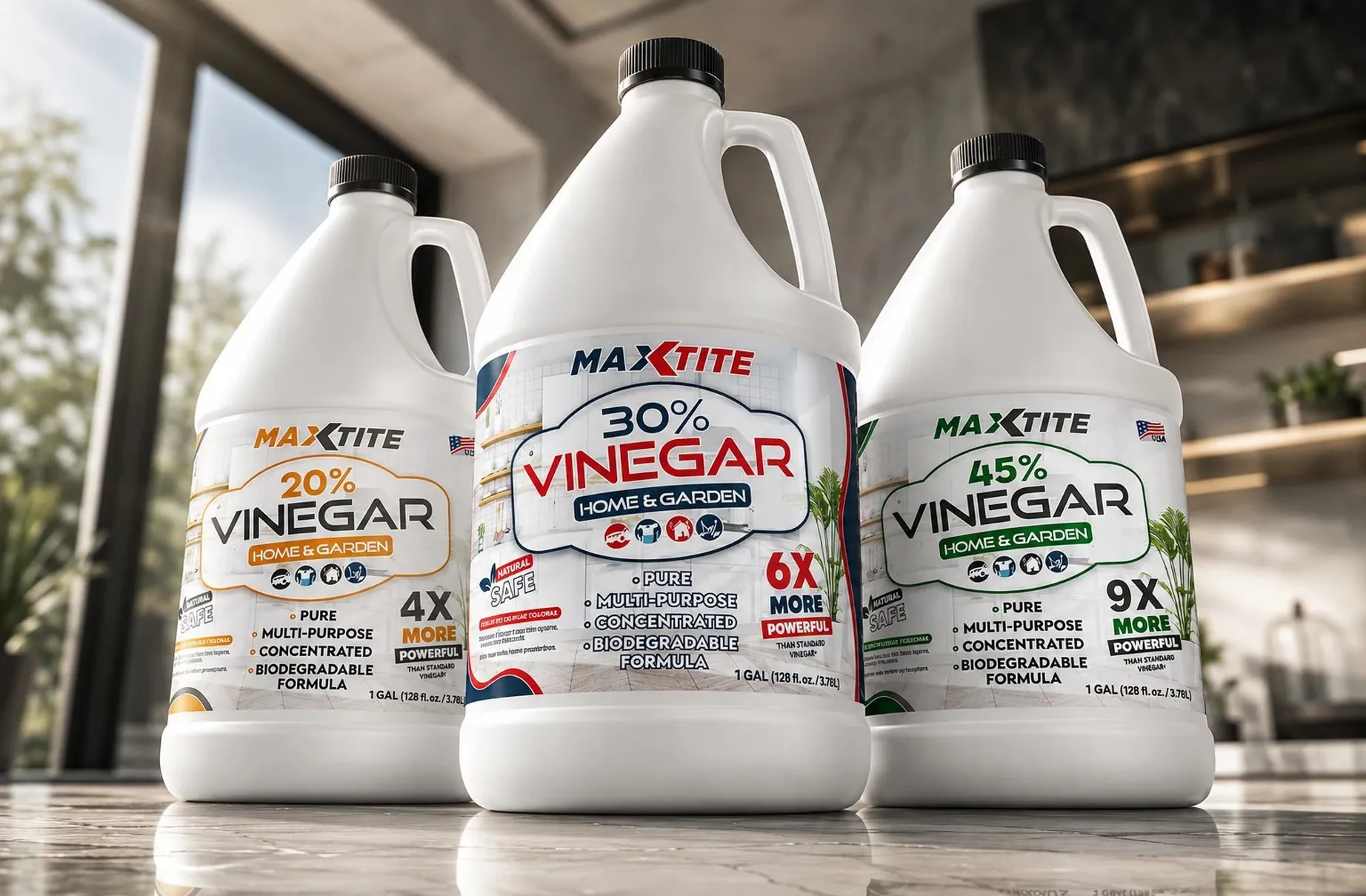
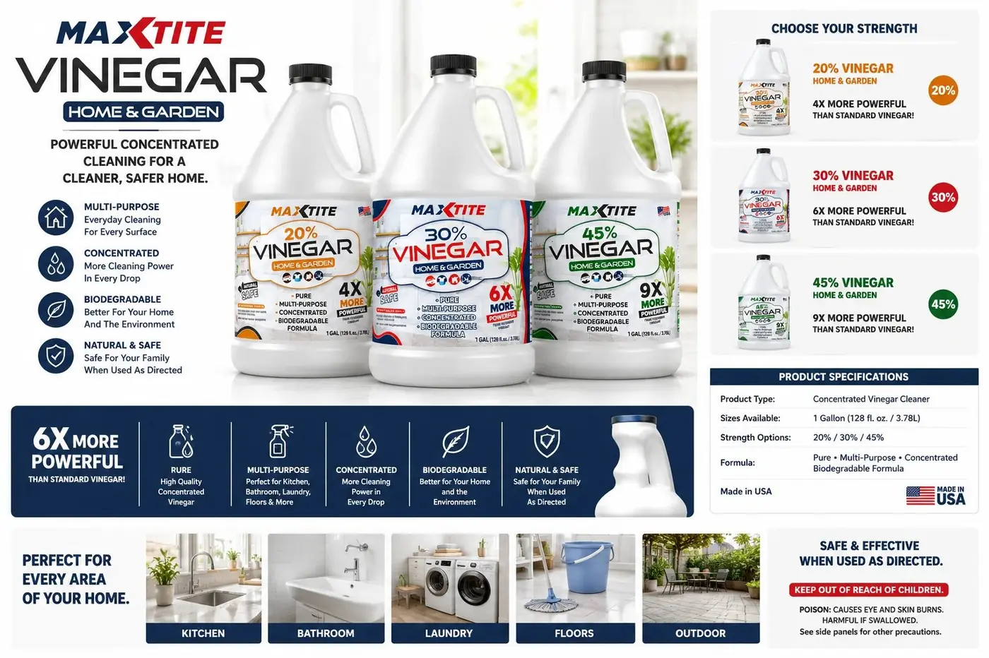
MaxTite's cleaning vinegar comes in three strengths of what is essentially the same liquid. The identity treats that as a comparison problem before a design one, since a shopper has to understand the difference between the jugs from several feet away.
01
Strength you can see from the aisle
Three concentrations of one product is the hardest kind of range to build, because the difference is real and completely invisible. Nothing about a jug of 20 percent tells you how it relates to 45 percent, and the number itself hands the shopper arithmetic they have no interest in doing. Color coding the three orange, red and green makes concentration something you register before reading a single percentage sign.
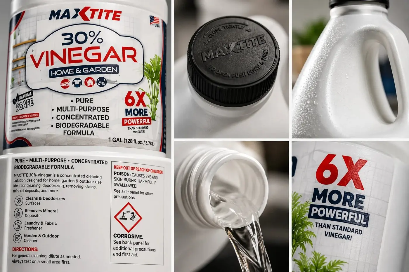
The comparison hook is the multiplier rather than the percentage. Making 4X, 6X and 9X more powerful the largest type on each label was a decision about how people actually choose, because more powerful than standard vinegar is a claim someone can act on in a second while a percentage is homework. The percentage still sits with the product name for anyone who wants the precise figure.
02
Three jugs that stay one family
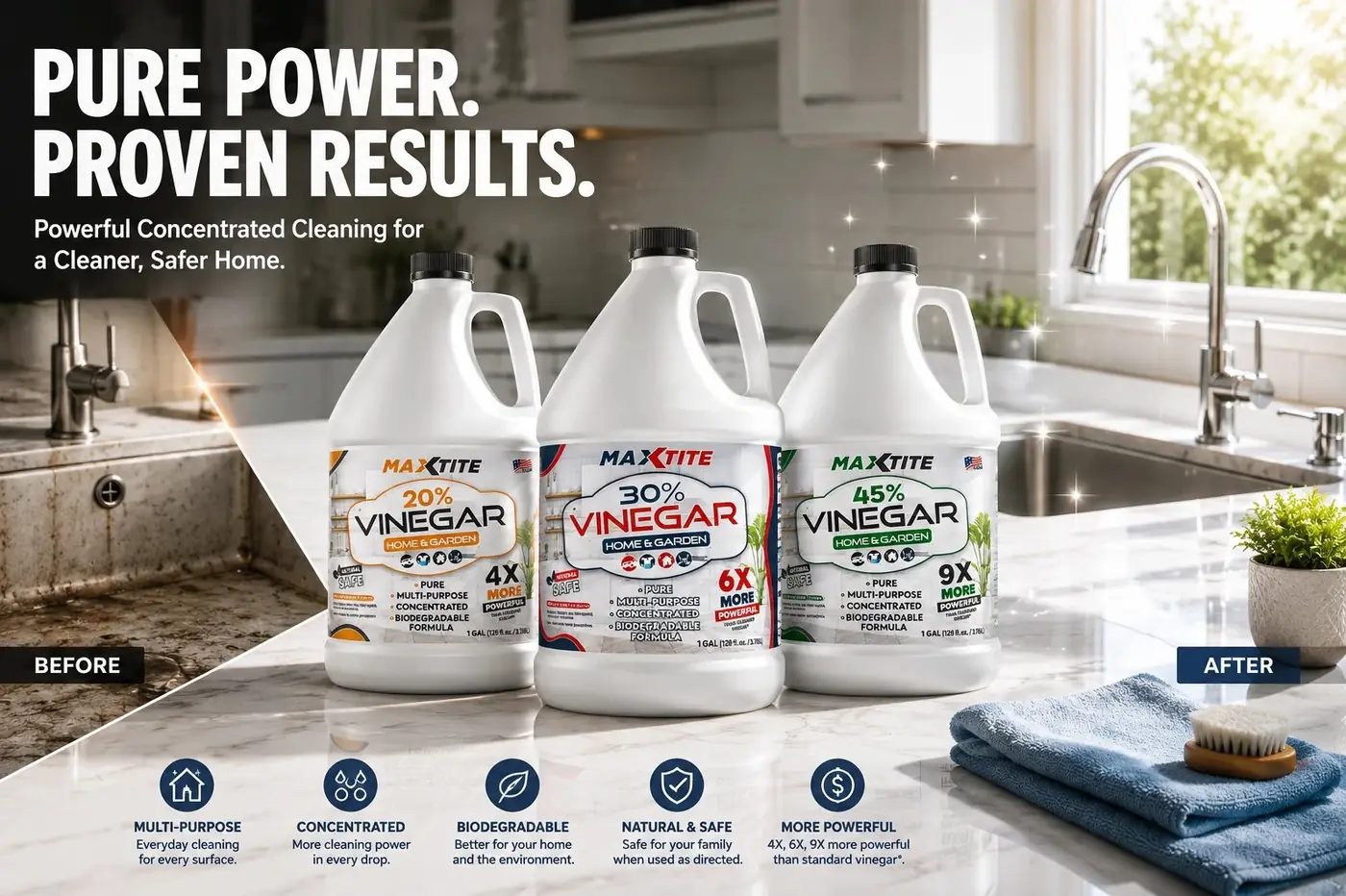
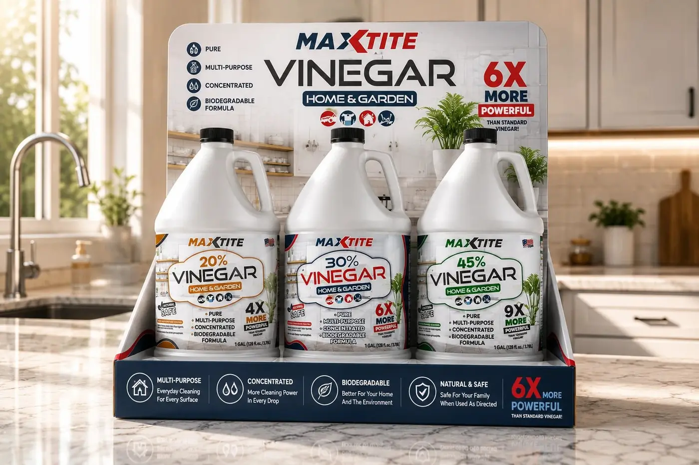
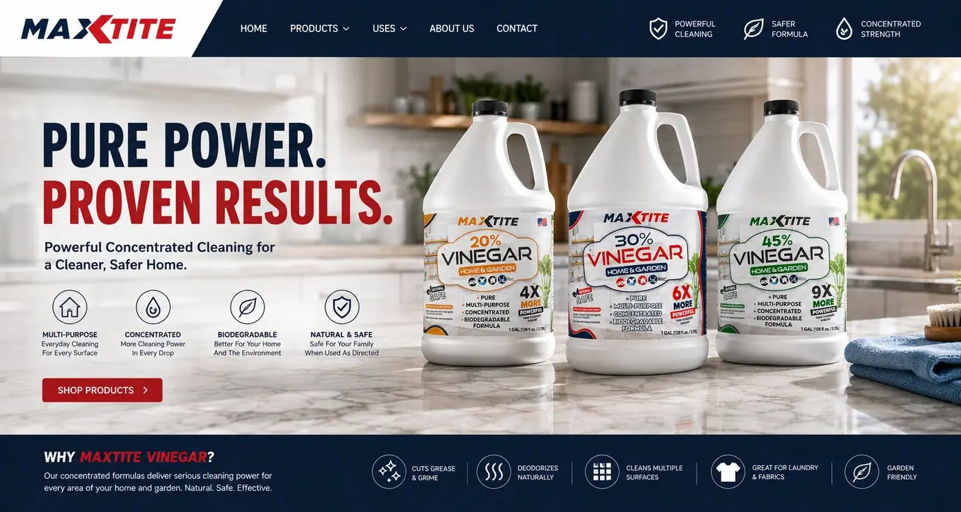
The risk with color coding is ending up with three products that look unrelated, which trades one problem for a worse one. Holding the jug shape, the masthead, the Home and Garden badge and the icon strip identical across all three keeps the color doing exactly one job, marking difference, while everything around it carries the identity. Pick up any one of them and the other two are implied.
That badge is also what keeps the category honest. Forty five percent vinegar is a serious material, and the obvious move is to dress the strongest jug as a professional chemical, which would sell it to one kind of buyer and quietly lose everyone else. Keeping the same domestic badge on the top of the range says the strength belongs to the same household product, only more of it.
The range was photographed together in a bright kitchen with a potted plant in frame rather than in an industrial cleaning scene, and that choice follows from the same reasoning. Most of these jugs go home with someone cleaning a patio or a kitchen floor. The picture should show them the place they intend to use it, not a warehouse.
More work
More projects.





Have a project like this?
Tell me what you are building, changing or launching, and I will help you define the right scope and direction.