
Case study · Packaging Design
SuperVag
Feminine Care Product Line Packaging
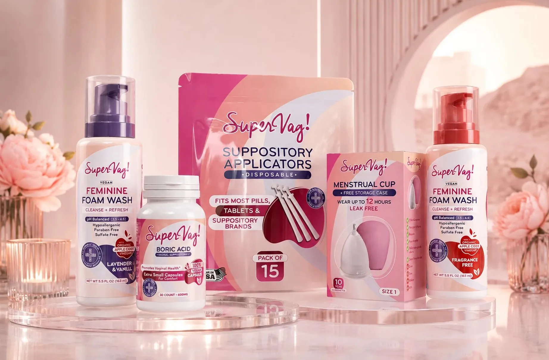
SuperVag is a feminine care line in a category that tends to swing between the clinical and the juvenile. The identity refuses both, and treats the customer as someone making a considered purchase rather than an embarrassed one.
01
Neither the clinic nor the cartoon
Walk that aisle and you see two defaults. One borrows from the pharmacy, cold blues and diagnostic type, which tells a woman that something is wrong with her. The other goes soft and giggly, which tells her the same thing in a friendlier voice. Tone was the whole design problem here, not shelf impact, and once that was settled every other decision had something to answer to.
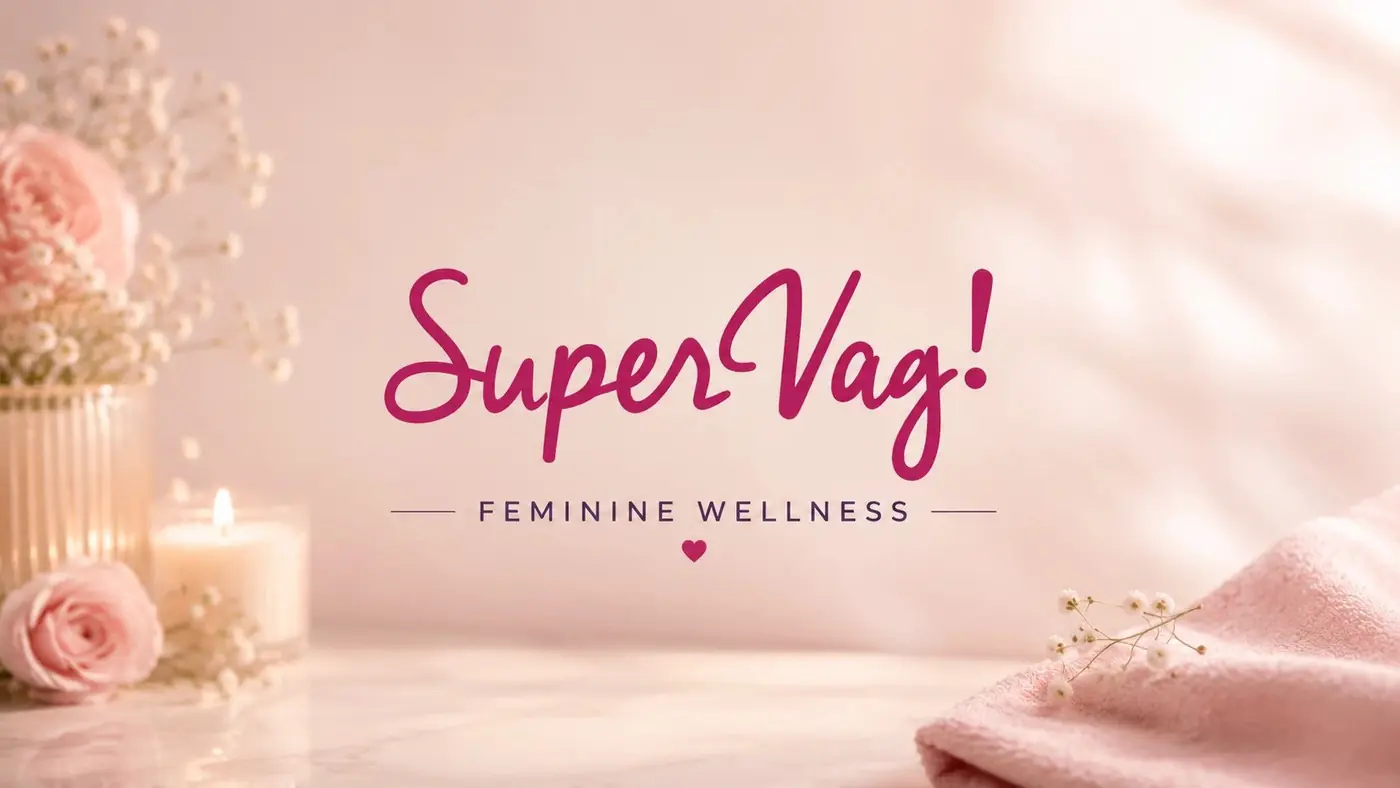
I built the brand around a script logotype because script is the letterform that sounds most like a person talking. Set in magenta with a lifted exclamation, it stays cheerful without sliding into anything childish, and it is the one element every product carries without variation. Below it the product name and the directions hold to a plain upright sans, so warmth at the top never costs a shopper clarity about what she is actually holding.
02
One family across unlike shapes
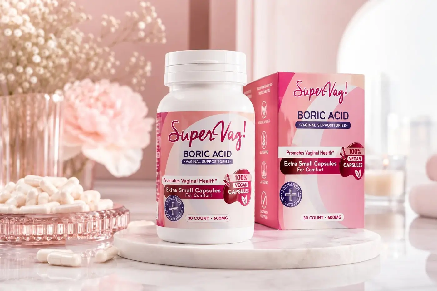
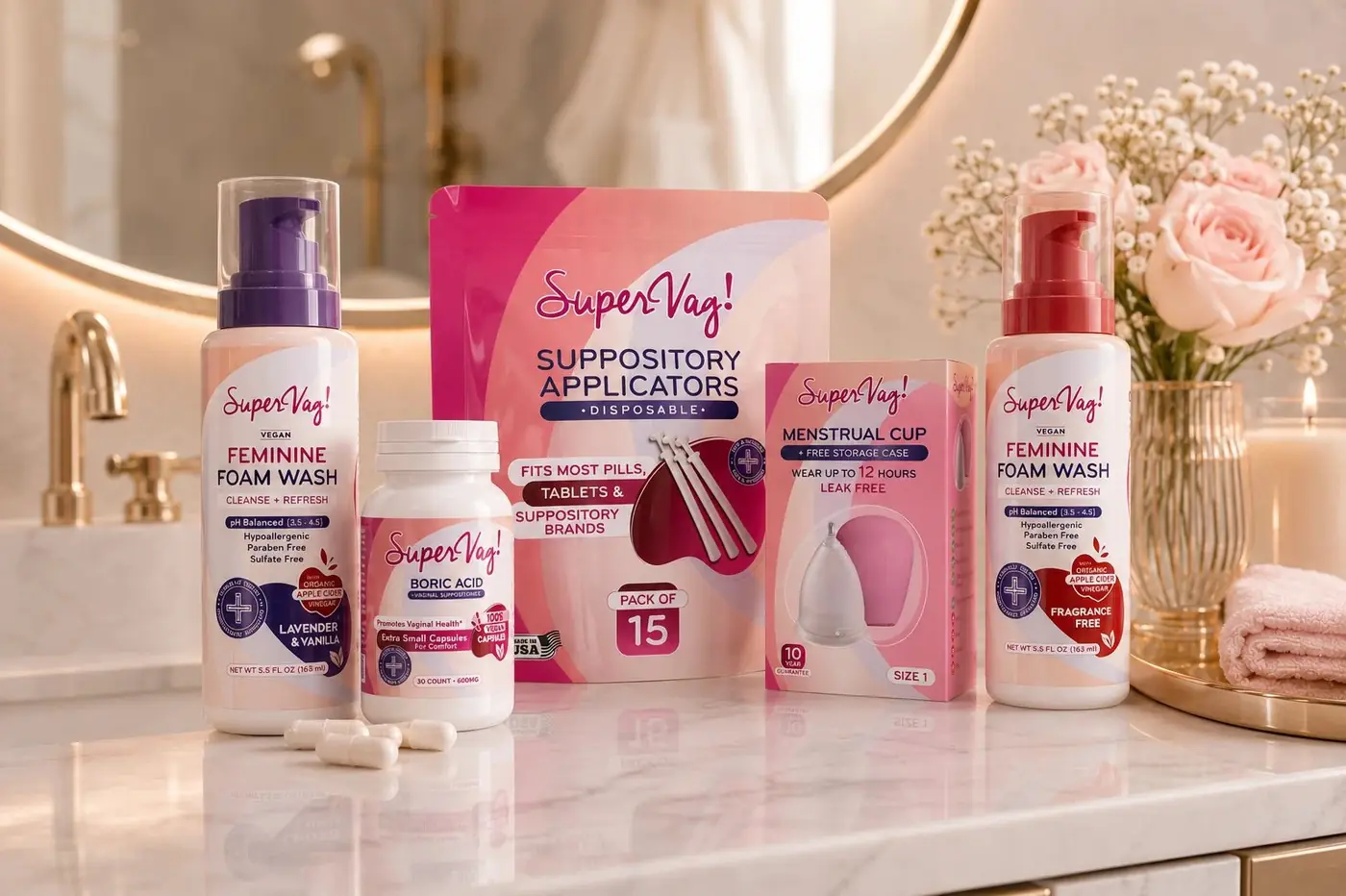
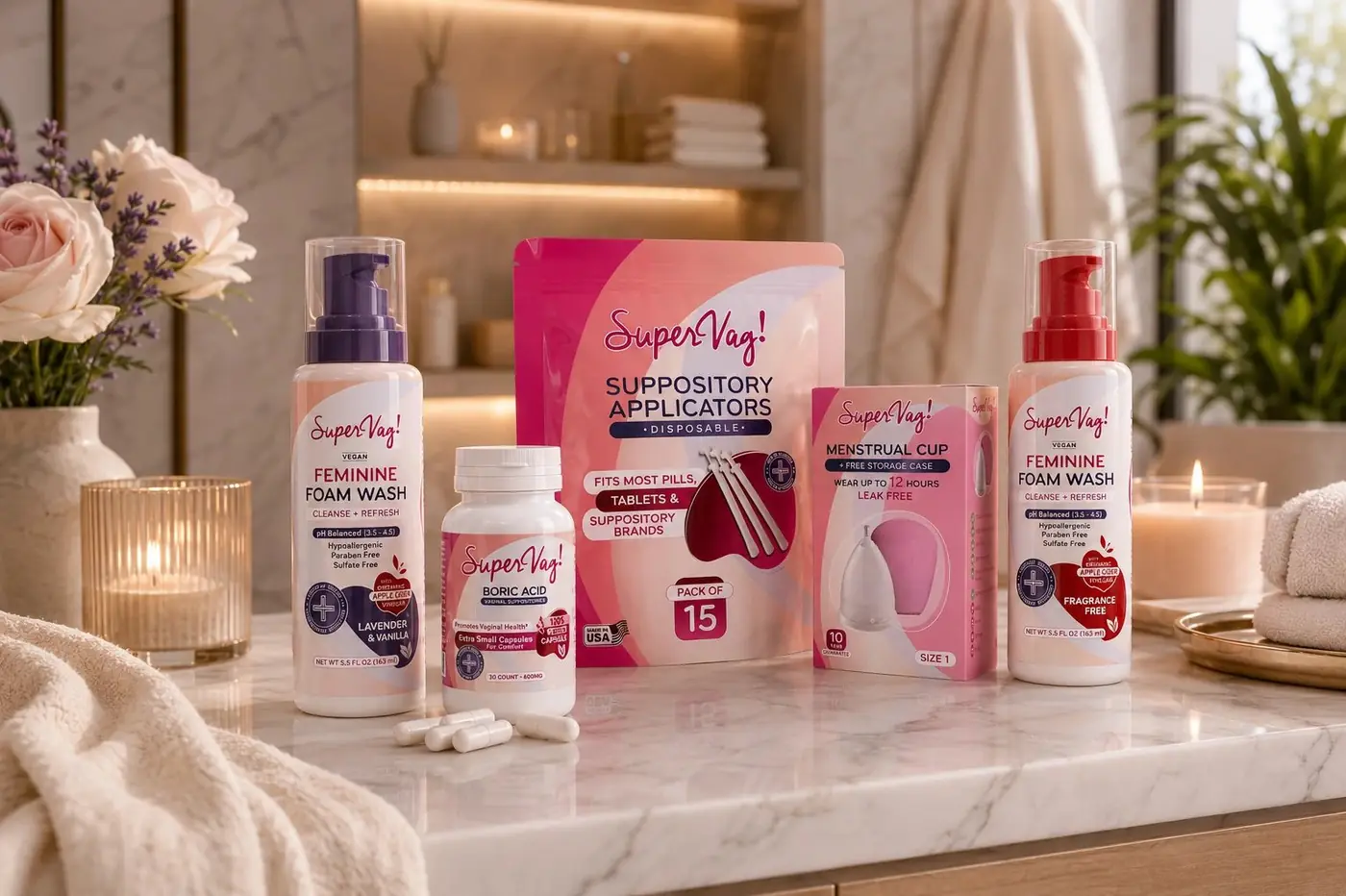
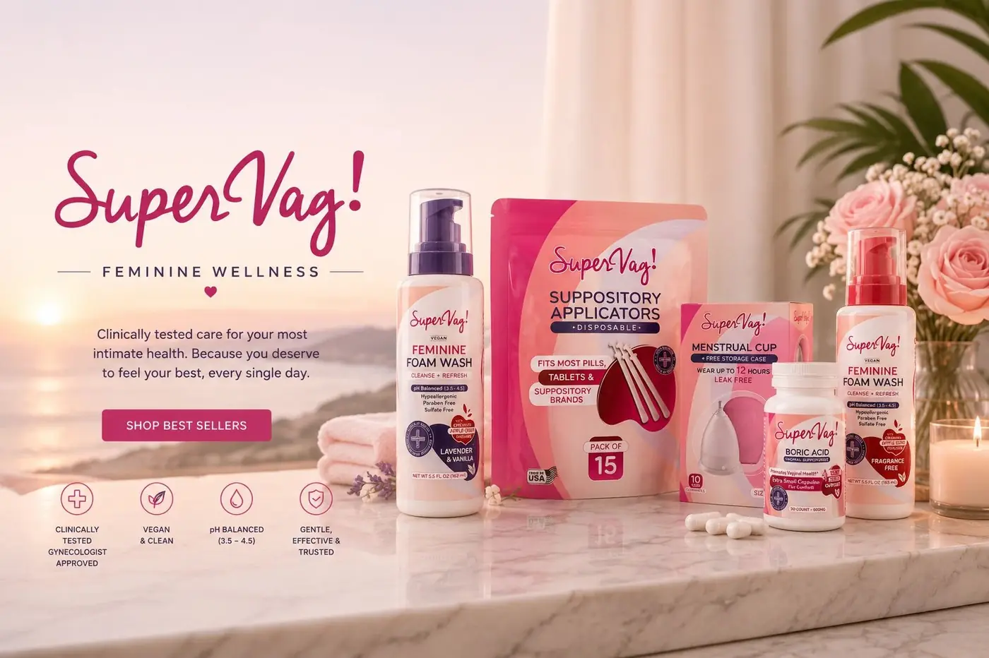
The range is where a system like this gets tested. A pump bottle and a stand pouch have nothing in common structurally, and left to themselves they would look like purchases from four different companies. The agreement had to come from the surface instead: a shared cream ground and one curved sweep of color repeated in the same gesture on every pack, so there is a single thing to recognize before a word has been read.
Inside that structure each product takes its own accent, and the color is doing navigation rather than decoration. Someone who has bought once should be able to find the same item again from a few feet away by the color she remembers, not by reading five near identical fronts. Magenta stays the family color and the accents sit underneath it, which means the line can grow without anyone having to redraw the brand.
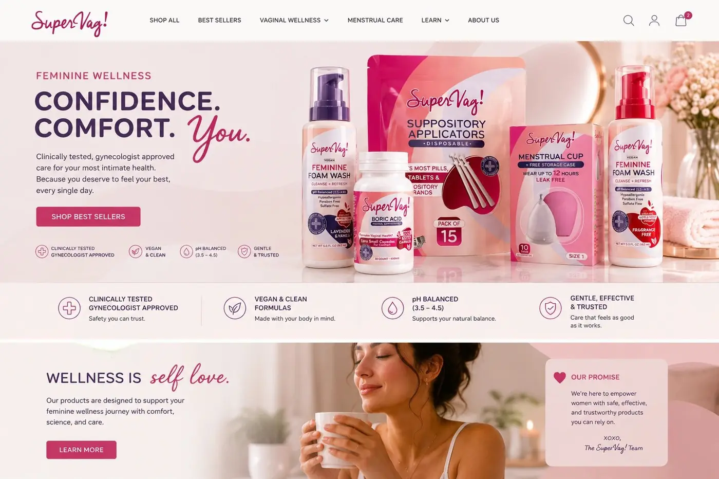
It follows that the range gets photographed in soft light beside flowers rather than on a clinical white sweep. The company a product appears to keep sets the expectation before the label gets its chance, and this one belongs nearer to skincare than to the first aid shelf.
More work
More projects.

Have a project like this?
Tell me what you are building, changing or launching, and I will help you define the right scope and direction.