
Case study · Packaging Design
Yamá Professional Color
Anti-Frizz & Bleaching System
Yama Professional Color is the salon tier of a brand most people meet on a drugstore shelf. The identity had one job: tell a stylist, in the first second, that this sits a step above everything else the company makes.
01
A step above, read in one second
Sub brands usually fail by borrowing too much from the parent. Keep the same palette and the professional line looks like the consumer line with a new word on it, which is exactly the impression a stylist will not pay more for. So the shift had to be structural rather than decorative, and it had to happen at the level of color and surface before it happened at the level of type.
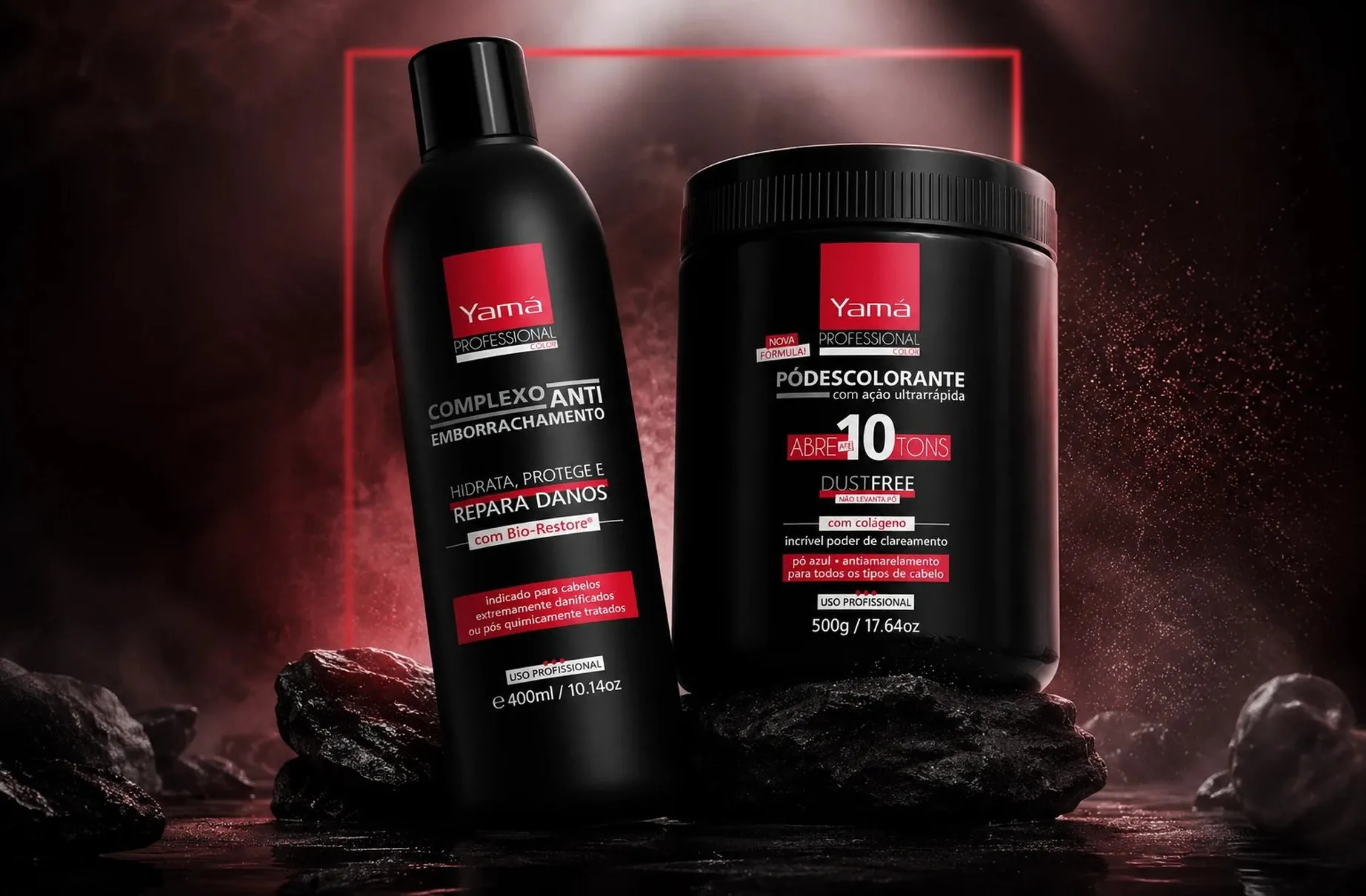
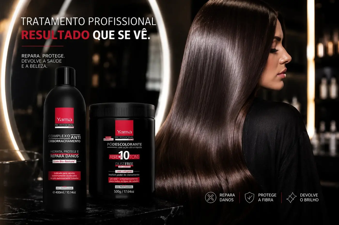
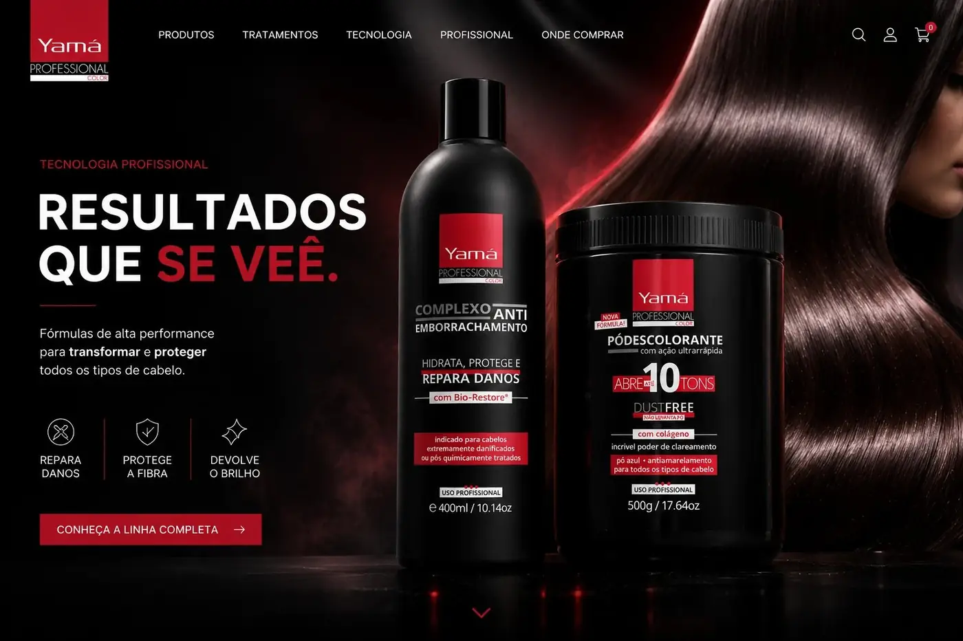
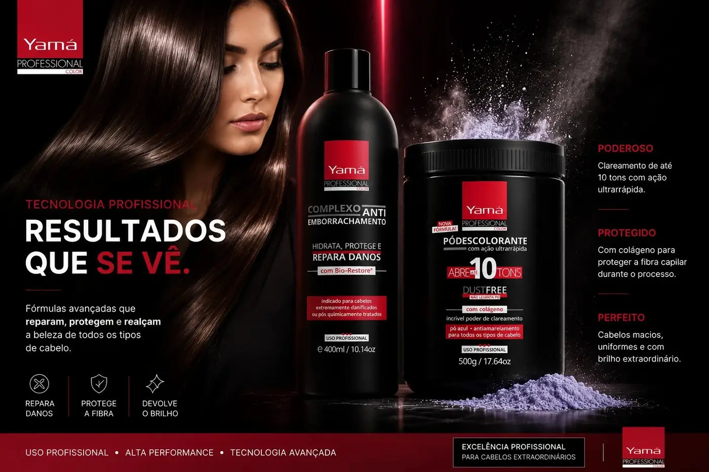
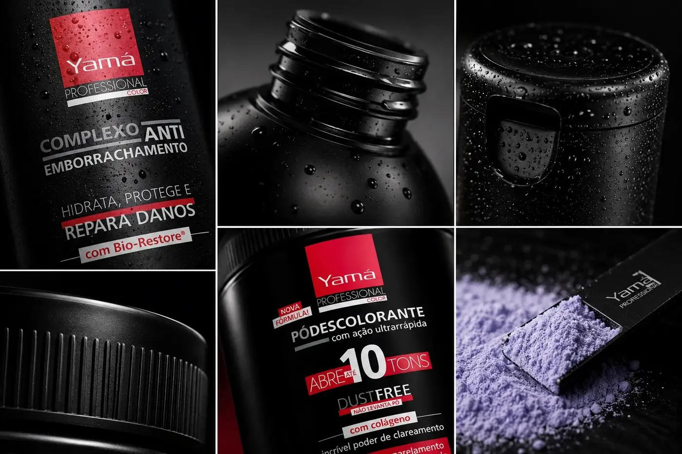
Matte black does most of that work. It changes the material read of the pack, it separates the tier from the brand's usual shelf presence at a glance, and it gives red somewhere to sit with real force. The parent name stays anchored in a red block at the top so the lineage is never in doubt, with the professional designation ruled directly beneath it, and the rest of the label runs in white and red on black. Restraint in the palette is what keeps it looking clinical in the good sense.
02
Two formats, one tier
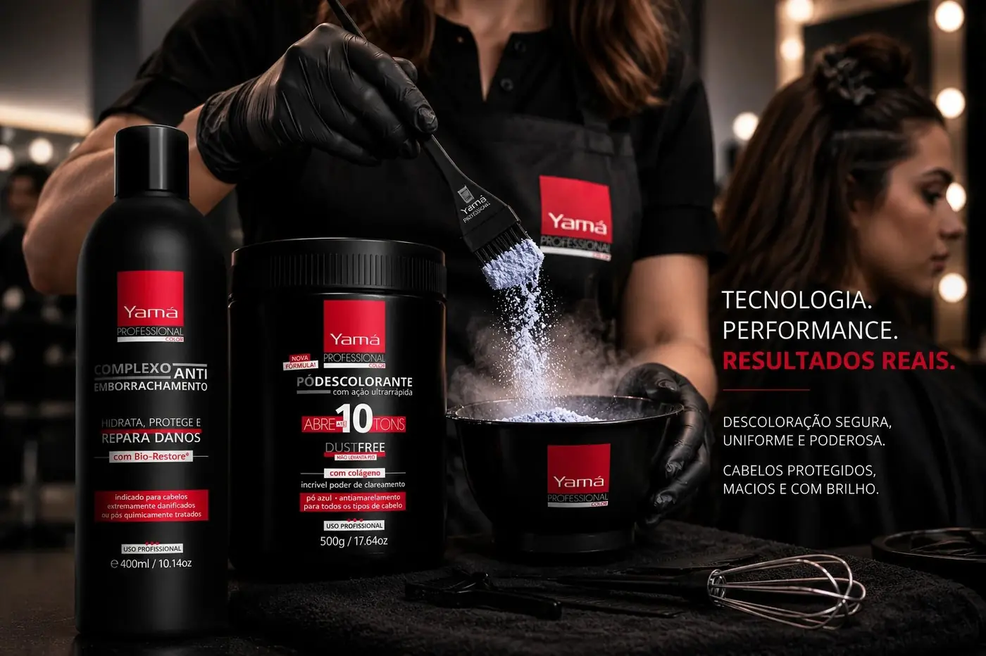
The line pairs an anti frizz repair treatment with a high lift bleaching powder, two products with nothing in common except the hands that use them. Treating them as separate launches would have been the obvious move and the wrong one, because a professional tier only exists if more than one thing belongs to it.
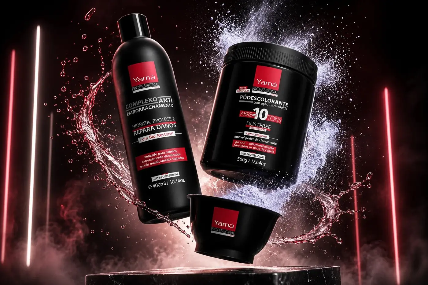
The type system stays identical across the liquid bottle and the powder tub even though their proportions fight each other, a tall narrow panel against a wide squat one. Holding the same hierarchy, the same red blocking and the same rule weights across both is what makes them read as one family rather than two products that happen to share a color.
The photography follows the same logic. Shot against a lit red frame with dark smoke and rock, the pair looks technical and serious, which suits a claim about professional performance far better than a soft lifestyle setup would.
More work
More projects.




Have a project like this?
Tell me what you are building, changing or launching, and I will help you define the right scope and direction.