
Case study · Packaging Design
PyurX LemonUp
Vitamin Gummy Packaging
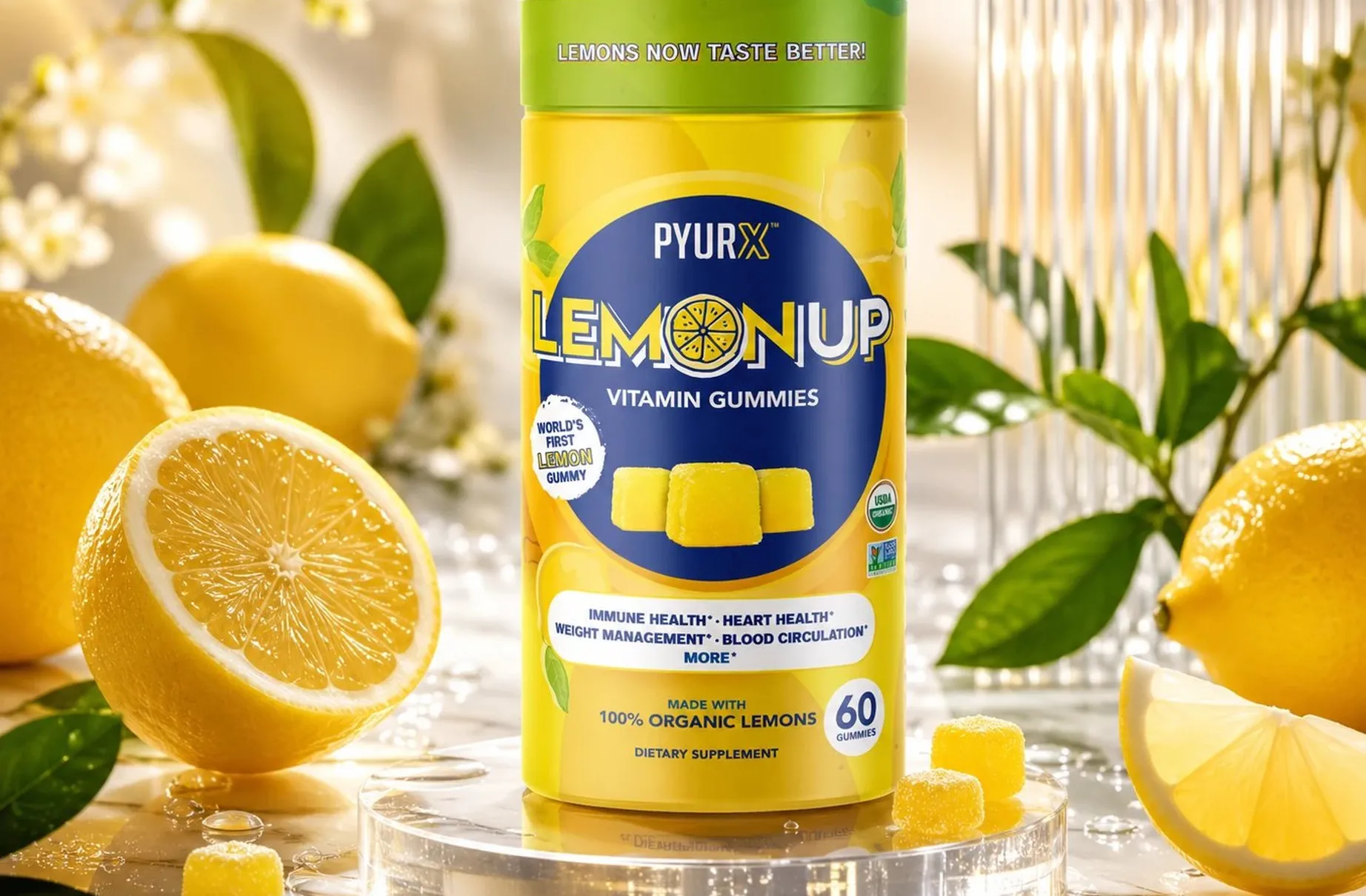
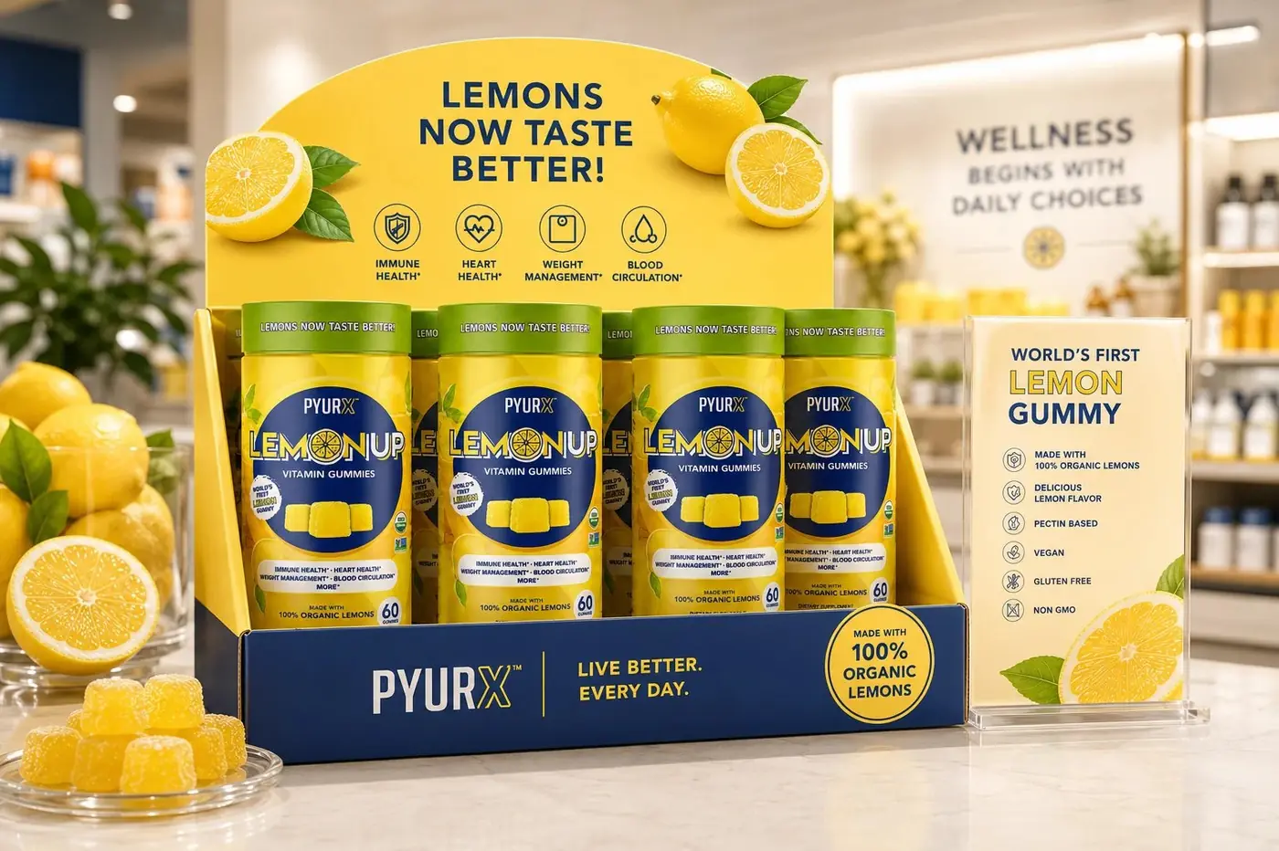
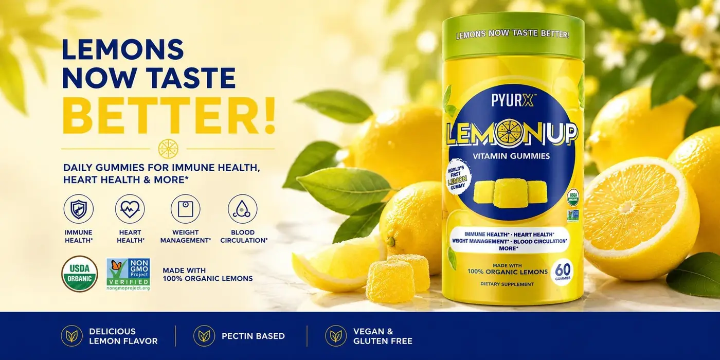
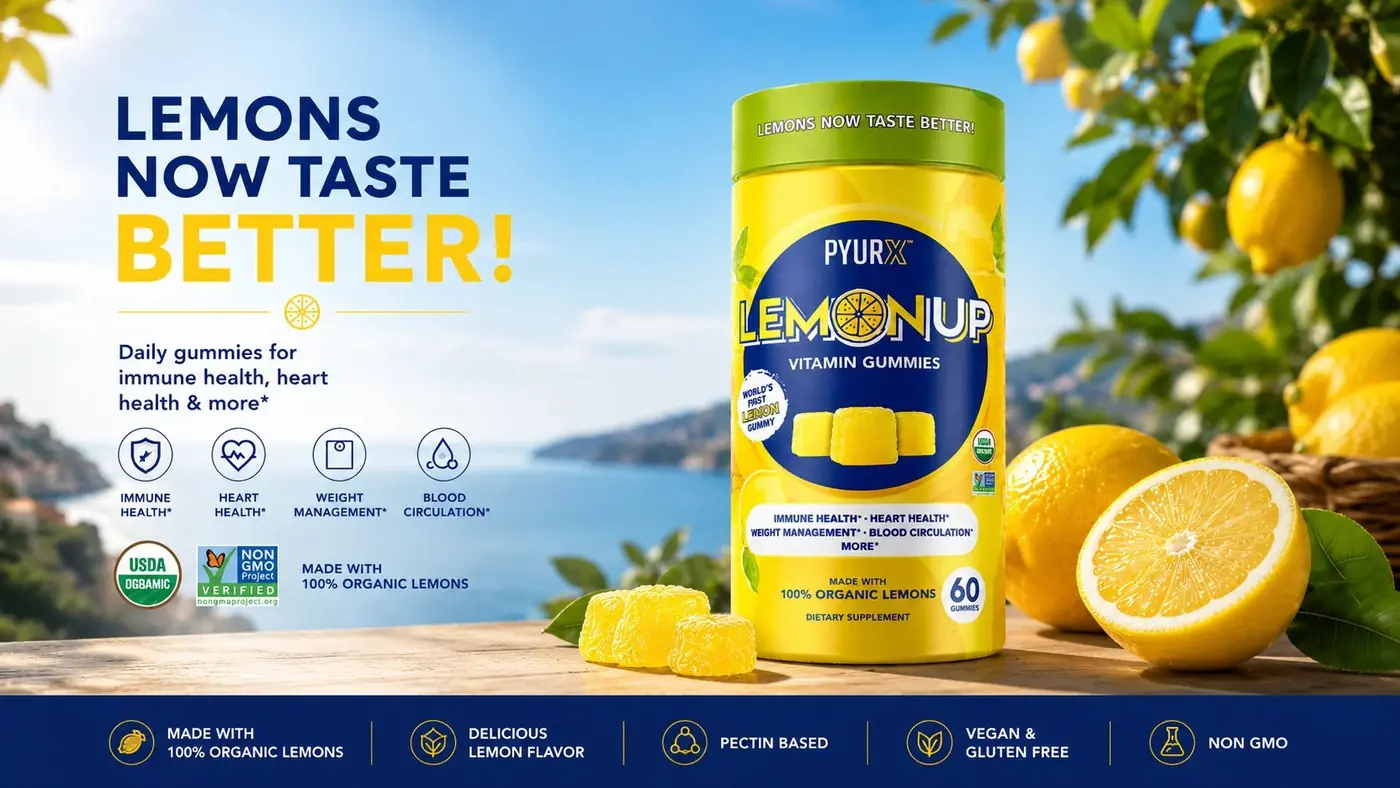
PyurX LemonUp is built on one claim, the world's first lemon gummy, and the packaging commits to that claim completely rather than treating lemon as a flavor note at the bottom of a supplement label.
01
One claim, carried all the way
Most gummy vitamins lead with the supplement and mention the flavor in passing. LemonUp has something nobody else in the category can say, so burying it under benefit copy would have thrown away the product's only real advantage. I took the opposite position: let lemon run the entire pack and let vitamin arrive second, which is much closer to how someone actually reaches for a jar in the first place.
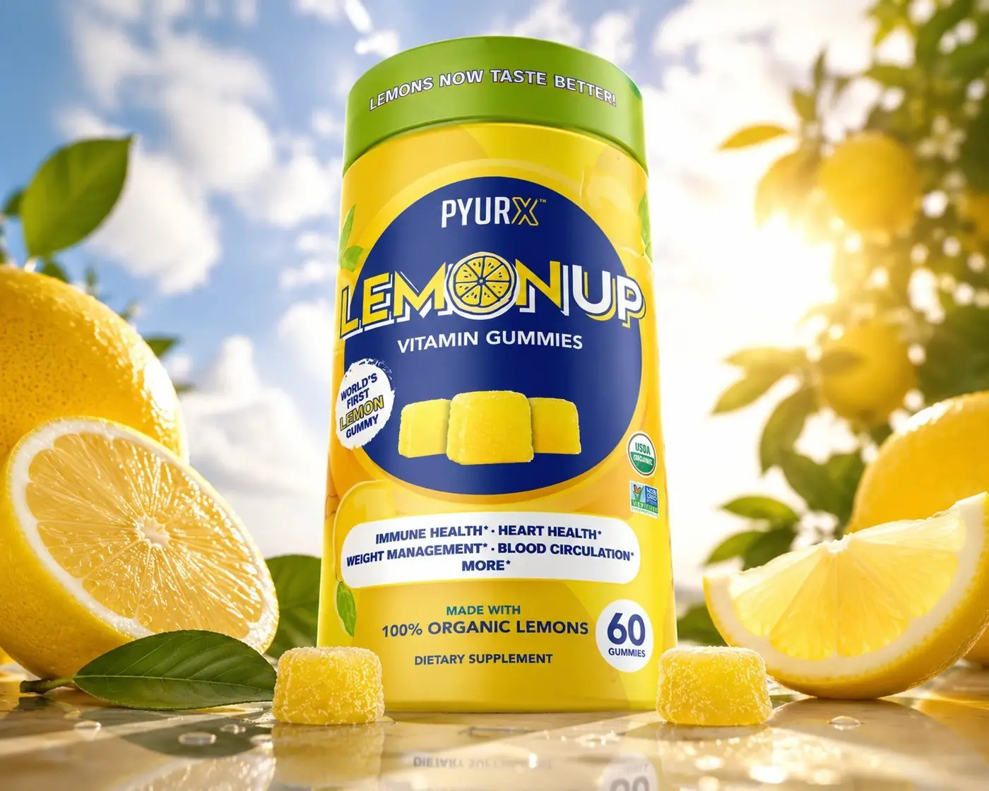
The logotype makes that literal. The O in LemonUp is a cut lemon slice with its segments drawn in, so the word reads as fruit at a glance instead of as a circle with a trick inside it. The name sits in a deep navy field on a yellow ground, because yellow on yellow goes soft and the navy gives the letters an edge to cut against. The novelty badge sits high, where a thumb naturally lands.

02
Delicious first, beneficial second
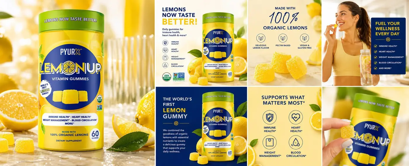
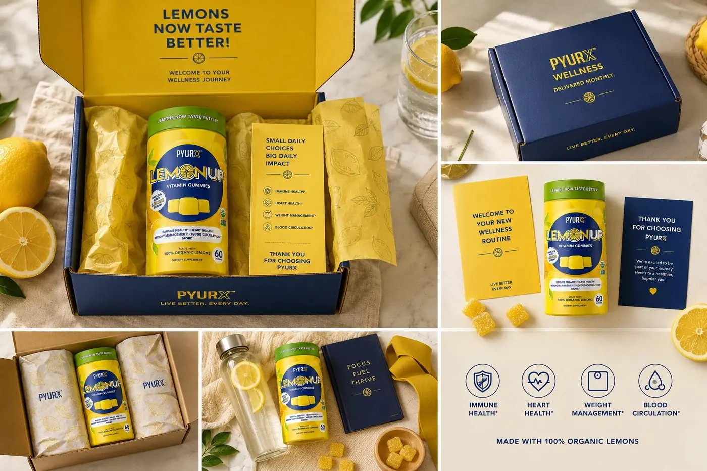
Supplement fronts get crowded fast, because every benefit wants its own bullet and its own asterisk. Compressing the health claims into one scannable line kept the panel from turning into a spec sheet and left the citrus as the loudest thing on the jar. A shopper reads that line once the product is already in their hand. Before that, the pack only has to say lemon.
The photography follows the same reasoning. Whole fruit, cut wedges and the gummies themselves spilled onto the surface, lit the way a food product gets lit rather than a supplement, because this has to look good to eat before it looks good for you. The green closure is the one break in the palette and it earns its place twice, reading as fresh rind and giving the jar a top edge that separates it from a shelf of yellow.
More work
More projects.

Have a project like this?
Tell me what you are building, changing or launching, and I will help you define the right scope and direction.