
Case study · Packaging Design
MaxTite Coffee Machine Descaler & Cleaner Packaging
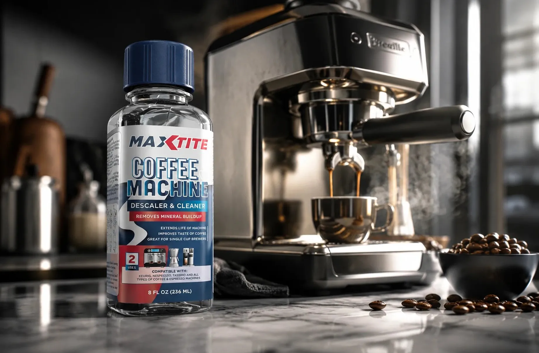
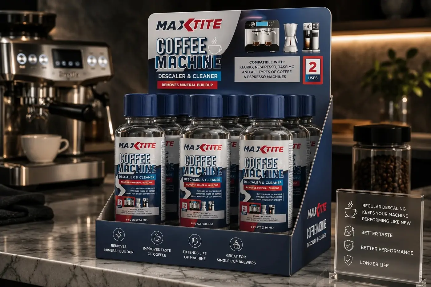
MaxTite's coffee machine descaler sits in a category where the shopper's first question is always whether it works with the machine they own. The label is designed to answer that before anyone turns the bottle over.
01
Answering the question on the front
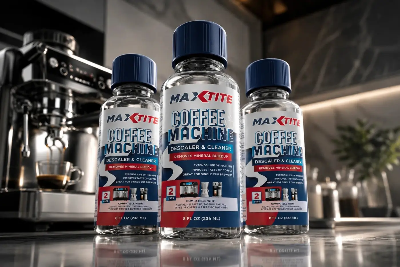
A descaler gets bought by someone mildly annoyed with an appliance who has no interest in becoming an expert about it. The convention is a paragraph of compatibility text somewhere on the back panel, which asks that person to do work before they can decide. Small icon graphics for each machine type, drip, pod and espresso, turn a reading task into a recognition task, and recognition is fast enough to keep the bottle in a hand.
Value is the second question, so the red "2 Uses" badge holds the front panel too. Answering both questions where the eye already is removes the two easiest reasons to put the bottle down and keep comparing. Everything on that front face is either the name, the promise or one of those two answers, which is why it stays readable at the size an online listing actually shows.
02
A kitchen product, not a chemical
The masthead is the same one running across the rest of the MaxTite cleaning line, and consistency is doing real work here rather than just keeping things tidy. This is a product someone buys once or twice a year. It has to be recognizable to a person who last saw the brand eleven months ago and remembers a shape and a color rather than a name.
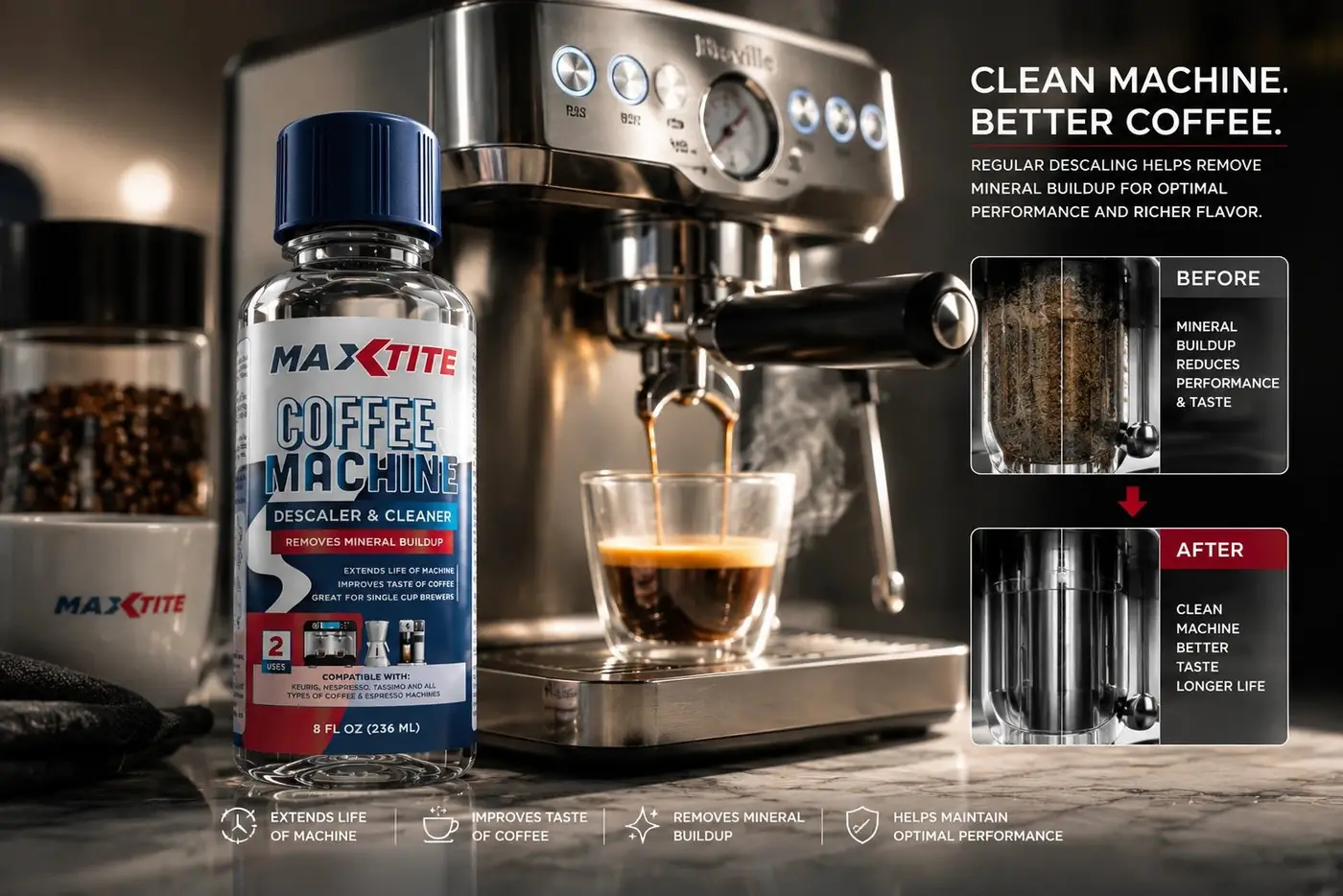
Supporting copy stays benefit first on purpose. Removing mineral buildup, extending the life of the machine, improving the taste of the coffee are the things a coffee drinker would say out loud, and descaling chemistry is deliberately absent. Technical language would have moved this product from the kitchen counter to the garage shelf, which is a different shopper with a different set of expectations.
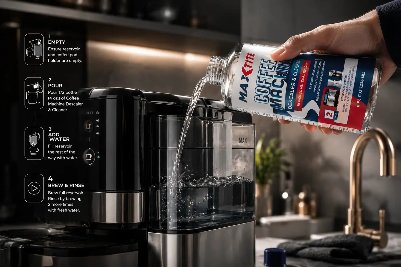
Photography carries the same argument one step further. Pairing the bottle with a machine actively pulling a shot makes the before and after concrete instead of asking anyone to imagine it, and it puts the product exactly where it will be used. A benefit you can picture is worth more than a benefit you have to accept on faith.
More work
More projects.


Have a project like this?
Tell me what you are building, changing or launching, and I will help you define the right scope and direction.