
Case study · Packaging Design
Winni Treats
Dog Treat Product Line Packaging
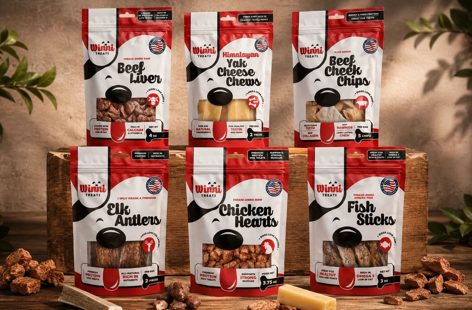
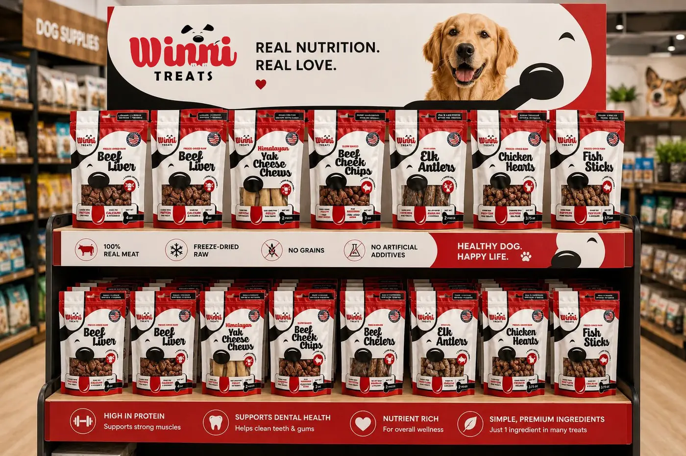
Winni Treats is a six flavor line of freeze-dried dog treats sold to an owner with an unusually literal question: what exactly is going in the bowl. The whole system is built on showing the treat instead of drawing it.
01
Let the buyer see the actual treat
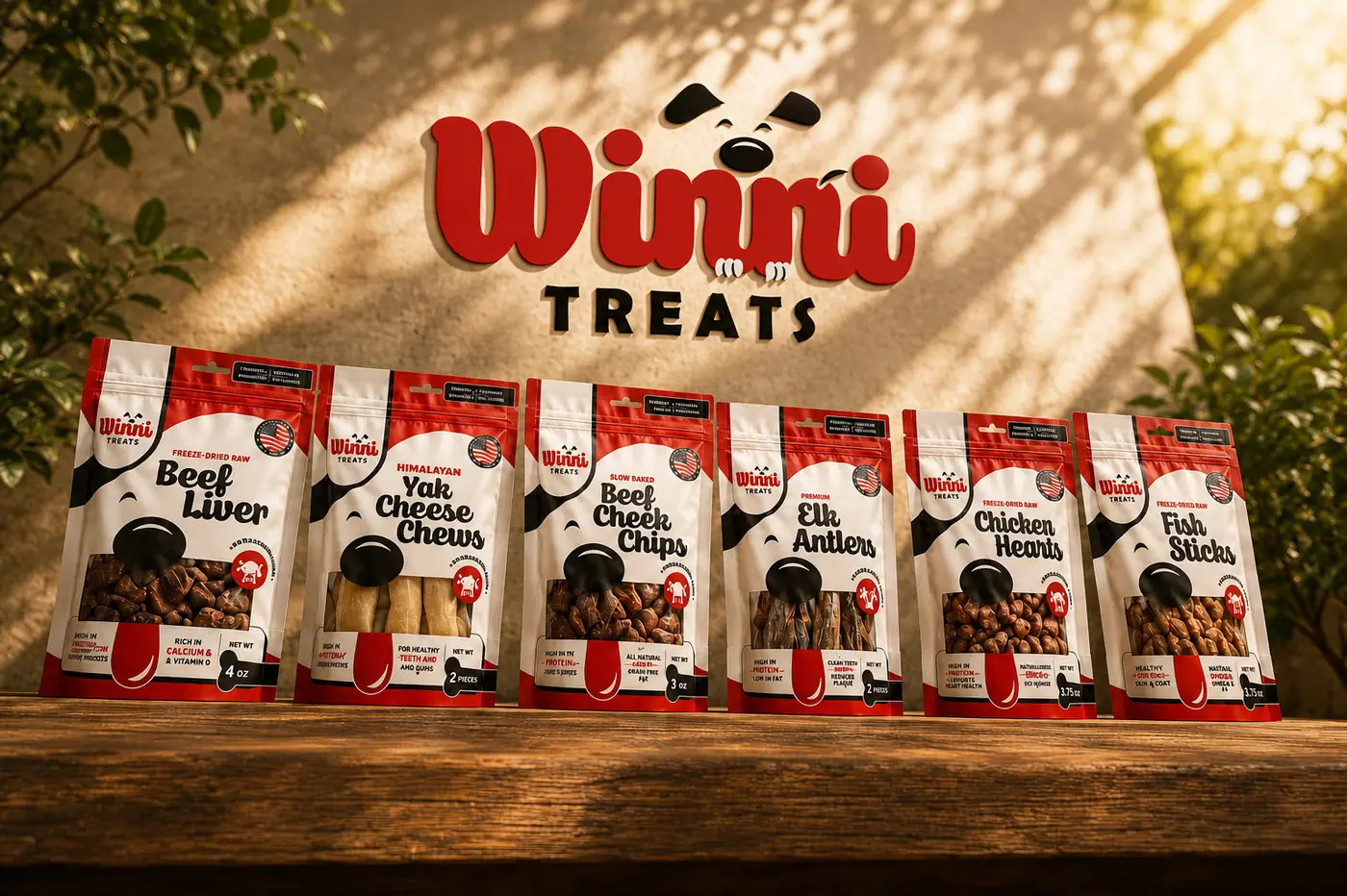
Owners in this part of the category read a treat panel the way they read their own food, and they have learned to distrust illustration, because a drawn treat is a treat somebody chose not to show. So the structural decision came before any styling. A large window sits in the same position on all six bags, with the real freeze-dried texture doing the selling. Transparency as a layout, not a claim.
Around that window the brand borrows trade dress from the neighborhood butcher, red and white and black with the plainness of paper and string. It frames the product as honest craft rather than pet industry science, which is the register this buyer already trusts. A friendly dog nose anchors the front, drawn as one simple black shape that doubles as a face looking down over the window.

02
Nothing moves except the flavor
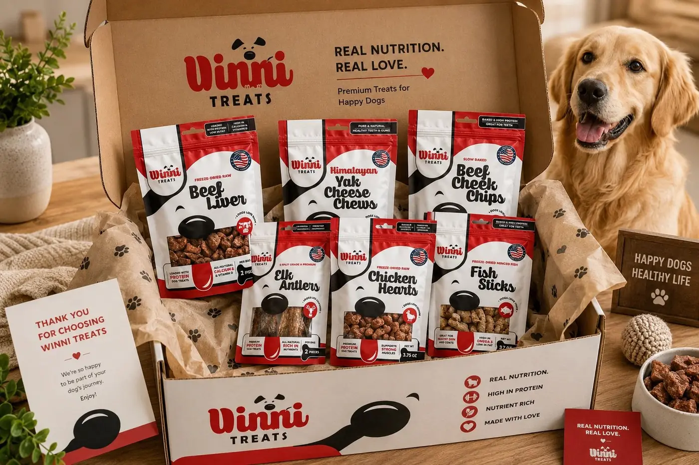
These shoppers do not pick up one bag. They stand at the shelf holding two or three, comparing, and that behavior set the rule for the entire range. Claims live in an identical footer grid from flavor to flavor, so a comparison that would otherwise take a minute of squinting resolves in seconds, and nobody puts both bags down out of fatigue.
The only thing that changes across the six is the flavor itself: the name in brush script, the small icon beside it, the food behind the window. Everything else holds position. That discipline is unglamorous to describe and it is the whole reason the line works as a line, because a range that rearranges its furniture between bags stops being a range and becomes six unrelated products.
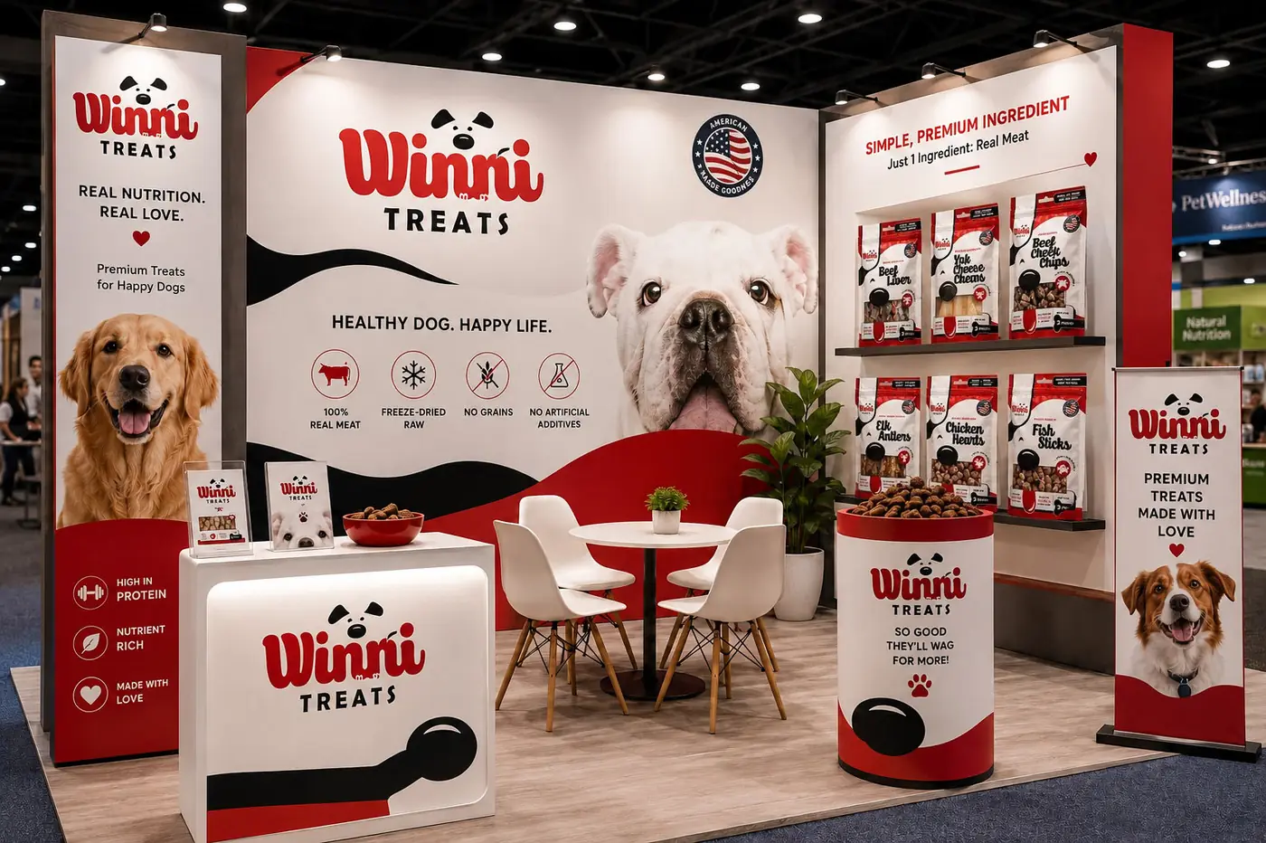
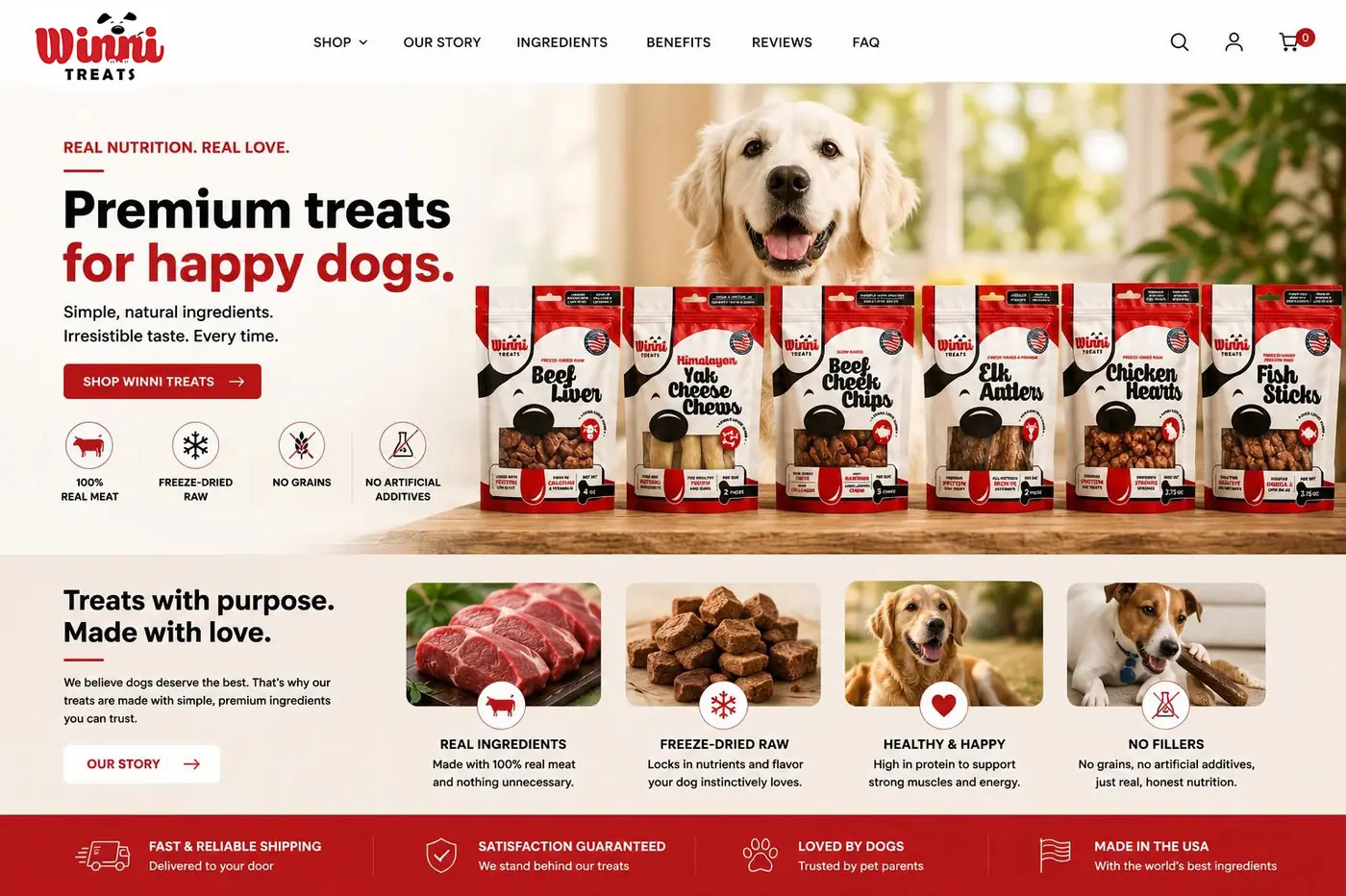
All six were built as digital renders in one continuous world, the same rustic wood under every bag. It let flavors still waiting on production sit beside launched ones with no visible difference in kind, so the range could be sold whole from the first day rather than assembled in public over a year.

More work
More projects.


Have a project like this?
Tell me what you are building, changing or launching, and I will help you define the right scope and direction.