
Case study · Packaging Design
MaxTite Industrial
Chemicals 9-Product Label System
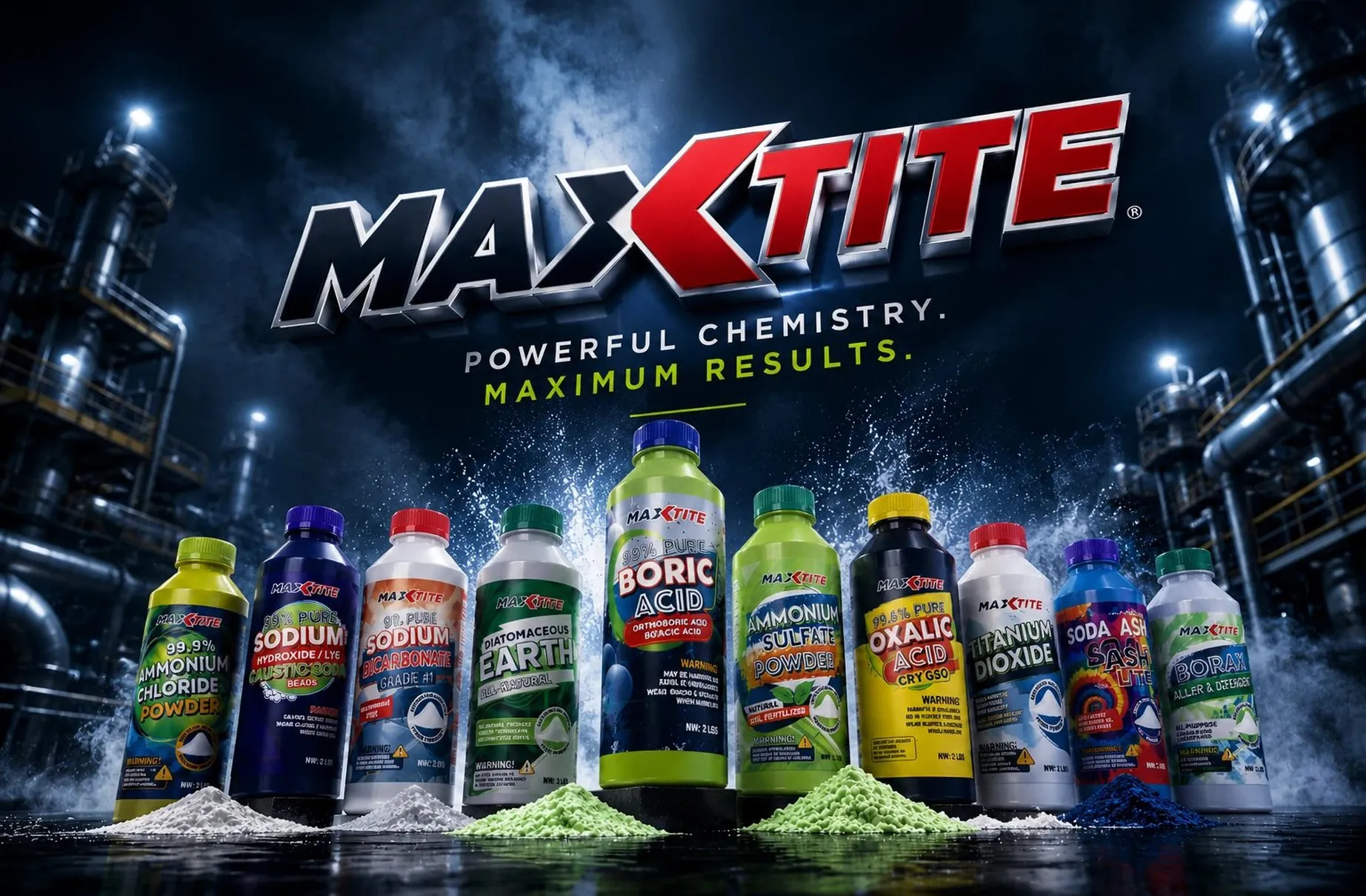
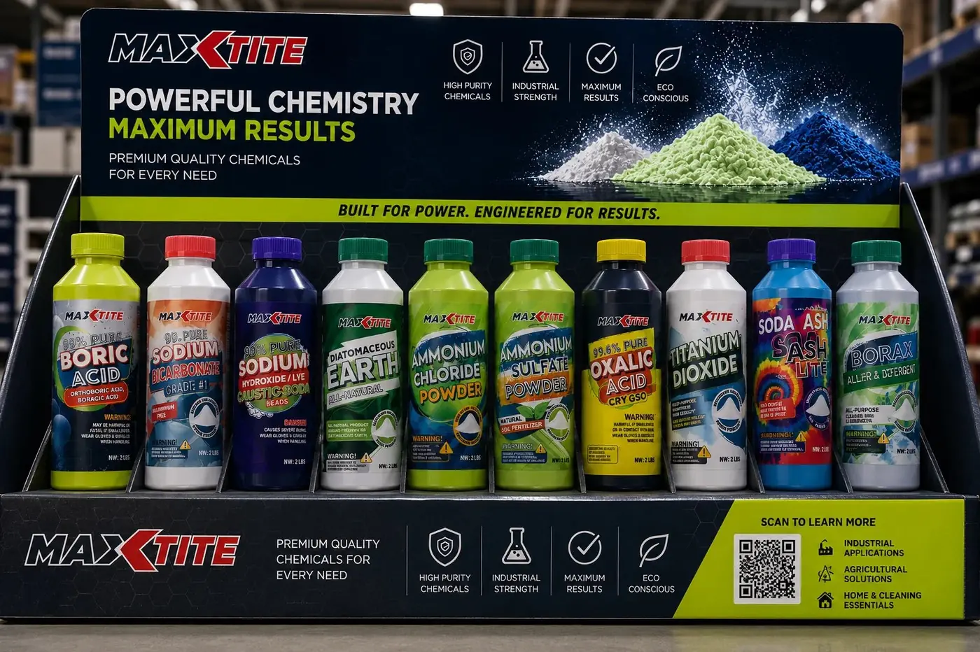
MaxTite Industrial is a range of nine chemicals that arrive as nine near identical white bottles of powder. The identity is built to solve navigation first, because telling one product from another is the hardest thing about this shelf.
01
Nine bottles, one scanning system
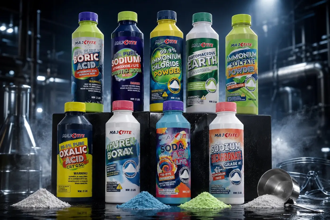
Designing a single chemical label is straightforward work. Designing nine that a buyer has to separate at a glance is a different problem, and that was the one actually in front of me. Boric acid, borax and soda ash are white powders in white bottles, so nothing about the product itself helps. The label has to do all of the distinguishing, at distance, before anyone is close enough to read.
So the masthead and the warning icon hold exactly the same position on every bottle in the range, and color carries the difference. Giving each product its own color turns a shelf into something a person can scan rather than read, and the fixed elements are precisely what make that color legible as a code instead of decoration. Recognition first, words only as confirmation.
02
Order that survives the whole range
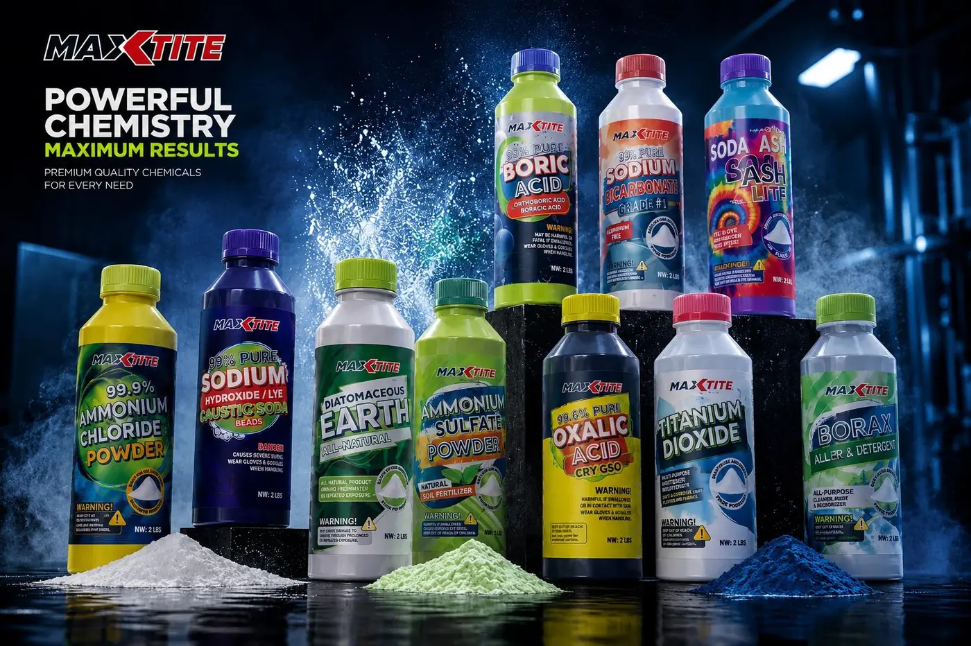
Required hazard statements were designed rather than tolerated. Boxing and bordering them the same way on every bottle means a buyer who has never handled a particular chemical still knows where to look for the thing that will keep them safe, which is a useful outcome from a decision most people treat as a formality. Legal copy only looks like clutter when it is added last.
That discipline is also what allows the range to be this wide without fragmenting. Every product gets the same skeleton and the same order of information, so the differences a buyer needs are the only differences they see. It puts the burden on the system rather than on nine separate acts of judgment, which is the only way a line this size stays coherent.
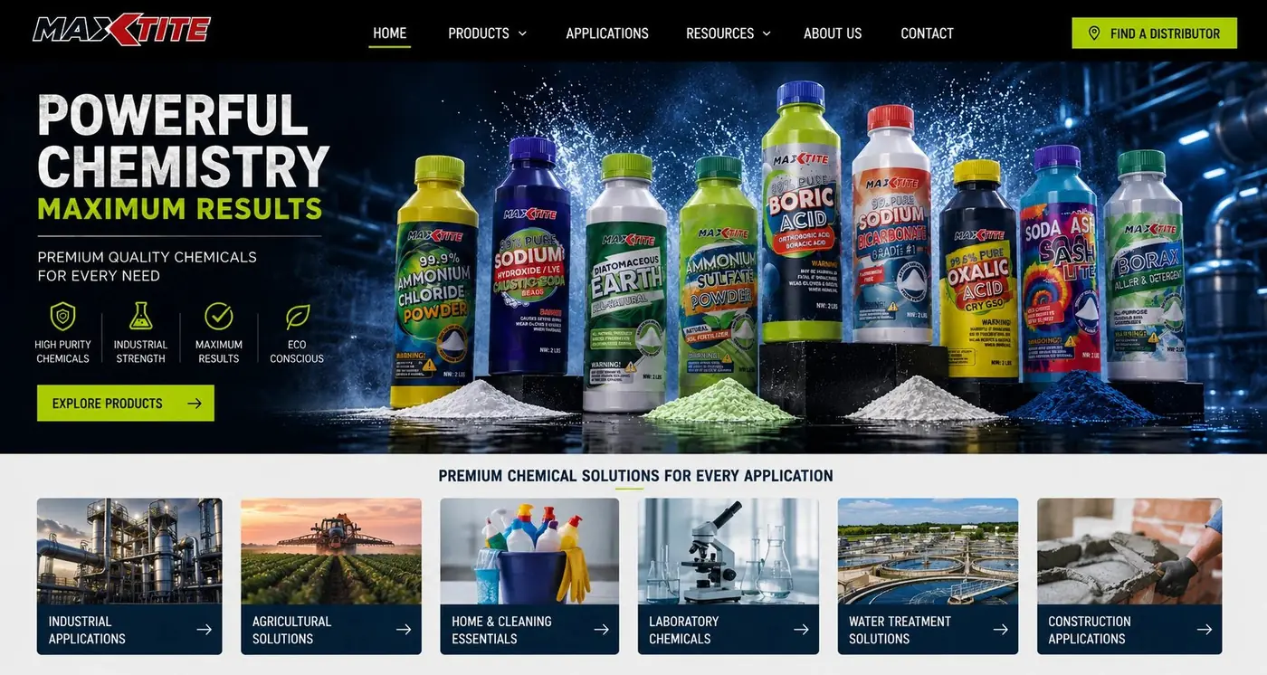
Shooting all nine together in an industrial setting with powder and liquid spilled at the base gives distributors a single image that proves breadth and real use at once. It is also the honest test of the work. If the color coding holds anywhere, it has to hold there, with every product in the line competing for the same eye.
More work
More projects.


Have a project like this?
Tell me what you are building, changing or launching, and I will help you define the right scope and direction.