Packaging That Builds Trust Before Purchase
Before anyone can verify a product, the package is the evidence they use to decide whether it deserves a first try.

How can packaging build trust before purchase?
Every first purchase contains uncertainty. The customer has not used the product yet, so the package has to carry most of the evidence available at the moment of decision. That does not mean covering the front panel with proof points. Trust is built through clarity, credibility and control: making the product easy to understand, the claims easy to rank, and the company easy to believe. Clean hierarchy, accurate production and complete information all signal that someone took care. The package cannot earn long term trust, but it can remove enough doubt for a first purchase to happen.
Every first purchase is a bet
When someone buys a product they have never used, they are accepting a small risk. Money, obviously, but also time, and sometimes something more uncomfortable: the risk of having chosen badly in front of themselves. Nobody enjoys discovering that the thing they picked was junk. That discomfort is part of what the package is negotiating with.
The customer handles that risk by looking for evidence, and in the aisle or the search result there is very little evidence available. They cannot test the product. They usually cannot ask anyone. Reviews help online but not at the shelf, and even online they arrive after the decision to click. What they have is the package, the name and the price, and they will read those far more carefully than most brands assume.
So the package is not primarily a container or a decoration. It is the document that stands in for everything the customer cannot check. That is a heavy job for a printed surface and it explains why so many packaging decisions that look cosmetic are actually about belief. The question behind every layout choice is simple: does this make the product easier to believe, or harder?
Clarity is the first form of credibility
Before anything else, a package has to answer three questions fast: what is this, who is it for, and what does it do. When those answers arrive in under two seconds, uncertainty drops immediately. When they do not, the customer starts working, and working feels like friction rather than interest.
Confusing hierarchy does more damage than most people expect, because customers transfer it. If the basic facts are hard to find on the box, the reasonable inference is that the product will also be hard to use, hard to return, hard to get help with. I have watched this happen with genuinely good products whose front panel gave equal visual weight to the brand name, the variant, the benefit and a marketing phrase, leaving the eye with nowhere to land.
Clarity is not the same as plainness. On something like the Absorbable vitamin C carton, the job is to let a shopper resolve the format and the strength almost instantly, then let the rest of the design work on tone. The order matters more than the amount. A package can be rich and still be immediately legible, as long as someone decided in advance which piece of information wins.
Claims need a rank, not a wall
Certifications, benefits and performance statements do support trust. They stop supporting it the moment there are too many of them competing at the same level. A front panel covered in badges reads as defensive, as though the brand expects an argument. It also becomes unreadable, which means none of the claims land.
The discipline is to separate the primary promise from the supporting evidence and to give them genuinely different weight. One claim carries the position. Two or three support it in a clearly lower rank. Everything else moves to the back panel where an interested customer will find it, because the customer who cares about a specific certification will turn the box over, and the customer who does not was never going to read it anyway.
There is also a credibility effect in restraint itself. A brand that states one thing plainly reads as more confident than a brand that states nine things loudly. Specific beats maximal too: a concrete, checkable statement about what the product contains or does is worth more than a superlative nobody can verify. Overclaiming does not just fail to persuade, it actively raises suspicion, which is one of the failures I list in seven packaging mistakes that make products look cheap.
Execution quality is read as a proxy
Customers know, if you ask them directly, that professional packaging is not proof of a good product. They use it as a signal anyway, and they are not being foolish. Production quality is one of the few things they can actually assess, and it does correlate with how much a company has invested in what it is selling.
The details that carry this are unglamorous. Type that is properly kerned and properly sized for the panel. Registration that holds. A varnish that sits where it was meant to. A carton that squares up. A pouch whose seal is straight and whose gusset stands. A label positioned the same way on every unit in the case. None of these is a creative idea. All of them are evidence of a process, and process is what the customer is really trying to detect.
Materials participate in the same judgment, often more strongly than graphics. Weight, rigidity, finish and the sound a closure makes are all assessed in the hand within a second of picking the product up, and they are difficult to fake. A structure that flexes when it should feel solid undoes a great deal of surface work, which is why I would rather move budget from a decorative effect into board thickness or a better closure when the choice has to be made.
This is also where money is often spent in the wrong order. Brands will fund a special finish while leaving the back panel typography to whoever had the file open last. The finish impresses for a moment. The back panel is what the customer reads while deciding, standing in the aisle holding the box. On a three scent system like PyurX Castile Soap, the value is in the rules holding identically across all three, so the range looks manufactured rather than assembled.
Transparency including the parts nobody wants to print
Trust grows when information feels complete rather than managed. Ingredients, quantity, directions, warnings and required disclosures should be organized so that a motivated reader can find what they want quickly. Burying the net weight, setting the ingredient list at a size that requires effort, or scattering the directions across two panels all produce the same reaction: the sense that something is being handled rather than disclosed.
Designers cause this more often than clients do. A dense legal block is genuinely inconvenient to lay out, and the temptation is to shrink it until it stops interfering with the composition. That solves a layout problem and creates a trust problem. I would rather redesign the panel around the legal copy than treat the legal copy as an obstacle, because the customer reading it at that moment is a customer who is close to buying.
Completeness applies to the awkward facts too. If the product needs to be refrigerated after opening, if it is not suitable for a group people will assume it is suitable for, if the count differs from the category norm, say so clearly on the package. A customer who discovers an inconvenient fact after purchase feels misled even if nothing was hidden. A customer who reads it on the box feels informed, and being informed is what makes them come back.
The context decides what evidence survives
Trust signals are not portable. A carton designed for a well lit shelf at arm’s length and a listing image seen as a thumbnail on a phone are different problems, and a package that performs in one can disappear in the other. Fine typographic detail, subtle embossing and secondary claims all vanish at thumbnail size. What survives is silhouette, dominant color and one or two words.
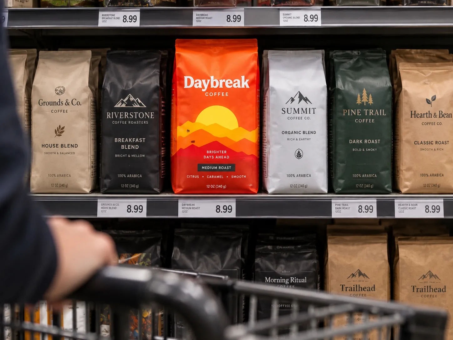
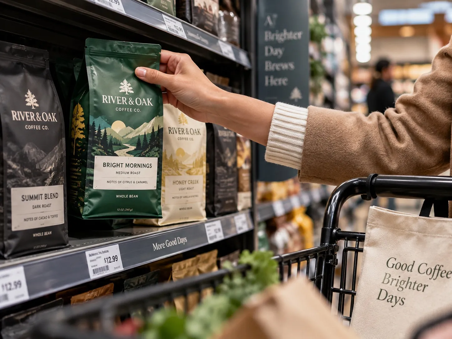
In retail, the sequence is different. The product is seen at distance, then approached, then picked up. Each stage has its own job: be found, be understood, be believed. Design that only works at one of those three stages will lose customers at the other two, usually invisibly, because nobody reports the products they walked past.
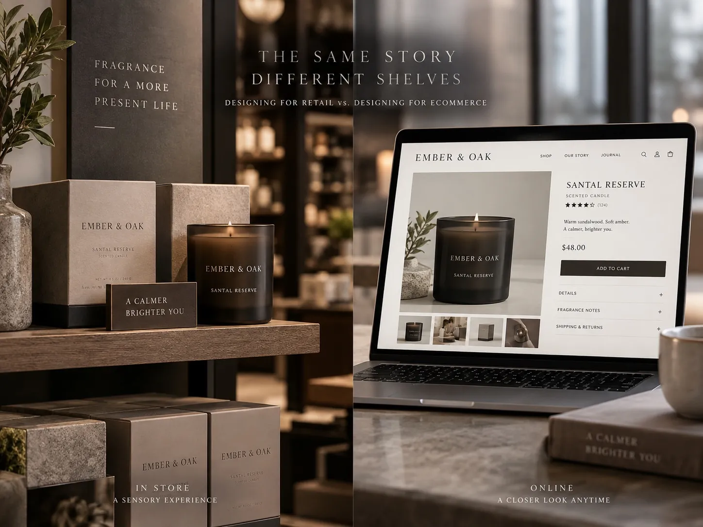
Online the package also has to survive being seen next to competitors in a grid that flattens everything to the same size. This is why I insist on reviewing comps at realistic scale and in realistic context rather than as beautiful renders, and why the choices differ so much between channels, a subject I take apart in designing for retail versus designing for ecommerce.
What packaging cannot do
Packaging cannot earn long term trust. The product has to do that. If the experience contradicts the promise, better packaging only means more people arrive at the disappointment faster, and the reviews catch up quickly. I have turned down requests to make a product look like something it plainly was not, because that work harms the client even when they are happy with the file.
There is also a limit around category expectations. In some categories, a package that looks too refined reads as expensive or as unserious. A professional grade product aimed at a trade buyer often needs to look utilitarian, because utilitarian is the language that signals the product was built for work rather than for a shelf in a boutique. Trust is relative to the audience, not absolute.
The honest framing is that packaging reduces uncertainty enough for a first purchase to be rational. It is the opening argument, not the verdict. That opening is valuable precisely because it is the only argument you get to make before someone has any experience of you, which is the same reason trust is the highest ROI in branding.
What to audit this week
Take one product and run a three distance test. Look at it from eight feet, from arm’s length, and in the hand. At eight feet, can you tell what category it belongs to. At arm’s length, can you tell what it is and who it is for. In the hand, can you find the ingredients, directions and quantity without hunting. Any stage that fails is a specific, fixable brief, not a vague feeling that the package needs refreshing.
Then count the claims on the front panel and rank them by importance. If more than one is competing for first place, you do not have a hierarchy, you have a list. Decide which single claim you want a stranger to leave with, demote everything else by at least one clear level, and move anything that fails to support the primary promise to the back.
Finally, read your own back panel as a skeptical customer would. Check the type size on the ingredient list and the directions against what your eyes can comfortably read in ordinary store lighting, not on a screen at 200 percent. Look for any fact a customer might feel was withheld. Fixing those is inexpensive, it does not require a redesign, and it is usually the fastest available improvement to how believable the product feels. For a full product family, that same review is where I start most CPG packaging engagements.
Key points
- The package is the evidence a customer uses to judge everything about the product they cannot yet verify.
- Fast answers to what it is, who it is for and what it does reduce uncertainty more than any additional claim.
- One primary promise with clearly subordinate support reads as confident, while a wall of equal badges reads as defensive.
- Customers use production quality as a proxy for company standards, so back panel craft matters more than a special finish.
- Complete, findable information builds trust, and inconvenient facts are cheaper to disclose than to have discovered later.
- Packaging can reduce enough doubt to earn a first purchase, but only the product itself can keep the trust after that.