Why Shelf Presence Matters
Packaging is designed one file at a time and bought many products at a time, and that difference decides what survives.

Why does shelf presence matter in retail?
Shelf presence matters because packaging is designed one file at a time and bought many products at a time. A package that resolves beautifully on a screen can disappear inside the environment where the purchase actually happens, surrounded by competitors using the same colors and the same claims. Shelf presence is the ability to stay visible, recognizable and understandable in that context: at distance, at real size, repeated across facings, next to whatever happens to sit beside it. It is not about being louder than everyone else. It is about holding your place.
Packaging is designed one file at a time
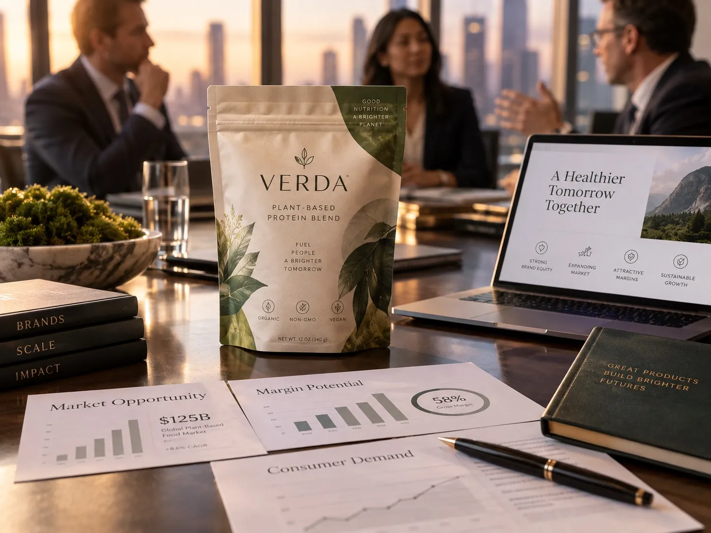
A designer opens a file, sets the artboard to the size of one front panel, fills the screen with it, and works. The client reviews that same panel, usually enlarged on a monitor or presented on a clean white slide with a drop shadow. Everybody involved spends weeks looking at the product completely alone, at a size it will never actually appear, against a background it will never actually sit on.
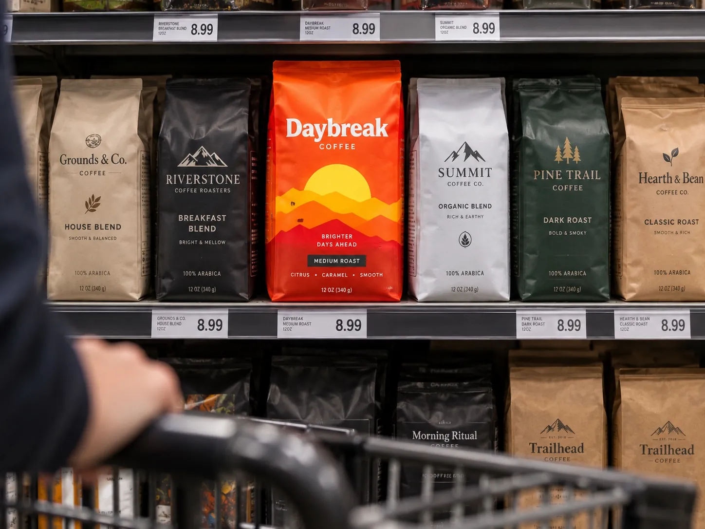
Then the product ships and enters a store. Now it is one unit among forty in a four foot section, at eye level if you are lucky, under lighting nobody chose, next to a competitor whose color happens to fight yours. The shopper is walking, not standing. They are holding a phone or a basket or a child. They give the whole section a few seconds before deciding where to look more closely.
That gap between how packaging is made and how it is encountered is the single most common reason a good looking package underperforms. Nothing is wrong with the file. The file was judged in a context that does not exist. Shelf presence is simply the habit of judging it in the context that does.
The shelf changes the scale of everything
At six feet away, the shopper is not reading. They are sorting shapes and colors. Large forms, dominant color fields and the biggest two or three typographic elements are the only things doing work at that distance. The elegant secondary line, the small icon row, the carefully set ingredient callout: none of it is participating in the decision to approach.
This is why I print at real size early and often. On a monitor at two hundred percent, a delicate serif looks refined. Printed at actual size and viewed from across a room, it can turn into a gray smudge. A subtle tonal shift between the brand color and the background can vanish completely under store lighting. These are not opinions. You see them immediately the moment the artwork exists as a physical object at its true dimensions.
The correction is usually about proportion rather than volume. Make the important element bigger relative to its neighbors, not bigger in absolute terms. Increase the contrast between the primary color field and everything sitting on it. Give the largest word enough clear space that it reads as a shape. Those moves preserve the character of the design while making it survive the distance it has to travel.
Contrast is relative, not absolute
A bright package does not stand out if every competitor is bright. A dark package does not automatically feel premium if the entire category has already gone black with gold foil. Contrast is a relationship between your product and the ones beside it, which means it cannot be evaluated from a file. It can only be evaluated from the aisle.
Before I design a line, I want photographs of the actual shelf, or at least a composite of the real competitors at real proportions. What color owns the category? Where is the white space, if any? Is everything horizontal, so vertical would read as different? Are all the competitors using photography, so illustration would break the pattern? The answers tell you where to align, so shoppers know what kind of product this is, and where to break, so they notice yours.
Both moves are necessary. Align everywhere and you become invisible, indistinguishable from private label. Break everywhere and shoppers cannot categorize the product at all, which is worse, because a package that nobody can classify does not get considered. The skill is choosing one or two places to be different and being disciplined everywhere else. Several of the ways this goes wrong are collected in seven packaging mistakes that make products look cheap.
Multiple facings build a brand block
A package is almost never seen once. It is seen as a repeated unit: three facings of the same SKU, or five variants sitting side by side. That repetition is the biggest source of visual presence available to most brands, and it is routinely wasted because each variant was designed to look good alone rather than as part of a wall.
The block is built by whatever stays constant across the line. A shared color field, a consistent band across the top, the same silhouette, a repeating pattern that tiles when units sit next to each other. PyurX Premium Castile Soap is a three scent system, and the interesting design question in a case like that is never how to make one bottle attractive. It is what the three bottles do together, and how the answer still works when a fourth scent arrives next year.
Line architecture becomes more demanding as the range grows. MaxTite Industrial Chemicals is a nine product label system, and at that count the structure has to do two jobs at once: hold the products together as one family, and let a buyer find the specific product they came for without reading every label. Getting that right is worth more shelf presence than any single decorative decision, because it multiplies across every unit on the fixture.
Recognition should happen before reading
The strongest packaging systems can be identified before the brand name is legible. A silhouette, a color split, a distinctive cap, a layout structure that is unlike its neighbors. The shopper does not consciously think any of this. They just find themselves looking in the right place, because the shape of the thing already told them what they were about to see.
This does not replace clear typography. It adds a second layer of recognition that operates at a distance where type has already failed. For a repeat buyer, it is the difference between scanning the section and going straight to the product. For a new buyer, it is what makes the product look like it belongs to a real brand rather than to a run of generic stock packaging with a name dropped on it.
Building that layer takes restraint, because it means committing to one or two ownable elements and repeating them long enough for them to become familiar. Most brands change too often for recognition to accumulate. The elements that make a package feel considered and worth its price are covered in the anatomy of premium packaging, and consistency is what converts those elements into recognition over time.
Shelf presence has an online equivalent
The same logic governs a marketplace grid, with the constraints turned up. Your package becomes a small square on a phone screen, in a row with competitors, often cropped to a square that ignores how the container is actually shaped. Everything that failed the six foot test in a store fails the thumbnail test online, and usually more severely.
There are differences worth respecting. Online the package can be rotated and zoomed if the shopper is interested enough, so secondary information has somewhere to live in the image carousel. But the first image has to earn that interest by itself, and it does that through exactly the qualities that create shelf presence: a strong silhouette, a dominant color, two or three words that survive at small size. The trade offs between the two contexts are worth working through deliberately, which is what designing for retail vs designing for ecommerce sets out to do.
Most brands now need both to work from one set of artwork, because printing two versions of a carton is rarely practical. That constraint is a useful discipline. A design that holds up at thumbnail size and at six feet is a design with clear hierarchy, and clear hierarchy is what you wanted anyway.
When standing out is the wrong goal
I want to be careful here, because shelf presence gets misread as a license to be aggressive. There are situations where the correct move is to look more like the category, not less. A new brand entering an established aisle has to be recognizable as a member of that aisle before it can be interesting, or shoppers will not even understand what they are looking at.
There is also the question of who is actually reaching for the product. In some categories the shopper arrives with a specific need and scans for a signal like a strength, a scent or a size. In that case presence means making that signal findable at a glance, not making the package dominate. A carton that shouts the brand and hides the variant will lose to a plainer competitor that puts the answer where the eye lands.
So the goal is not maximum distinction. The goal is enough distinction to be found, with enough familiarity to be understood, in the specific environment where this product competes. That balance is different in a club store than in a natural grocer, and different again in a salon or a hardware aisle. Decide which room you are designing for before you decide how far to push.
What the shelf does not forgive
Production reality is part of presence. A color that looks perfect on a calibrated screen can shift on uncoated stock or on a flexible pouch. A fine white line can fill in. A gradient can band. A varnish can flatten a color you were relying on for contrast. The package that appears on the shelf is the printed one, not the file, and the printed one is the only version customers will ever judge.
This is why press proofs and real substrate samples matter more than another round of revisions on screen. I would rather spend an extra week confirming how the ink behaves on the actual material than spend it nudging a layout that is already resolved. Once plates are made, the cost of being wrong is measured in reprints and in months of a product looking weaker than it should.
Structure matters here too. A pouch that will not stand up straight on a shelf loses presence no matter how good the artwork is. A carton that scuffs in transit arrives looking used. A shelf ready case that does not display well makes the product invisible until somebody stocks it by hand. These are unglamorous decisions, and they decide more about visibility than most of the aesthetic ones.
How to test your package before it prints
Print the front panel at exactly the right size, mount it on something with the right thickness, and set it up with five real competitors that you bought yourself. Not renders. Real products. Then step back six feet and photograph the group with your phone. What you see in that photograph is closer to the customer’s experience than anything you have looked at during the project so far.
Run three checks on that photo. Can you tell which product is yours without looking for it? Can you tell what it is? If it is one of several variants, can you tell which variant? If any answer is no, the problem is almost always hierarchy or contrast, and the fix is almost always to remove or shrink something rather than to enlarge everything. Then repeat the exercise at thumbnail size on a phone.
Last, look at the line rather than the unit. Put three facings of the same package side by side and see whether they build anything together, then put your variants in a row and ask whether they read as a family and still let someone find one specific item. If they do not, the architecture needs work before the graphics do, which is the part of a CPG packaging system that pays off every time the range grows.
Key points
- Packaging is judged in isolation during the project and encountered in a crowd at purchase, and that gap explains most underperforming designs.
- At shelf distance the shopper sorts shapes and color fields rather than reading, so hierarchy has to work before any type does.
- Contrast is a relationship with the products beside you, which means it can only be judged from the real aisle, not from a file.
- Repeated facings and a well built line architecture generate more presence than any single decorative decision on one panel.
- Standing out is not the goal by itself, because a package shoppers cannot categorize gets skipped even when it is noticed.
- Real size printed mockups, real competitors and a photograph from six feet away will expose problems no on screen review can find.