Seven Packaging Mistakes That Make Products Look Cheap
A product can be well made and still lose value when the package communicates the wrong level of quality.

What packaging mistakes make products look cheap?
Cheap looking packaging is rarely caused by one dramatic mistake. It is usually the accumulation of small decisions that together create a sense of low control: the type is slightly wrong, the claims compete with each other, the finish is trying too hard, the hierarchy feels improvised, the structure was chosen after the graphics. Customers almost never name these issues, but they respond to the impression the issues create. The seven problems worth watching are crowded front panels, decorative effects, weak typography, ignored structure, copying competitors, designing only on screen, and treating every SKU as a separate design.
Cheapness is cumulative, not catastrophic
In twenty five years of packaging work I have almost never seen a product look cheap because of one catastrophic error. It happens the way a room becomes messy. No single object is the problem. The accumulation is the problem. A package collects small compromises: a claim added late, a logo scaled up because someone asked, a finish chosen from a sample book without a reason, a back panel laid out by whoever had time.
This matters practically, because it changes how you fix things. If cheapness were caused by one error, you could find it and correct it. Since it is cumulative, fixing a single visible symptom often changes nothing. The owner replaces the photograph, looks at the new version and feels the same discomfort, because perceived quality lives in the relationship between all the decisions rather than in any one of them.
The customer experiences this as a general impression with no specific reason attached. They do not think the kerning is loose. They think it looks like a store brand. That translation from technical detail to overall judgment happens below the level of language, which is why asking customers what is wrong with a package rarely produces useful answers.
Trying to say everything on the front
The first mistake is the most common one, and it is driven by good intentions. Everyone inside the company knows why the product is worth buying, and everyone wants their reason on the front. Marketing wants the benefit. Regulatory wants the claim substantiated. The founder wants the origin story. Sales wants the certification badge. The front panel ends up carrying six messages at equal volume.
At equal volume, none of them are heard. A front panel has roughly one job at the moment a shopper’s eye crosses it: make the category obvious and give one reason to care. Everything else is supporting material and belongs on the side or the back, where an interested customer will actually read it. Hierarchy is not a style preference. It is the mechanism that lets a package be understood in the time it is given.
The test I use is simple and it is uncomfortable for teams. Cover everything except the largest element. Then reveal the second largest. Then the third. If a stranger can say what the product is and who it is for after the first two reveals, the hierarchy works. If they need the fourth or fifth element to make sense of it, the panel is a list, not a design. On the multi product label systems I have built, like the nine product MaxTite industrial line, that discipline is the only thing keeping a dense range legible.
Using effects to manufacture premium
The second mistake is reaching for finishes and effects to create a feeling the layout has not earned. Gold gradients, heavy drop shadows, foil on every element, bevels, decorative textures behind the type. Each of these can be excellent. Used to compensate, they broadcast exactly what they are trying to hide.
The reason is that premium materials read as premium only when they appear restrained and deliberate. Spot gloss on one element says a choice was made. Spot gloss on six says nobody chose. Foil around a small mark reads as confidence. Foil around everything reads as anxiety. The customer is not evaluating the finish in isolation, they are reading how much control the company appears to have, and covering a surface in effects is the visual equivalent of talking too fast.
There is a cost argument here too. Finishes are expensive per unit and they are the first thing a procurement conversation tries to remove. If the package only feels premium because of the foil, every future cost reduction attacks the brand directly. A design that holds its level through typography, proportion and structure survives that conversation. I have written about why that restraint is harder than it looks in why simplicity is expensive.
Typography and spacing give you away
Type is the fastest indicator of design quality, and it is the hardest thing to fake. A shopper who has never heard the word kerning can still tell that one package looks resolved and another does not. What they are reading is a set of small relationships: how the lines break, whether the spacing between blocks is consistent, whether the weights create a real hierarchy or just variety.
The specific failures repeat across categories. Two typefaces that are almost the same, so the contrast reads as a mistake rather than a decision. A line break that splits a phrase in the wrong place. Text centered in one block and flush left in the next with no reason. Margins that are generous at the top and cramped at the bottom because the content grew. A body size chosen to fit the copy rather than to be read.
None of these is visible on its own at arm’s length. Together they produce the impression of a package that was assembled rather than designed. The fix is mostly patience: set the type properly, fit the copy to the design instead of the design to the copy, and be willing to go back to the client and say that two sentences have to go. That conversation is where a lot of perceived value is won or lost.
The structure is part of the design
The fourth mistake is treating packaging as a graphic that gets applied to whatever container was already sourced. Proportion, closure, substrate, label shape and print method are design decisions with as much influence as the layout. A strong graphic on the wrong bottle still feels wrong, and no amount of layout work rescues it.
Structure carries information the graphics cannot. Weight in the hand suggests substance. A cap that turns smoothly suggests engineering. A pouch that stands straight on a shelf suggests a company that specified something. Customers pick products up, and what the object does in the hand adjusts the judgment their eye made a moment earlier. That is a channel most packaging projects leave unused.
The practical consequence is about sequence. Structure has long lead times and hard constraints, so it has to enter the conversation early, not after the graphics are approved. On product families like the Itallian Color and Oxi professional hair color packaging system, the box proportions, the tube format and the way the pieces sit together were part of the design problem from the beginning rather than a later procurement detail.
Copying the category too closely
The fifth mistake is borrowing so heavily from category leaders that the product becomes recognizable and replaceable at the same time. Some borrowing is necessary. Categories have codes, and a product that ignores all of them makes the shopper work to understand what it even is. Green for unscented, a certain shape for a certain kind of supplement, a specific layout for professional salon products.
The problem is volume. Borrow the color, the layout, the type style, the photography treatment and the naming convention, and you have built a package whose only distinguishing feature is the name. When a shopper cannot tell two products apart at a glance, they resolve the tie on price, and you have designed yourself into a discount.
The useful balance is to take enough category language to be understood instantly, then make one strong, ownable decision that nobody else in the aisle has made. It might be a structural format, a photographic point of view, a color that the category has avoided, or an illustration system. One clear decision is enough. This is the difference between fitting in and disappearing, and it is worth reading alongside why shelf presence matters.
Designing only at screen size
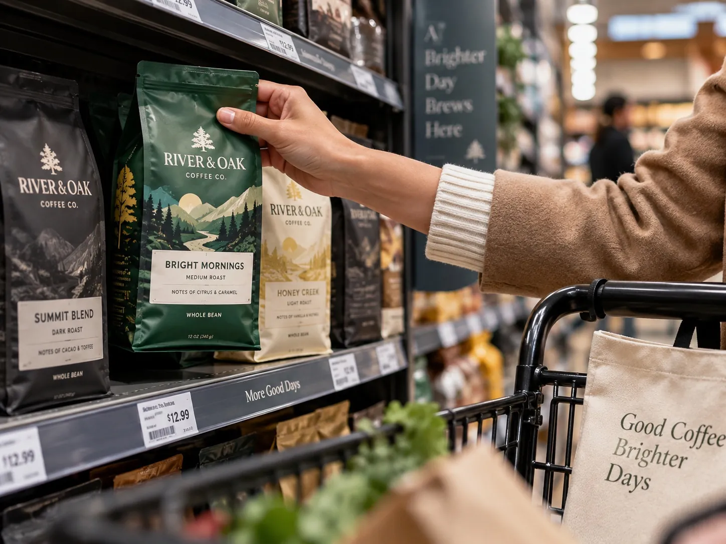
The sixth mistake has become more common as work has moved entirely onto monitors. A package viewed at four hundred percent on a large screen is a different object from a four inch box under retail lighting, seen from six feet away, at an angle, next to competitors, by someone who is not looking for it.
Details that felt refined at screen size disappear. Contrast that read as sophisticated becomes muddy. A thin weight that looked elegant vanishes. Meanwhile the elements you did not think about, the overall color mass and the silhouette, do most of the work at distance. Shelf reading happens in that order: color and shape first, then the brand block, then anything else if the shopper has stopped.
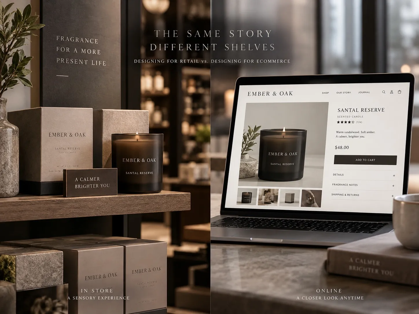
Ecommerce inverts some of this without removing it. The thumbnail on a marketplace listing is small and it is seen without competitors touching it, so silhouette matters less and legibility at tiny sizes matters more. Most products now live in both places, which means the package has to survive two different viewing conditions. I have laid out how those requirements differ in designing for retail versus designing for ecommerce.
Treating every SKU as a separate design
The seventh mistake shows up as a company grows. The first product gets real attention. The second is designed by adapting the first. The third is handled quickly because there is a deadline. By the sixth, the range looks like a group of unrelated products that happen to share a logo.
A line that looks unrelated reads as cheaper than the same products would individually, because the shopper can see that nobody is minding the whole. Architecture is what prevents it: a fixed structure for the brand block, a defined system for how flavor or variant is expressed, rules for which elements stay constant and which are allowed to change. Done well, the range becomes an asset. The shopper finds the variant they want faster, and the block of products holds more space on the shelf than any single package could.
This is the discipline behind multi scent and multi variant systems like the PyurX premium castile soap line and its three scents, where the job is to make the family obvious and the differences unmistakable at the same time. It also makes the next launch cheaper, because the eighth product is a decision inside an existing system rather than a new design project.
An audit you can run this week
Print your package at one hundred percent, trim it, and build it if you can. Stand it on a table with three competitors, two you consider above you and one below. Step back six feet and ask someone unfamiliar with the category which looks most expensive and why. Their first unprompted sentence is worth more than an hour of internal discussion, and it usually names the thing you have been avoiding.
Then run the reveal test on your front panel. Largest element, second, third. Stop when a stranger can say what it is and who it is for. Count how many elements it took. Anything past three is a candidate for the side panel. While you are there, list every claim and badge on the front and ask what specific doubt each one removes. The ones that remove nothing are costing you clarity.
Finally, line up every product you sell as a group, and look at the back panels next to each other. The front panels usually hold together better than the backs, because the backs get less attention. If the group looks like several companies, the architecture is the first thing to fix, ahead of any individual package. That structural work is the core of what I do in packaging design for consumer brands, and it is the change that makes every later launch easier.
Key points
- Products rarely look cheap for one reason, so fixing a single visible symptom usually does not change the overall impression.
- Packaging has to communicate quickly in the real context where the product is sold, at real size and real distance.
- Hierarchy on the front panel matters more than how many good arguments the company has.
- Finishes and effects read as premium only when they appear restrained and deliberate.
- Structure, substrate and print method are design decisions and have to enter the project early.
- A product line with a clear architecture looks more valuable than the same products designed one at a time.