Packaging Isn’t Decoration. It’s Sales.
The package is usually the only salesperson present at the exact moment someone decides what to buy.

How does packaging function as a sales tool?
Packaging works as a sales tool because it stands at the point where attention, understanding, trust and purchase all meet. In a store or on a marketplace listing, the package has to stop the right shopper, signal the category, explain what the product is and why it is different, make the price feel believable, and reduce the risk of a first purchase. No one is standing there to answer questions. Every panel, material and typographic decision either helps that sale happen or quietly gets in its way.
The step that gets treated as styling
In a lot of companies, packaging is the last item on the launch list. The formula is locked, the price is set, the retailer conversation has started, and now someone needs to pick colors, place the logo, fit the required copy and make it attractive. Treated that way, packaging is a finishing task, which is why it is so often given the shortest timeline and the smallest budget in the entire project.
I understand how it happens. Packaging looks like surface. You can see it, it has a pleasant quality to it, and unlike a supply agreement it seems like something anyone could have an opinion about. But the order of events matters. When the package is designed after every other decision is frozen, design can only decorate the choices, including the ones that will make the product hard to sell.
The alternative is not slower. It just moves a few questions earlier. What is this product for, who is it competing against on that shelf, what does the buyer need to understand in the first two seconds, and what does the price require the package to look like? Answer those while the structure and the range are still flexible, and design stops being the last coat of paint.
Where a package actually does its work
Almost everything else a brand makes reaches people at a distance from the decision. An ad is seen while they are thinking about something else. A website is visited days before or after. The package is different. It is present at the exact moment money is being decided, usually with no salesperson, no explanation and a competitor sitting two inches away offering the same benefit.
That is an unusual position for a company asset, and it is why I call the package the most consistent sales tool most consumer brands own. It works every hour the store is open. It travels home with the customer, sits in a cabinet and repeats the brand every morning. It gets photographed by people you will never meet. Nothing else in the marketing budget has that kind of presence for that kind of money.
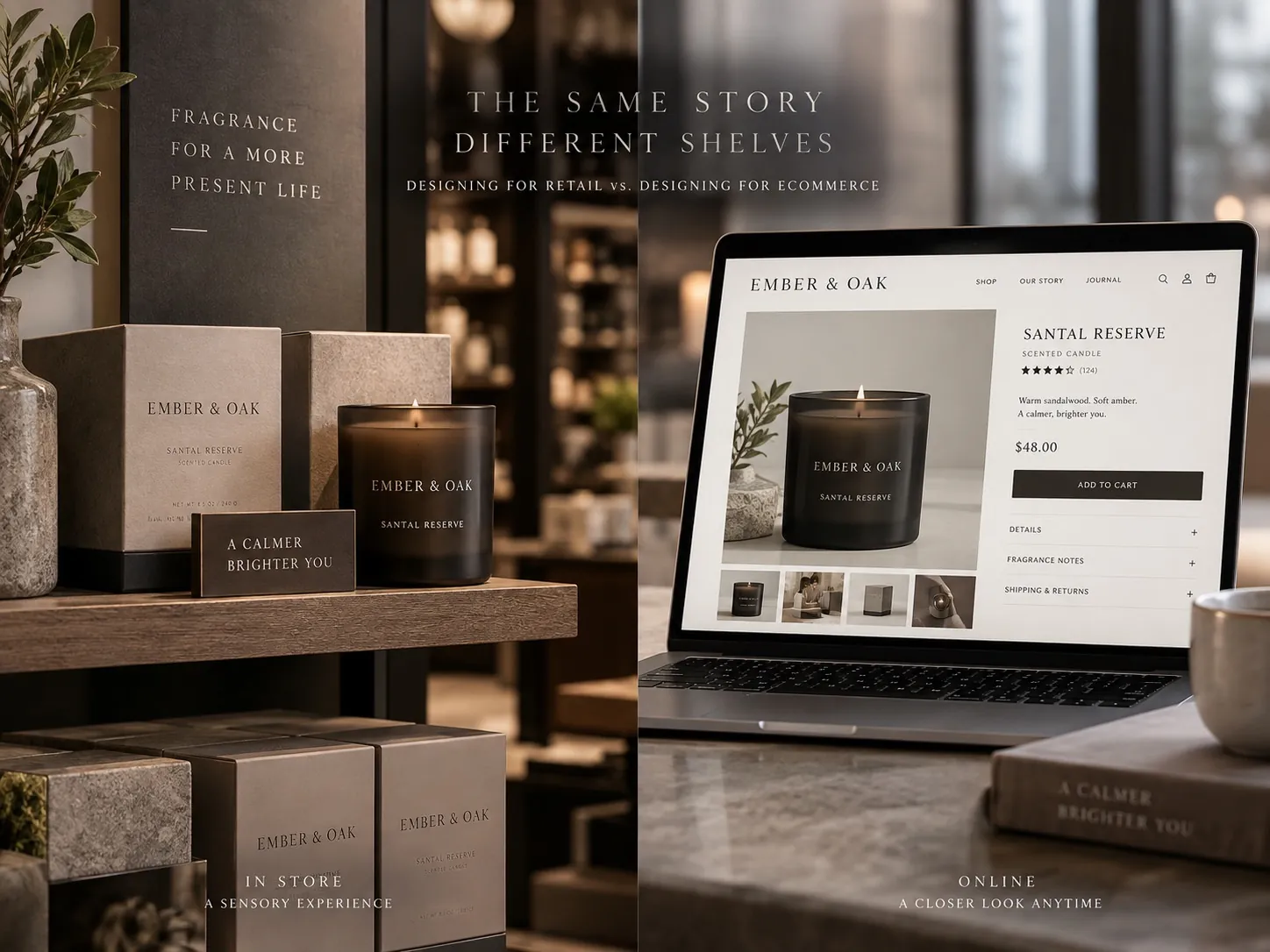
The context has changed over the years without changing the function. The same package now has to work as a physical object on a shelf and as a small image on a screen, often in the same week. Those are two different viewing conditions and they pull design in slightly different directions, which I take apart in designing for retail versus designing for ecommerce.
Stopping the right person, not everyone
Attention is not the goal. Attention from the wrong person is worthless, and it is easy to buy with a loud color and a strange shape. The real job is to be noticed quickly by the specific shopper the product is for, which means the package has to broadcast its category and its position before anything else registers.
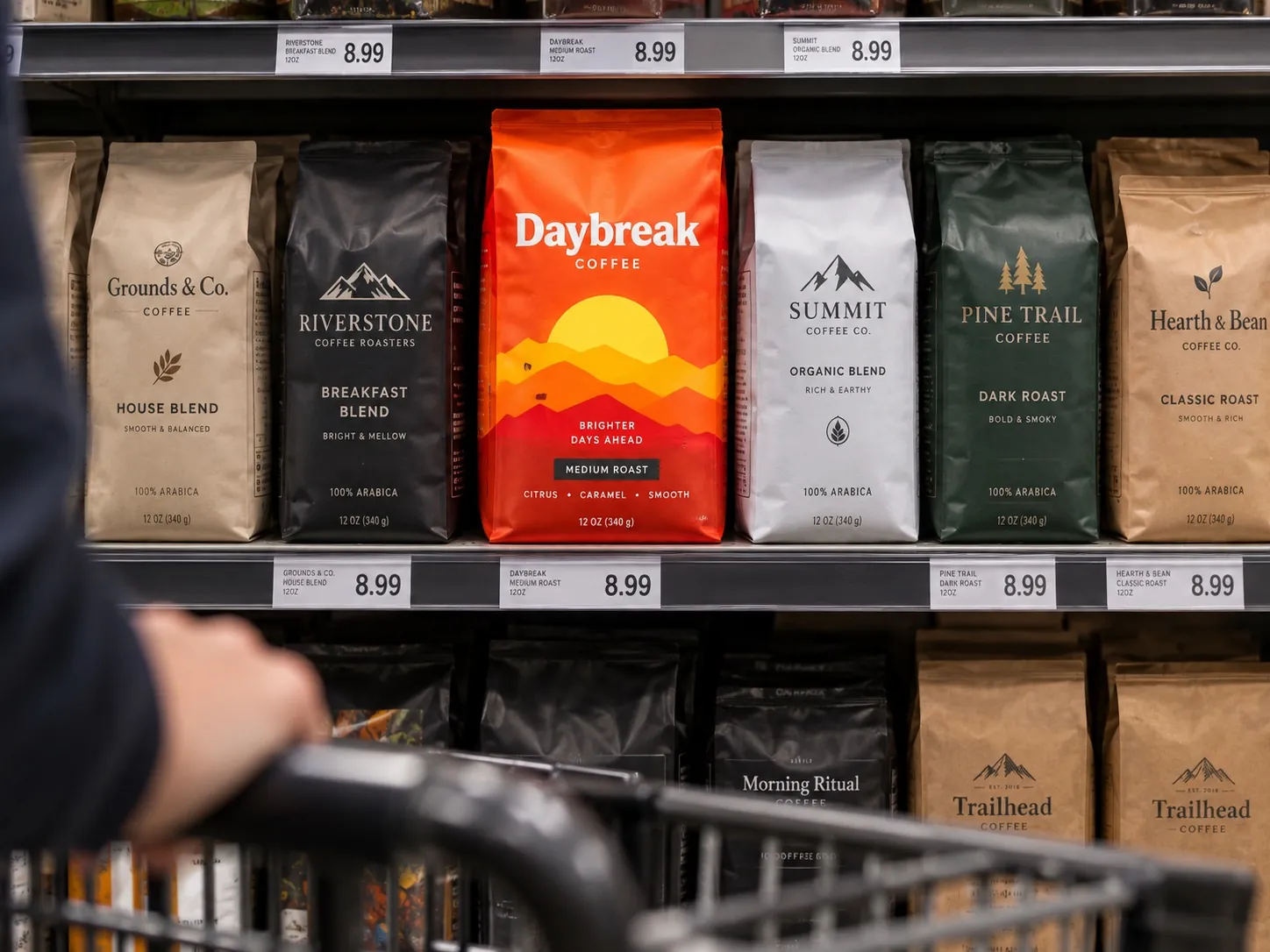
Category signals are the ones people underestimate. A shopper scanning a shelf is not reading. They are filtering, using shape, color territory, material and structure to decide what a thing even is. Stray too far from the category and you become invisible in a different way: people cannot classify the product, so they skip it. The task is to look unmistakably like the category and unmistakably unlike the competitors inside it, which is a narrower opening than most briefs assume.
Position works the same way. The shopper is placing your product on a ladder within seconds. When I designed the dog treat line for Winni Treats, the visible decisions were about which shelf neighborhood it belonged to and how the range read as a family, not about making one package as eye catching as possible in isolation. A single striking package that does not tell the shopper who it is for has not done its job.
Explaining the offer without a founder present
Customers should not need someone standing beside the shelf. Everything the founder would say in ten seconds has to be built into the hierarchy of the front panel: what this is, who it is for, why it is different, and what to read next if they are interested. When that hierarchy is unclear, people do not work harder. They put the box down, and no one records that as a lost sale.
Hierarchy is the skill that separates a designed package from a decorated one. It means deciding what is first, second and third, and being willing to make the third thing small or remove it entirely. Almost every package I am asked to fix is carrying four things fighting to be the most important element, usually because four people each won an argument. The result reads as noise, and noise is a comprehension problem before it is an aesthetic one.
This gets harder as a range grows. When a supplement brand adds its fourth flavor, the front panel now has to communicate brand, product, variant and benefit at once. The system has to say what stays fixed so the family is recognizable, and what varies so the flavors separate at arm’s length. Getting that architecture right is the core of packaging work for consumer goods lines, and it is much cheaper to decide before the second flavor than after the sixth.
Making the price believable
Price is never read in isolation. It is read against the frame the package has already established, and that frame is set before anyone looks at the number. Thin material, crowded typography, a photograph that has been resized too many times: these tell a shopper what tier the product belongs to, and the price is then judged as correct or greedy on that basis.
This cuts both ways, which is the part clients sometimes miss. A package that looks more expensive than the price suggests can create suspicion instead of a bargain feeling, particularly in categories where people associate a low price with a shortcut somewhere. The goal is not maximum polish. It is agreement between what the package promises and what the number asks, so neither one has to be explained away.
The materials carry more of this than the graphics do. Substrate, finish, closure quality, the weight of a cap, whether a pouch stands straight on a shelf: those register in the hand and the eye before any claim is read. I go through the specifics in the anatomy of premium packaging, and the short version is that the details people cannot name are the ones doing the most work on price perception.
Reducing the risk of a first purchase
Before trial, every customer is making a prediction. They are guessing whether the product will work, whether the company is real, whether the thing will arrive intact and whether they will regret it. Nothing on the package can prove the product is good. What it can do is make the prediction feel safer, which is often the actual difference between the sale and the hesitation.
The signals are ordinary and cumulative. Clean printing. Text that lines up. Claims stated plainly rather than shouted. Ingredients and directions that are easy to find and easy to read. A back panel that answers the questions a careful person would ask instead of repeating the front. A code, a batch number, a real address. None of these are exciting. All of them say a company that pays attention made this.
The reverse is just as cumulative, and it is why sloppy execution costs more than it looks like it should. One misaligned element is nothing. A crooked seal, a typo in the directions, a color that shifted between runs and a barcode crowding the copy add up to a general impression of carelessness, and shoppers transfer that impression straight onto the product inside.
Every surface has a job
The front panel sets the first hierarchy and wins or loses the glance. The side and back panels are where uncertainty gets resolved, which makes them the part most worth spending time on once the front is right. The structure decides whether the product feels considered when it is picked up. The opening experience, in a category where people film it, is the last chance to confirm the price was justified.
Treating those as one system is what turns a package into a selling asset instead of a decorated container. In practice that means the back panel is written and designed with the same seriousness as the front, the variants are planned together rather than one at a time, and the dieline is part of the creative thinking rather than a template handed over at the end.
It also means designing for the states people actually see. A package is rarely viewed alone. It is viewed in a row of six of its own siblings, next to three competitors, under store lighting, at an angle, sometimes behind a shelf rail that cuts off the bottom inch. Designs that only look right centered on a white background have been evaluated in conditions that do not exist.
What to test on your own package this week
Do the shelf test properly. Print the front panel at actual size, put it in a row with the three competitors it will genuinely sit beside, step back six feet and look for two seconds. Then ask someone who has never seen it what the product is, who it is for and roughly what it costs. If they hesitate on any of those three, the problem is hierarchy, and no amount of new artwork will fix it.
Then do the thumbnail test. Shrink the same front panel to the size of a marketplace listing on a phone. Whatever survives at that size is what your package actually communicates online. Most packages lose the variant name first, which is exactly the information a returning customer needs to buy the right one without thinking.
Finally, read your own back panel out loud as if you were a cautious first time buyer. Note every question you would still have afterward. Those unanswered questions are where the package is currently leaving sales on the table, and rewriting that panel is usually the fastest improvement available, ahead of any redesign of the front.
Key points
- The package is present at the moment of decision, which makes it the most consistent sales tool most consumer brands own.
- Attention only counts when it comes from the right shopper, so category and position have to register before anything else.
- Unclear hierarchy is a conversion problem, because confused shoppers put the product down instead of asking a question.
- Materials, structure and print quality set the frame in which the price is judged, often before a claim is read.
- Back panels, dielines and the opening experience are part of the selling system, not leftovers after the front is approved.
- Testing at actual size in a real competitive row, and again as a phone thumbnail, reveals most packaging problems for free.