Designing for Retail vs Designing for Ecommerce
The same package has to perform in two very different environments, and optimizing for only one can create problems in the other.

How should packaging design differ for retail and ecommerce?
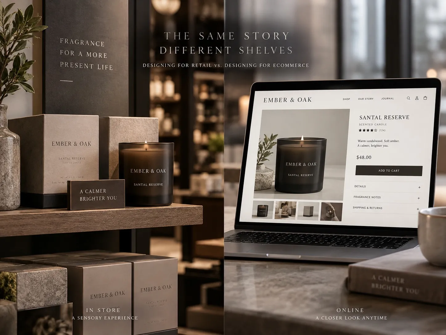
Retail and ecommerce reward different strengths. On a shelf the package competes physically at distance, so silhouette, color blocking and large hierarchy decide whether it is seen at all. Online it first appears as a small thumbnail in a grid, so the brand, product type and main benefit have to survive heavy reduction, and the listing photography becomes part of the packaging system. The answer is not two unrelated designs. It is one system with rules flexible enough to lead with different elements in each context while still reading as the same brand.
Two environments, one package
Most packaging now has to work in two places that have almost nothing in common. In a store, the product is a physical object among other physical objects, seen from a distance, under lighting nobody chose, by a person who is walking. Online, the same product is a small rectangle in a grid of small rectangles, seen on a phone, by a person who is scrolling and comparing prices at the same time.
Those environments do not reward the same qualities. Retail rewards presence: something the eye can find before it can read. Ecommerce rewards resolution at small size: something that stays legible when the image is a few hundred pixels wide. A design can be excellent at one and quietly useless at the other, and most brands only discover this after the print run.
The common mistake is to treat one channel as the real one and the other as a copy. Brands that grew up in retail design for the shelf and photograph the result afterward. Brands that grew up online design for the thumbnail and are surprised when the physical product feels thin in the hand. Both are optimizing for the channel they remember rather than the channel the next customer will use.
Retail is a distance and interruption problem
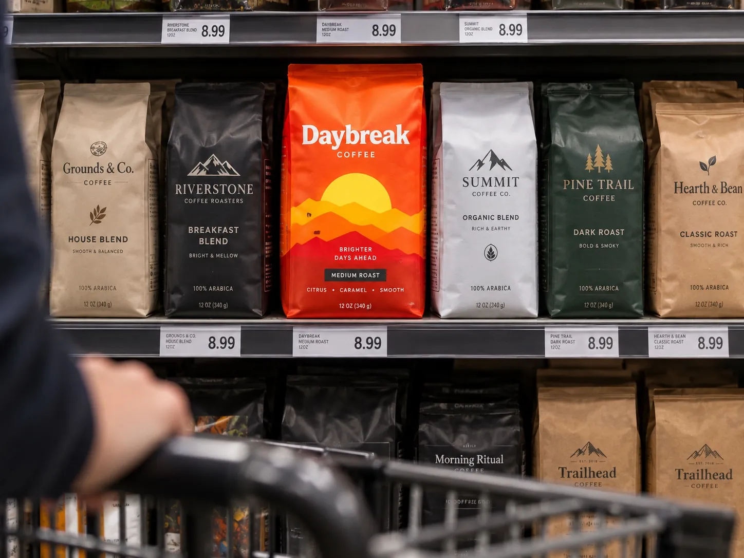
On a shelf the first job is interruption. Before anything is read, the package has to be noticed by peripheral vision belonging to someone who was not looking for you. That is a job for large shapes and strong color relationships, not for detail. Color blocking, the silhouette of the structure and the overall value contrast against neighbors are what pull the eye across an aisle.
The second job is placement. Within about a second of the eye landing, the shopper needs to know what category this is and roughly what tier it belongs to. Those cues are learned from the category itself, which is why breaking every convention tends to produce confusion rather than distinction. A product that cannot be filed gets skipped, and nobody reports the things they walked past.
Fine detail only becomes useful after those two jobs are done. Secondary claims, ingredient callouts and typographic refinement are read at arm’s length or in the hand, not from six feet. Designing them first is backwards, and it is the most common way a package that looked beautiful in review disappears in a store, a failure I take apart in why great products still fail on the shelf.
Ecommerce is a reduction and comparison problem
Online the physics change completely. Nothing is interrupting anyone: the customer arrived with intent, typed a search and is now looking at a grid where every product is exactly the same size. Your package is not competing for attention against an aisle. It is competing for comprehension against nine near identical squares on a screen the size of a hand.
Reduction is brutal. At thumbnail size, small claims vanish, subtle embossing vanishes, careful secondary typography vanishes, and any distinction that depended on texture is gone. What survives is the dominant color, the overall shape, the brand name if it is large enough, and perhaps one word. If your differentiation lives anywhere else, it does not exist at the moment of the click.
Comparison changes the emphasis too. In a store, being different is enough to get noticed. In a grid, the customer is actively sorting, so the package has to make the sorting easy: what type of product, which variant, what size, what strength. An energy powder in single serve sticks, for example, has to communicate format at a glance, because format is often the specific thing the shopper is filtering for.
The listing image is part of packaging
Online, the first package the customer sees is a photograph. That makes photography a component of the packaging system rather than something that happens after the design is finished. If the hero image is dim, inconsistently cropped or shot at an angle that hides the front panel, the package has been redesigned by whoever took the picture.
I treat the listing image set as a designed sequence. The hero shot establishes what it is and reads at thumbnail size. Subsequent images do the job that the back panel does in a store: the facts, the directions, the scale reference, the comparison between variants. Scale reference matters more than people expect, because online nobody can judge size, and a product arriving smaller than imagined generates returns and bad reviews that have nothing to do with quality.
Consistency across the set matters as much as quality. A range shot on different days with different lighting looks like several brands sharing a shelf. On a multi product line like the MaxTite industrial label system, the value comes from every unit obeying the same rules, and the photography has to preserve that rather than undo it.
Handling creates a sequence screens must rebuild
In a store the customer can pick the package up, turn it and read the back. That physical act creates a natural sequence of information: front panel earns the pickup, side panel answers the second question, back panel carries the detail. Designers can rely on that sequence, which is what allows a front panel to stay disciplined.
Online that sequence does not exist unless it is deliberately rebuilt. The customer cannot turn the box, so everything the back panel would have told them has to appear in the image gallery, the bullet section and the description. Brands that simply upload a front shot and a paragraph have removed two thirds of their own argument without noticing.
There is a useful discipline here. Write down the questions the back panel answers, then check that each one is answered somewhere on the product page, in an order that matches how a customer would ask them. This costs nothing, requires no redesign and usually reveals two or three questions that are currently answered nowhere at all.
Shipping and unboxing belong to the product
Retail packaging ends at the shelf edge. Ecommerce packaging keeps going, through a shipping box, a mailer, filler material and a moment of arrival at a kitchen counter. That moment is the first physical contact with the brand, and it either confirms what the product page promised or contradicts it.
Contradiction is expensive. A premium item that arrives crushed inside an oversized plain box, buried in filler, has undone the entire visual argument that persuaded the customer to buy. No product page fixes that impression afterward, because the customer now has evidence and the page only had claims. Protection is not a logistics detail, it is a brand decision with a logistics cost.
That does not mean elaborate unboxing theater for every category. A soap refill does not need a ribbon. It does mean matching the arrival experience to the positioning: right sized box, minimal loose filler, something intentional on the inside surface if the price point supports it, and a primary package that is still square when it lands. What deserves investment and what does not is part of what I mean by the anatomy of premium packaging.
Where the two channels genuinely conflict
Most retail and ecommerce requirements coexist, but a few really do pull against each other, and pretending otherwise leads to muddy compromises. Density is the main one. A shelf shopper who has already picked the product up can absorb more information than a thumbnail can carry, so what serves the aisle can clutter the grid.
Structure creates a second conflict. Shapes that own space on a shelf, tall bottles, unusual silhouettes, generous cartons, are often expensive and fragile to ship. A structure that is cheap and safe in transit may look unremarkable in a lineup. That is a real trade off with money on both sides, and the right answer depends on where the majority of volume actually comes from.
Finish creates a third. Soft touch coatings, foils and embossing are persuasive in the hand and close to invisible in a photograph, sometimes worse than invisible because reflective finishes are difficult to light. If most of your sales happen online, spending heavily on a finish that only exists in the hand is a choice you should make consciously rather than by habit.
One system, two sets of priorities
The solution is not two identities. It is one set of rules with a defined order of importance that can shift by context. Decide which elements are fixed everywhere: the mark, the color logic, the type family, the position of the product type. Then decide which elements are allowed to change scale or drop out entirely when the context shrinks.
In practice this means designing the thumbnail version and the shelf version together rather than deriving one from the other. Draw the front panel, then immediately reduce it to the size of a search result and see what is left. If what remains does not identify the brand and the product, the hierarchy needs rebuilding before anyone discusses the details. A line like Winni Treats has to read as one family in a store aisle and as one family in a grid of pet products, and those two checks happen at the same desk on the same day.
Variants make this sharper. Most brands do not stay at one product, and the rules that separate flavors, strengths or scents have to work at both sizes. A color difference that is obvious on a shelf can be indistinguishable in a thumbnail, and a variant name that reads in the hand can be unreadable at small size. Deciding the differentiation system early is much cheaper than retrofitting it at the fourth product, which is a large part of what professional packaging design is actually buying.
What to test in both channels this week
Do the two extremes on the same afternoon. Print your front panel at actual size, put it beside printed fronts of three competitors, and look at the group from six feet. Then take the same artwork, scale it to about the size it appears in a search result on a phone, and put it in a row with the same three competitors. Note what you can identify in each test. The gap between the two lists is your brief.
Next, open your own product page as a stranger. Time how long it takes to find the size, the count, the directions and the one fact that most often causes a return in your category. If any of those takes more than a few seconds, the back panel information has not been rebuilt online, and that is a copy and image fix rather than a design project.
Finally, order your own product and pay attention to the arrival. Note the box size relative to the item, how much filler was needed, whether the primary package is still square, and what the first thing you see is when the flap opens. Write down what you would change and what it would cost. In my experience that list is short, inexpensive and has more effect on repeat purchase than most of the changes a brand is currently debating, and it also tells you whether your shelf presence and your screen presence are still describing the same company, which is the underlying argument in why shelf presence matters.
Key points
- Retail rewards interruption at distance while ecommerce rewards comprehension at thumbnail size, and a package can excel at one while failing the other.
- Online the listing photography is part of the packaging system, because the first package a customer sees is an image rather than an object.
- The information sequence that physical handling creates has to be deliberately rebuilt through the image gallery and product page copy.
- Shipping and arrival are part of the ecommerce package, and a crushed or oversized box contradicts everything the product page promised.
- Structure, density and special finishes are where the two channels genuinely conflict, so those trade offs should be decided by where the volume is.
- One rule system with a context dependent order of priority beats two separate designs, especially once a range grows past its first product.