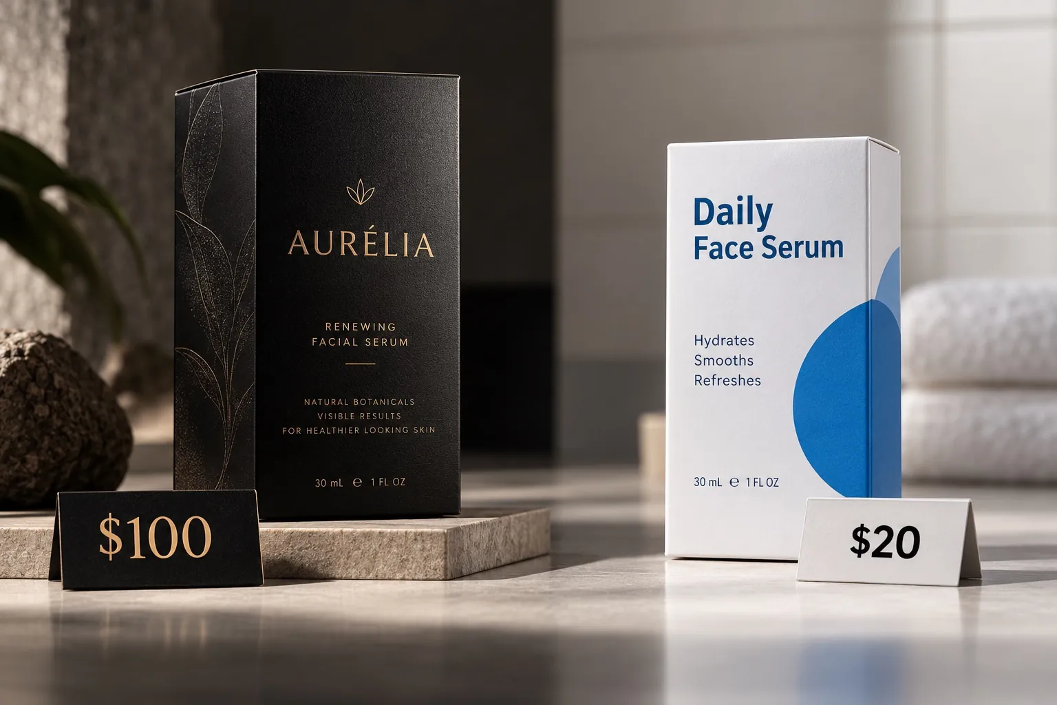
Why Great Products Still Fail on the Shelf
Retail does not reward hidden quality. It rewards products that communicate quickly enough to be chosen.

Why can a good product fail at retail?
Founders know what is inside their products. Shoppers do not. A shelf is a fast, crowded, distracted environment where the package has to identify the category, signal what makes the product different and create enough confidence to earn a closer look. Quality that cannot be seen cannot influence the first decision, so a genuinely better product can lose to a weaker one that communicates faster. Retail failure is usually a communication failure, not a product failure, and it is fixable once you judge the package in the conditions where it actually competes.
The gap between founder and shopper
A founder carries years of context. They know which supplier they switched to, why the formula costs more, what the first version got wrong and how many samples it took to fix. All of that is real. None of it is visible on a shelf. The customer arrives with none of that history and about two seconds of attention, and they make a decision using only what the package manages to transmit in that window.
This gap is the single most common reason I see strong products underperform in stores. The team is not wrong about the product. They are wrong about how much of it the package is carrying. Internally, the packaging is reviewed by people who already know the answer, so ambiguity reads as elegance and a vague benefit line reads as confident. A stranger reads the same panel and gets nothing they can act on.
The fix is not to explain more. It is to decide what the package has to prove in the first moment and to let that decision govern the layout. Everything a customer cannot verify in the aisle has to be inferred from what they can see, which is why the perception of value is doing real commercial work rather than decorative work.
The shelf is a distance test
Packaging is almost always approved on a large screen, at high resolution, with the file centered and nothing next to it. In a store the first judgment happens from several feet away, often while the shopper is still walking, with competitors on either side and a light source that was not designed to flatter anything. Those are completely different viewing conditions, and a design can pass one and fail the other.
At distance, fine detail does not exist. What survives is silhouette, dominant color, the shape of the color blocking and one or two large elements. If the brand name and the product type do not read at that scale, the package is not yet in the competition. It is visual texture that the eye passes over on the way to something it can resolve.
I test this crudely and early. Print the comp at actual size, stick it on a wall, walk backward and note the point where you stop being able to name the product. Then do it again with three competitors beside it. Most packages fail this before the details anyone argued about in review ever become legible, and that failure is invisible in a presentation deck.
Too much information hides the important information
Every claim on a package got there because someone inside the company believed it mattered, and internally each one is defensible. The problem is cumulative. Add eight defensible claims to one panel and you have not made eight arguments, you have made none, because nothing has priority and the eye has nowhere to land first.
Attention is sequential. A shopper reads one thing, then decides whether to read another. The package controls that sequence through size, contrast, position and spacing, or it fails to control it and the sequence becomes accidental. A front panel with a clear first message, a clear second message and everything else demoted will outperform a denser panel almost every time, even when the denser panel contains more true and useful information.
Deciding what loses is the hard part, and it is usually a business decision rather than a design one. Someone has to say which single idea a stranger should leave with. Once that is settled, the layout resolves quickly. Until it is settled, every review meeting will reopen the same argument and the panel will get slightly more crowded each round.
Category cues are the price of being understood
Standing out and being understood are different goals, and they can pull against each other. Customers navigate a store using learned cues: the shape a coffee bag takes, the way a supplement carton states its strength, the color conventions that separate hot sauce heat levels. Those cues are how a shopper decides, before conscious thought, what kind of thing they are looking at.
A package that breaks every convention is not automatically distinctive. It is often just unplaced. The shopper cannot file it, so they move on, and the brand never learns that this happened because nobody reports the products they walked past. I would rather hold the category cues that establish what the product is and then differentiate hard on one or two dimensions that competitors are not using.
In practice that means deciding deliberately which conventions you keep and which you break, rather than breaking them by accident. Keep the cues that answer what is this and who is it for. Break the ones that only exist because everyone copied the category leader. That is a much more reliable way to look different than redesigning the parts that were doing navigational work.
Quality that cannot be seen cannot be priced
Customers form a price expectation before they evaluate the full product. They look at the package, form a rough sense of what tier this belongs to, and then read the price against that expectation. If the price is higher than the package suggested, the reaction is not admiration for hidden quality. It is suspicion that the brand is overcharging.
This is why superior ingredients, better manufacturing and real testing can fail to earn a premium. The evidence of that investment has to appear somewhere the customer can perceive it: in the substrate, the print quality, the typography, the closure, the way the carton squares up. Those things are read in the hand within about a second, and they are difficult to fake, which is exactly why customers trust them.
The mistake I see most often is spending the packaging budget in the wrong order. A brand will fund a decorative foil while leaving the back panel typography to whoever had the file open last, or choose a thinner board to protect margin on a product positioned as the careful option. The foil impresses for a moment. The board is felt every time someone picks the product up.
There is a fair objection here, and it deserves an answer. Better materials cost money per unit, forever, while a design fee is paid once. That is true, and it is why the decision belongs to whoever owns the margin rather than to me. What I can say is that the cost of looking one tier cheaper than you are is also paid forever, in the price you are able to hold and in the customers who never picked the product up. Both numbers are real, and only one of them appears on an invoice.
The package has to earn the second look
Retail decisions happen in stages, and each stage has a different job. At distance, the package has to be found. At arm’s length, it has to be understood. In the hand, it has to be believed. A design that only works at one of those stages loses customers at the other two, and it loses them quietly.
The second look is where most of the real persuasion happens, and it depends entirely on the first one succeeding. If the front panel earns a pickup, the customer will turn the package over and read more carefully than most brands expect. That is where ingredients, directions, quantity and the honest awkward facts belong, organized so a motivated reader finds them fast rather than shrunk until they stop interfering with the composition.
Treating the back panel as leftover space wastes the highest intent moment in the whole purchase. The person reading it is closer to buying than anyone else in the aisle. I would rather redesign the front around the legal copy than treat the legal copy as an obstacle, because the shopper holding the box is a shopper who has already said yes to the first question.
Where strong products usually lose
The pattern repeats across categories. A small brand with a genuinely better product designs packaging that reflects the founder’s taste, reviews it at 200 percent on a monitor, approves it, and then cannot understand why a mediocre competitor keeps outselling it. Nothing about the product is wrong. The package is simply not doing its job in the conditions where it is asked to work.
The second pattern is drift across a range. The first product gets careful attention. The fourth flavor is added in a hurry, with a slightly different type size and a color chosen because it was available, and suddenly the set does not read as a family. A shopper scanning a shelf sees assembled products rather than a manufactured line, and that inconsistency quietly reduces what the whole range appears to be worth.
The third is optimizing for one channel and assuming the other will take care of itself. A carton built for a well lit shelf can vanish as a thumbnail in a search grid, and a design tuned for thumbnails can look thin in the hand. Those are genuinely different problems, which is why I separate them in designing for retail versus designing for ecommerce rather than treating channel as a detail.
What to test on your shelf
Start with the distance test, because it is free and it is decisive. Print your front panel at actual size, put it next to printed fronts of your three closest competitors, and photograph the group with a phone from six or eight feet. Look at the photo, not the originals. If you cannot immediately tell which one is yours and what it is, you have found the problem and you have found it cheaply.
Next, count the claims on the front panel and rank them honestly. If two or more are competing for first place, you have a list rather than a hierarchy. Pick the one idea you want a stranger to leave with, demote everything else by a visible level, and move anything that does not support that idea to the back. Then check the same panel at thumbnail size on a phone, because most customers will meet the package there first even if they eventually buy it in a store.
Finally, audit the range rather than the hero. Line up every product you sell and look for the rules that should be holding across all of them: the position of the brand mark, the treatment of the variant name, the color logic, the type sizes. Where a rule breaks, write it down. Most of those are inexpensive corrections that do not require a redesign, and tightening them is usually the fastest available improvement to how the whole line performs. If the range has outgrown its current system, that is the moment to build a real one, which is the work I do in CPG packaging design, and it is also where the smaller execution failures I collect in seven packaging mistakes that make products look cheap tend to surface all at once.
Key points
- Founders judge packaging with context the shopper does not have, which hides the gap between what the product is and what the package communicates.
- Customers form a price expectation from the package before they evaluate the product, so invisible quality cannot earn a premium.
- At shelf distance only silhouette, color and one or two large elements survive, and details argued over in review are not yet legible.
- Category cues let a shopper place the product, so distinction works best when you break conventions deliberately rather than all of them at once.
- A package has three separate jobs at distance, at arm’s length and in the hand, and failing any one of them loses customers invisibly.
- Printing the front panel at actual size beside real competitors and viewing it from several feet is the cheapest diagnostic available.