Why Some Products Look Worth $100 and Others Look Worth $20
The price a customer accepts is shaped by everything they see before they ever read the number on the tag.

Why do some products look more expensive than others?
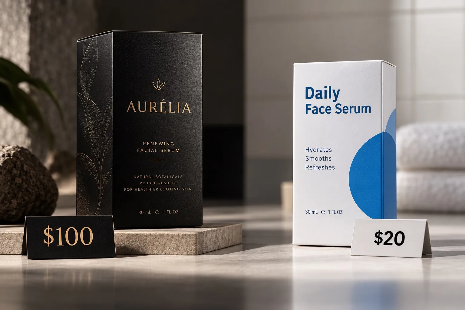
Two products can solve the same problem, use similar ingredients and come out of the same kind of factory, yet one sells comfortably at $100 while the other stalls at $20. The difference is usually not product quality. It is how value was communicated before the customer had any chance to experience the product. Typography, materials, naming, photography, structure and copy all form a context. The price is then judged against that context. When the signals agree with each other, the number feels believable. When they contradict each other, the same product looks overpriced.
The price was guessed before it was read
Almost nobody evaluates a price on its own. By the time a customer looks at the number, they have already seen the package, the cap, the label, the product photo, the name and the sentence describing what the thing does. Those inputs take a second or two to absorb, and they quietly set a range. The customer is not calculating. They are doing something closer to recognizing a category: this looks like a $19 product, this looks like a $90 one.
The price tag then gets compared against that private range. If it falls inside, nothing happens. The customer moves on to whether they want the thing. If the price sits above the range, they need a reason, and most of the time they will not go looking for it. They will assume the brand is charging what it can get away with, and they will move to the next option on the shelf or the next tile in the search results.
This is the part business owners underestimate. They think of pricing as a decision they make and communicate. In practice, the customer has already proposed a price before the brand names one. All the brand gets to do is either confirm that guess or argue with it. Confirming is cheap. Arguing is expensive, and it usually fails at the exact moment when the customer has the least patience.
What the signals actually are
When I say signals, I do not mean a mood or a vibe. I mean specific, physical, checkable decisions. The weight of the board in a folding carton. Whether the type on the back panel was set by someone who understood hierarchy or someone who was filling space. Whether the product photograph was lit for the product or just taken. Whether the name sounds like it belongs to the category it is competing in. Whether the cap closes with a sound that suggests engineering.
Each one on its own is small. Together they form a case. A customer who cannot inspect your supply chain, your sourcing or your quality control will read the things they can inspect and extend those judgments to the things they cannot. That extension is not irrational. It is the most reasonable inference available to someone who has thirty seconds and no other information.
The practical consequence is that value communication is distributed. It does not live in one hero element. It lives in the accumulation of decisions across the package, the listing, the site and the follow up. This is why I resist the request to make a product look premium by changing one thing. One thing rarely moves the range. Five coordinated things almost always do, and I have written more about how those decisions compound in the anatomy of premium packaging.
Premium is quieter than most brands expect
The instinct when a brand wants to look more expensive is to add. Add a foil. Add a second metallic. Add three more claims to the front panel. Add a badge, a seal, a starburst. The logic feels sound: more visible investment should read as more value. In practice it reads as effort, and effort is what brands display when they are worried the product will not carry itself.
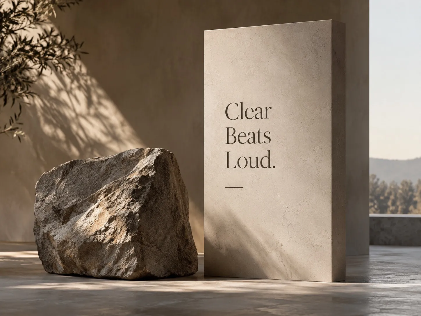
Look at the categories where high prices are normal and you tend to find restraint instead. Fewer messages competing for the same two seconds. Generous space that nobody filled. One clear promise, stated once, with the supporting information given a lower rank instead of an equal one. That restraint is not minimalism as a style choice. It is a signal of confidence. A brand that leaves space is telling you it does not need to convince you in a hurry.
There is a real trade off here and I want to be honest about it. Restraint assumes the customer will give you a moment of attention. In a crowded discount aisle, or in a marketplace grid where your product is one thumbnail among forty, quiet can become invisible. The answer is not to abandon restraint. It is to make the one loud thing genuinely loud: a distinctive silhouette, a color block nobody else owns, a shape that reads at a distance. Loud structure and quiet surface is usually a stronger combination than the reverse.
Details become evidence for things nobody can see
A customer will never see the meeting where you chose the better resin, or the batch you rejected, or the supplier you fired. Those decisions are invisible, and they are exactly the decisions that justify a higher price. So the customer substitutes. They look at what is in front of them and they treat it as a sample of your standards.
This is why a misaligned label costs more than the label. A cap that feels loose in the hand, a seam that does not line up, a back panel where the ingredient list runs into the disclaimer, a product page with one photo at the wrong resolution: each of these is read as a sample. If this is the part they let me see, what does the part I cannot see look like? That question is rarely asked out loud, but it is always being answered.
The inverse is also true, and it is the more useful half. When the visible details are controlled, customers extend credit to the invisible ones. They assume care. That assumption is what lets a higher price feel like a reflection of quality rather than a markup. Perceived quality is not decoration applied to a product. It is the legible part of real quality, and I have unpacked that distinction further in the hidden cost of looking cheap.
Where the $20 look actually comes from
In my experience the cheap look is almost never caused by a small budget. It is caused by accumulated compromise without a system. A brand launches with one product. The label is fine. Then a second flavor arrives and someone matches the color by eye. Then a retailer asks for a different size and the layout gets stretched to fit. Then a promotion adds a burst. Two years later there are six products that clearly came from the same company and just as clearly came from six different afternoons.
Nobody made a bad decision. Each individual choice was defensible under the pressure of that week. But the result is a product family with no visible rules, and a customer reading that family sees improvisation. Improvisation is what small, unstable operations look like. It is not that the customer thinks less of your ethics. They just assume you are newer, smaller and less proven than you are.
The second common cause is borrowed language. A brand looks at the category leader, absorbs the surface, and reproduces it slightly worse. A near copy of a strong brand always reads as the cheaper version of that brand, because that is what near copies are in every other part of life. You cannot price above a category by looking like a slightly degraded version of it. You price above a category by looking like you belong to a different conversation.
Consistency is what makes a price stick
A strong package can win the first purchase. It cannot hold a price on its own. After the shelf comes the product page, then the shipping box, then the instructions, then the email when something goes wrong. Each of those is another chance to confirm or contradict the range the customer originally guessed.
Contradictions are expensive because they force a decision. If the package feels considered and the packing slip looks like a spreadsheet printout, the customer has to work out which one represents the company. Most people resolve that by trusting the weaker signal, because the weaker signal feels less likely to have been staged. This is the uncomfortable asymmetry in brand work: the strongest touchpoint sets the expectation, and the weakest one sets the belief.
Consistency also compounds in the direction you want. A customer who meets the same character three times stops evaluating and starts recognizing. Recognition is what lets a brand raise a price later without renegotiating its whole case. The work of building that kind of coherence across a product family is the core of brand identity work, and it is why I push clients to define rules before they define the fourth SKU.
Perceived value is not a trick
I want to separate two things that get confused. There is making an ordinary product look expensive, which is a short trade. The customer buys once, the experience does not match the presentation, and you have spent your credibility to collect one sale. That is not what I am describing, and it does not survive contact with reviews.
What I am describing is the opposite failure, and it is far more common among good companies. A business genuinely invests: better ingredients, tighter tolerances, real service. Then it presents that investment through a brand built in a hurry three years ago. The customer is asked to pay for value they have no way to see. That is not humility. It is a tax the company pays on every transaction, and it usually shows up as discounting, longer sales cycles and a nagging sense that the market does not understand the product.
Perceived value, done honestly, is the discipline of making real quality legible. If the product is better, the brand has a job: show enough evidence that a stranger can believe it before they own it. If the product is not actually better, no amount of design will hold, and the right move is to fix the product first. I say that to clients regularly, and it is the same reason premium pricing starts long before the price tag.
What to audit this week
Start with a shelf test you can run in an hour. Put your product next to the two competitors you lose to most often, at the same distance a customer would stand, in ordinary light. Then ask three people who do not work for you to price all three from memory, without picking anything up. You are not looking for accuracy. You are looking for the range they assign you relative to the others. That gap is your real pricing problem, stated in one number.
Then run the same test online. Shrink your main product image to thumbnail size and put it in a row with the competitors as they appear in a search result. Most premium detail disappears at that size. What survives is silhouette, color and one word. If nothing of yours survives, no amount of back panel craft will rescue the listing, because the listing is where the decision to click gets made.
Finally, audit for contradictions rather than for beauty. Lay out every physical and digital thing a customer touches in order: ad, listing, package, unboxing, insert, receipt, support email. Find the weakest item in that sequence and fix it before you improve the strongest one. Raising the floor moves perceived value more than raising the ceiling, every time. If you want an outside read on where that floor sits, that is exactly the conversation I have at the start of most packaging design projects.
Key points
- Customers form a price expectation from visible signals before they ever evaluate the full product.
- Visual coherence reduces uncertainty, which is what makes a quality claim believable instead of merely stated.
- Premium perception usually comes from restraint and control, not from adding more finishes, badges and claims.
- The cheap look is normally caused by accumulated compromise without a system, not by a small budget.
- Perceived value across the whole experience is set by the weakest touchpoint, not the strongest one.
- Making real quality legible is honest work; making an ordinary product look expensive is a short trade that reviews will end.