Brands Don’t Need to Be Loud. They Need to Be Clear.
Volume is easy to copy and cancels itself out. Clarity is what turns a glance into understanding, and understanding into trust.

Why is brand clarity more important than visual loudness?
Loudness wins a glance. Clarity wins the decision that follows. A brand that shouts with bigger type, brighter color and more claims is competing on the same terms as every other brand in the category, so the shouting cancels out. Clarity works differently. It decides what the customer should read first, makes that message easy to understand, and gives everything else a place behind it. That is what turns attention into comprehension, comprehension into memory, and memory into trust. In most categories, being unmistakable beats being loud.
Loud is a tactic, not a strategy
There is a persistent assumption that a brand has to be loud to be noticed. Bigger type, brighter color, one more burst on the front panel, one more claim above the logo. I understand where it comes from. A client walks a store aisle, sees fifty products fighting for the same two seconds, and concludes that the only way to win is to fight harder. In some categories that reasoning holds. In most of the ones I work in, it produces a package that is busier than its competitors and no more visible.
Loudness is a relative measure. It only works when the neighbors are quiet. The moment every brand in the category adds a starburst, the starburst stops meaning anything and becomes background. I have watched this happen in supplements, in cleaning products, in pet care. A category starts with one aggressive package, the aggression spreads, and within a few years the whole shelf reads as a single loud wall that shoppers scan past. Volume is easy to copy. That is exactly why it stops working.
Clarity behaves differently under pressure. When a competitor becomes clearer, it does not make your clarity less effective. Two well organized packages sitting next to each other both remain readable. Clarity is not a zero sum resource the way attention is. That is the practical reason I push clients toward it. It is one of the few advantages in packaging that does not erode the moment somebody else decides to adopt it too.
Hierarchy is a decision someone has to make
Every composition tells the customer what to read first, whether the designer intended it or not. Size, contrast, position and spacing create an order. When everything on a front panel is large, bold and urgent, that order collapses and the customer has to build it themselves. Most of them will not bother. They will look at the package for a second, fail to find an entry point, and move to the next one that offers an easier read.
Good hierarchy makes that decision on the customer’s behalf. It identifies the single most important message, gives it real prominence, and puts supporting information in a clear second and third place. This is harder than it sounds, because it requires the client to say out loud what the most important message is. Often that conversation is the real work. When a founder tells me the flavor, the certification, the dosage and the founder story are all equally important, we do not have a design problem yet. We have a priority problem.
I ask a simple question in those meetings. If the shopper only reads one thing and then walks away, what should that one thing be? The answer is rarely the logo. For a new brand in a familiar category, it is usually what the product is. For an established brand adding a variant, it is usually which variant this is. Once that answer exists, the layout mostly resolves itself, because every other element now has a job that is clearly subordinate to it.
Why restraint reads as confidence
In a crowded environment, quiet becomes a form of contrast. White space, disciplined typography and a limited palette can attract attention precisely because everything nearby is straining. This is not a style preference on my part. It is a response to context. If the category code is saturated color and heavy type, a calm package is the one that looks different, and different is what the eye stops on long enough to process.
There is a second effect, and it has to do with how people read intent. A package that argues with the shopper, that piles on claims and exclamation points, tends to read as a brand worried about being chosen. A package that states what it is and then stops tends to read as a brand that expects to be chosen. Customers pick this up without being able to explain it. It is part of why restraint and price expectation are so closely linked, which I go into in why some products look worth $100 and others look worth $20.
Restraint only works when it is intentional. A package with a lot of empty space and nothing considered inside it does not read as premium. It reads as unfinished, or as a brand that ran out of budget. The difference between the two is precision. The type has to be right, the proportions have to be right, and the one color you kept has to be doing real work. Simplicity is expensive because there is nowhere for a weak decision to hide.
Clarity is what makes a brand memorable
People remember simple structures more easily than complicated ones. A distinctive name, a recognizable mark and a consistent visual language create a pattern the brain can file and retrieve later. A brand does not need a hundred memorable elements. It needs a small number of elements used with enough repetition to become familiar. That is the entire mechanism, and it is not complicated. What makes it hard in practice is the discipline of not adding.
I think about this every time a client asks for one more graphic device. Each addition dilutes the ones already there. If the brand is a color, a shape and a typeface, the shopper has three things to recognize. If it becomes a color, three shapes, two typefaces, a pattern and an illustration style, there is nothing stable left to hold on to. The elements compete with each other for the same limited space in memory. Fewer components, used more often, is almost always the stronger trade.
This is also why consistency matters more than novelty. A brand that changes its look every season asks customers to relearn it every season, so the work of recognition never compounds. I go deeper into which elements are worth repeating in what makes a brand memorable, but the short version is that memorability is built through subtraction and repetition rather than invention.
Clarity is a conversion issue online
On a marketplace listing, your package is a thumbnail. Maybe four hundred pixels wide, often less, sitting in a grid with eleven competitors. Everything I said about the shelf gets more severe. Small type disappears. Secondary claims disappear. What survives is the shape of the container, the dominant color field and the largest two or three words. If the design depends on anything smaller than that, online it does not exist at all.
Confusion also costs much less online than it does in a store. In a store, a shopper who is unsure might pick the package up and turn it over. On a screen, that same shopper closes the tab. There is no picking up. Every second of uncertainty is a second in which leaving is easier than understanding. That is the practical argument for clarity in ecommerce, and the differences between the two contexts are worth understanding before you commit to a layout, which is what designing for retail vs designing for ecommerce is about.
Clear branding is not minimalism as a style. It is the removal of friction from communication. Sometimes that means less on the panel. Sometimes it means more: a line of copy explaining what the product does, because the category is unfamiliar and the customer genuinely needs the help. The test is not how little is there. The test is whether a stranger understands what this is and who it is for.
What clarity looks like on a real panel
Take a supplement carton. Absorbable is a vitamin C 500mg package, and the hierarchy question there is typical of the category. The shopper needs to know the ingredient and the strength before anything else, because that is how people shop supplements. The brand name matters, but it matters second, since almost nobody walks into that aisle looking for a specific supplement brand they have never heard of before.
Once that order is set, the rest of the panel has a logic. The ingredient and the dose take the largest typographic position. The brand sits with enough presence to be recognized on a repeat purchase but not enough to crowd the thing people came for. Supporting claims, the ones that matter to a smaller group of shoppers, go where they can be found by someone already holding the box. Nothing has to shout, because everything is where the eye expects it to be.
The same logic applies in a completely different category. A dog treat package like Winni Treats starts from a different first question: what animal, what kind of treat, what size. The answers change, the method does not. Decide the order of the questions the customer is actually asking, then build the panel to answer them in that order. That is the difference between a package that is designed and one that is decorated.
Where loud actually earns its place
I want to be fair to the other side, because loud is not always wrong. There are categories where volume is the code, and refusing to speak the code makes a product look like it does not belong. Energy drinks, a lot of candy, seasonal impulse items, much of the club store aisle. In those environments, a quiet package can read as private label, or as something that wandered in from a different store entirely.
Even there, the useful version of loud is structured. High energy color and large type can coexist with a clear hierarchy. The question is never loud or quiet in the abstract. The question is whether the composition still tells the shopper what to read first. A loud package with hierarchy works fine. A loud package without it is a wall of noise with a logo hidden somewhere inside.
So the decision depends on the category, and the honest answer requires looking at that category before deciding anything. Walk the aisle. Photograph it. Study what the shelf already does with color and type and shape. Then choose deliberately where to align with the code and where to break it. Align everywhere and you disappear. Break everywhere and you become illegible.
Clarity has to survive the whole system
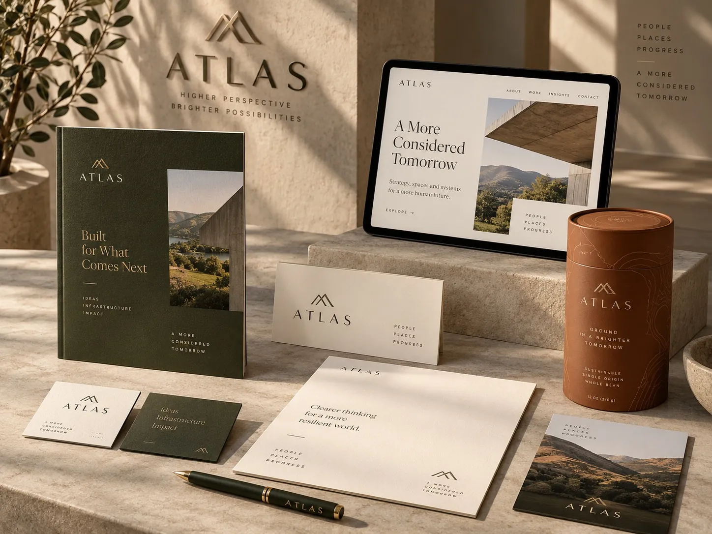
A clear package sitting next to an unclear website does not produce a clear brand. The customer moves between surfaces, and the impression is cumulative. If the carton is disciplined and the social grid is chaotic, the chaos is what gets remembered, because it arrives more often and in larger quantities. Clarity is a property of the system, not of any single file you approved.
That is why I build identities as rules rather than as artwork. Which typeface carries a headline, how large the logo sits relative to the type, when the accent color is allowed to appear, what a second product looks like standing beside the first. Those rules are what let three different people, working in three different tools, produce work that still looks like it came from the same company. A brand identity system is mostly a set of answers to questions like those.
Without them, clarity erodes quietly. A vendor picks a slightly different blue. A sales deck defaults to a system font. A new flavor gets a layout that does not match the first three. None of it is a disaster on its own. Together, over two years, it turns a clear brand into a vague one, and nobody can point to the moment it happened.
What to check on your brand this week
Print your front panel at real size and put it on a table with five competitors. Stand back six feet. Ask someone who does not work at your company what each product is. Not which one they like: what each one is. The packages that fail that test are not failing on taste. They are failing on hierarchy, and the fix is usually removing something rather than adding a new element to compensate.
Then do the same thing online. Screenshot your listing in the grid where it actually appears, at the size it actually appears, on a phone. Anything you cannot read at that size is decoration, not communication. Decide whether it deserves the space it occupies. Most brands find two or three elements that exist only because nobody ever questioned them.
Last, open the last ten things your company published: the website hero, a sales deck, an email, three social posts, a trade show banner, the newest label. Lay them side by side. If they look like they came from five different companies, your problem is not the logo. It is the absence of a system that tells everyone what stays fixed. If you want to see how that looks when it holds together, the finished work is the clearest illustration I can offer.
Key points
- Loudness is a relative advantage that disappears as soon as competitors copy it, while clarity keeps working no matter what the neighbors do.
- Hierarchy is a business decision before it is a design decision, because someone has to name the one message that matters most.
- A brand becomes memorable through a small number of elements repeated consistently, not through adding more distinctive parts.
- Online, anything that cannot be read in a thumbnail is decoration, so clarity matters even more in ecommerce than on a shelf.
- Loud can be correct in categories where volume is the code, but only when the loud composition still tells the shopper what to read first.
- Clarity is a property of the whole system, so it erodes quietly whenever vendors and internal teams improvise without rules.