Credibility Has a Visual Language.
People read visual cues long before they consciously explain why something feels credible.

What makes a brand look credible?
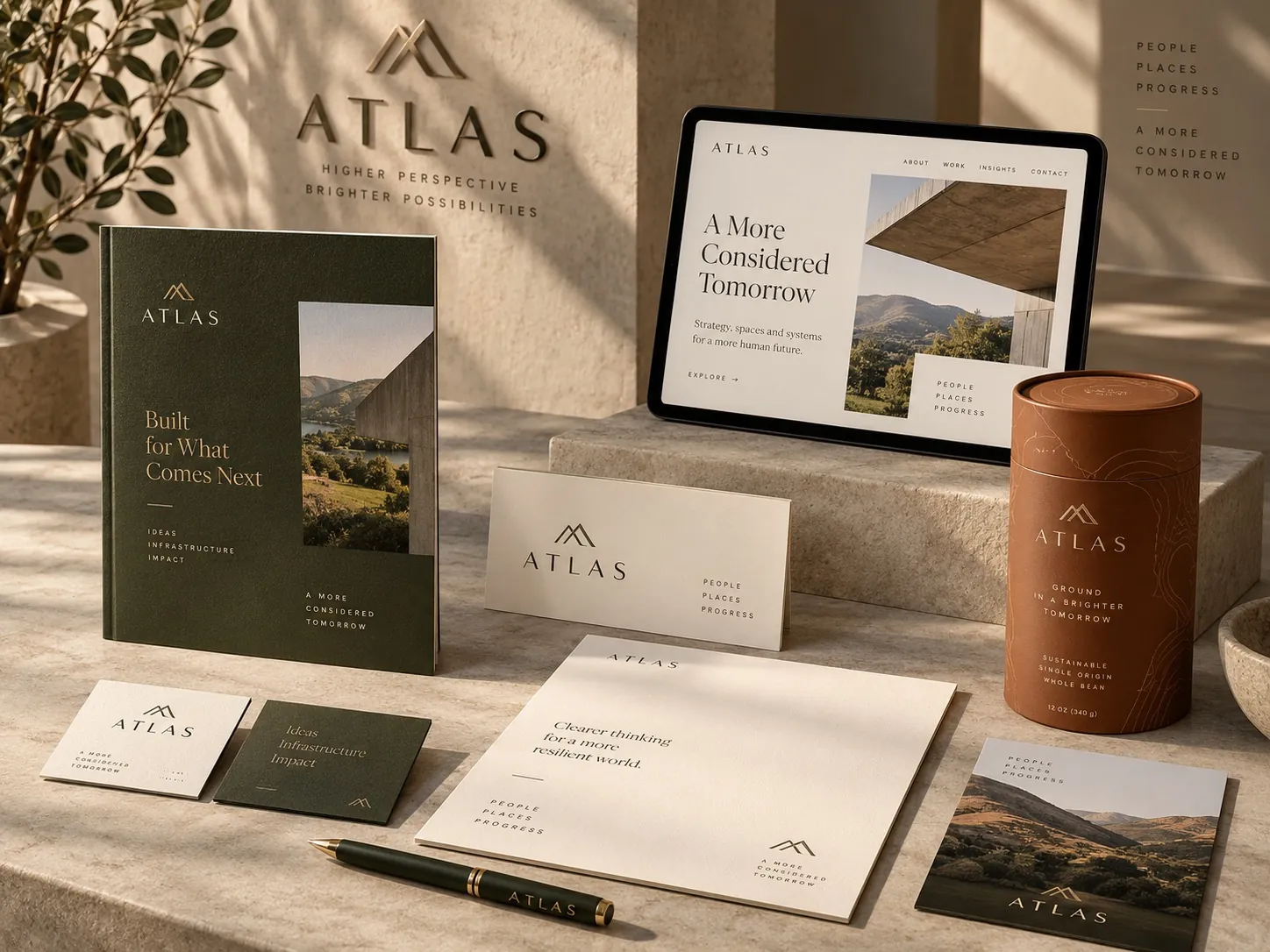
Credibility is read before it is argued. People interpret typography, hierarchy, imagery, color and consistency as signals of care, competence, maturity and relevance, usually without being able to name what convinced them. A credible brand looks like it made decisions: one message leads, the rest support, and the same visual logic repeats everywhere. The specific cues depend on context, because a law firm, a supplement brand and a robotics company should not look alike. What they share is precision, relevance and repetition, which together lower a stranger’s uncertainty before any claim has to carry the weight.
Credible is a feeling before a reason
Ask someone why a company looks trustworthy and you usually get something vague. It looks professional. It looks like they know what they are doing. That vagueness is not ignorance. It is what happens when a judgment is assembled from a dozen small cues that were never processed consciously in the first place.
The cues themselves are not mysterious. We spend our lives around printed material, packaging, signage and interfaces, and we absorb an enormous amount of pattern from them. We learn what a careless document looks like. We learn what a company that has been around a while looks like. By adulthood most people can sort visual material into rough tiers of seriousness in under a second, even in categories they know nothing about.
That speed is the commercial point. The judgment happens before your copy is read, before a salesperson speaks, before anyone visits a pricing page. The design is not decorating an argument that happens later. It is making the opening argument, which is why trust is designed before it is earned rather than being a reward for time served.
Typography sets tone before anything is read
Type communicates while it is still just shape. A serif with high contrast and tight spacing reads as institutional. A geometric sans reads as modern and slightly impersonal. A rounded sans reads as friendly and consumer facing. A condensed industrial face reads as utilitarian. None of these is better. They are different registers, and the reader is fluent in all of them without having studied any.
Problems appear when the register fights the claim. A company that positions itself as the careful, rigorous option and then sets everything in a playful face has created a small contradiction that the reader feels but does not articulate. The words say serious. The letters say casual. The reader resolves the conflict by trusting the visual signal, because the visual signal feels less like something they were told.
Craft matters as much as choice. Type that is set with awkward line breaks, inconsistent sizes, loose tracking in headlines or a body size chosen for the designer’s monitor rather than the reader’s eye reads as amateur regardless of how good the typeface is. On something like the Lane Law Office stationery system, most of the credibility sits in restraint and precision: a limited set of sizes, consistent margins, and nothing on the page that was not deliberate.
Hierarchy is evidence that someone decided
Credible communication has priorities. It tells you what matters first, what matters next and what can wait. That structure is doing something beyond convenience. It is proof that a person inside the company made a judgment about what their audience needs, and making judgments is exactly what competence looks like from the outside.
When everything competes at the same level, the reader senses an unresolved argument. Three headlines of equal weight usually mean three stakeholders who all won. A page with five equally prominent calls to action means nobody was willing to choose. The reader does not know any of that, but they feel the absence of a point of view and they discount accordingly.
Strong hierarchy is also generous. It lets a busy person stop reading at any moment and still leave with the main idea. A page that requires full attention to be understood is quietly asking for something most readers will not give. Designing so that the first ten percent of attention delivers the most important message is one of the most reliable ways to appear both confident and considerate.
Imagery has to be specific to be believed
Photography and illustration either make a business feel particular or make it feel interchangeable. Images of the actual product, the actual space, the actual work and the actual kind of customer function as evidence. They say this exists, we have done it, here is what it looks like. That is a different category of persuasion than a well composed picture of nobody in particular.
Generic stock imagery weakens credibility precisely because the reader has seen it elsewhere. The smiling team in the bright office appears on hundreds of sites in a dozen industries. It is not offensive, it is just empty, and empty imagery leaves the reader to fill the gap with whatever assumption they already had. A brand that shows nothing specific is asking to be judged on price.
Specific does not require a large budget. Honest photographs of real products at real scale, consistent lighting, a repeatable crop and restraint about how many images appear will outperform expensive but generic material. Environmental work makes this visible quickly: signage for a place like Copper Springs Lodge has to look like it belongs in its setting, and photography of that setting carries more conviction than any composed scene that could have come from anywhere.
Color and space carry category meaning
Color is read as category information before it is read as taste. Certain ranges signal clinical, others signal natural, others signal premium, others signal value. These associations are learned and they shift over time, but at any given moment they are stable enough that ignoring them costs you. Using a color scheme that belongs to a different tier of your category confuses the placement of the whole business.
White space is the other half of that signal, and it is the one most often cut. Space communicates confidence because it implies that the company did not feel the need to say everything at once. Dense, edge to edge layouts read as either budget or desperate, which is unfair to a great many good businesses that simply had too much they wanted to include.
There is a trade off here worth naming. Generous space means less content per view, and someone will always argue that a specific item deserves to be above the fold. That argument is usually correct about the item and wrong about the total. The value of the page is not the sum of what it contains. It is what a stranger retains after eight seconds, and crowding reliably lowers that number.
Consistency is what turns style into identity
One well designed page is not a brand. Credibility compounds when the same visual logic appears across the website, the proposal, the invoice, the vehicle, the storefront and the email signature. Repetition builds familiarity, and familiarity lowers perceived risk, which is the whole mechanism by which consistent companies feel larger and older than inconsistent ones of the same size.
The inconsistencies that do the most damage are boring ones. Four slightly different versions of the logo. A brand color that shifts between print and screen because nobody specified the values. A second typeface introduced by a vendor and never removed. Individually each is trivial. Collectively they tell a stranger that nobody is minding the details, and they will assume the same about the work you sell.
This is why a mark on its own does not get you very far. The rules around it do the compounding, a point I make at length in a logo is not a brand. A wayfinding system like the one for Waypoint only works because every sign obeys the same rules about type size, color and placement, so a person moving through the building never has to relearn how to read the next one.
Credibility is relative to the audience
There is no universal look for trustworthy, and chasing one is a common way to waste money. A pediatric practice that adopts the visual language of a private bank has not become more credible, it has become colder to the people it serves. An industrial supplier that adopts the visual language of a lifestyle brand reads as unserious to a buyer who wants to know about tolerances and lead times.
The right question is what this particular audience treats as evidence. In some categories that is clinical precision. In others it is craft and visible human hands. In trade categories it is often plainness: a utilitarian look signals that the product was built for work rather than for display. Getting this wrong is not a matter of taste, it is a positioning error with visual symptoms.
Age of company matters too, though not in the way people expect. Young companies frequently try to look new when their customers are actually looking for signs of stability, which is the argument behind why looking established matters more than looking new. The visual cues of being established are mostly cues of consistency and restraint, and both are available to a business in its first year.
How to audit your credibility signals
Gather every artifact a customer might see in a single place: homepage, one interior page, a proposal, an invoice, a business card, a package, a vehicle if you have one, a social profile image. Print them or arrange them on one screen at the same time. Almost nobody inside a company has ever looked at all of these together, and most of the damaging inconsistencies become obvious within a minute of doing it.
Then check three things specifically. Count how many typefaces and weights appear across the set and ask whether that number was a decision. Check whether the brand color is actually the same color everywhere, including the versions a printer or a vendor produced. Look at the smallest text anyone is expected to read and ask whether it is comfortable at real size rather than zoomed in.
Finally, run the stranger test on your strongest page. Show it to someone outside your industry for eight seconds, take it away, and ask them what the company does, who it is for and whether it looks like a company they would take seriously. The answers will tell you whether your hierarchy is working. If the results are scattered, the problem is usually a system problem rather than a page problem, and rebuilding the rules is what brand identity design is for.
Key points
- Credibility is assembled from small visual cues that people process before they can explain them, which makes it a design outcome rather than a copy outcome.
- Typography sets a register, and a register that contradicts the claim will be believed over the claim.
- Clear hierarchy reads as evidence that the company made decisions, while equal weight everywhere reads as an unresolved internal argument.
- Specific imagery of real products, spaces and customers functions as proof, while generic stock imagery invites the reader to judge on price.
- Consistency across every touchpoint compounds familiarity, and boring inconsistencies do more damage than most teams expect.
- There is no universal credible look, so the useful question is what this particular audience already treats as evidence.