A Logo Is Not a Brand
A logo identifies the business. A brand shapes what people expect from it.

What is the difference between a logo and a brand?
A logo is an identifier. It tells people who is speaking. A brand is the expectation attached to that identifier, built from everything a company says, shows, sells and does, repeated until people form a stable opinion. The logo is one asset inside that system, alongside typography, color, imagery, layout, tone, product quality and service. Treating the logo as the brand usually produces a nice mark with no structure around it, which is why companies often redraw the symbol and find the underlying perception problem completely unchanged.
A logo answers one question and only one
At its best, a logo answers the question: who is this? That is a real job and it is worth doing well. A good mark gives a company visual ownership of its own communication, survives being printed small on a cap or etched into a sign, and becomes a piece of property that gains value the longer it stays in place.
What a logo does not do is explain what the company stands for, who it serves, or why the offer is different from the one next to it. Those answers come from positioning, messaging, typography, color, imagery, tone and the actual experience of buying. A symbol can carry meaning, but it does not generate meaning by itself. It stores whatever the rest of the business puts into it.
This is why I get uncomfortable when a company describes a logo project as a brand project. The request is usually sincere. They know something is wrong with how they are perceived and the logo is the most visible object they can point at. But the logo is rarely where the problem is living, and redrawing it is an expensive way to find that out.
A brand is an accumulated expectation
The way I define it for clients: a brand is what people expect before you do anything. It is formed by repetition. Someone sees your listing, reads your email, gets the package, talks to your support person, sees you again six months later, and out of all of that they build a rough prediction of what dealing with you is like.
That prediction is the asset. It is why an established company can launch a new product and get a hearing that a stranger cannot. It is also why a bad experience is so expensive: it does not just cost one sale, it revises the prediction for every future one.
Notice what is in that list. Some of it is design and some of it is not. Pricing, delivery time, how a return is handled, whether the person on the phone knows the answer, all of that is brand. Design cannot indefinitely compensate for a weak experience. What design can do is make the intended promise clear and keep the company recognizable while the rest of the business proves itself.
Identity is the structure between the two
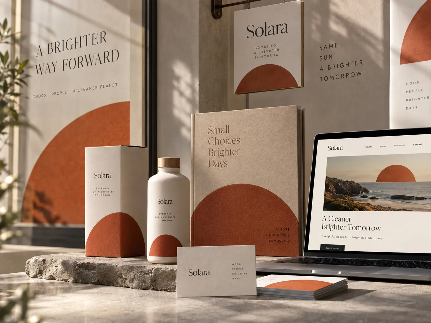
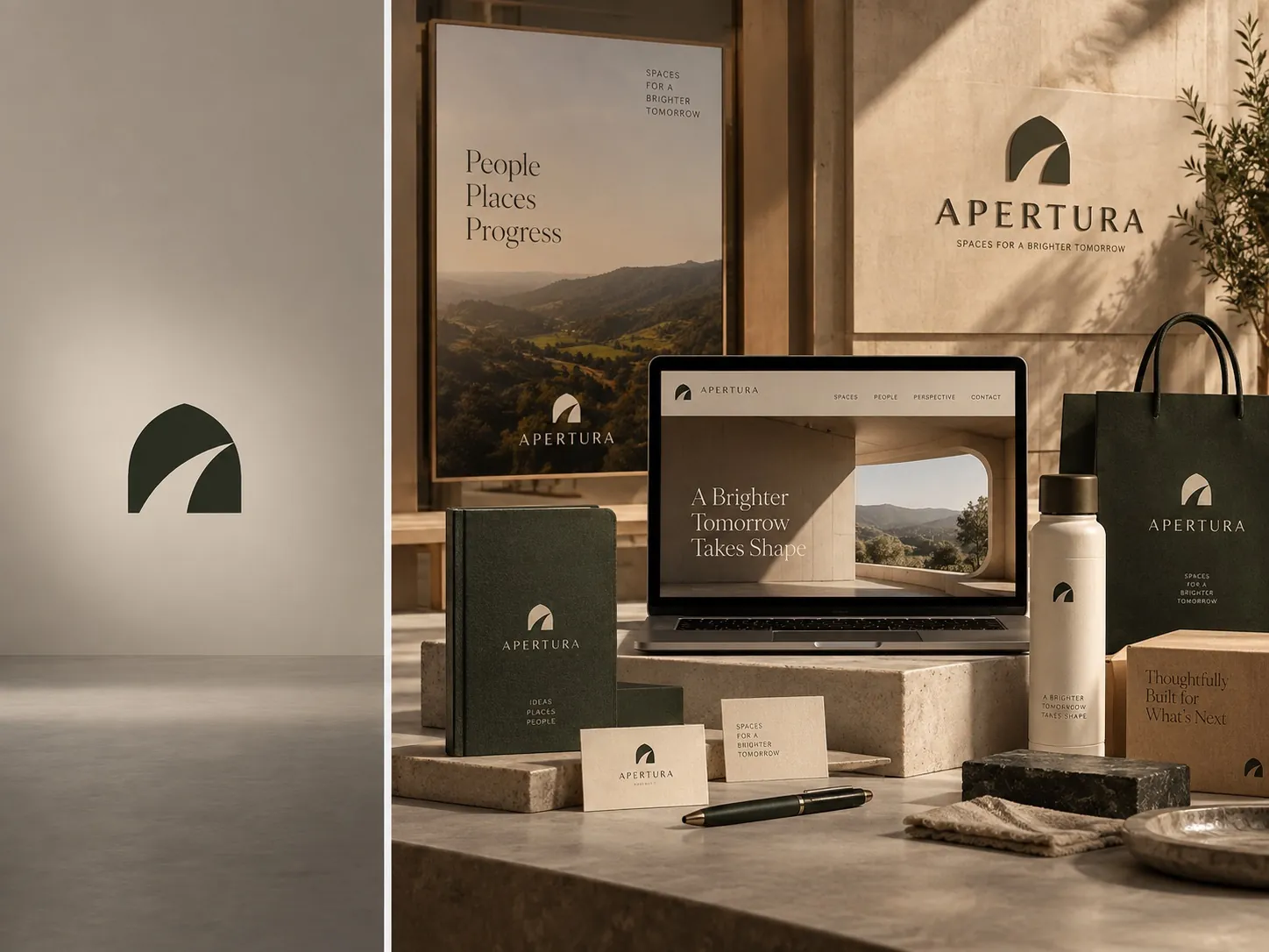
Between the logo and the brand sits the identity system, and this is the layer most companies skip. A visual identity is a set of rules that lets the business behave consistently without re-deciding everything each time. Which typeface, at which weight, in which role. Which color leads and which colors support. How much space around the mark. How a photograph is cropped. How a product name is written.
Without those rules, every new application becomes a fresh design decision made by whoever is closest to the deadline. The logo stays the same, which makes leadership think the brand is stable, while the website, the deck, the package and the trade show banner slowly drift into four different companies wearing the same badge.
With those rules, work gets faster and cheaper over time, not slower. A new sell sheet is an assembly job instead of a design project. A vendor can produce something on brand without a long briefing. That compounding effect is the real argument for brand identity work, and I have written about the growth side of it in brand consistency is a growth strategy.
What the logo only approach looks like in practice
Picture a service company, five trucks, good crews, solid reputation in one county. They commission a logo. It is genuinely well drawn. Then reality arrives. The truck wrap needs a layout, not a mark. The uniform shirt needs a one color version small enough to embroider. The invoice needs a typeface. The yard sign needs a color that reads at fifty feet. The website needs photography with a point of view.
None of that came with the logo, so each decision gets made separately, by different people, months apart. The wrap uses a gradient the mark was never designed for. The shirt uses a stretched version because nobody supplied a horizontal lockup. The invoice uses whatever was installed. A year later the company looks like five companies, and the owner concludes the logo was the problem.
It was not. The missing piece was the system. When I worked on the identity and vehicle branding for Florida Cool, the mark was only the beginning of the conversation. The useful output was knowing how the brand occupies the side of a van, how it holds up at highway speed and how it shrinks onto a business card without falling apart.
Famous marks borrow their power from everything around them
People look at the world’s most recognizable symbols and conclude that the symbol is the source of the power. It is the other way around. Those marks feel meaningful because decades of products, advertising, service, packaging and public presence have been deposited into them. The shape is a container. The contents came from somewhere else.
The same principle scales down. A small company’s mark becomes valuable through repetition connected to good experiences. Repetition without quality builds recognition of something people do not want. Quality without repetition builds a good reputation that nobody can find twice.
So the goal is not to make the logo carry the brand. The goal is to build a system where the logo has a clear, repeatable role, appears in the same way often enough to be learned, and gets loaded with meaning by everything happening around it. That is the argument I make at length in building a brand system instead of just a logo.
What actually belongs in the system
Typography does more brand work than most owners expect. It sets the voice before a single word is read, and a system with real range, a display weight and a text weight that stay legible in legal copy, prevents the drift toward a new typeface every time a different tone is needed.
Color needs roles, not just swatches. Which color leads, which supports, which is reserved for a warning or a call to action, what happens when the line grows to six products and every variant wants to be the loudest. A palette without assigned jobs turns into a mood board, and mood boards do not survive contact with a product line.
Layout behavior is the most underrated piece. How imagery is cropped, where type sits on a panel, how much space is allowed to stay empty, how elements align to each other. Those habits become recognizable on their own. In the Valeroso Stables identity the monument signage, the mark and the typographic treatment were designed as one set of relationships, because the entrance sign and a printed piece had to feel like the same estate.
When a logo by itself is genuinely enough
I do not think every business needs a full identity system, and I would rather say that plainly than sell something nobody needs. A sole practitioner with one service, one channel and a personal referral network can run for years on a clean mark, one typeface and a consistent way of writing. The system is small because the surface area is small.
The moment that stops being true is when other people start producing work in your name. A second employee, an agency, a printer, a packaging supplier, a marketplace contractor. Each of them will make defensible decisions that do not match each other, and the cost of not having rules becomes visible fast.
The other trigger is category. If you are selling a physical product that sits next to competitors, or charging a premium that has to be justified visually, the system is doing commercial work from day one. If you mainly need people to find you and remember your name, start with logo design and build outward when growth makes it necessary.
Why replacing the symbol rarely fixes perception
Companies often try to solve a perception problem by changing the mark. It feels decisive and it produces something visible to show the board. But if the positioning, the messaging, the photography, the packaging, the website and the customer experience are still incoherent, the new mark simply inherits the same problem with a new shape.
I have seen a company redraw its logo twice in four years while the real issue, that nobody could explain in one sentence who the product was for, stayed untouched the whole time. Each redraw cost money, reset whatever recognition had accumulated, and left the underlying question unanswered.
The diagnostic question is whether the gap is between the company and its symbol, or between the company and how it is understood. Only the first one is a logo problem. The second is a positioning and system problem wearing a logo costume. I walk through how to tell them apart in does your company really need a rebrand.
What to audit this week
Collect ten things your company produced in the last six months without designing them specially: an invoice, a proposal, a social post, a shipping label, an email signature, a job listing, a slide, a sign, a package, a listing photo. Lay them out together. That is your brand, far more honestly than any presentation deck.
Then ask three questions of that pile. Does it look like one company. Could a new hire produce the eleventh item correctly without asking anyone. Is the most important thing about your business visible in more than one of them. A no to any of those points at a missing rule, and missing rules are cheap to write compared to what they cost you in drift.
Finally, write down what you want people to expect from you in one sentence, in plain language, without adjectives. Then check whether that sentence is doing any work in the ten items you just collected. If it is not, the next investment is not a new symbol. It is the structure that would have made the current one mean something, and you can see how that plays out across finished projects in my work.
Key points
- A logo identifies the company while a brand is the expectation people attach to that identifier over time.
- The identity system is the missing middle layer, turning a single mark into rules the whole business can follow.
- Without written rules, every new application becomes a fresh decision and the company slowly stops looking like itself.
- Famous marks feel powerful because of the products, service and repetition deposited into them, not the drawing alone.
- Replacing a logo does not fix a perception problem caused by unclear positioning or an inconsistent experience.