
Case study · Logo & Brand Identity
Valeroso Stables
Equestrian Estate Brand Identity & Entrance Signage
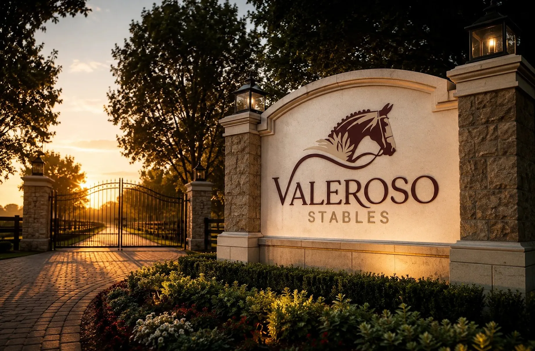
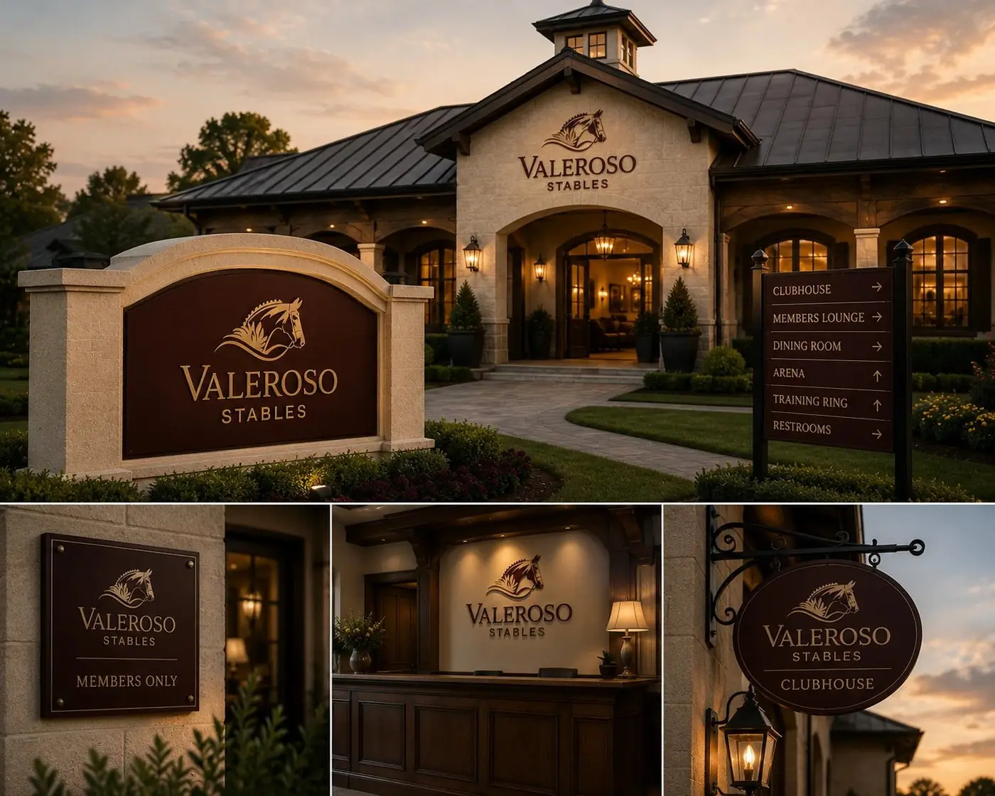
Valeroso Stables is a private equestrian estate, and its gate is the first thing anyone meets. The identity was built on a single idea: the mark should feel inherited, not installed.
01
An heirloom rather than an installation
Private stables sell an emotional register before they sell a service, something closer to continuity than to amenity. That ruled out a crest assembled from stock parts, because the whole point is that someone made this for this place. So I commissioned a horse head illustration with real engraving in it, drawn at a level of detail that reads as a hand rather than a template.
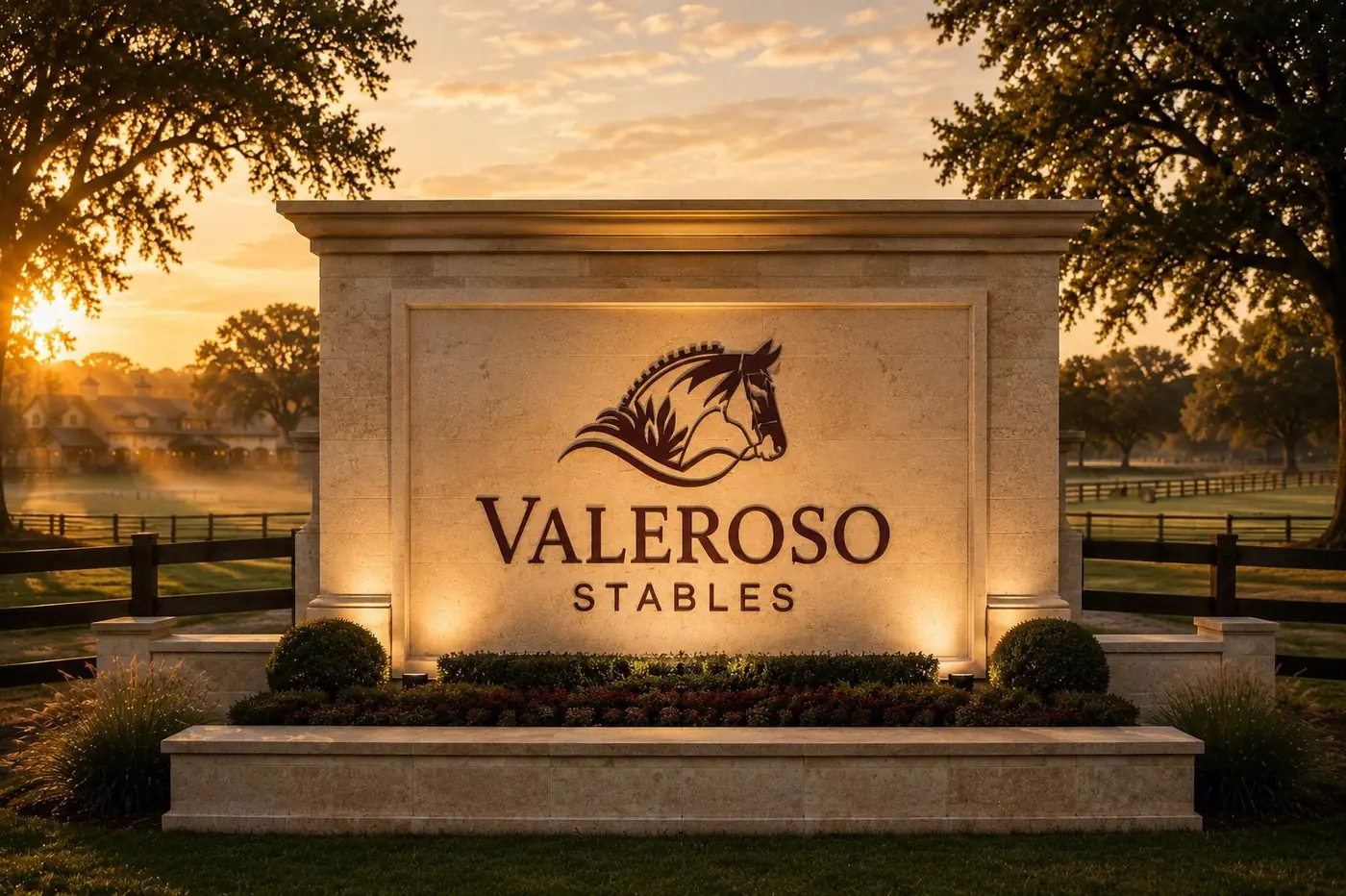
The head is cropped close at the neck and carried in burgundy, with the mane cut as short struck strokes the way an old plate would hold them. A gold line sweeps out from the bridle, drops below the muzzle and curves back to close the emblem. That line gives the animal somewhere to be, and it puts motion into a mark that would otherwise sit as still as the wall it is fixed to.

02
Gold that ties the mark to the gate
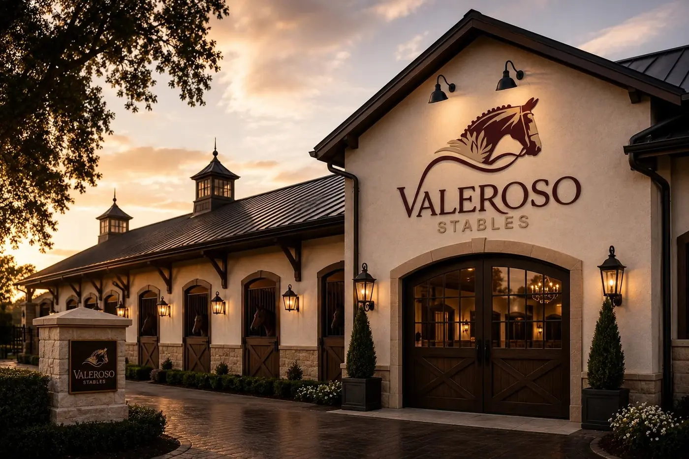
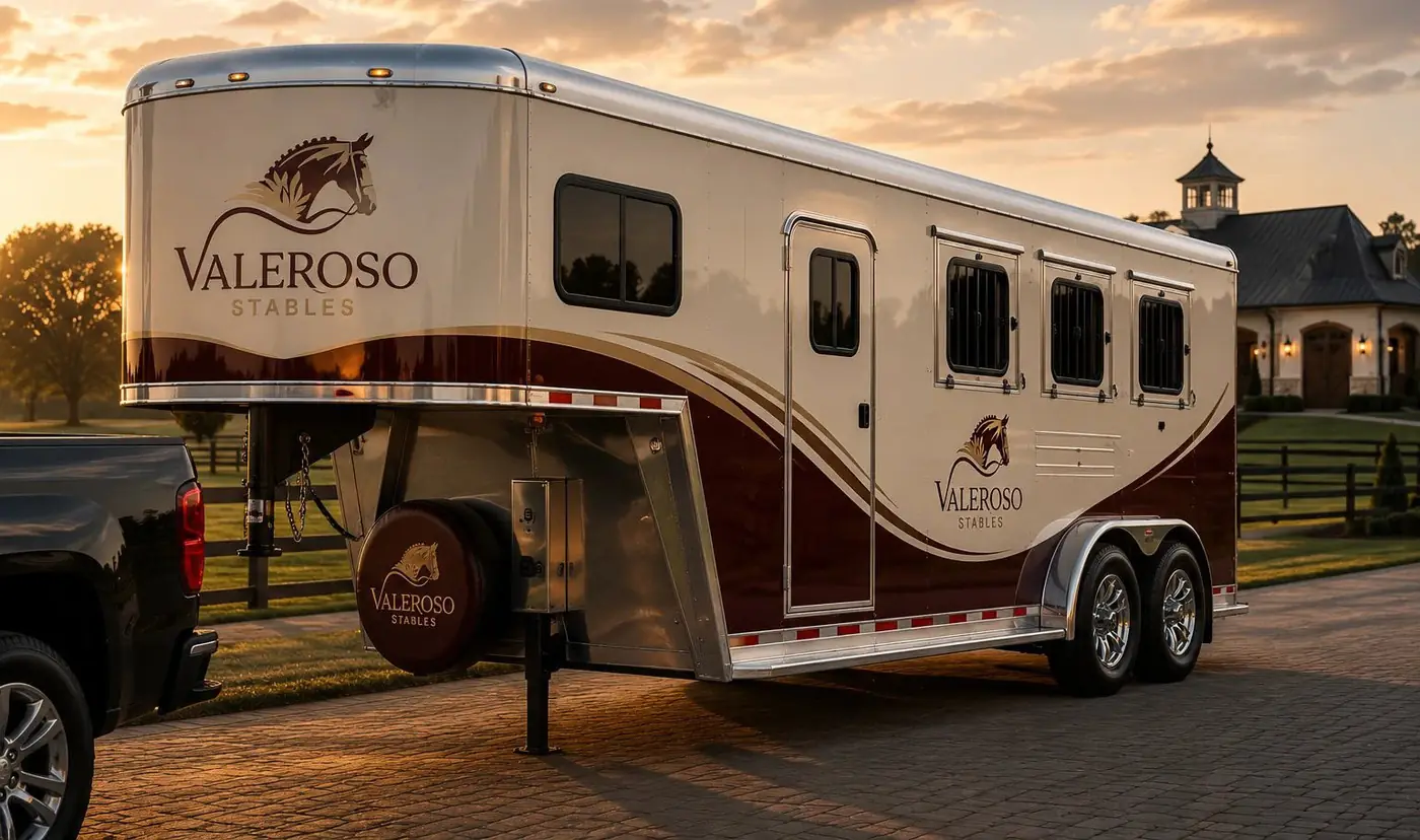
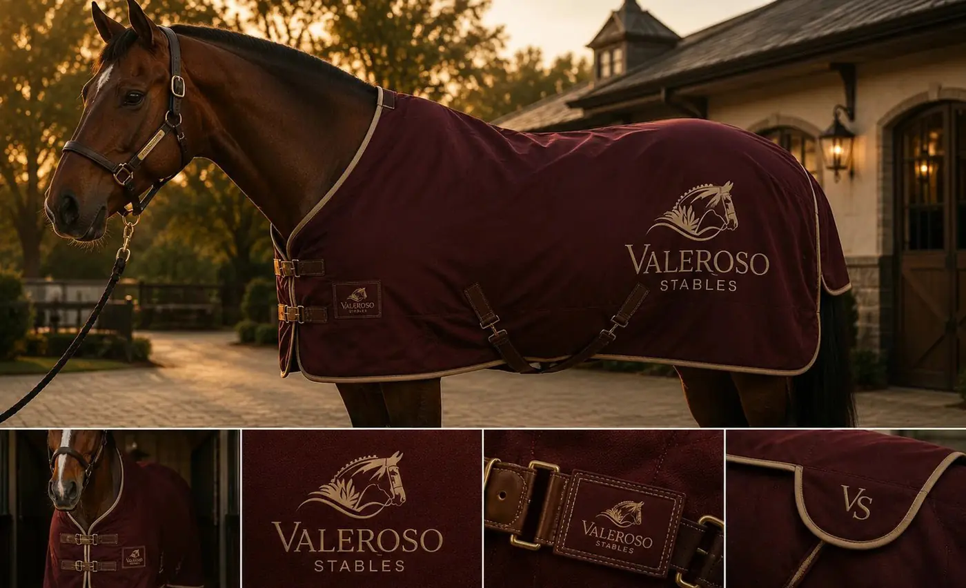
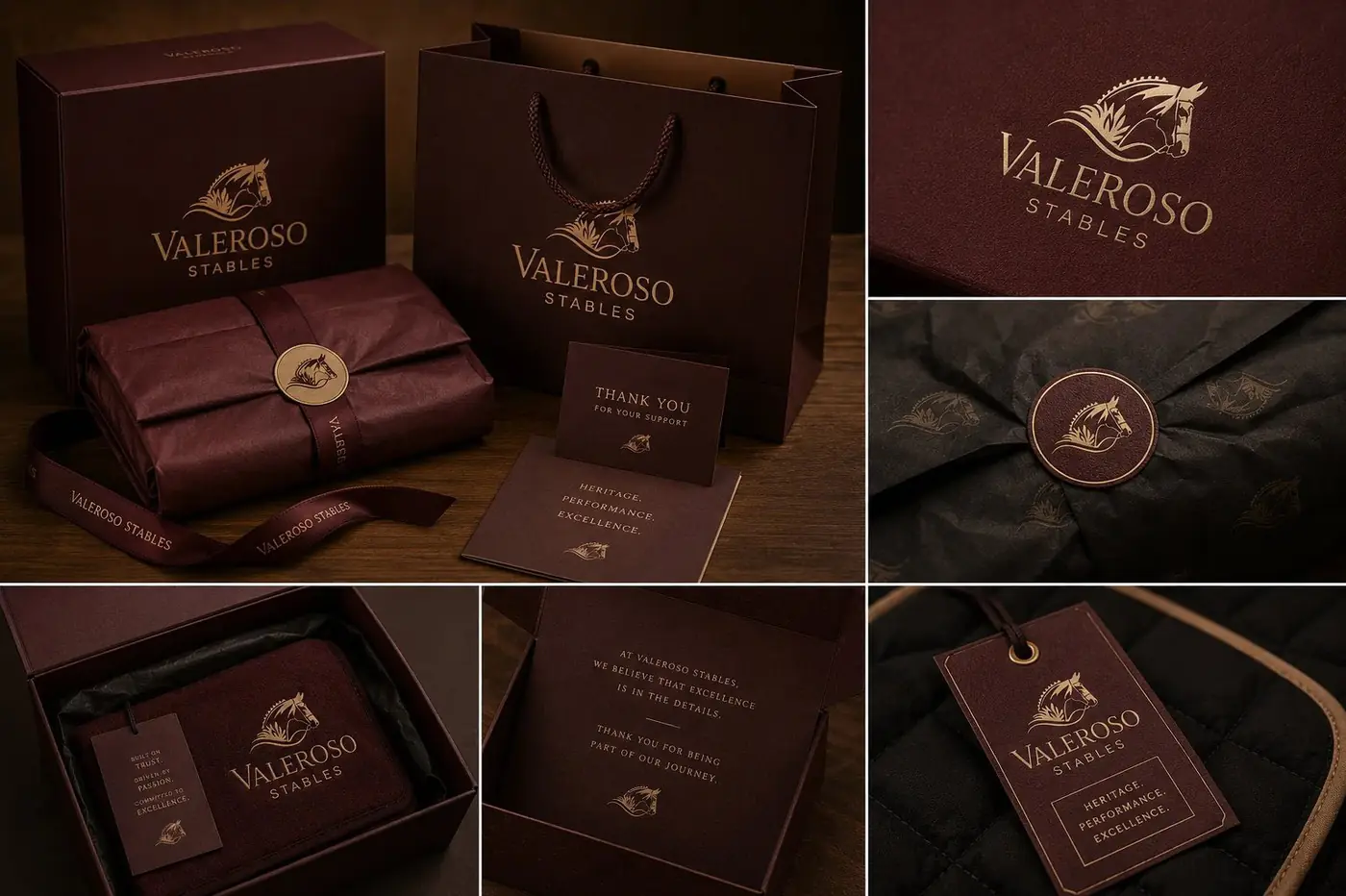
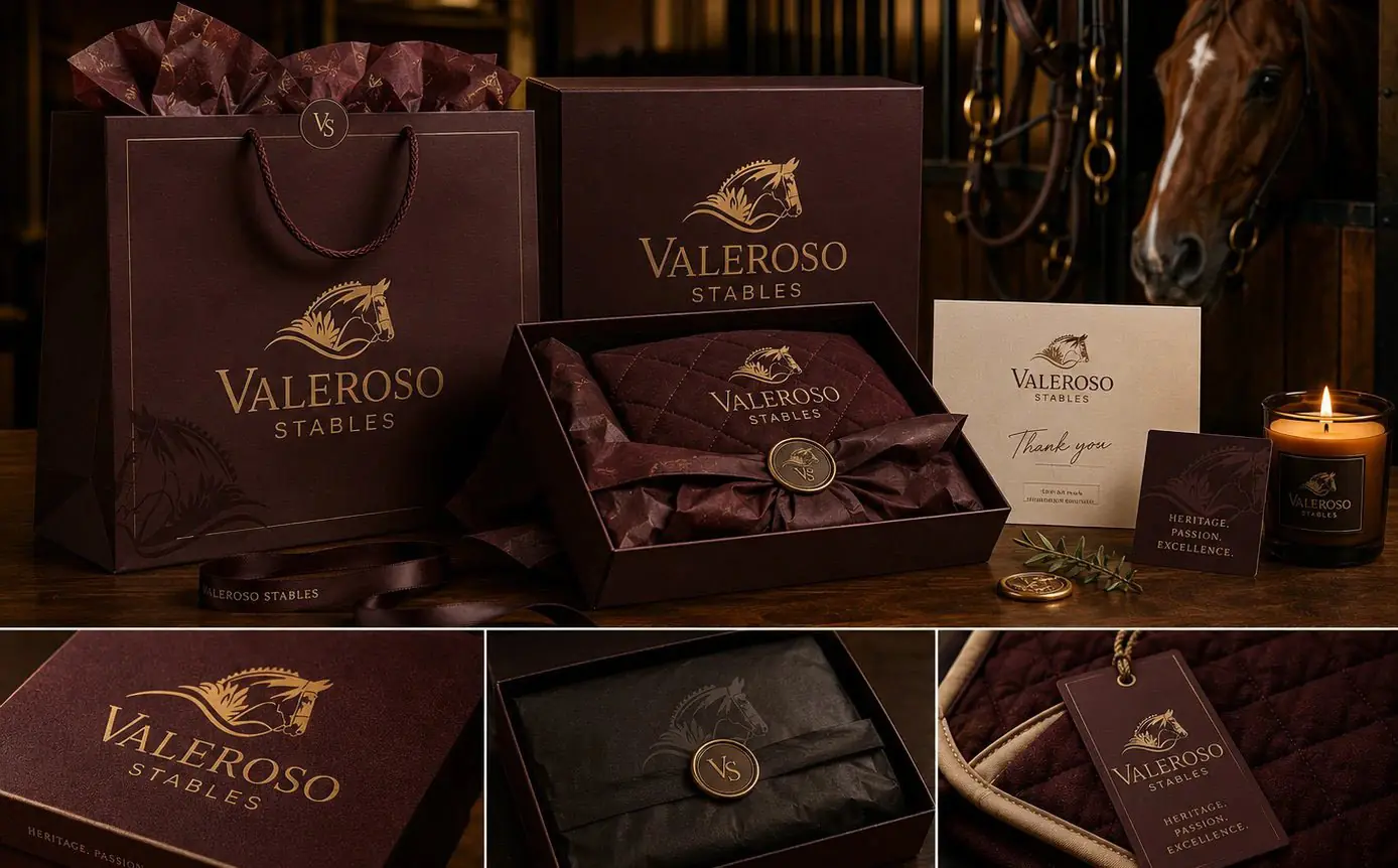
The serif wordmark sits beneath with room to breathe, so the emblem stays the hero and the name never crowds it. Valeroso takes the weight in burgundy, and Stables runs small underneath in gold, letterspaced wide enough to behave as a line of information rather than a second name. Hierarchy that plain is what allows the lockup to be cast at the scale of a wall.
Holding the gold consistent between the logo and the surrounding ironwork was the decision that mattered most. It means the mark and the gate read as one considered design instead of a plaque bolted on after the masons left, and on a property like this that difference is the whole impression.
Mounted on stone and lit from below at dusk, the burgundy stays legible against warm stucco and the gold takes the lantern light rather than fighting it. Low light is the condition a gate mark cannot design its way around, so it had better be the condition the mark was drawn for. A mark built on drawing holds up in that light. A mark built on gloss would not.
More work
More projects.



Have a project like this?
Tell me what you are building, changing or launching, and I will help you define the right scope and direction.