
Case study · Logo & Brand Identity
Lake Effect
Waterfront Bar & Grill Brand Identity & Signage
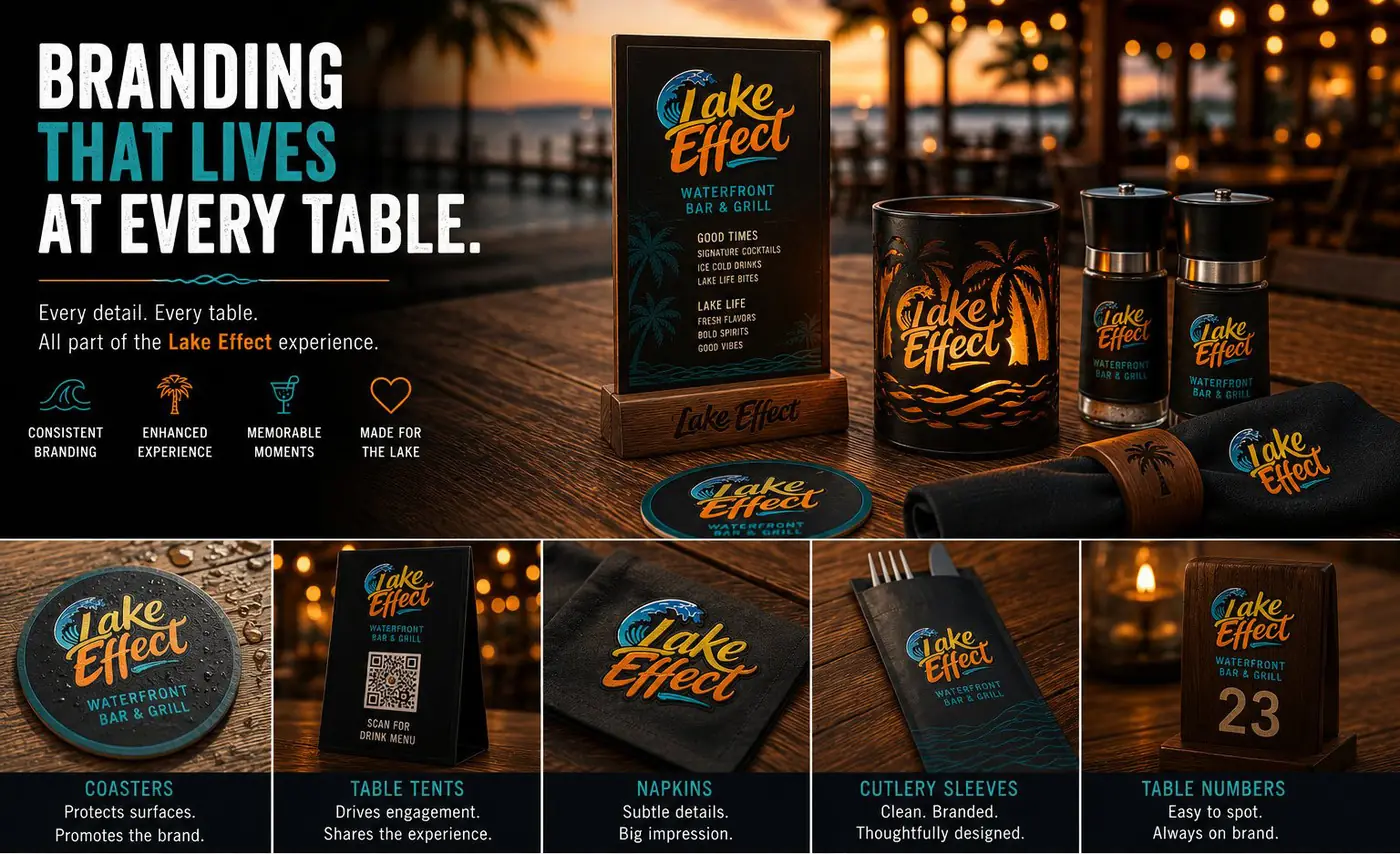
Lake Effect is a waterfront bar and grill whose whole appeal is the water it sits on. The identity is built on one idea: the mark should belong to the view rather than compete with it.
01
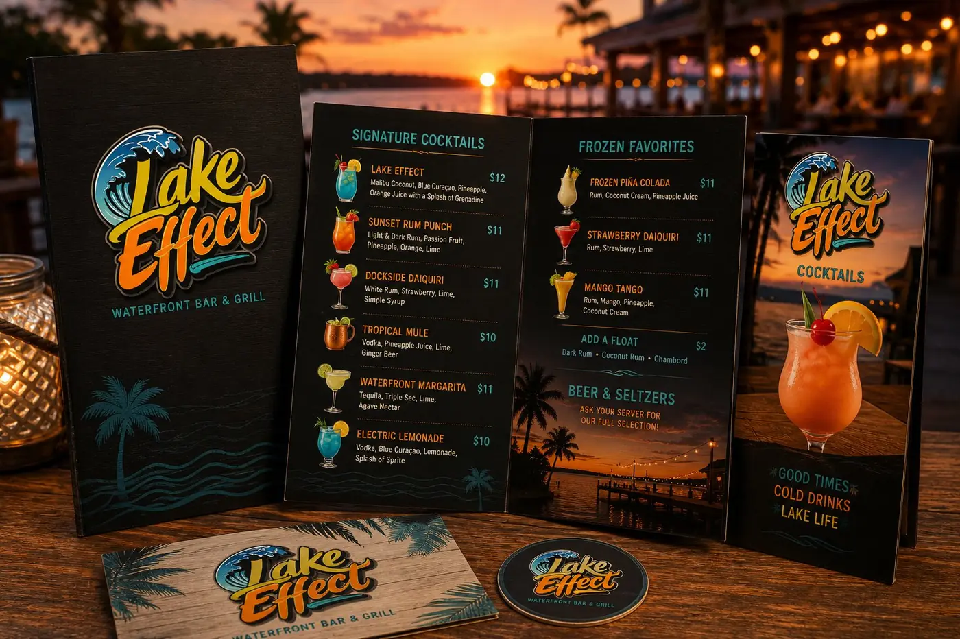
Borrowing the color of the view
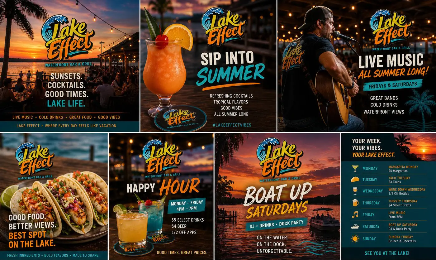
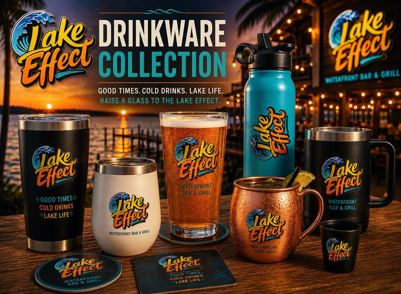
Most dockside places bolt a logo to a post and hope it reads. I wanted the opposite, a mark that a customer looking out at golden hour would take as part of what they were already looking at. So the logotype was hand lettered and colored from the sky itself, yellow at the top of the letters falling into orange at the bottom, running the same direction the light runs over the lake.
The letterforms are loose and fast, with curves that answer the wave breaking over the first letter. Drawing them by hand mattered, because a typeface set and tinted would have felt applied, and the point was to look like weather rather than like signage. Teal turns up twice only, in that wave and in the swash underlining the name, so the water brackets the words at both ends.
02
A sign that has to work at dusk
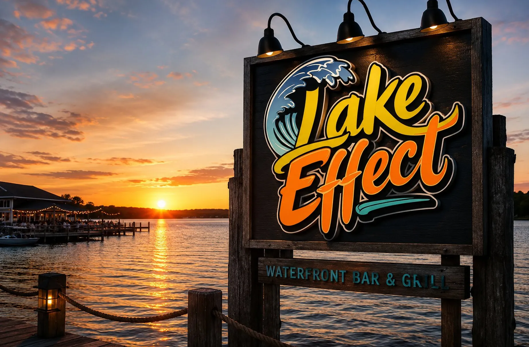
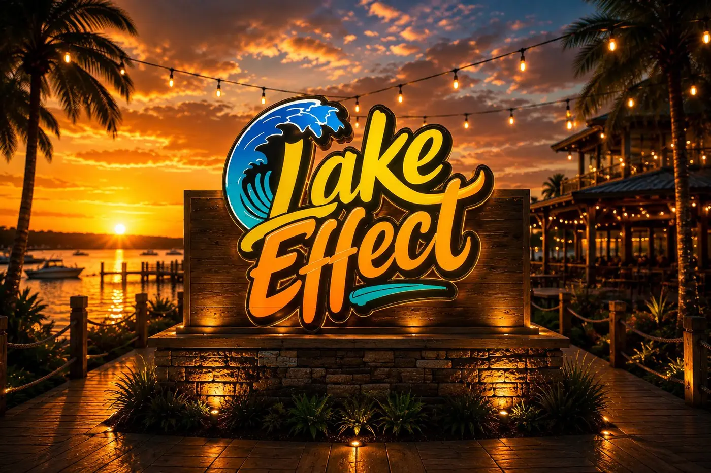
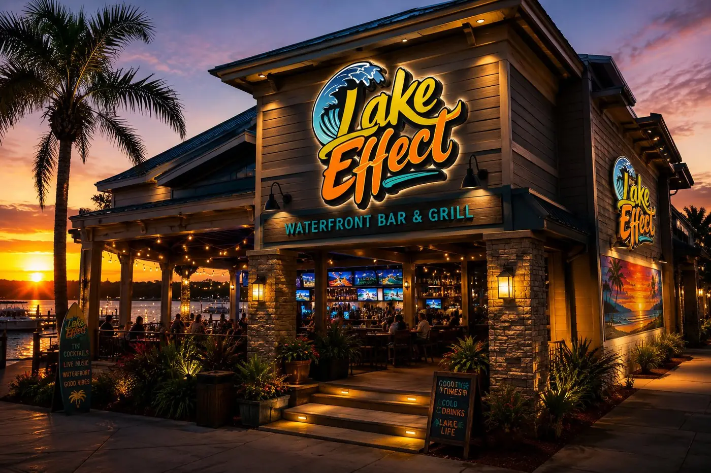
The lettering sits against dark weathered wood, which is the practical half of the idea. A bright warm mark on a dark ground keeps its shape as the light goes, and a dockside venue does much of its business in exactly the hours when a paler sign would start dissolving into the sky behind it.
Scale settled the rest. The name takes the full board and the descriptive line runs beneath it on its own crossbar, small and level and in teal, because someone arriving by water needs to identify the place before they need to know what it serves. The tagline earns its position by being the part you read second, not first.
More work
More projects.

Have a project like this?
Tell me what you are building, changing or launching, and I will help you define the right scope and direction.