
Case study · Logo & Brand Identity
Copper Springs Lodge
Resort Community Monument Signage & Brand Identity
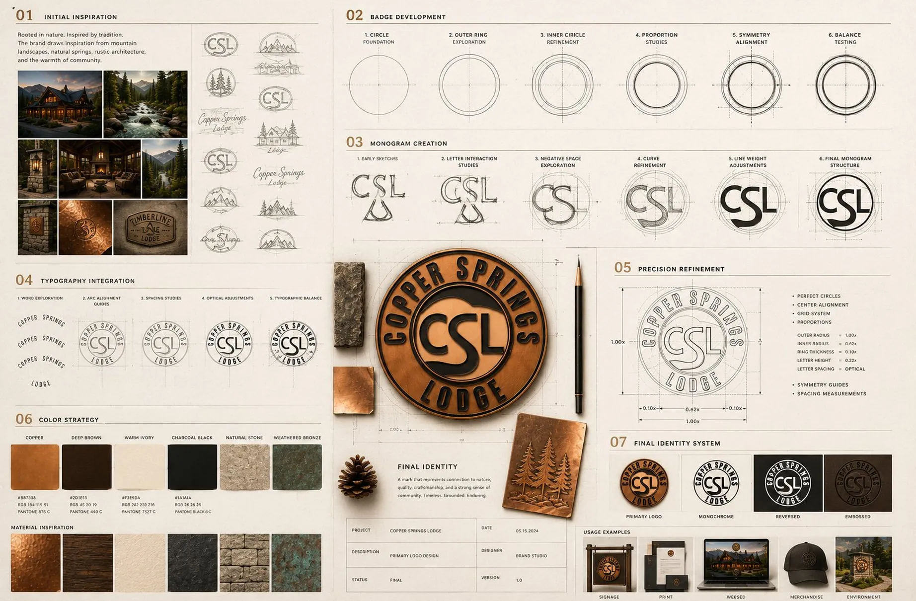
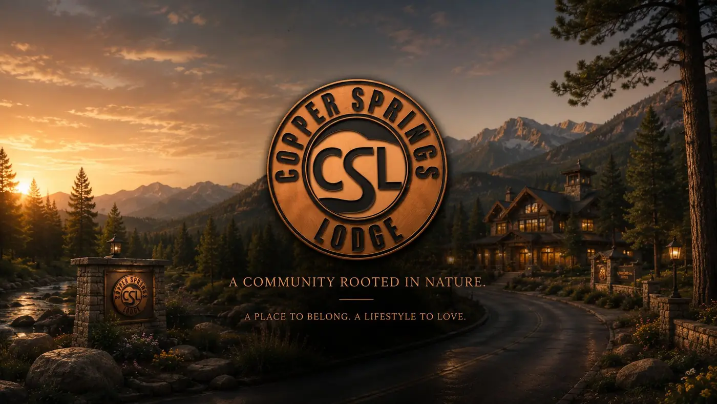
Copper Springs Lodge is a mountain resort community whose first impression happens at the entrance gate, often at dusk and long before anyone reaches the main building. The identity is built on a mark designed to be made out of material rather than printed onto it.
01
A mark built from material
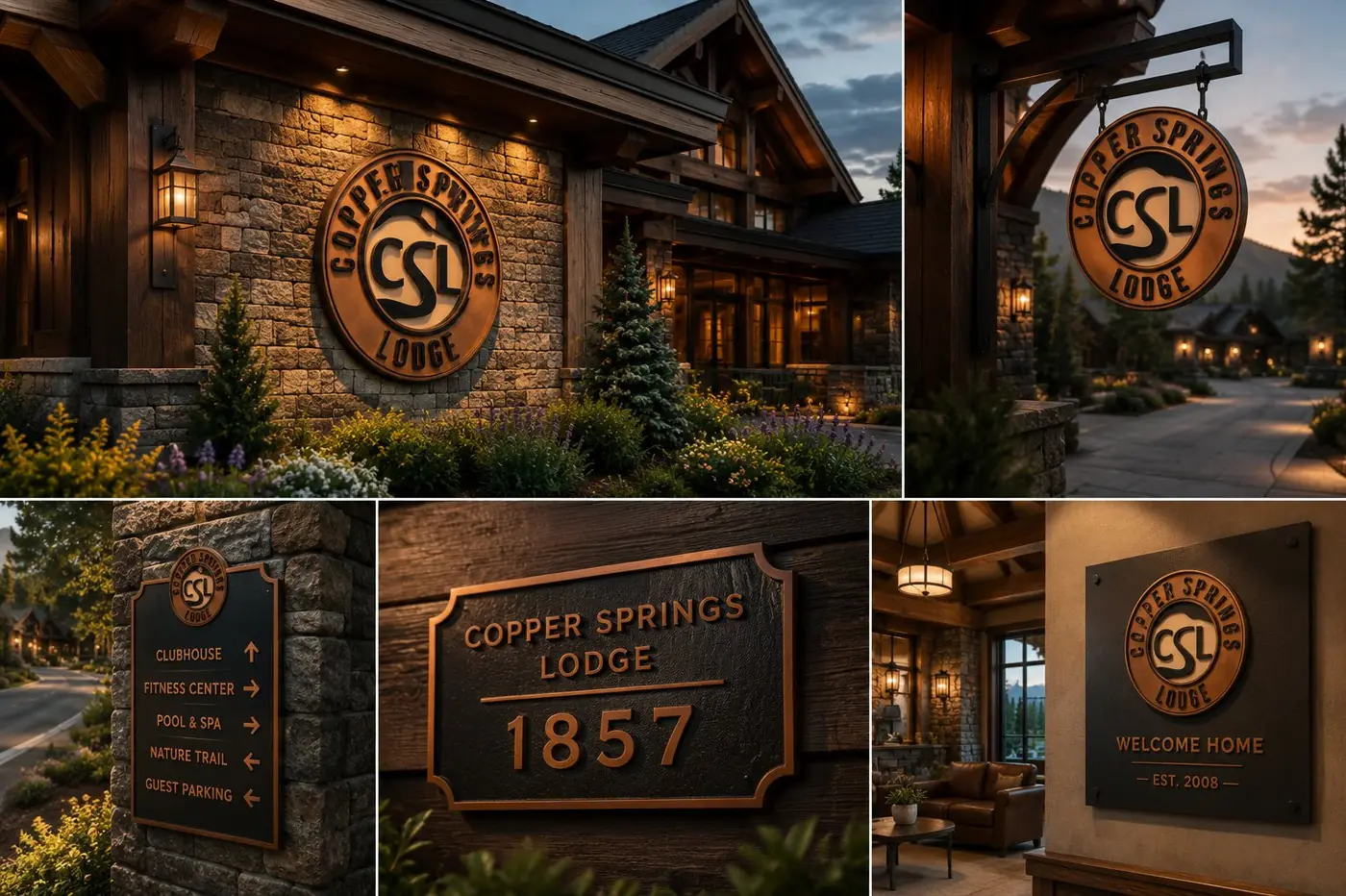
Most marks are drawn for paper and adapted to everything else afterward. Here the sequence ran the other way, because the monument at the entrance is where this brand actually introduces itself. I designed the emblem to sit into natural stone from the beginning, letting the property's own masonry become part of the presentation rather than a backdrop the logo was placed against.
That decision set the form. A circle in copper tone, CSL locked in the center, the name curving around the ring above and below. The monogram is drawn so the S bridges the C and the L into one connected shape, because a badge that has to survive casting, carving and embossing cannot rely on three letters standing politely apart. Geometry holds up in metal and stone. Fine detail does not.
02
Reading at dusk and at noon
The lettering inside the emblem is dimensional rather than flat print, which is the difference between a sign that works and a sign that only photographs well. Raised letters catch warm lantern light after dark and cast their own shadow in direct sun, so the mark keeps its contrast in both conditions instead of flattening into the copper field around it.
A mountain entrance is experienced at every hour and from every distance, so the identity was checked at dusk, at night, and on the aerial approach where the badge registers as a shape rather than as letters. An identity that only looks right under one lighting condition is not actually finished, and a resort gate is the least forgiving place to discover that.
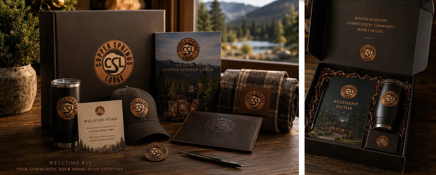
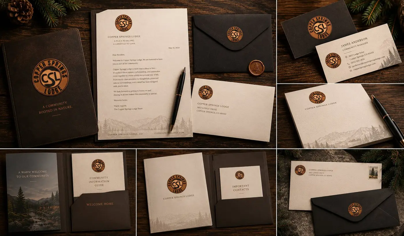
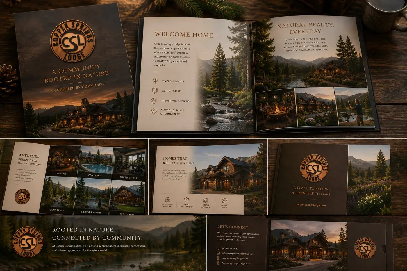
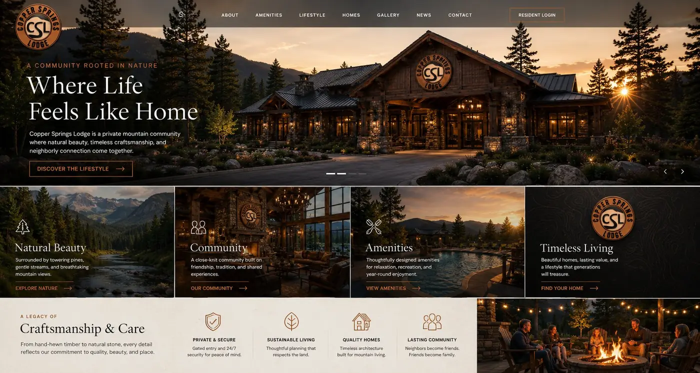
Away from the gate the same badge reduces without fuss, running as a single color on printed material, reversing out on dark ground, or blind embossed where copper cannot go. The palette stays loyal to the site, copper and deep brown and charcoal, with a warm ivory that keeps correspondence from feeling cold next to all that stone and timber.
More work
More projects.


Have a project like this?
Tell me what you are building, changing or launching, and I will help you define the right scope and direction.