
Case study · Logo & Brand Identity
Acres Down South
Southern Lifestyle Apparel Brand Identity
Acres Down South is a new southern lifestyle label that needs to feel like it has been outfitting people for decades. The identity has to earn that age in its construction, because nothing else will hold.
01
Heritage you build, not fake
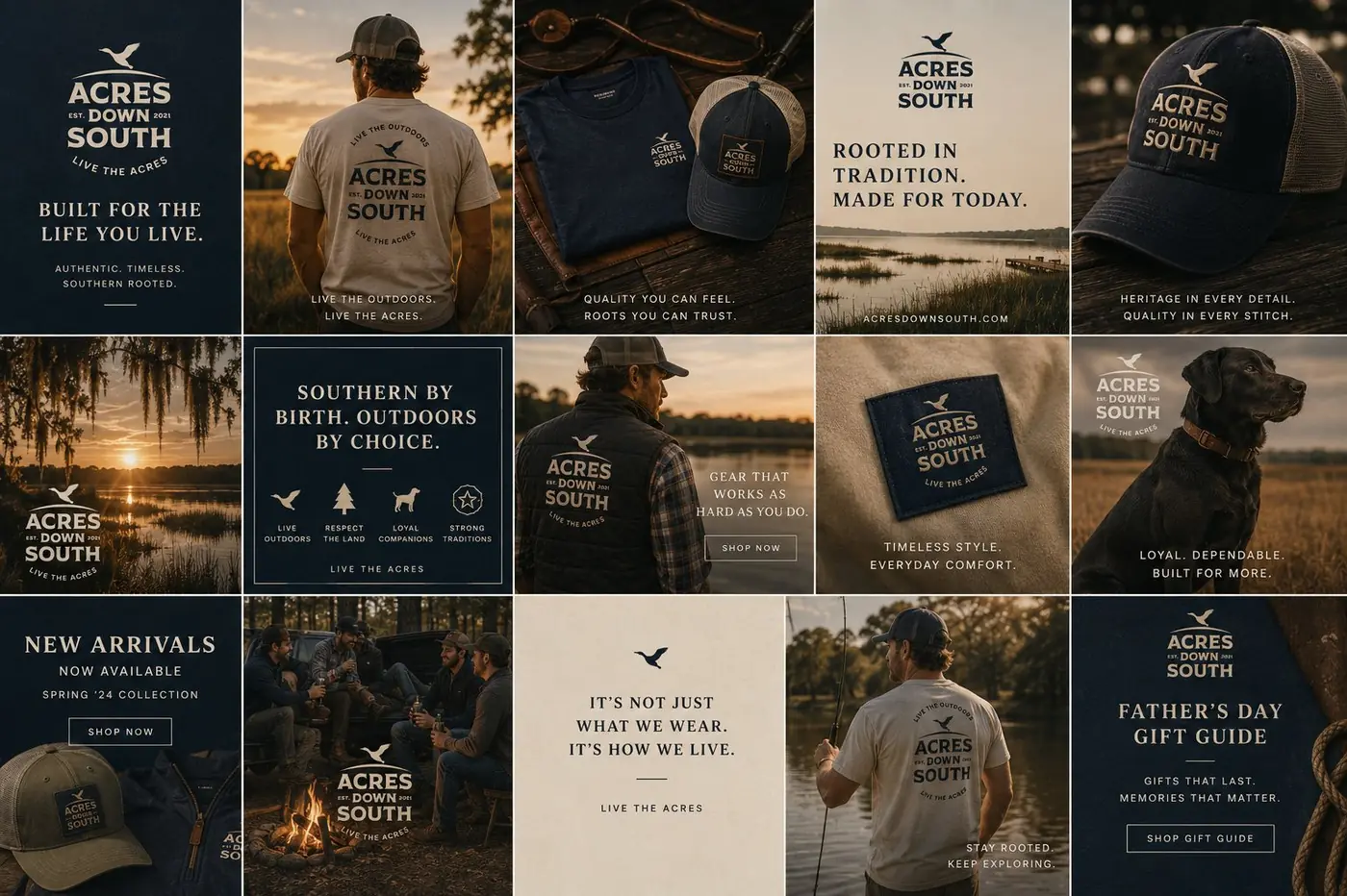
The easy move for a young outdoor label is to age the artwork. Run it through some grit, add a little wear, hope it passes for something older than it is. That never survives contact with a real product, because the distressing is the only thing doing the work. Age lives in the construction instead: a form that closes on itself, type that stacks with the settled confidence of a lodge crest.
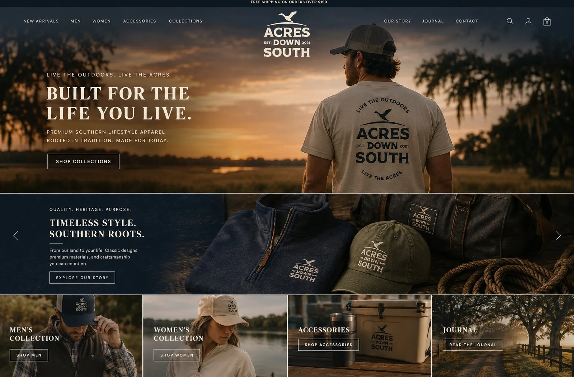
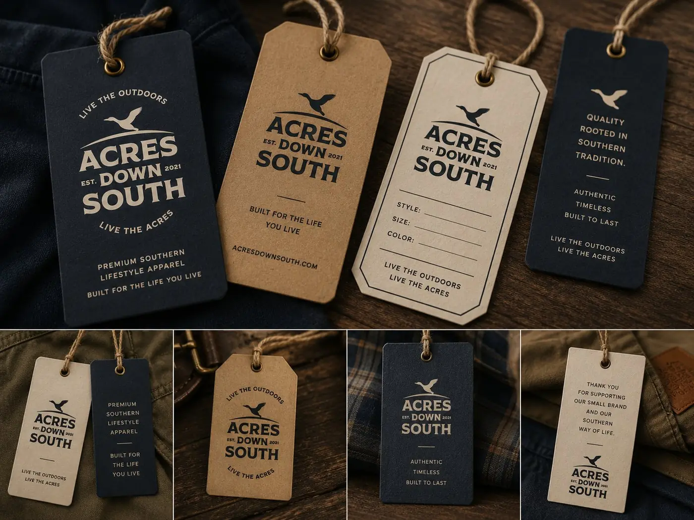
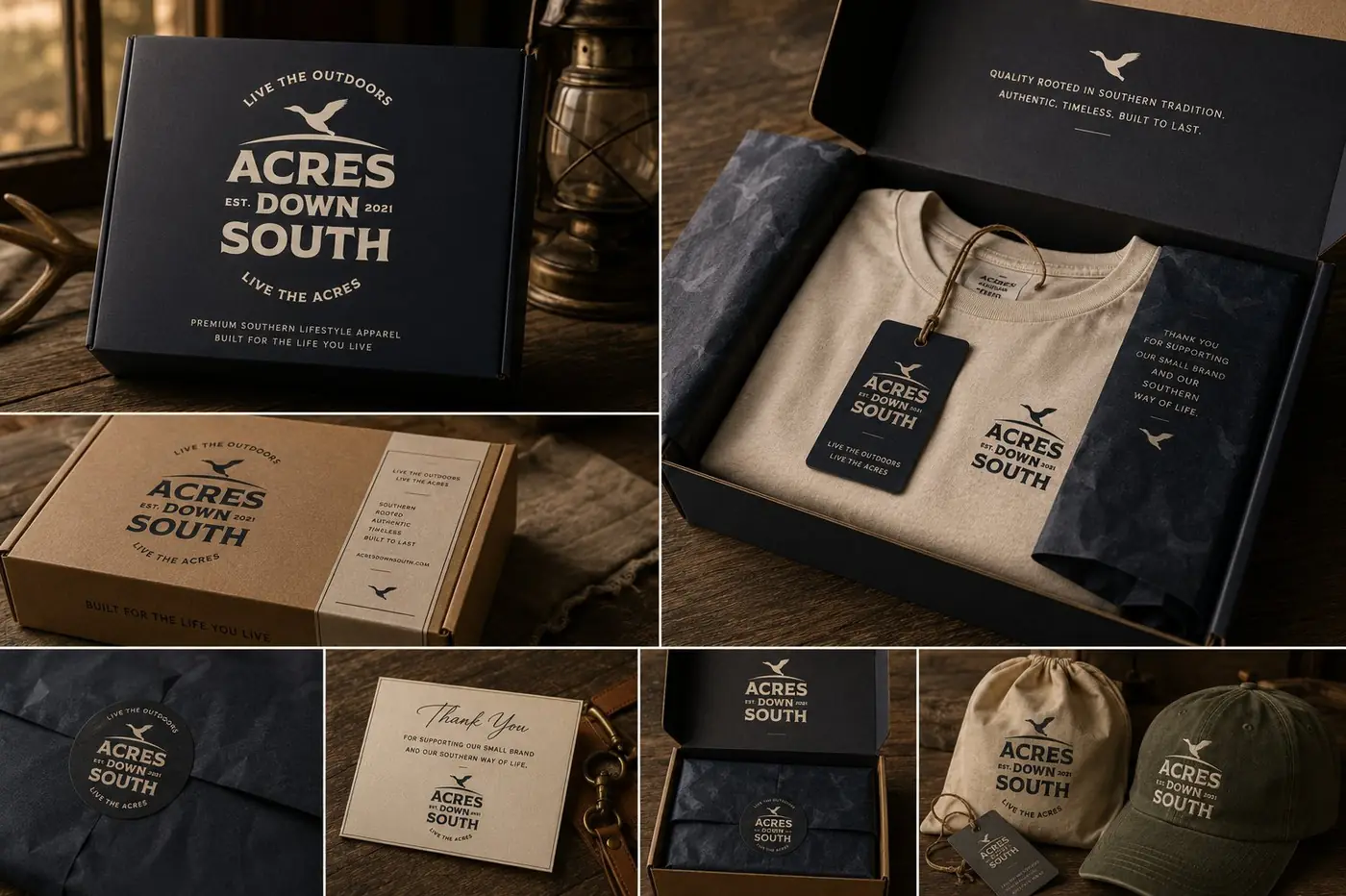
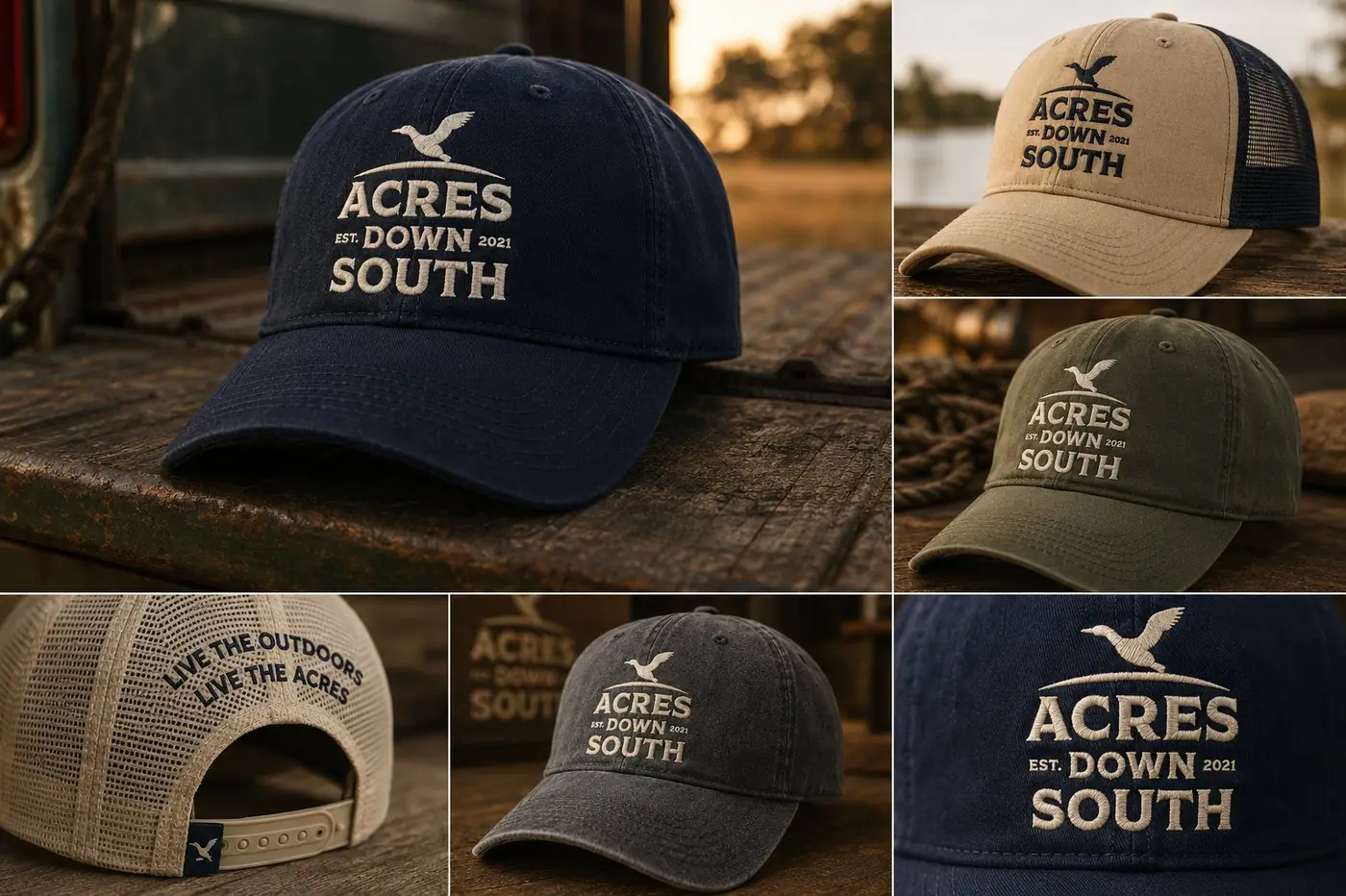
So I built the mark around a flying duck over an arc, with the name stacked beneath it in a condensed serif that is deliberately old fashioned, and the founding year tucked into the middle line. The duck carries the recognition, because a silhouette survives everything that detail cannot. On the full badge the motto wraps the mark as a ring, the way a crest carries its words, and that circle is what makes the thing read as an outfitter rather than a graphic.
02
What an embroidered patch decides
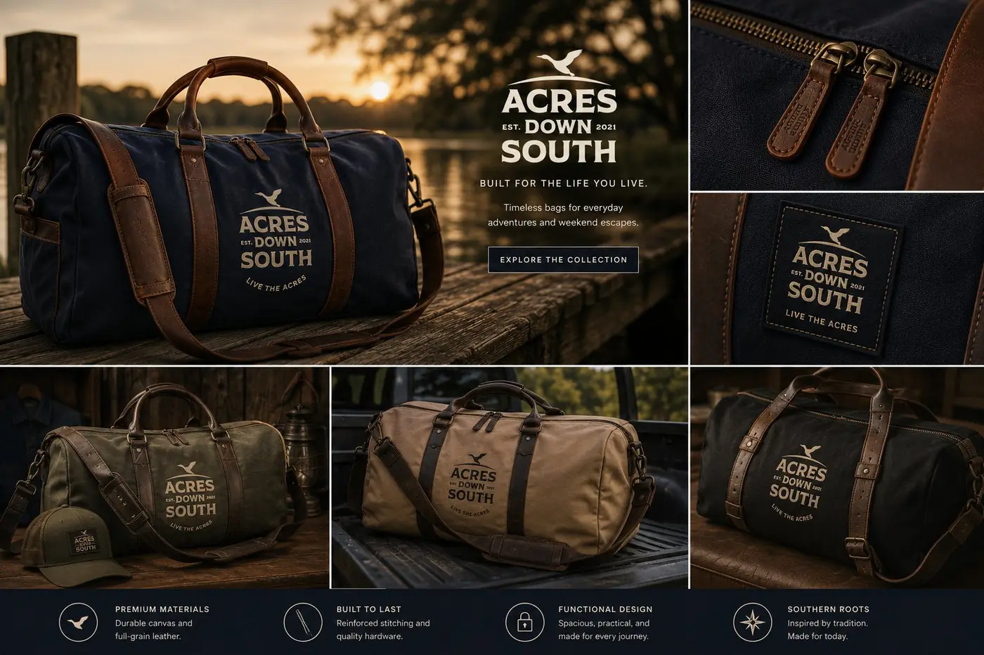
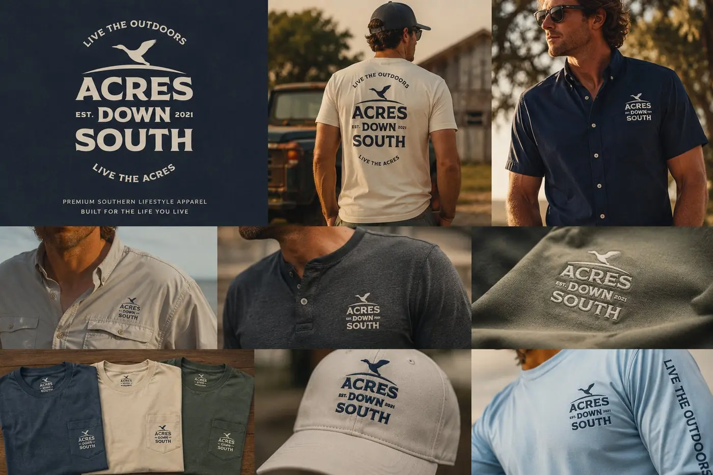
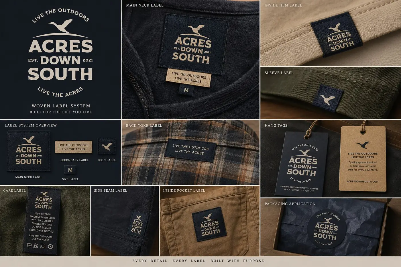
A logo that only looks resolved as a flat vector file is not finished. The real judgment happens at chest patch scale, in thread, where a needle will not hold a hairline and every join either survives or turns to mush. Keeping the palette to cream, navy and olive meant the mark could go down in a single thread color and still be the same mark it is when printed full across the back of a tee.
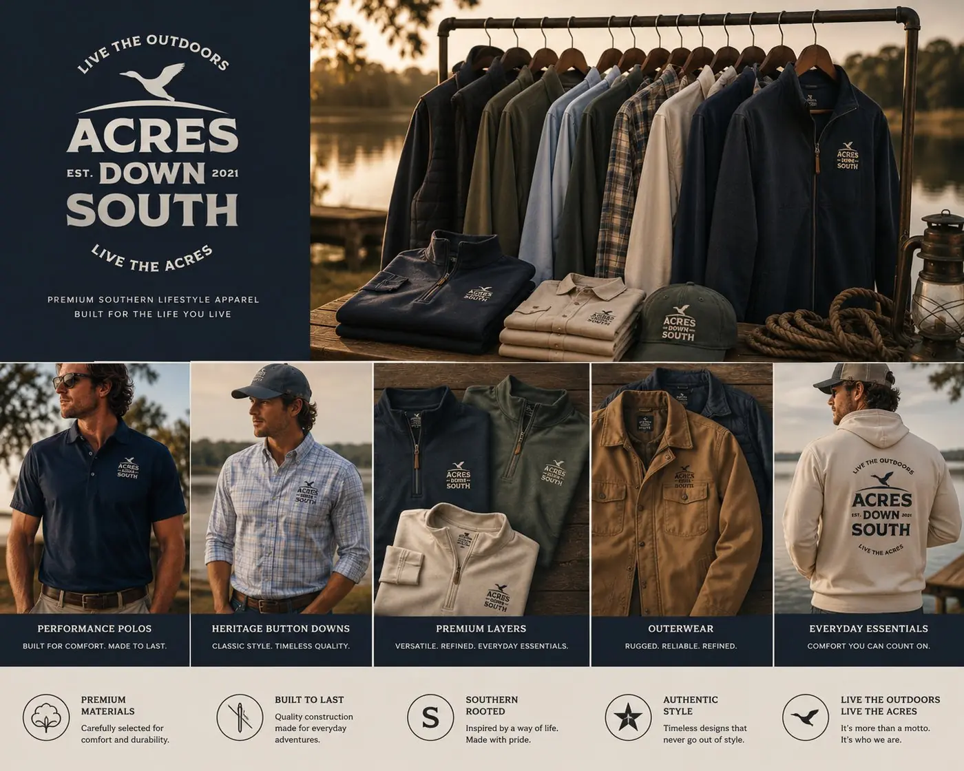
That is why I worked it across an actual range instead of presenting it on its own. A cap, a quarter zip chest hit, a patch sewn onto a duffel, a tumbler. Each one asks a different question of the drawing. On a cap the badge shrinks until the duck is the only thing anyone reads from six feet away, and it still says the right thing. Light garments take navy, dark ones take cream, and nothing needed a special version made for it.
More work
More projects.


Have a project like this?
Tell me what you are building, changing or launching, and I will help you define the right scope and direction.