
Case study · Logo & Brand Identity
Complete Document Systems
Corporate Brand Identity & Stationery
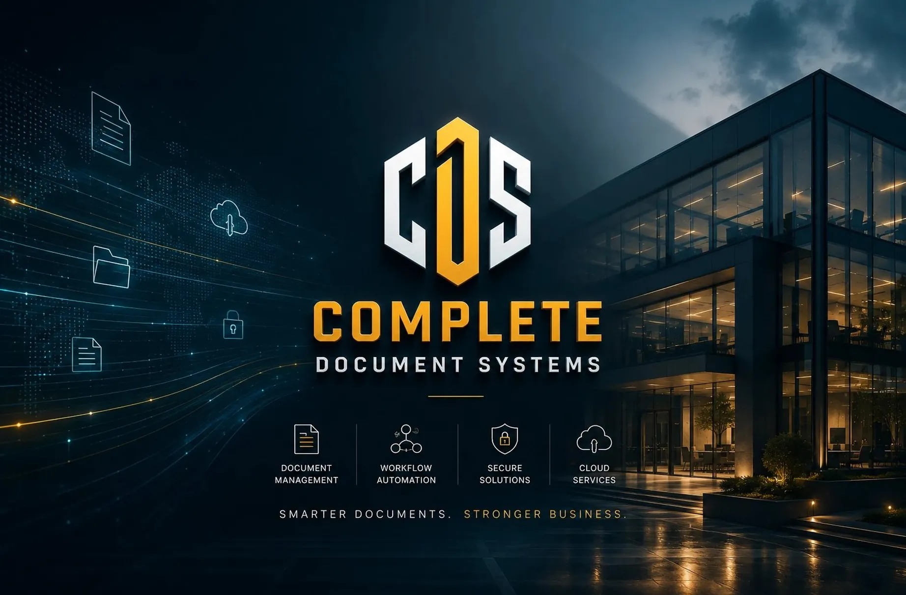
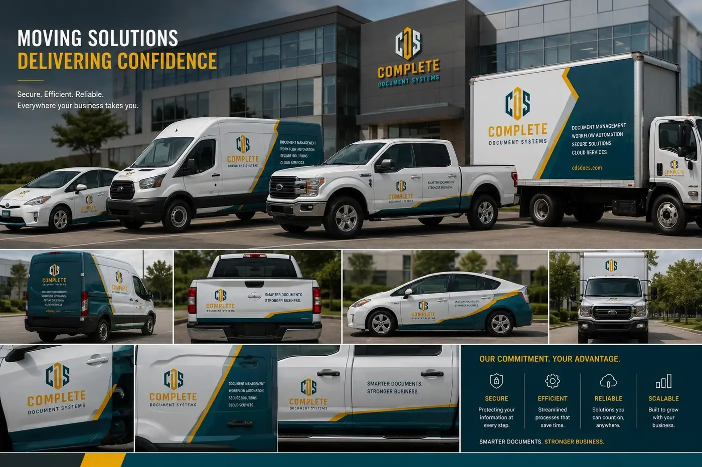
Complete Document Systems takes custody of other companies' records, so the identity had to argue for trustworthiness before a word of copy did. The logo is built as a piece of protection rather than a piece of decoration.
01
Protection built into the construction
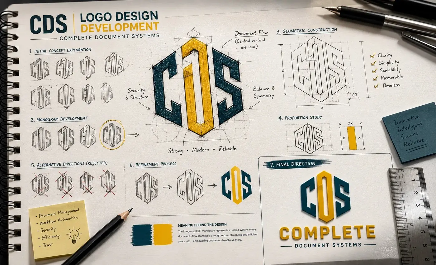
In document management the sale is trust. A client is being asked to hand over contracts, records and the material they would least like to lose, and that decision gets made well before anyone reads a service description. So the mark had to carry the promise structurally, in the way it is drawn, rather than leaning on a line of copy to explain it afterward.
The CDS monogram sits inside a geometric shield, because a shield says protection faster than any other shape available to a logo. The letters are cut from hard angles with no curve anywhere, and the center letter resolves into a vertical bar that locks the outer two in place. Gold against a deep blue ground keeps the whole thing reading as solid and corporate instead of merely technical.
02
One voice across the paperwork
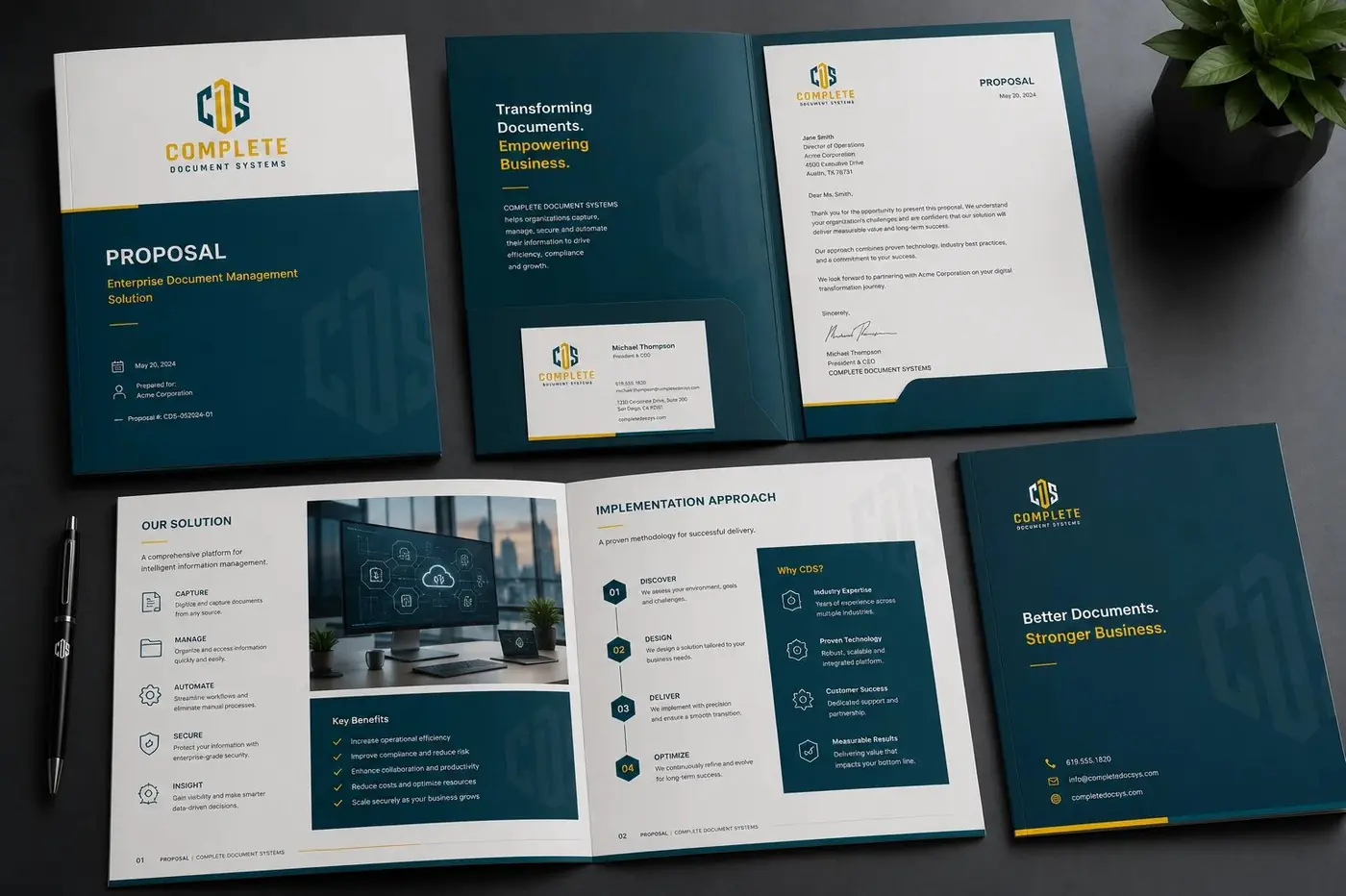
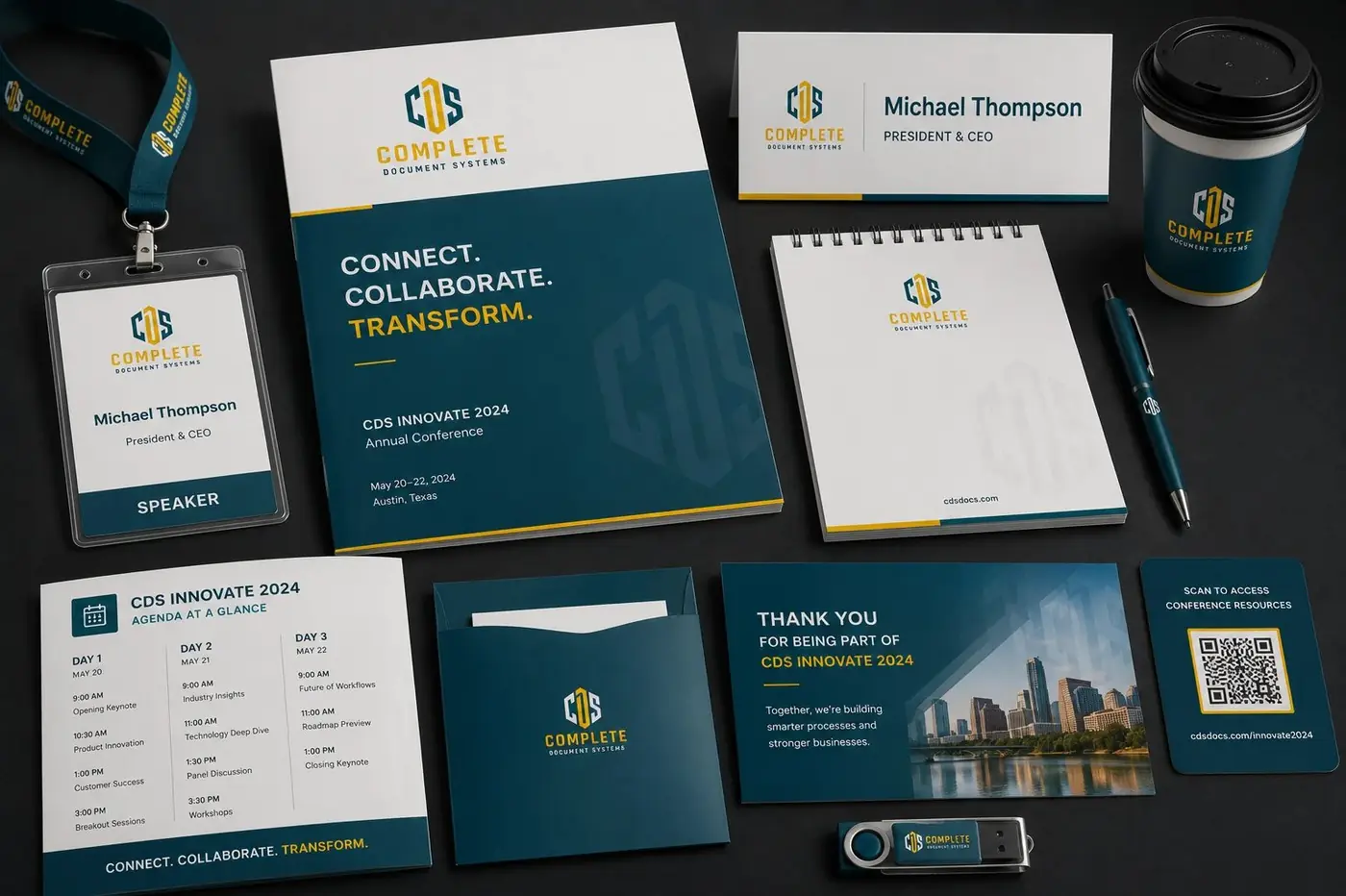
The monogram's real work starts on paper. It has to hold on a letterhead, in the corner of a business card, on an envelope and across the face of a two-pocket folder, at four different sizes inside a client's first week. Geometry survives that range in a way an illustrative mark never would.
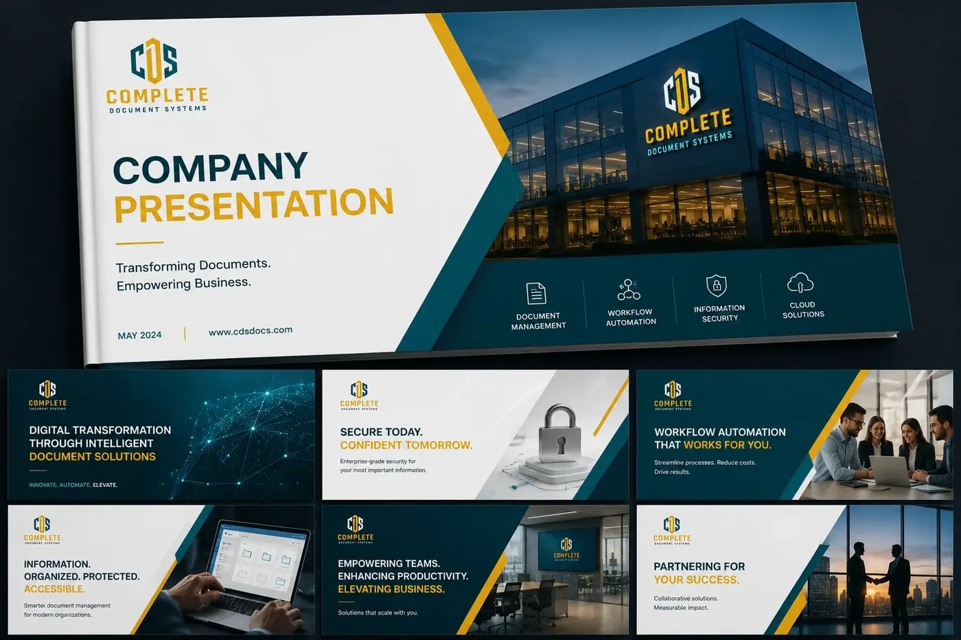
For the folder and the notebook covers I pulled line art directly out of the monogram's own geometry and let it run large and quiet behind everything else. That choice matters more than it looks. A second decorative pattern would have introduced a voice the brand had not earned, while an enlarged fragment of the mark gives flat corporate stock some depth and keeps saying the same thing.
Holding every piece in the one gold and deep blue system is the point of the exercise. The first letter a client receives, the folder their signed contract goes into and the notebook handed over at onboarding all read as one considered brand rather than three template packs bought separately, which is the impression a company selling order should be making.
More work
More projects.




Have a project like this?
Tell me what you are building, changing or launching, and I will help you define the right scope and direction.