
Case study · Logo & Brand Identity
AI Business Connect
Corporate Brand Identity & Stationery System
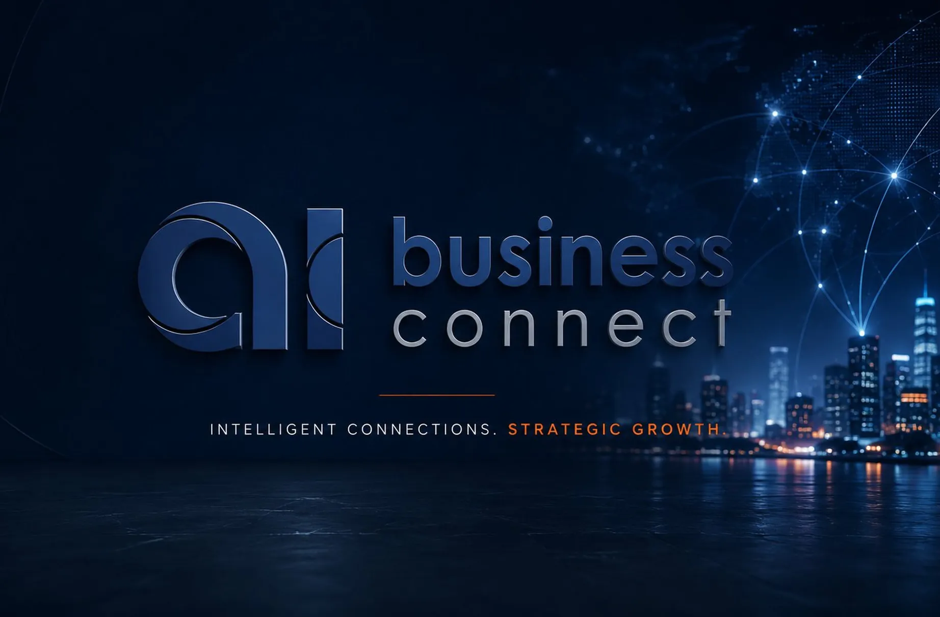
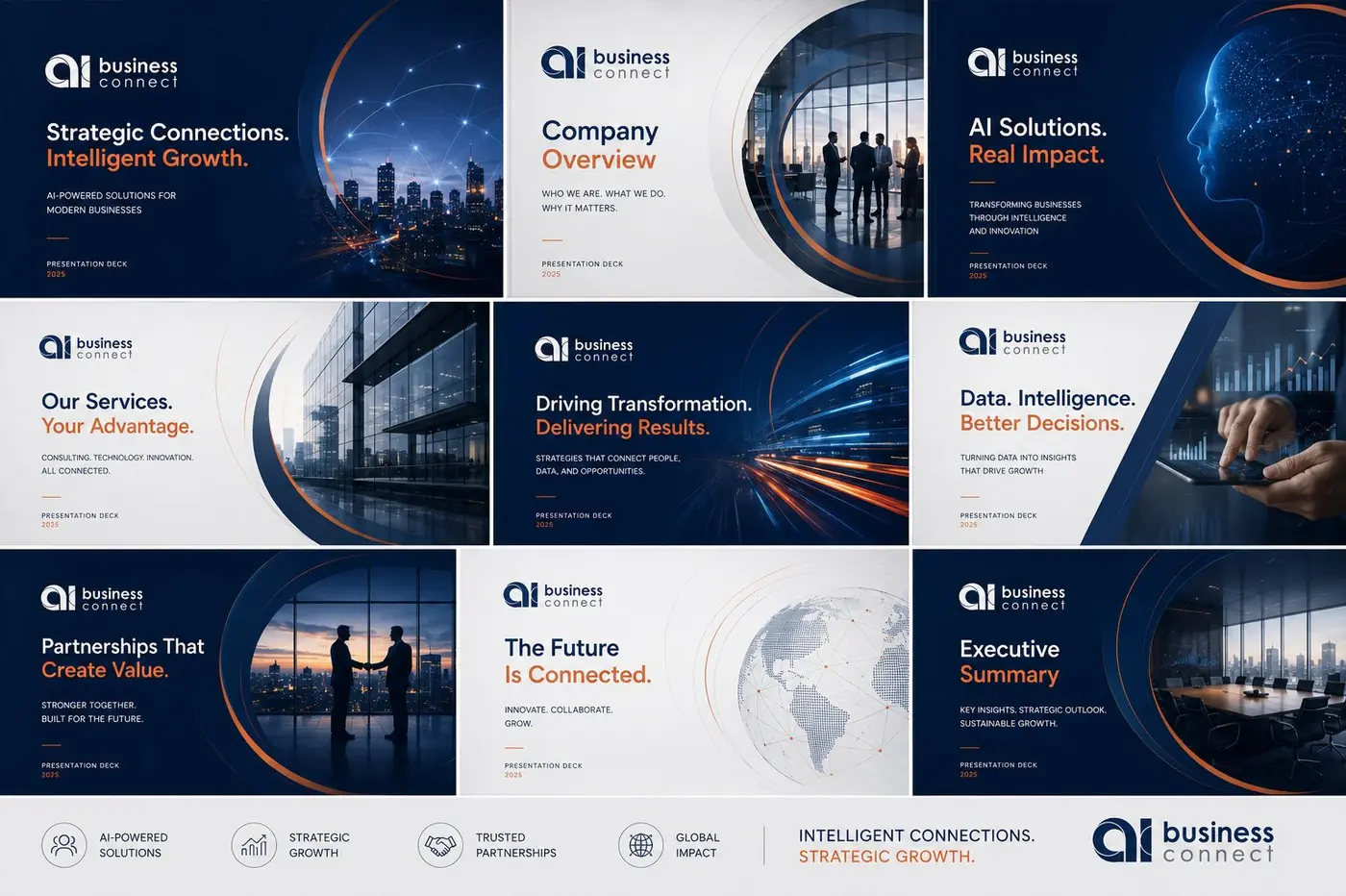
AI Business Connect had to read as established enterprise infrastructure from its first day in market, not a startup logo stretched thin across a few templates. The identity is built on one idea: connection is the product, so connection had to be the form.
01
Momentum instead of a static icon
A platform that sells access to a network gets judged on whether it looks like it already has one. That is a branding problem before it is a drawing problem, and it pushed me to build a full system from the first sketch rather than a mark with collateral bolted on later. Consistency is what reads as scale here. A company whose pieces look assembled by different hands is telling you exactly how small it is.
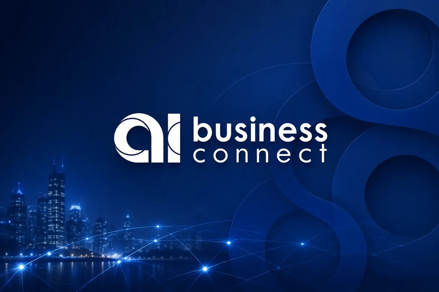
The mark sets the two lowercase letters as one figure, with a circular sweep cutting through the a so the shape reads as something turning rather than something parked. I wanted geometry that suggests movement across a network instead of the usual dots and connecting lines, which this category has used to exhaustion. Navy holds the weight, a lighter silver carries the second word, and a short orange rule sits under the lockup to close it.
02
A second thing people recognize
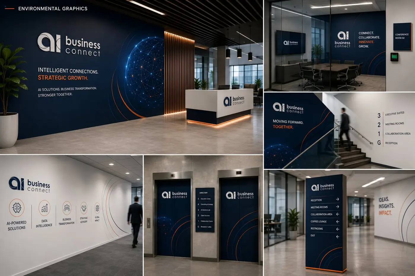
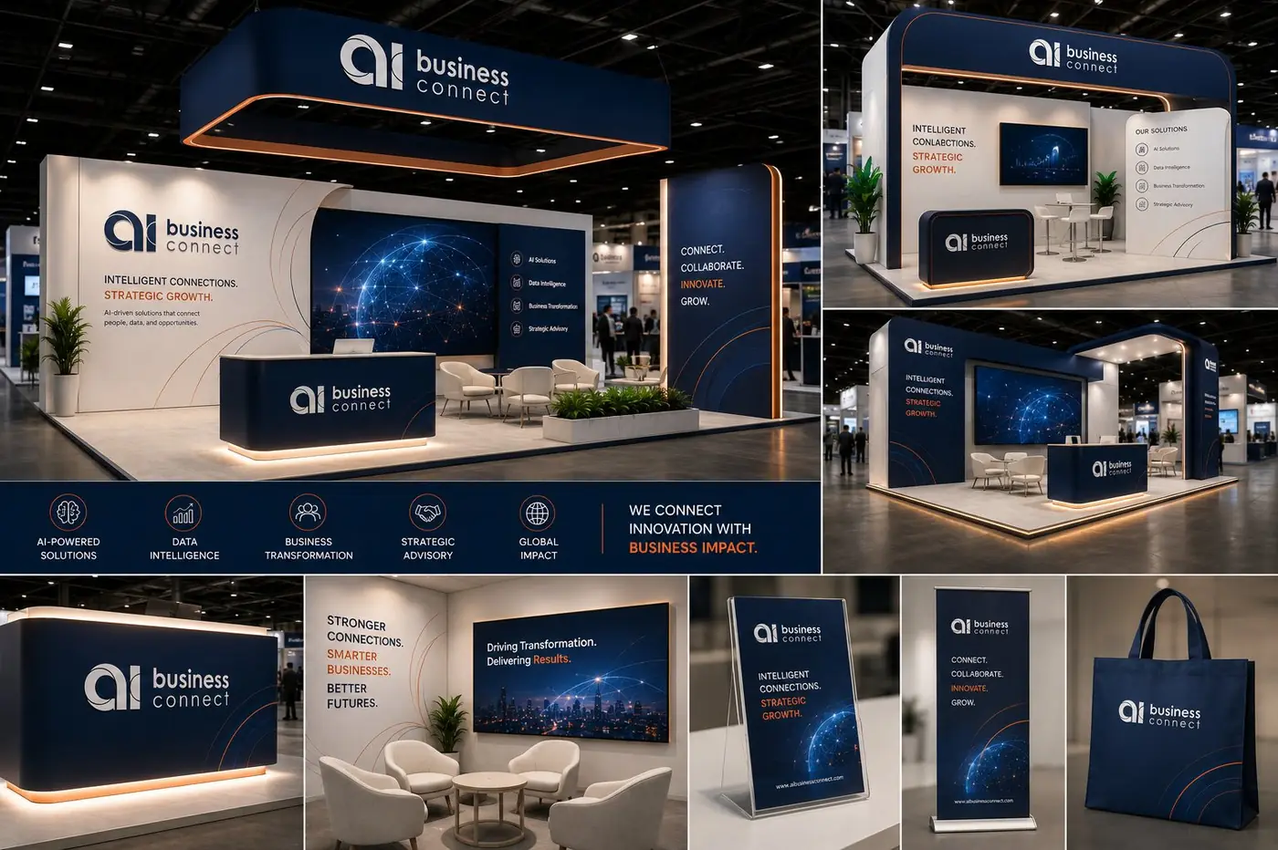
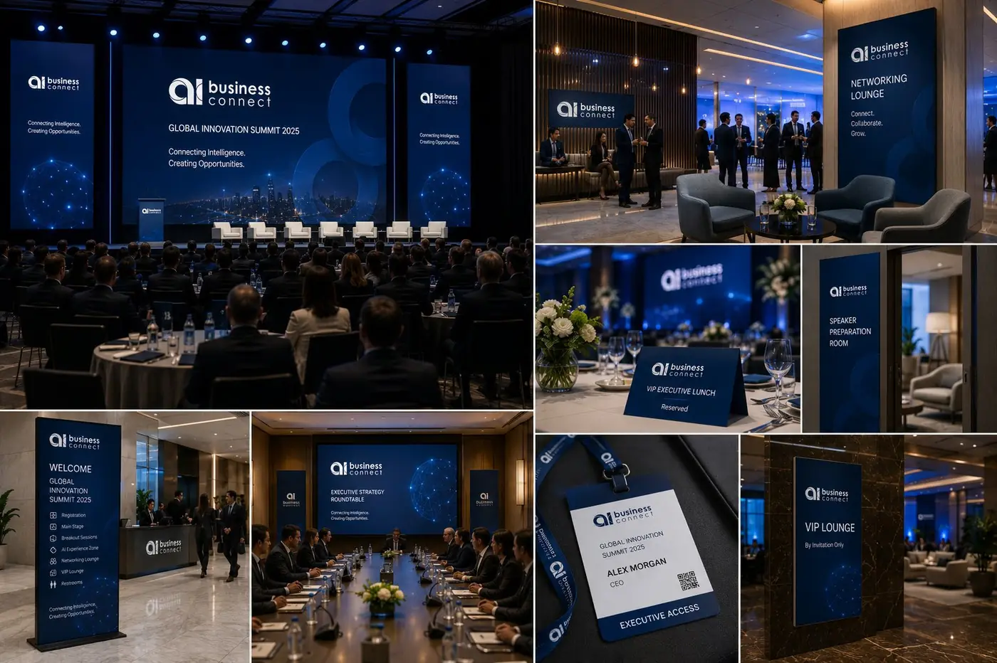
The tagline appears in the same position, at the same measure, on every touchpoint, which turns it into a second point of recognition. That matters for a business where first contact often happens on a slide, a lanyard or a folder rather than a homepage, and where the mark itself may be small or partly out of view.
A city skyline sits behind the key pieces at low contrast. It is there to place the brand in the world these clients actually work in, and it stays quiet enough that the wordmark never has to fight it. Holding that treatment back was deliberate, because the same image at full strength stops being an identity and becomes a stock photograph with type on it.
The system also had to survive the unglamorous formats, the envelope and the access card a visitor turns over while waiting. A platform making a claim this large earns it on those pieces far more than on a logo sheet, so the mark keeps its proportion when it shrinks and the orange rule does the identifying wherever nothing else fits.
More work
More projects.

Have a project like this?
Tell me what you are building, changing or launching, and I will help you define the right scope and direction.