
Case study · Logo & Brand Identity
ProBody
Sports Systems Athletic Apparel Brand Identity
ProBody Sports Systems is performance apparel, and a logo in this category gets judged in motion, on a body, not sitting still on a hanger. I built the identity to that standard from the first sketch.
01
A mark that reads in motion
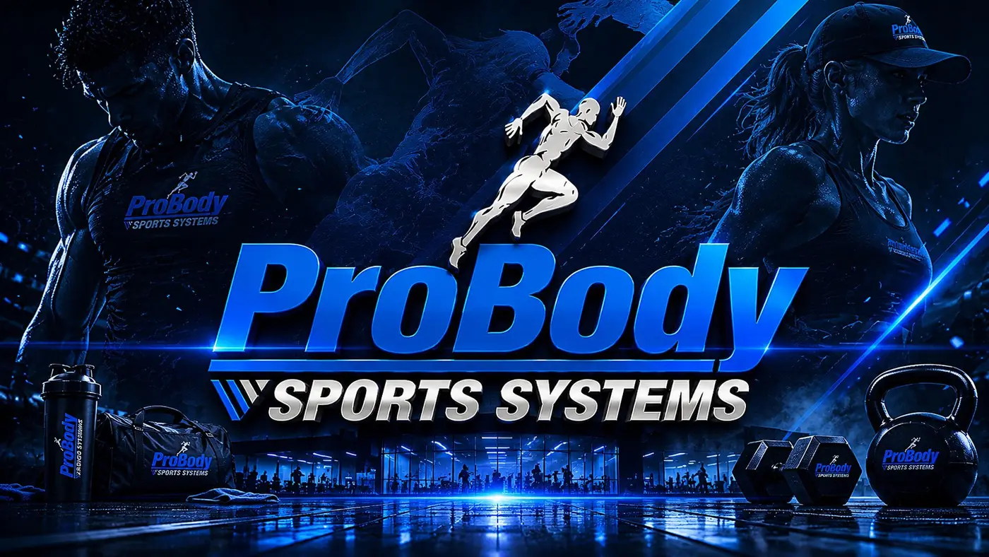
The icon is a runner at full extension, drawn as a solid white silhouette with the trailing leg and the forward arm breaking past the line of the wordmark. Credibility here is decided in about a second, so the figure has to do the work a photograph would. I kept it a filled shape rather than a line drawing, because thin strokes are the first thing to vanish under embroidery or at small sizes.
The wordmark leans with it. A heavy sans, italicized just enough to feel forward, with a rule running back under the name like a motion trail. Blue carries the type and the figure stays white, which is what lets the lockup hold on dark and light colorways without a second version. None of this is subtle, and in a category where hesitation reads as weakness, it should not be.
02
Holding shape at every scale
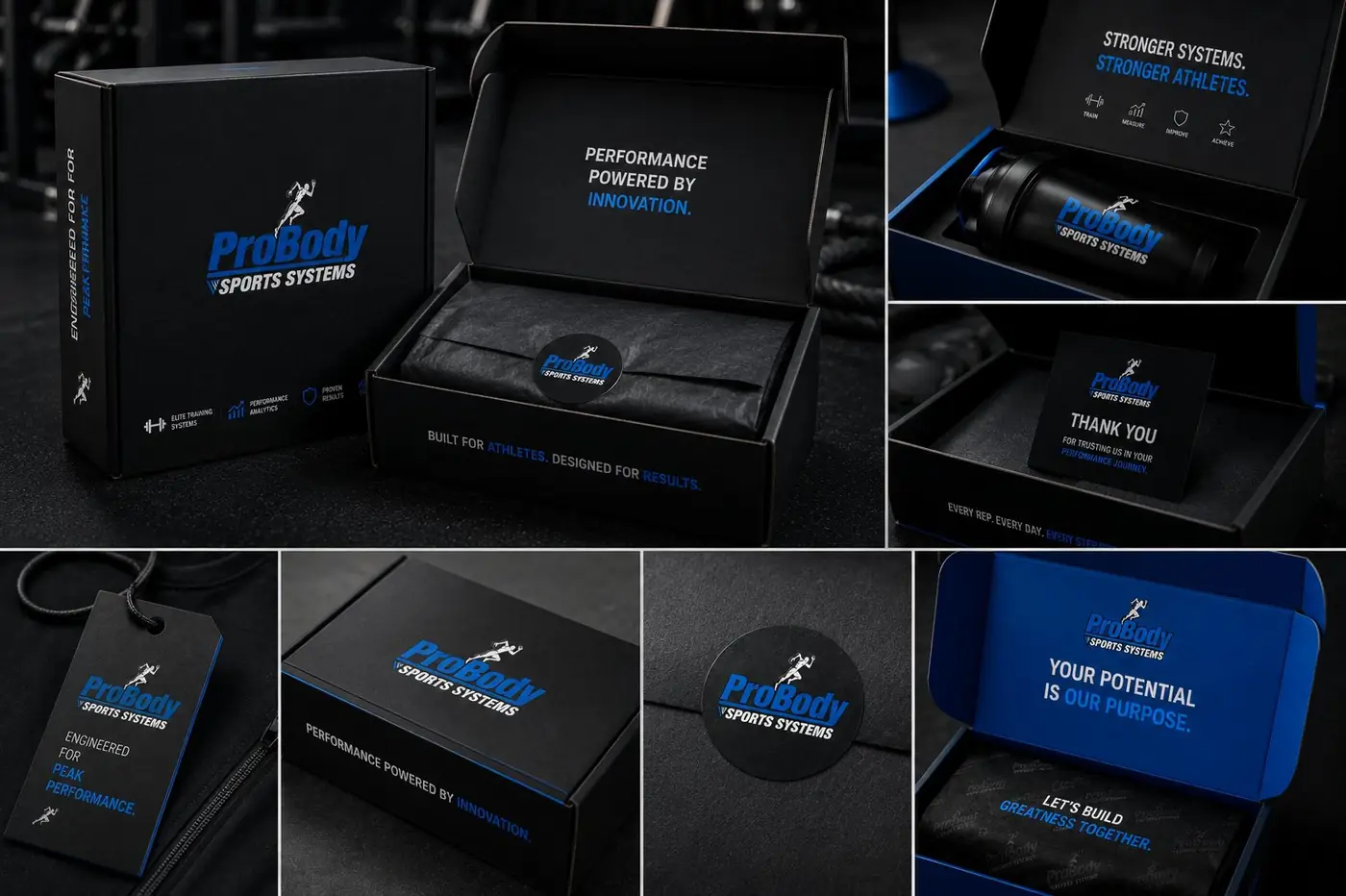
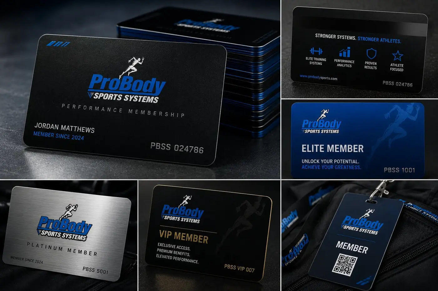
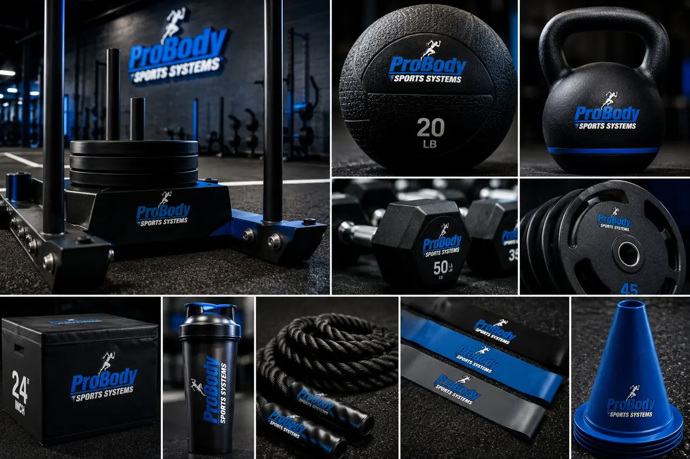
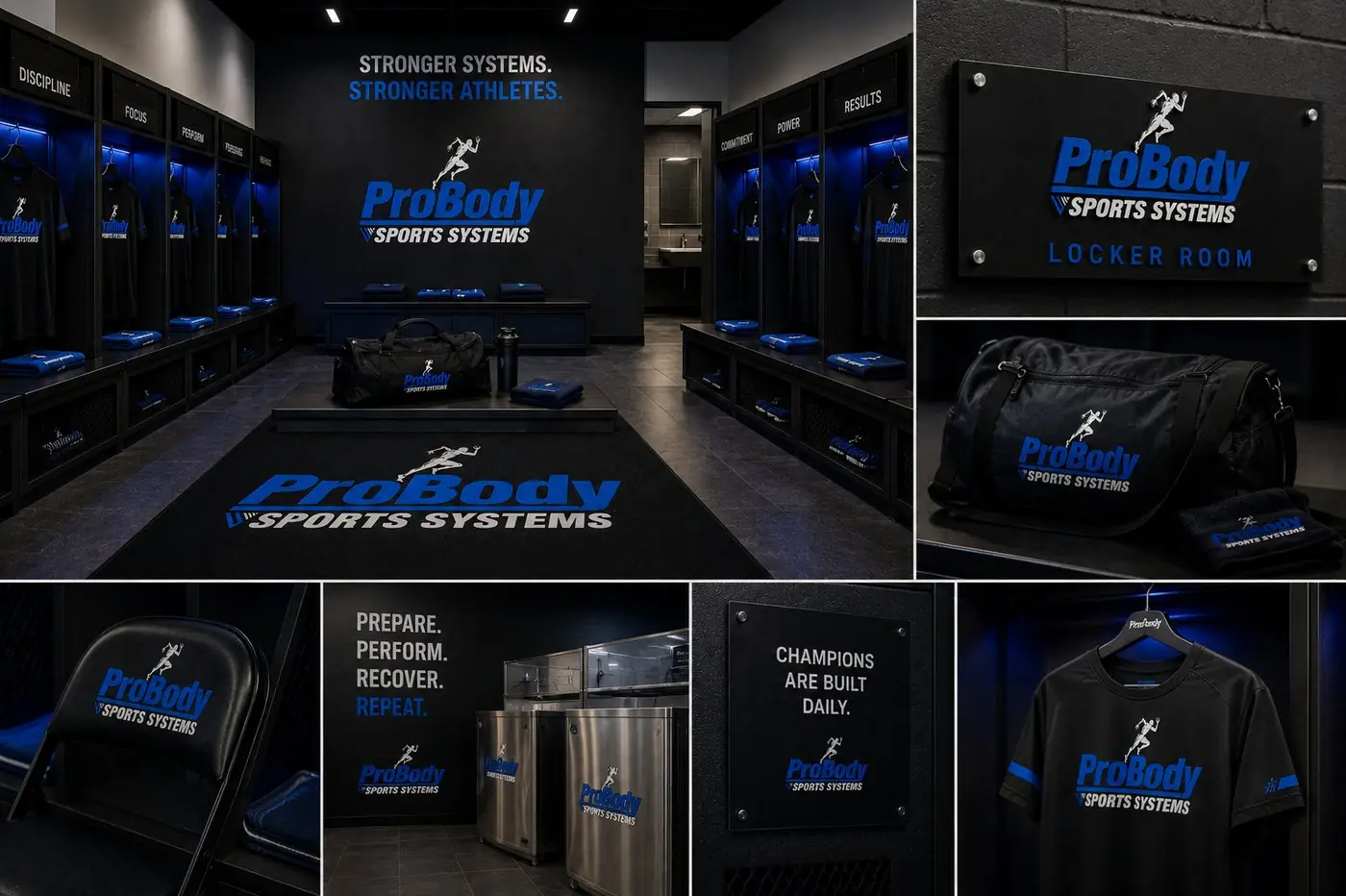
The hardest size is the smallest. On a tee or a jacket the lockup drops to a chest patch a few inches across, and that is where I tested it first, because if the runner turns to mush there the rest of the system is decoration. Stacking Sports Systems as a shorter locked line beneath the name keeps the proportion stable wherever it lands.
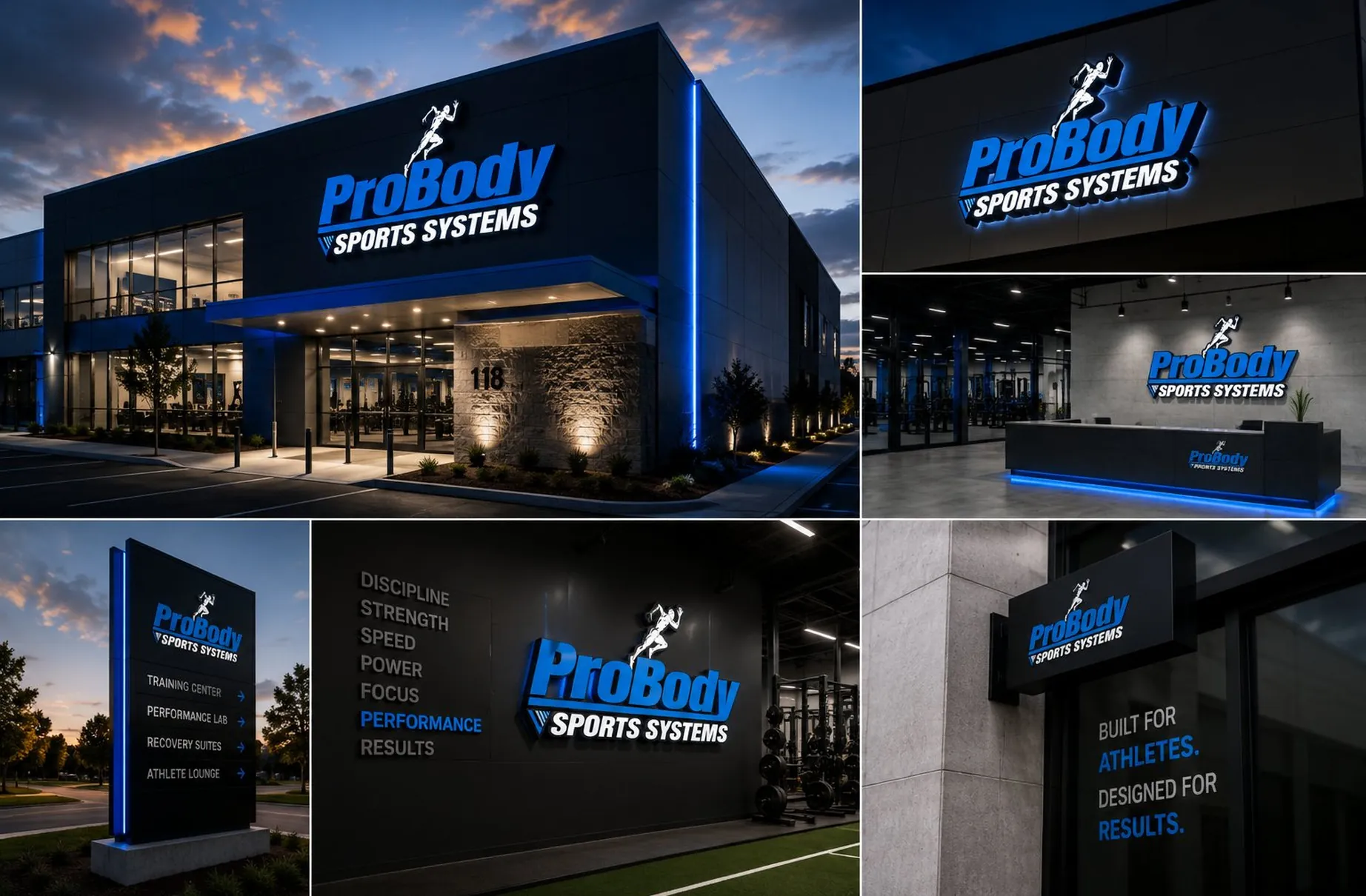
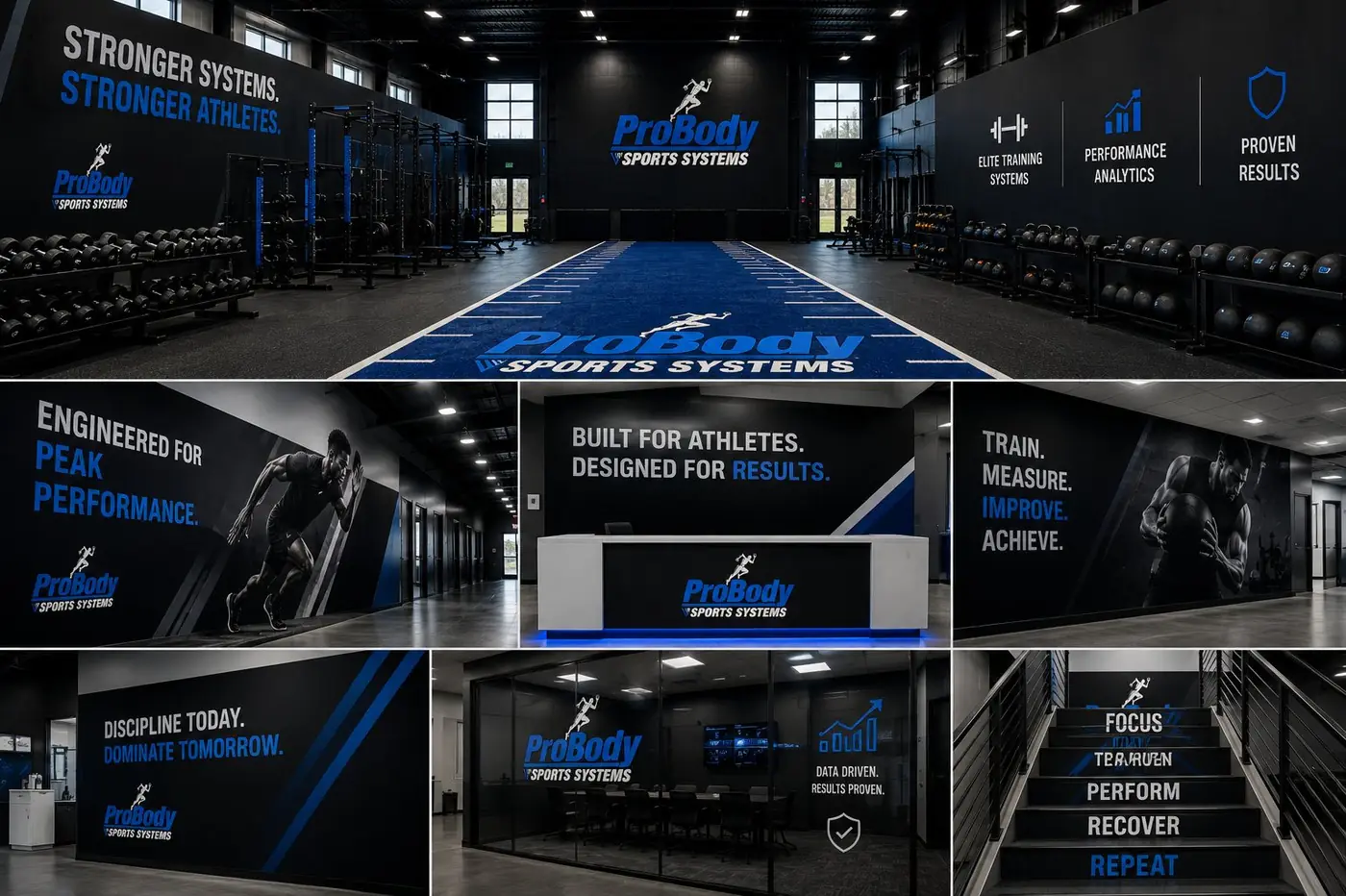
At the other end the same mark goes architectural. Built out in dimensional letters on a dark facade and lit from behind, or standing alone above a reception desk, it has to hold a wall from across a parking lot. A shape built on this much contrast travels in both directions, which is the argument for drawing it plainly in the first place.
The imagery follows the same rule. An athlete mid sprint, shot as real effort rather than a staged lifestyle setup, because a performance brand gives up its claim the moment the pictures look arranged. That is the standard the mark was drawn against in the first place, and it is the one thing the whole system has to keep proving. Judged in motion, or not judged at all.

More work
More projects.




Have a project like this?
Tell me what you are building, changing or launching, and I will help you define the right scope and direction.