
Case study · Logo & Brand Identity
Surfskate Love
Skateboard Brand Identity & Deck Graphics
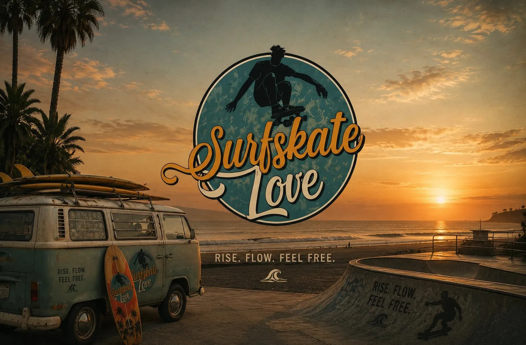
Surfskate boards get bought for identity as much as for function. Surfskate Love was built so that a line of four reads as a set worth collecting rather than one board printed in four colors.
01
One fixed anchor, four rewards
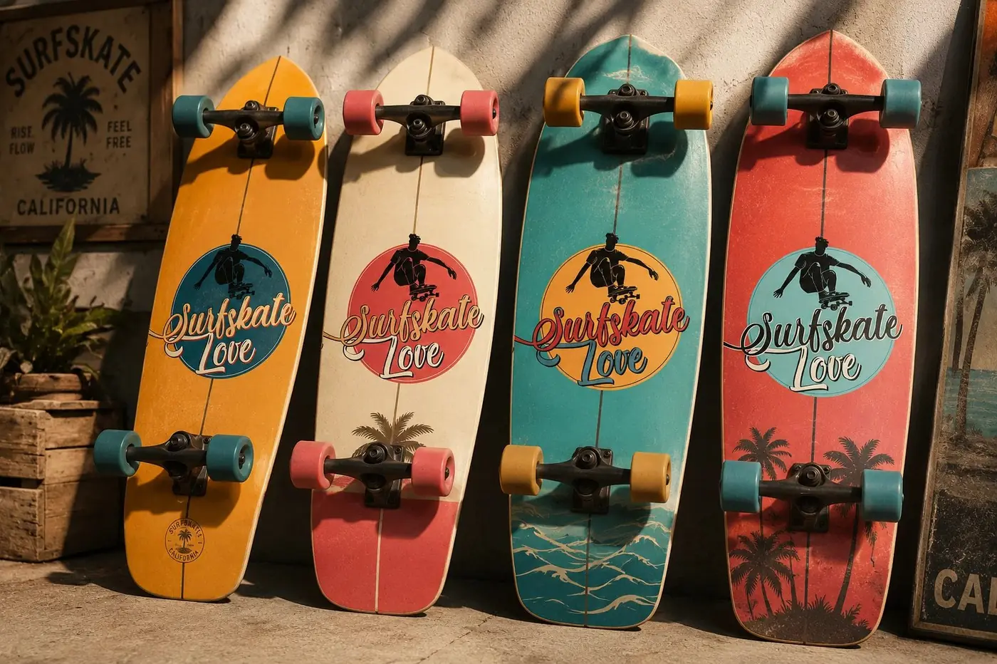
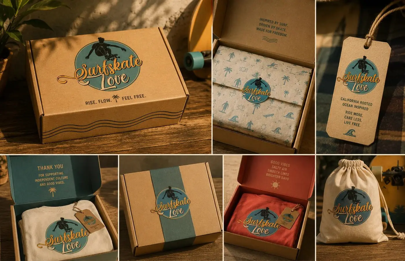
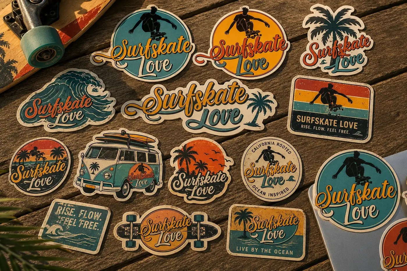
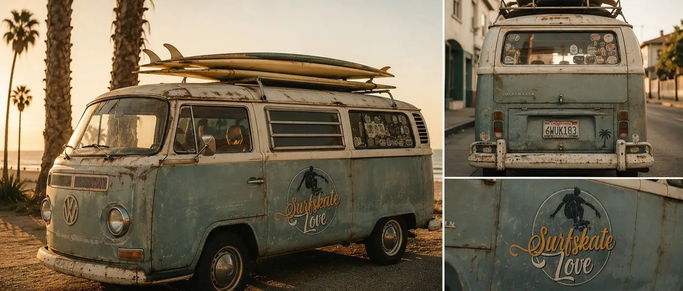
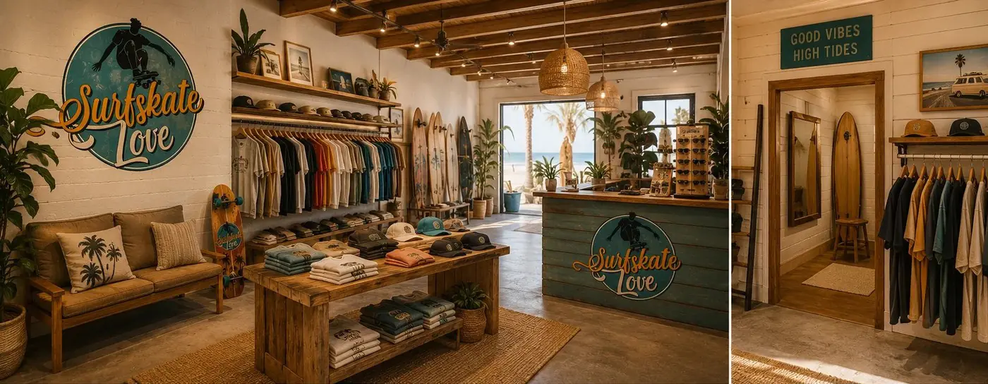
A brand in this category lives or dies on whether the second purchase feels like a different object. So the system has one thing that never moves and one thing that always does. The badge is the constant: a circle of weathered teal, a skater silhouette breaking up out of the ring so the shape never quite closes, and the name lettered in a retro script the whole surf category already speaks.
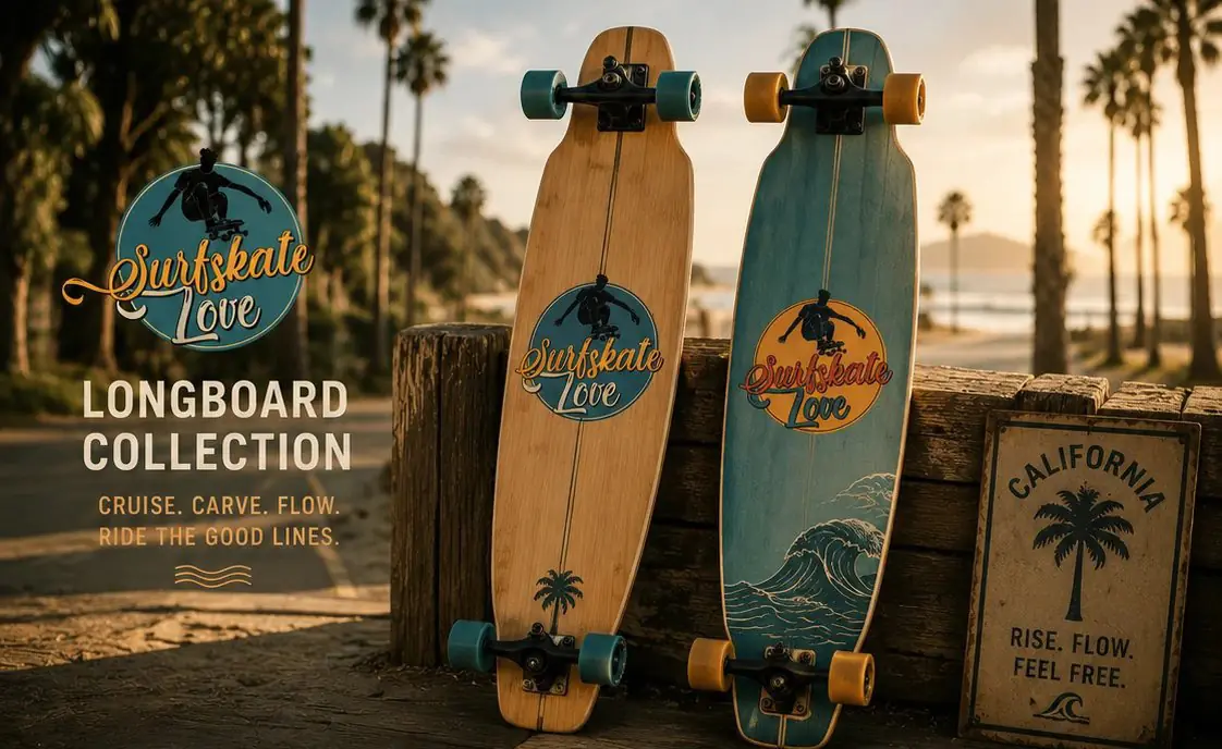
Everything else belongs to the colorway. Each of the four decks carries its own palm and wave illustration on the tail, which is the part a rider looks at most and the part that makes owning two boards feel like owning two things. Holding the badge identical across all of them is what keeps that variety from reading as a brand that cannot make up its mind.
02
A feeling the board is part of
The script does real work here. Sun bleached and slightly swollen, with a long swash curling off the first letter and running back under the word, it carries the California reference without a single literal beach cue in the lockup. Mustard and cream against the teal keep the whole thing warm, which matters for a mark that will spend its life photographed at the end of the day.
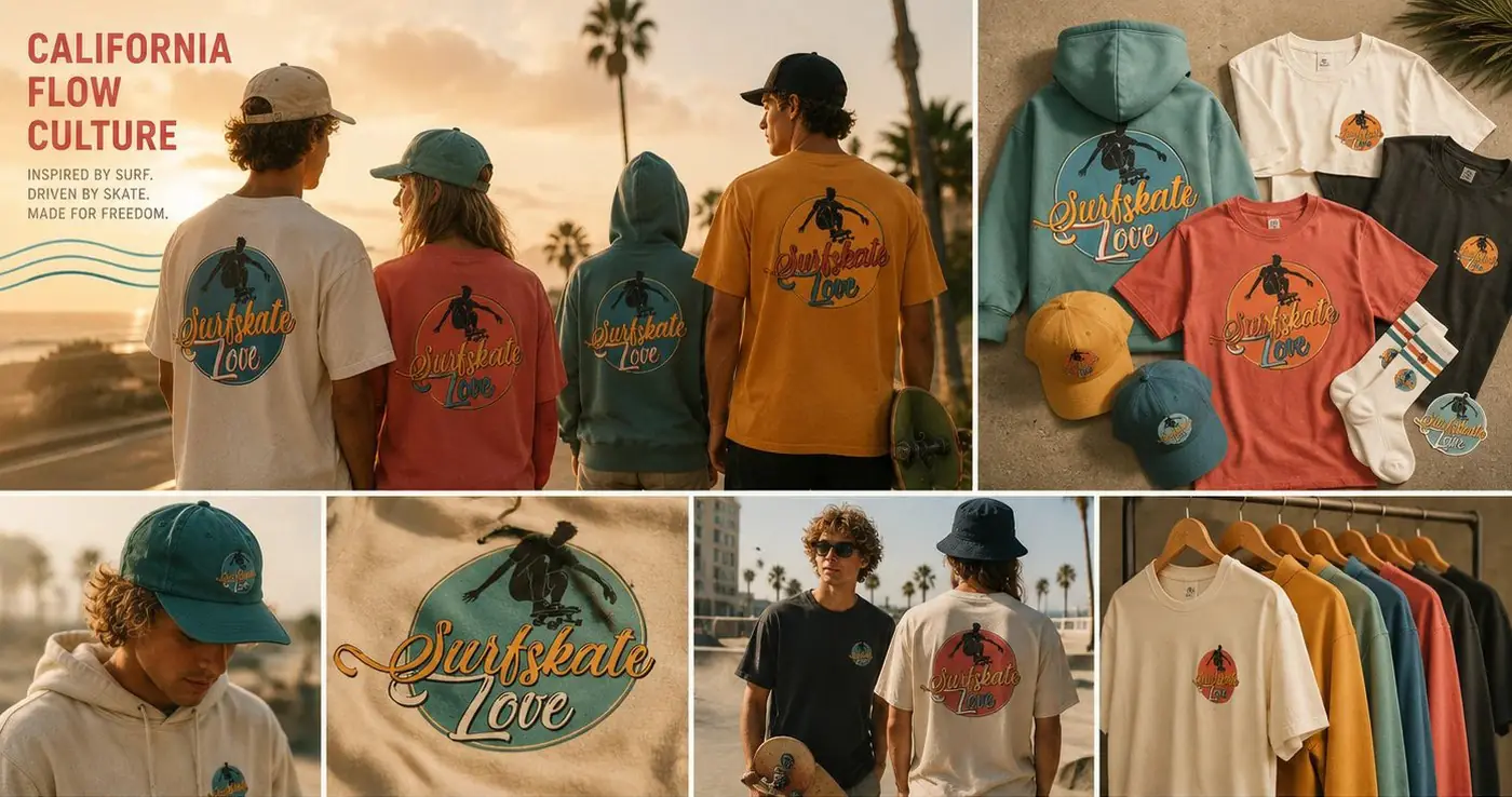
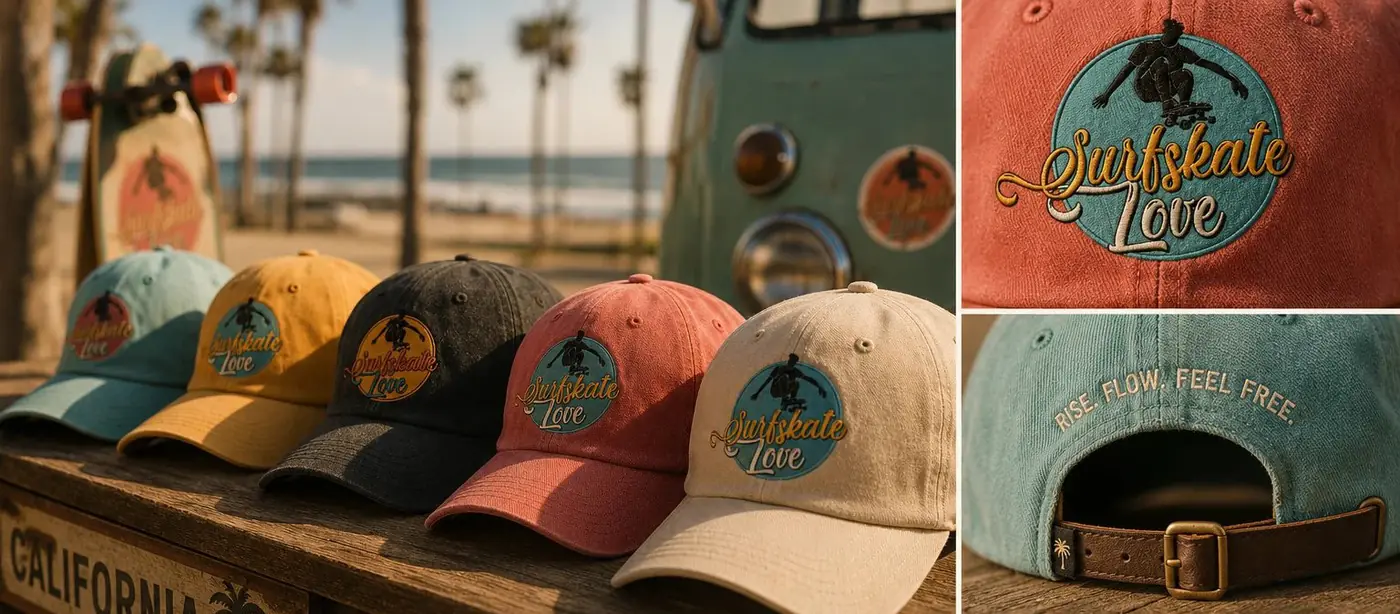
A wave glyph drawn from the same world handles everything the full badge is too big for: a deck nose, a hat, a small stamped detail. It reduces to almost nothing and still reads as the brand, which is the test every badge logo eventually faces, since a circle that looks generous at deck scale is the first thing to go muddy at an inch.
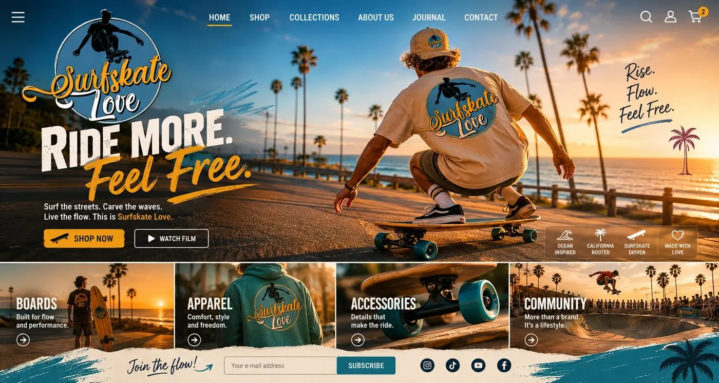
The companion sign style graphic came out of the same reasoning. Rise. Flow. Feel Free. runs in wide spaced caps, deliberately plain, so it lands as a statement rather than a slogan. A brand like this sells a feeling more than a product, and that line gives people somewhere to put the feeling when they are not standing on a board.
More work
More projects.


Have a project like this?
Tell me what you are building, changing or launching, and I will help you define the right scope and direction.