
Case study · Logo & Brand Identity
Lane Law Office
Corporate Legal Brand Identity & Stationery
Lane Law Office advises CFOs and holding companies, the kind of client who reads restraint as competence. The identity is built on a single idea: a firm this senior does not need to raise its voice.
01
Restraint as the actual strategy
For advisory work at this level the branding problem is not attention, it is credibility. Someone choosing counsel for a high stakes engagement is looking for evidence of judgment, and nothing undermines that faster than a mark that performs. So restraint became the strategy itself rather than a style laid over one, and every decision after that had to answer to it.
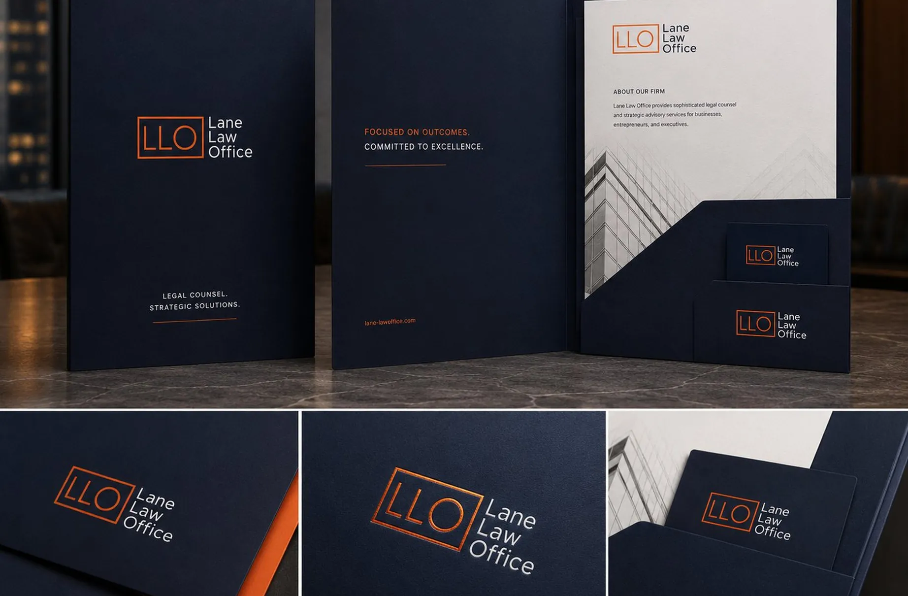
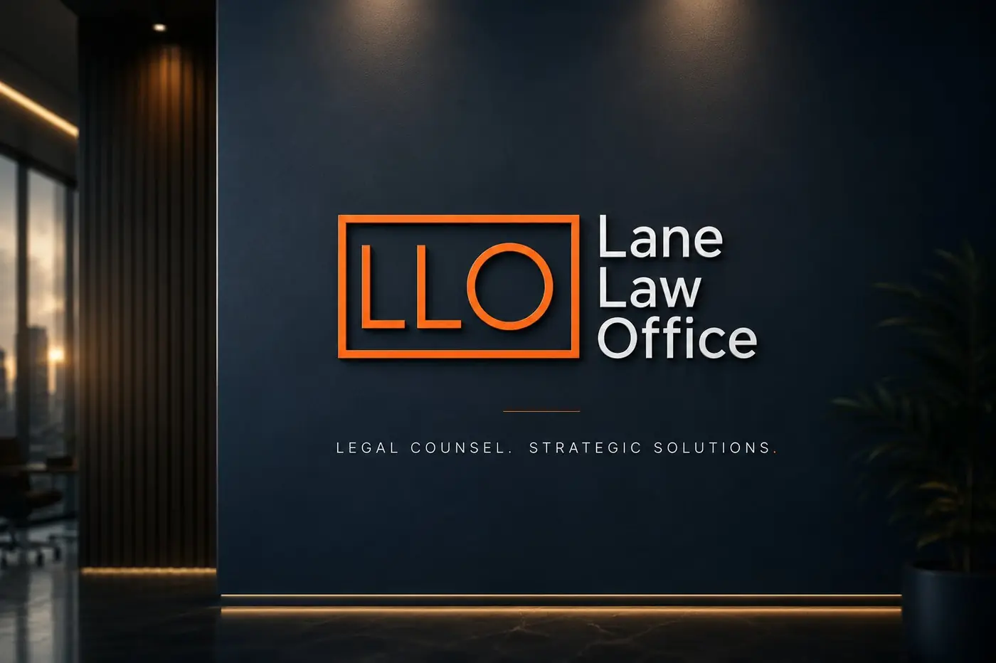
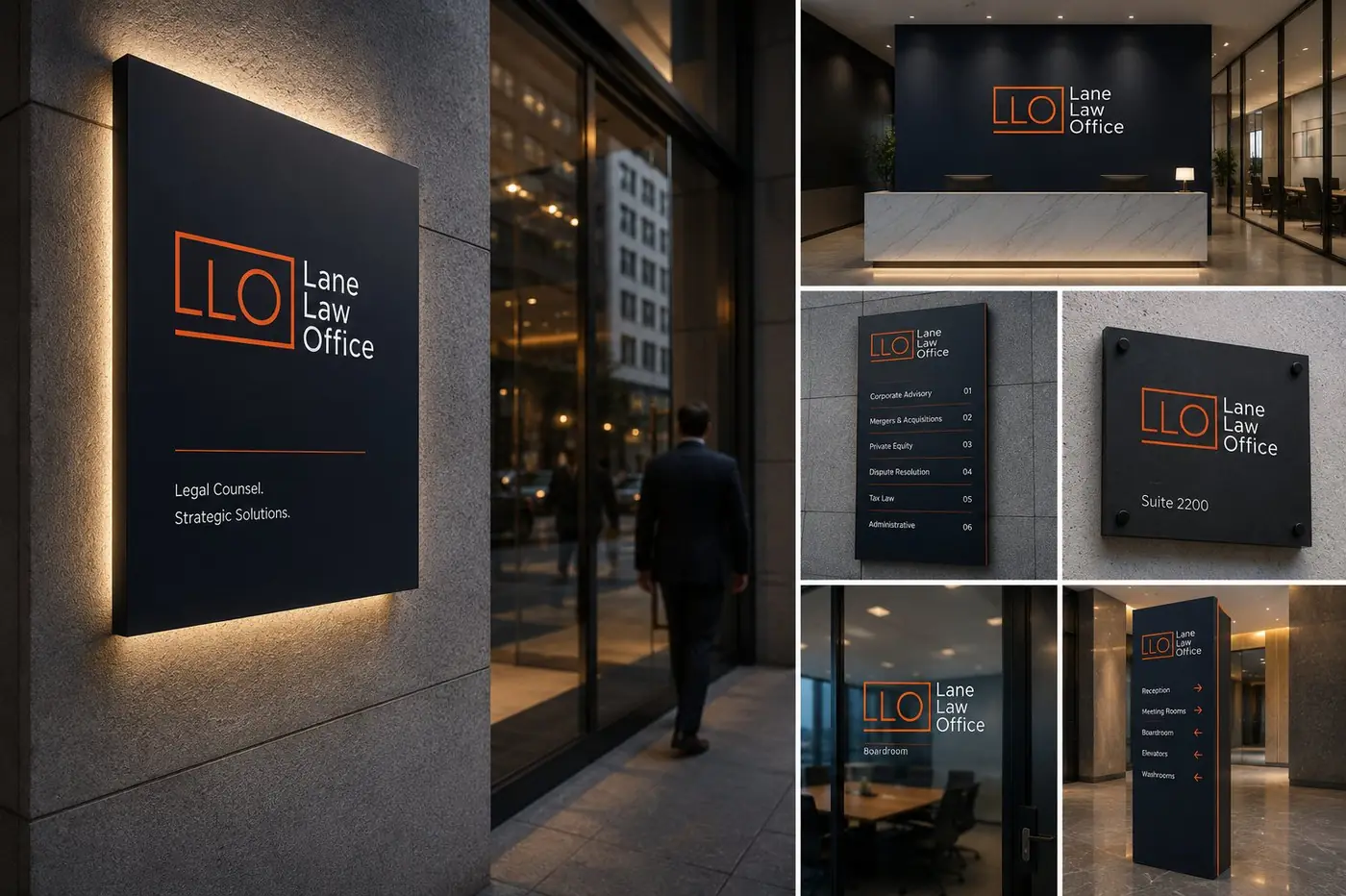
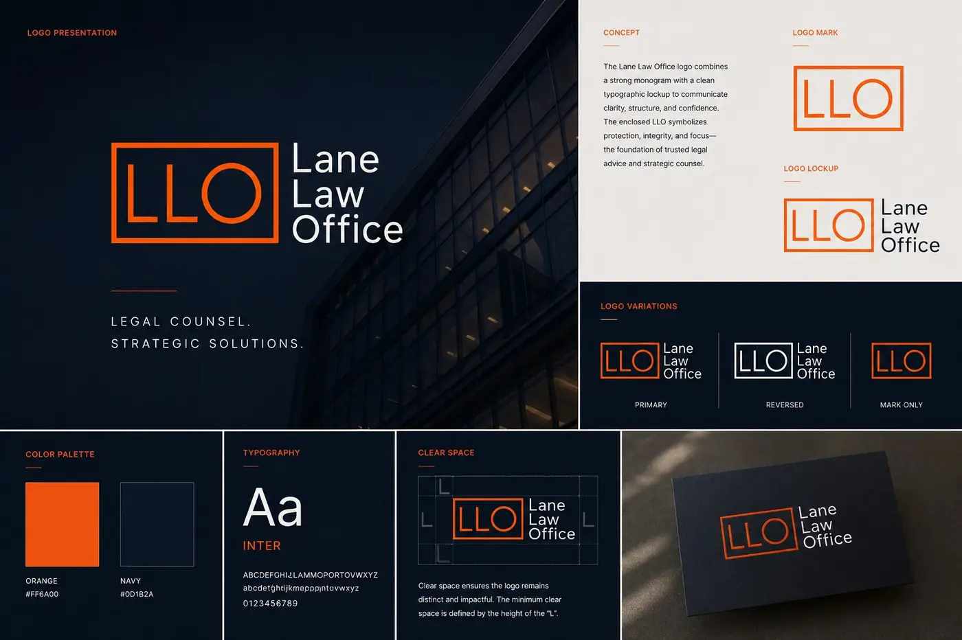
The monogram came out of the way these firms actually talk. Three letters, squared off, held inside a thin ruled rectangle that closes the shape without asking for attention. I kept the construction geometric and the weights even, because anything more expressive would have read as a firm with something to prove. The name stacks alongside in three short lines, so the lockup sits as one settled object.
02
The same voice on every page
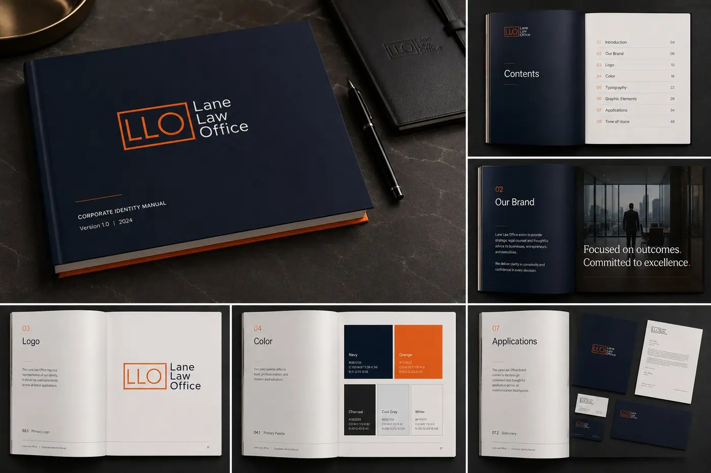
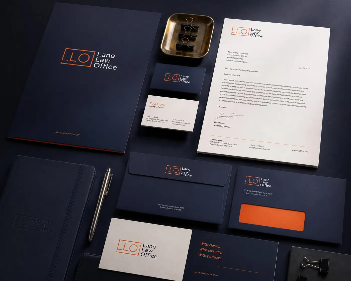
Orange earns its place by staying a hairline. It draws the rectangle, it turns up as a short rule under a line of type, and it appears almost nowhere else, which means it marks the brand without ever competing with the words a client is there to read. Navy carries the rest of the surface, with cream reserved for the places where reading happens.
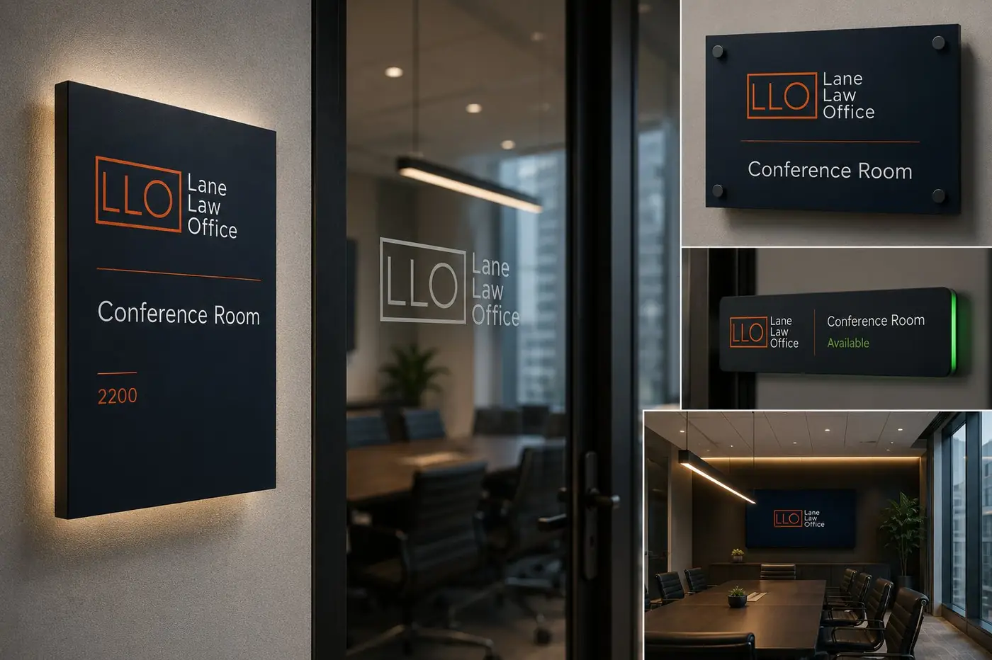
One sans serif runs the whole system, in two weights that handle every level of hierarchy the material needs. That limit was deliberate. Correspondence from a firm like this should feel like its advice, precise and free of unnecessary flourish, and a second typeface would have introduced a voice nobody asked for. The taglines run as short declaratives, set small and spaced wide.
The real test is how the mark behaves once it shrinks. On a business card the rectangle is barely more than a drawn line and it still holds its proportion, still reads as deliberate. Printed in copper foil on dark stock it picks up light without changing character, which is the argument for building a mark on geometry instead of on effect.
More work
More projects.


Have a project like this?
Tell me what you are building, changing or launching, and I will help you define the right scope and direction.