
Case study · Logo & Brand Identity
RateSaver
Energy Consulting Corporate Brand Identity
RateSaver sells measurable savings to CFOs and operations directors, an audience that reads precision as proof. The identity does its work inside the name itself, splitting one word into the two things the company actually promises.
01
Two halves of the same word
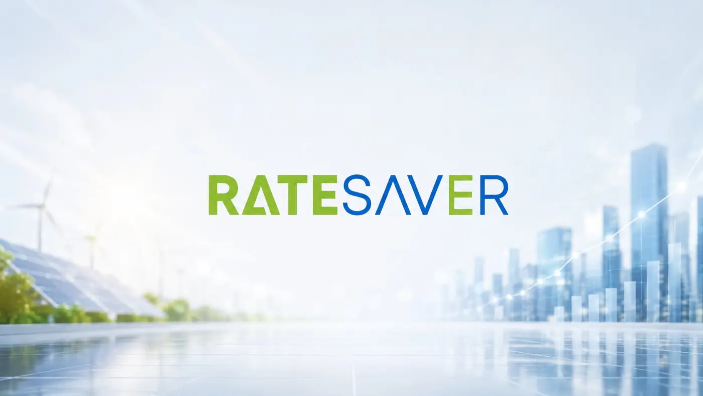
The proposition is a compound. There is the rate, and there is the saving, and the business only makes sense when both are true at once. So the wordmark carries that split in color rather than in space: green takes the first half, blue the second, and the two lock up with no gap between them, because this is a single idea with two components, not two services stacked on a page.
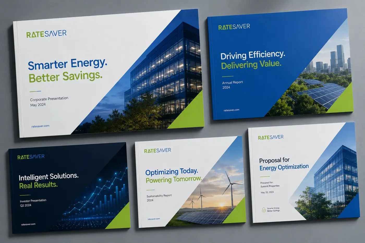
I drew the letterforms on clean angles with even weight, engineered rather than styled, and a diagonal in the same two colors turns up as the only ornament the system allows. That diagonal earns its place at large sizes. It gives a flat panel a direction to move in without introducing a graphic that means nothing.
02
Proof that it holds at every size
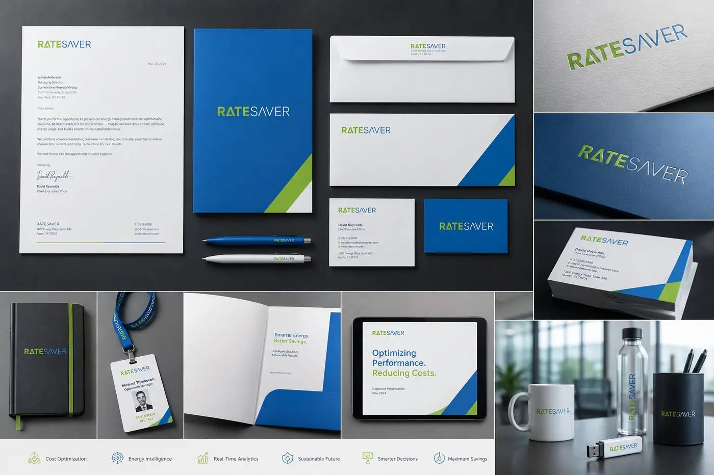
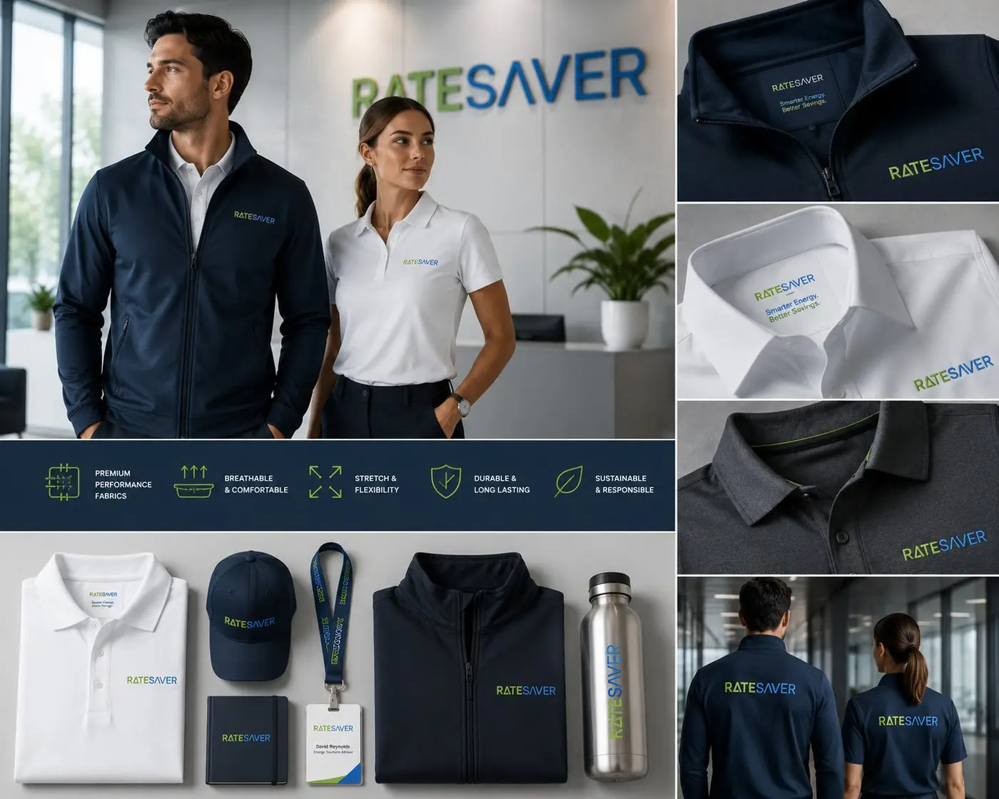
A consultancy that sells numbers cannot afford a brand that looks improvised, so the type stays deliberately plain and the color pair never varies. The benefit icons repeat at one weight across the material, drawn as simple line figures so they read as labels rather than illustration. This audience wants a visual language that behaves the way a spreadsheet does: consistent, countable, quick to scan.
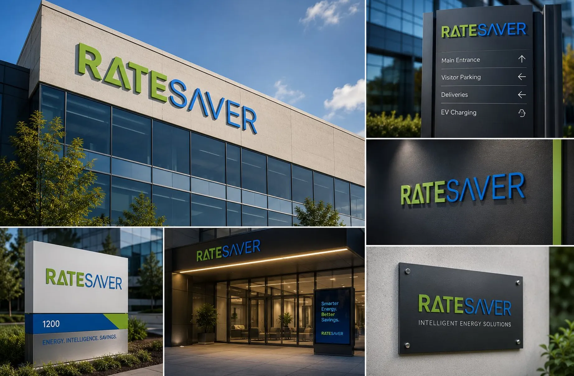
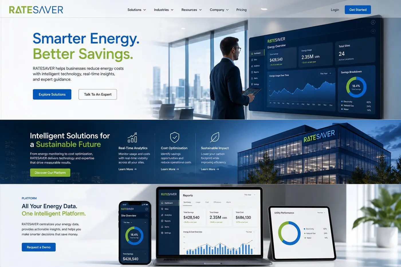
The real test was whether two colors and a wordmark could carry a whole company. On a dark wayfinding panel the green and blue separate cleanly enough to read from the parking lot; on a small brushed plaque the same lockup sits above a line of spaced capitals and keeps its proportion. Stationery, badges, a presentation deck and the small branded objects that end up on a desk all take it without adjustment.
That constraint was the strategy rather than a limitation on it. If a brand has one memorable move, repeating it exactly is the whole mechanism by which it becomes memorable, and every variation somebody adds in the name of freshness makes the original move worth a little less than it was.

More work
More projects.



Have a project like this?
Tell me what you are building, changing or launching, and I will help you define the right scope and direction.