
Case study · Logo & Brand Identity
Compass Fire
Investigations & Consulting Corporate Brand Identity
Compass Fire investigates cause and origin, and its reports get read by judges and juries. The identity had to look technically credible from the moment a document lands on a desk, which ruled out anything decorative.
01
Two meanings in one mark
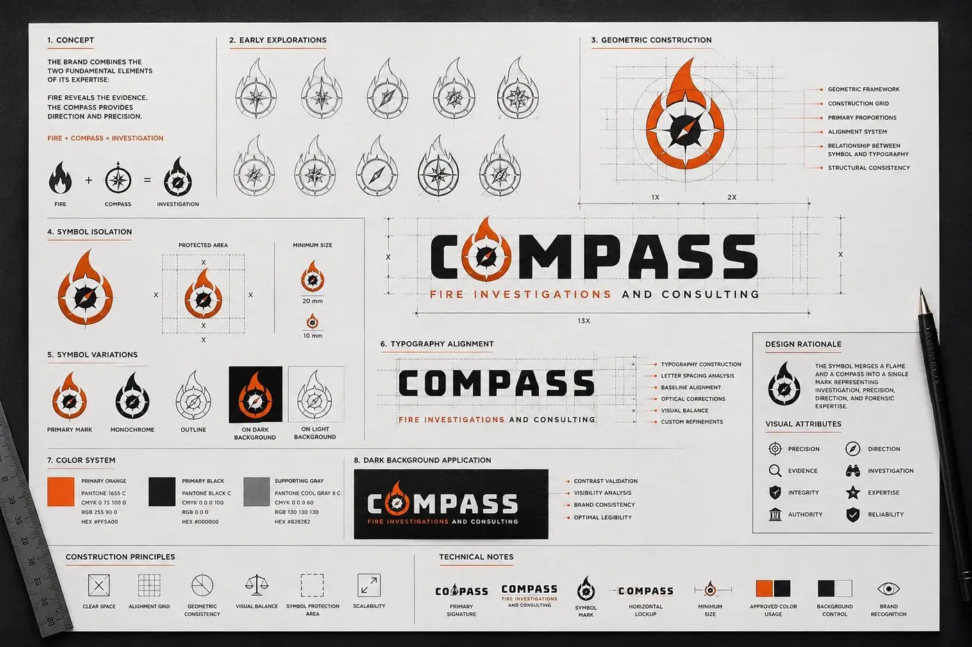
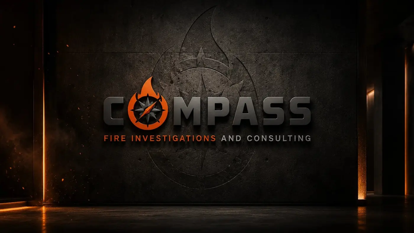
The firm's work sits where two things meet: the discipline of investigation and the fire itself. So I merged a compass rose with a flame, housing the needle inside a form that tapers to a point at the top. That is not a visual pun for its own sake. Expert witness work in cause and origin is precisely the act of pointing at where something started, and the mark says both halves of that at once.
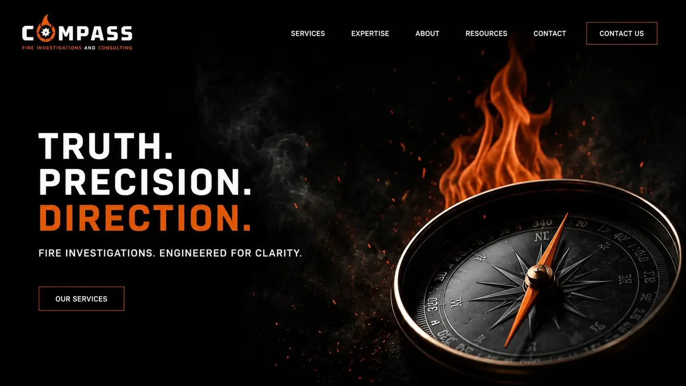
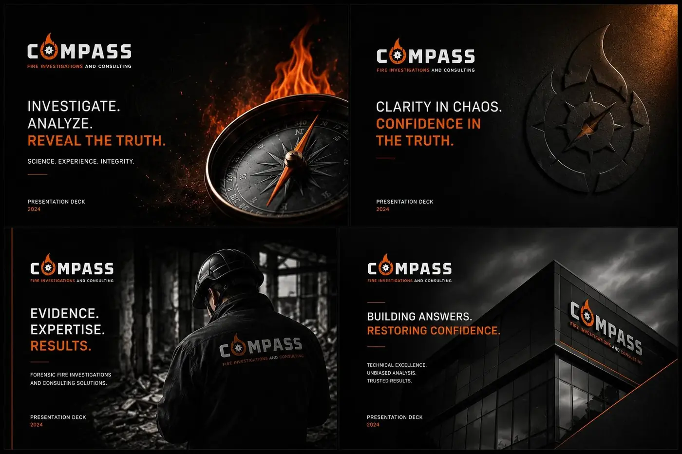
It lives in the wordmark as the letter O, which is the detail that makes the whole thing hold. A mark carried inside the name cannot be cropped off, cannot drift out of relationship with the type, and reads as one object at any size. Black, orange and white keep the register technical rather than corporate, warm enough to acknowledge the subject and hard enough to look like evidence.
02
Credibility a reader can feel
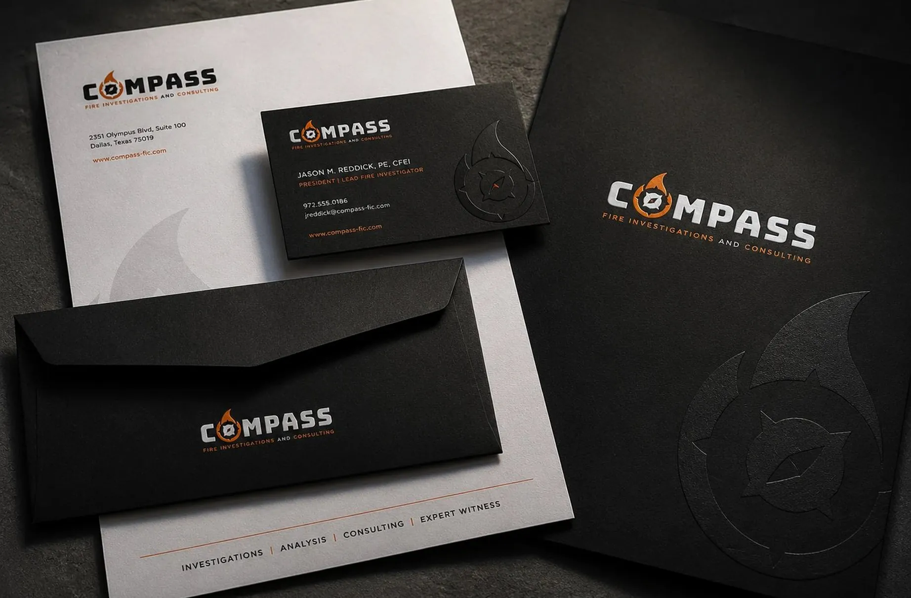
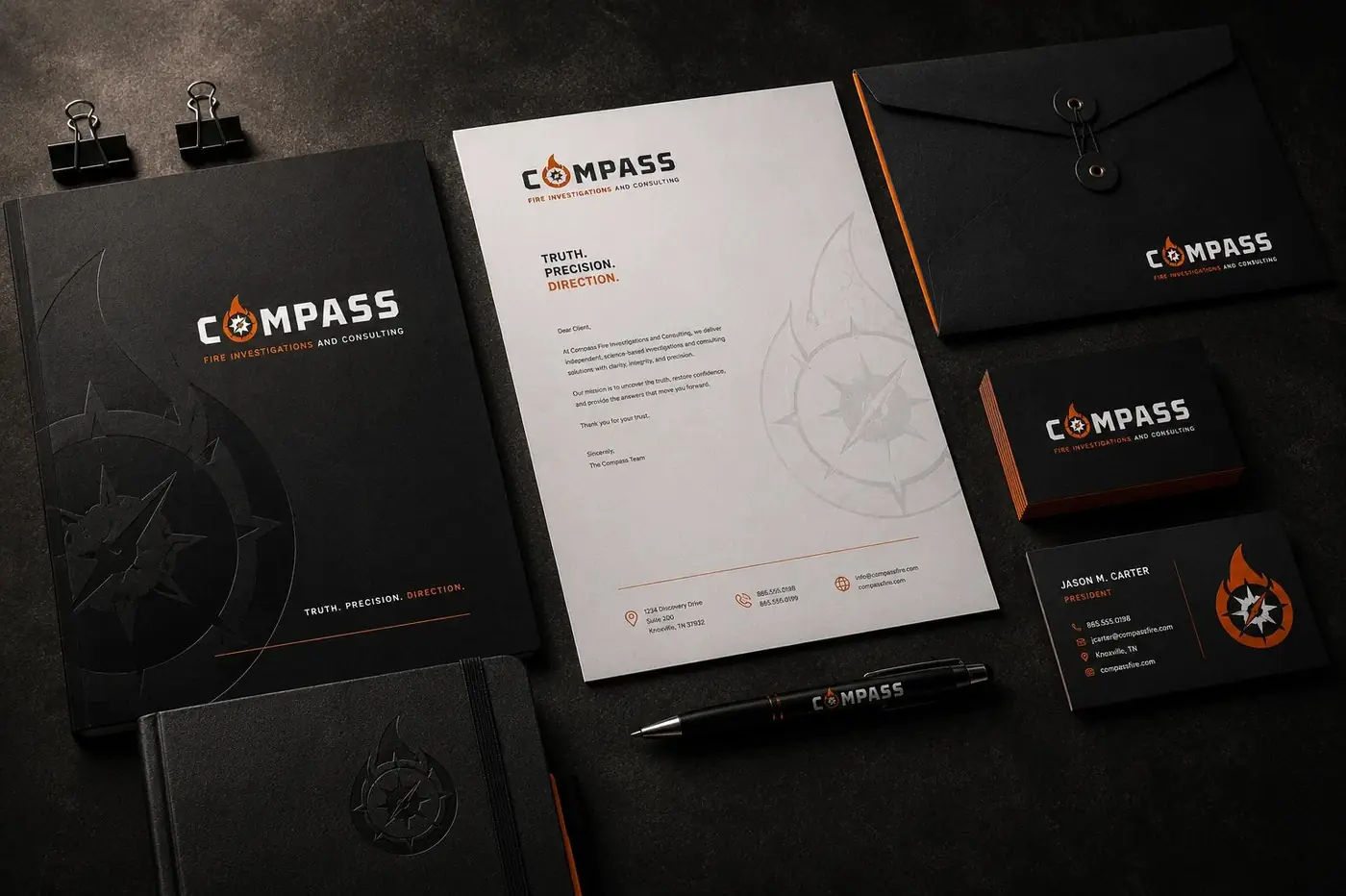
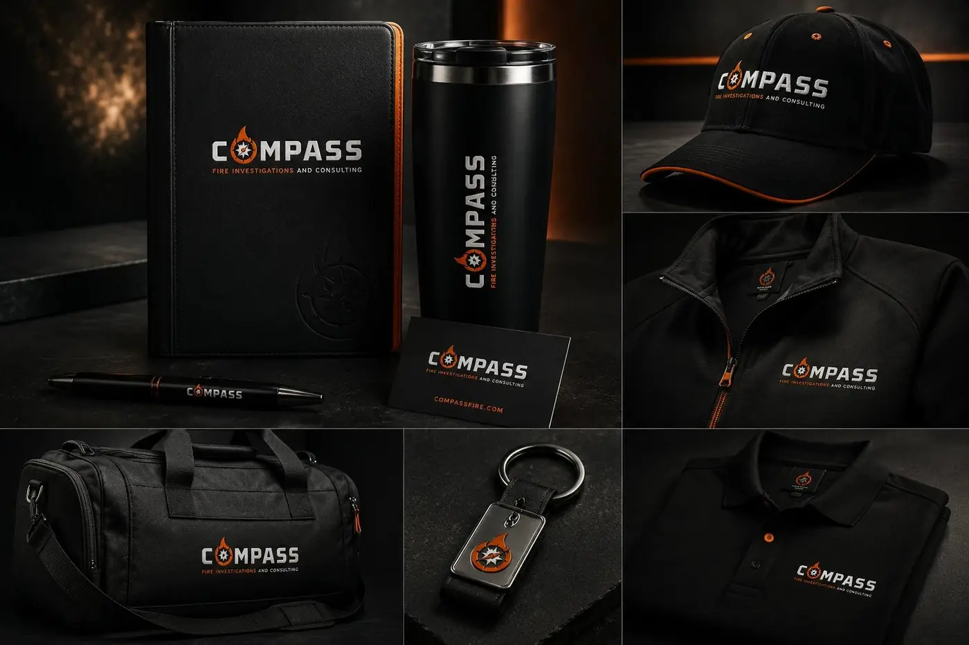
Everything downstream is built for paper, because paper is where this firm gets judged. The wordmark is set heavy and wide enough to carry a report cover, then reduces to a business card without the needle closing up, which is the reason the compass was drawn with so few internal lines to begin with.
Then there is a quieter move. The flame appears blind embossed, large and unfilled, on the folder and the envelope, so it registers as texture before anyone identifies what it is. A document from a firm like this is doing persuasive work before it has been opened, and a surface that has been physically worked signals what good binding signals: that whatever is inside was considered worth the trouble.
More work
More projects.




Have a project like this?
Tell me what you are building, changing or launching, and I will help you define the right scope and direction.