
Case study · Logo & Brand Identity
SpraySafe
Pest Control Mascot Brand Identity & App/Merch Design
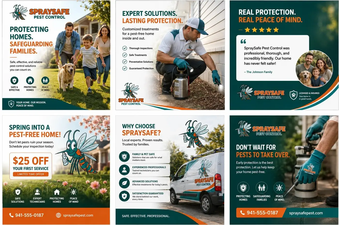
SpraySafe is a home pest control service, and the identity rests on one inversion: make the pest itself the friendly face of the company.
01
Charm instead of the usual dread
Pest control sells through fear almost by default. Oversized insects, alarm colors, the suggestion that something is already wrong behind your baseboards. That approach might win a first call, but it makes a brand hard to live with once the van is a regular fixture in the driveway. SpraySafe needed to win people over by seeming capable and easy to have around, so charm became the strategy rather than a softening of one.
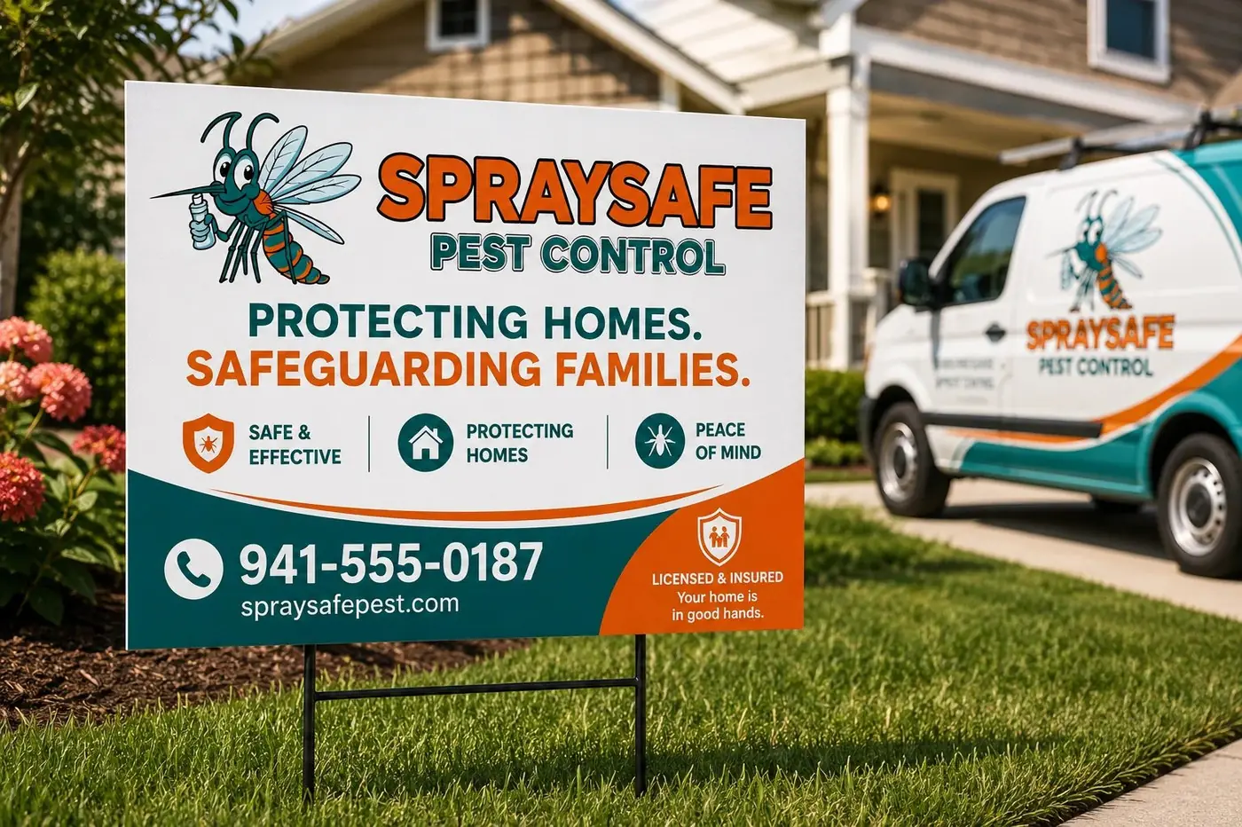
The mascot is the mosquito, drawn smiling and upright with a spray can in hand, clearly working for you rather than against you. It is a small flip of the category's logic and it changes everything downstream, because once the pest is the helper the brand stops being about the threat and becomes about the person who handles it. The drawing stays round and the silhouette stays simple, so it survives being printed small or printed badly.
02
The same face on every surface
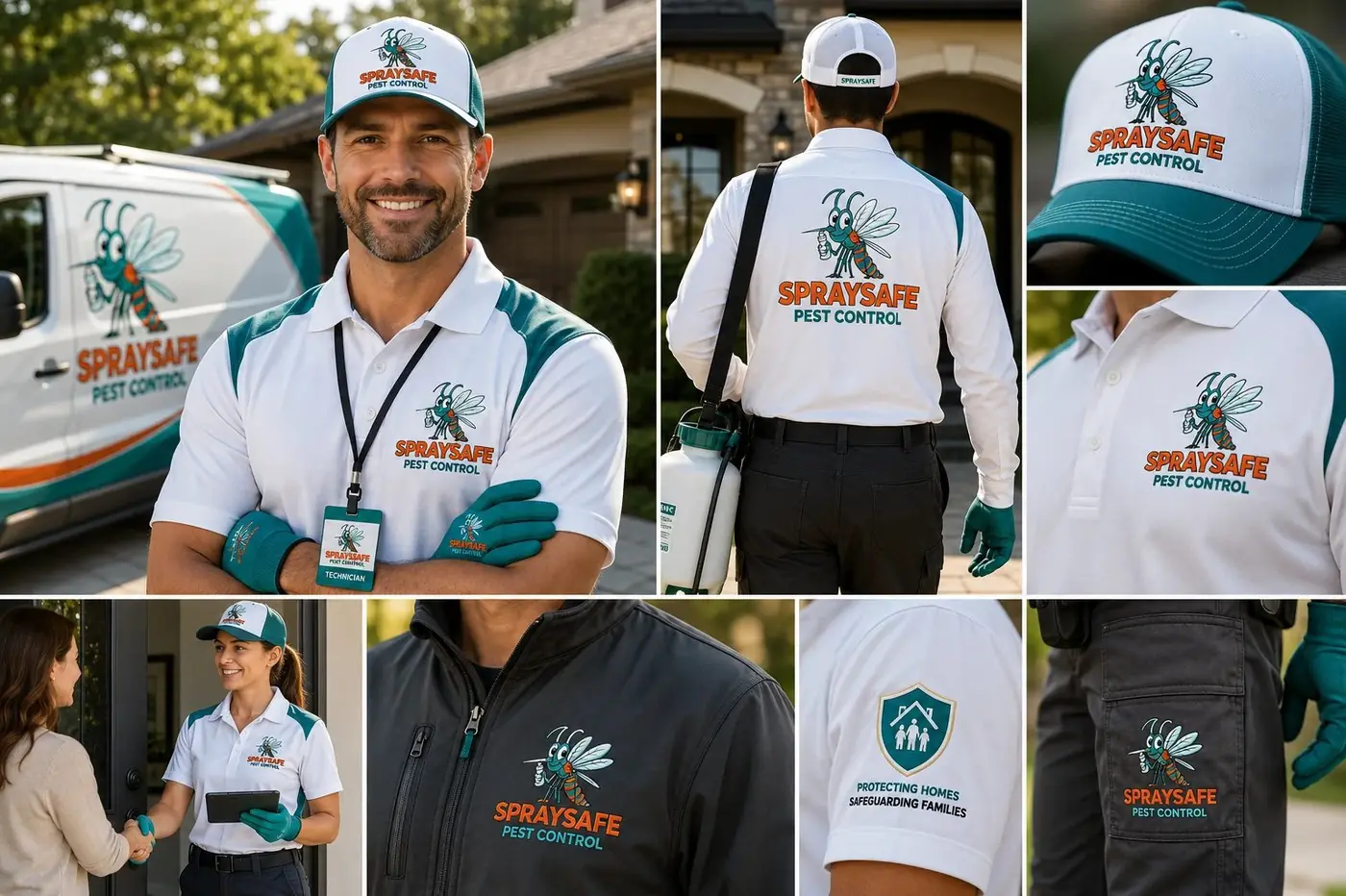
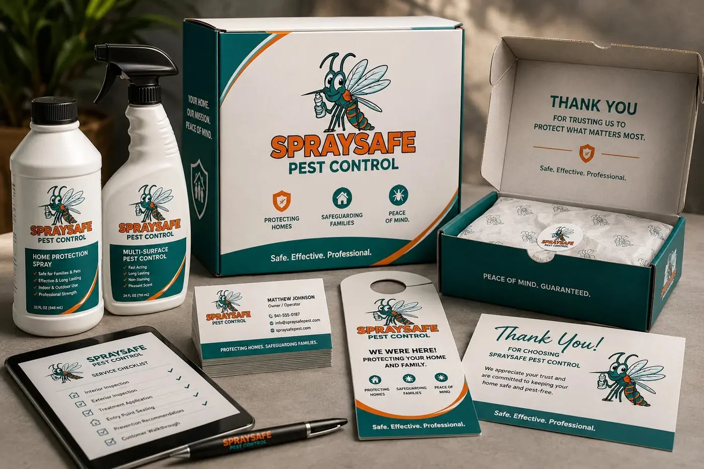
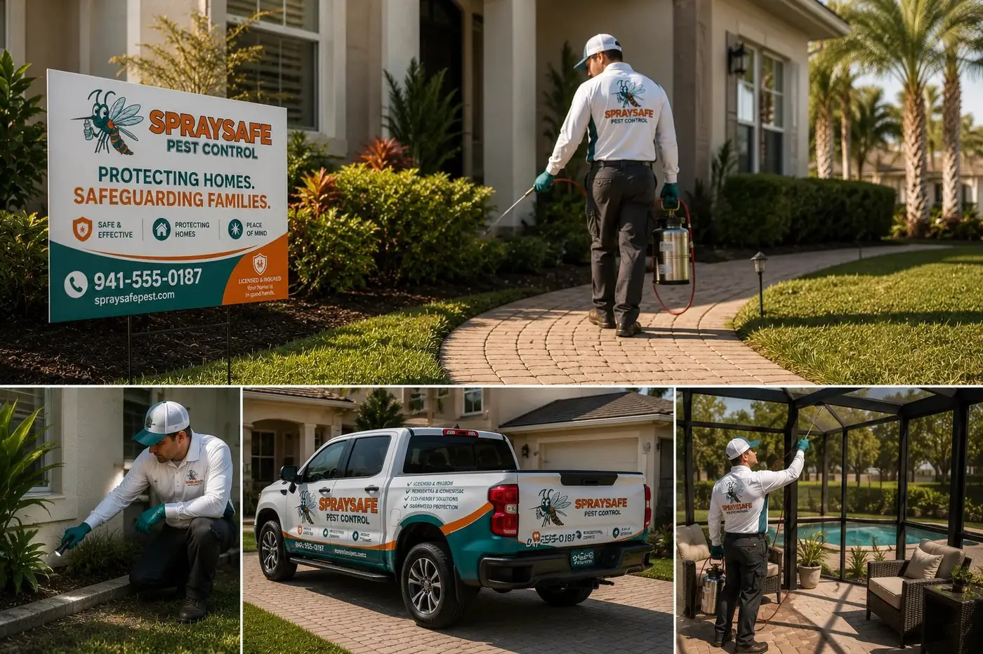
A mascot earns its keep only when it is the same character each time, so proportion and expression stay locked wherever the mosquito appears. At app icon size the head and the can still read, and at chest height on a uniform tee nothing has been redrawn to compensate. That discipline is what turns a cartoon into a face a customer recognizes instead of a decoration that happens to be on things.
Teal and orange carry the tone when the character is not in the frame. Teal keeps the brand clean enough to be trusted with chemicals in a family home, and orange keeps it warm rather than clinical. The type is rounded and slightly bubbly for the same reason, because a sharp technical sans would have brought back exactly the seriousness the mascot was drawn to take away.
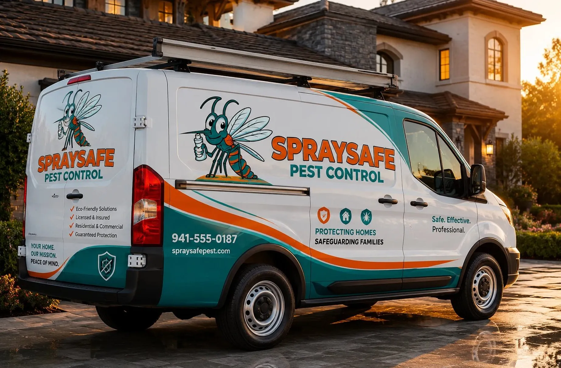
The van is where the system gets tested. I sized the wordmark to be read from across a street and stepped the shorter trust lines down to where someone waiting at a front door can take them in. Booking online or opening that door, a customer meets the same friendly face, which is the entire point of building the brand around a character.
More work
More projects.


Have a project like this?
Tell me what you are building, changing or launching, and I will help you define the right scope and direction.