
Case study · Logo & Brand Identity
The Thirsty Hound
Dog Bar Brand Identity & Storefront Signage
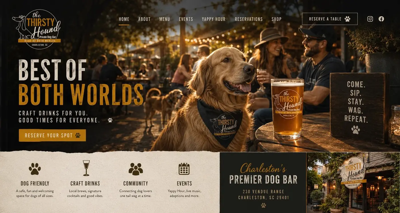
The Thirsty Hound is a private dog bar in Charleston, and a new idea like that is the easiest thing in the world to make look like a gimmick. The identity is built to feel like a neighborhood bar that has been on the corner for years.
01
Charm without the novelty act
A bar built for dogs and their owners can go two ways. Play the concept for laughs and you get a place people visit once, for the photograph. Play it completely straight and you lose the warmth that made the idea appealing to begin with. The identity aims between the two, borrowing the visual habits of an established neighborhood bar and letting the concept arrive through a character rather than a joke.
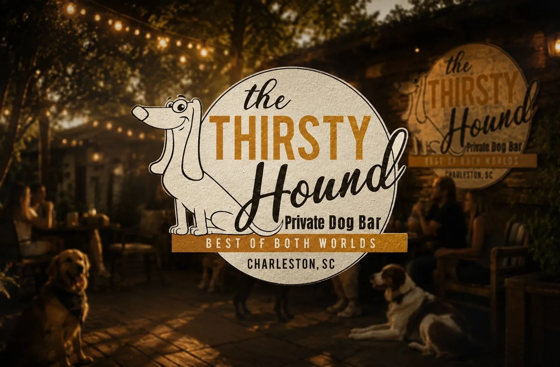
So I drew the dachshund by hand, a single continuous line at the same weight as the lettering, seated at the left of a circular badge and leaning past its edge. A character sets the tone for this place in a way no purely typographic mark could, and keeping the drawing spare rather than detailed is what makes it feel handcrafted instead of corporate. The script logotype is unhurried in exactly the same way.
02
The same dog every time
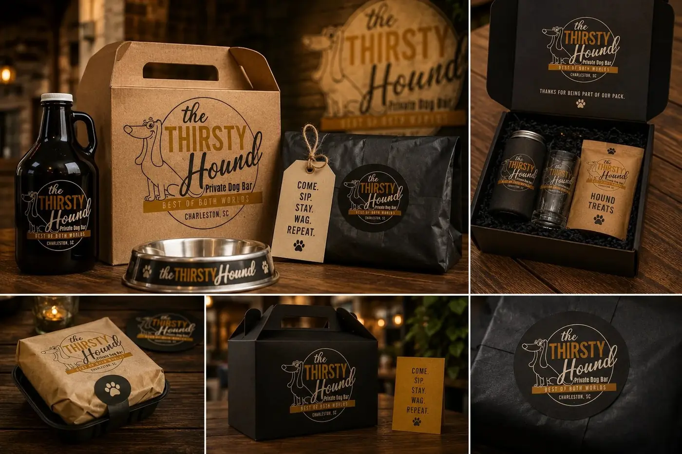
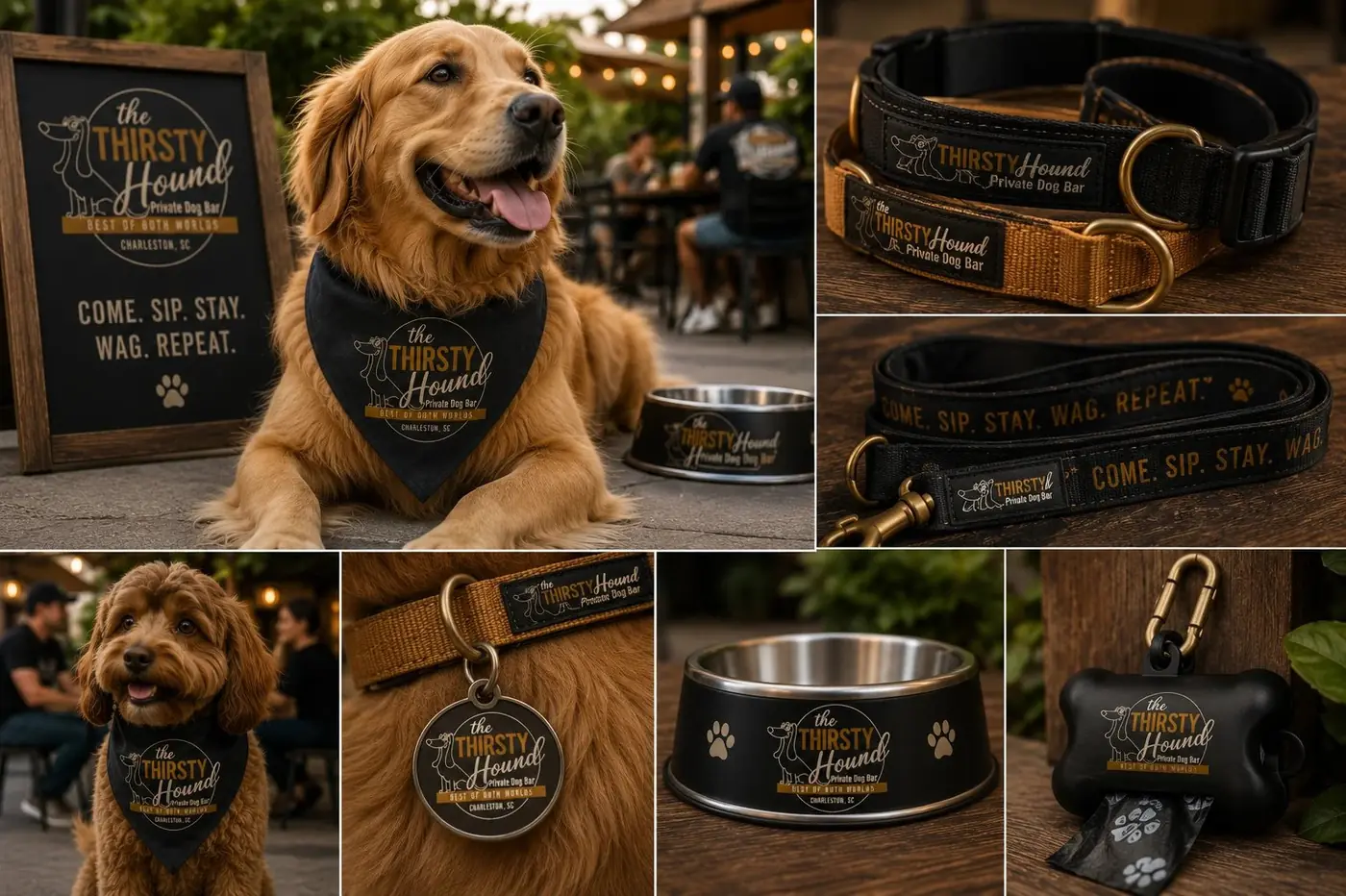
A mascot only works if it is the same animal everywhere, so the proportions and the expression are fixed and never redrawn to suit a shape. A character that changes from one sign to the next stops being a mascot and becomes decoration. Holding it steady is what lets people recognize the place from across the street and start using the dog as the name.
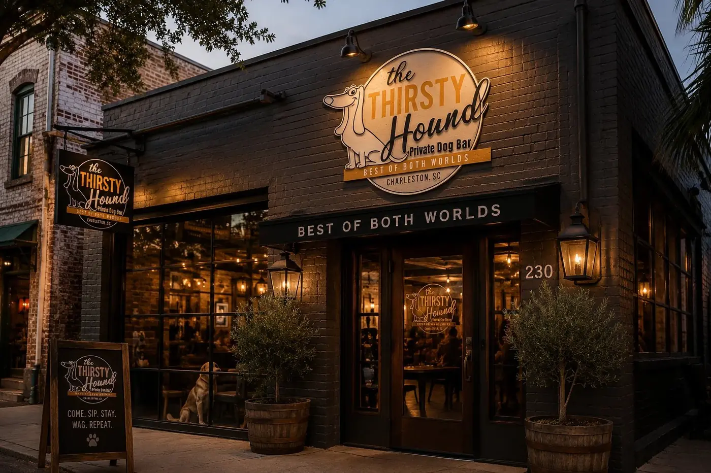
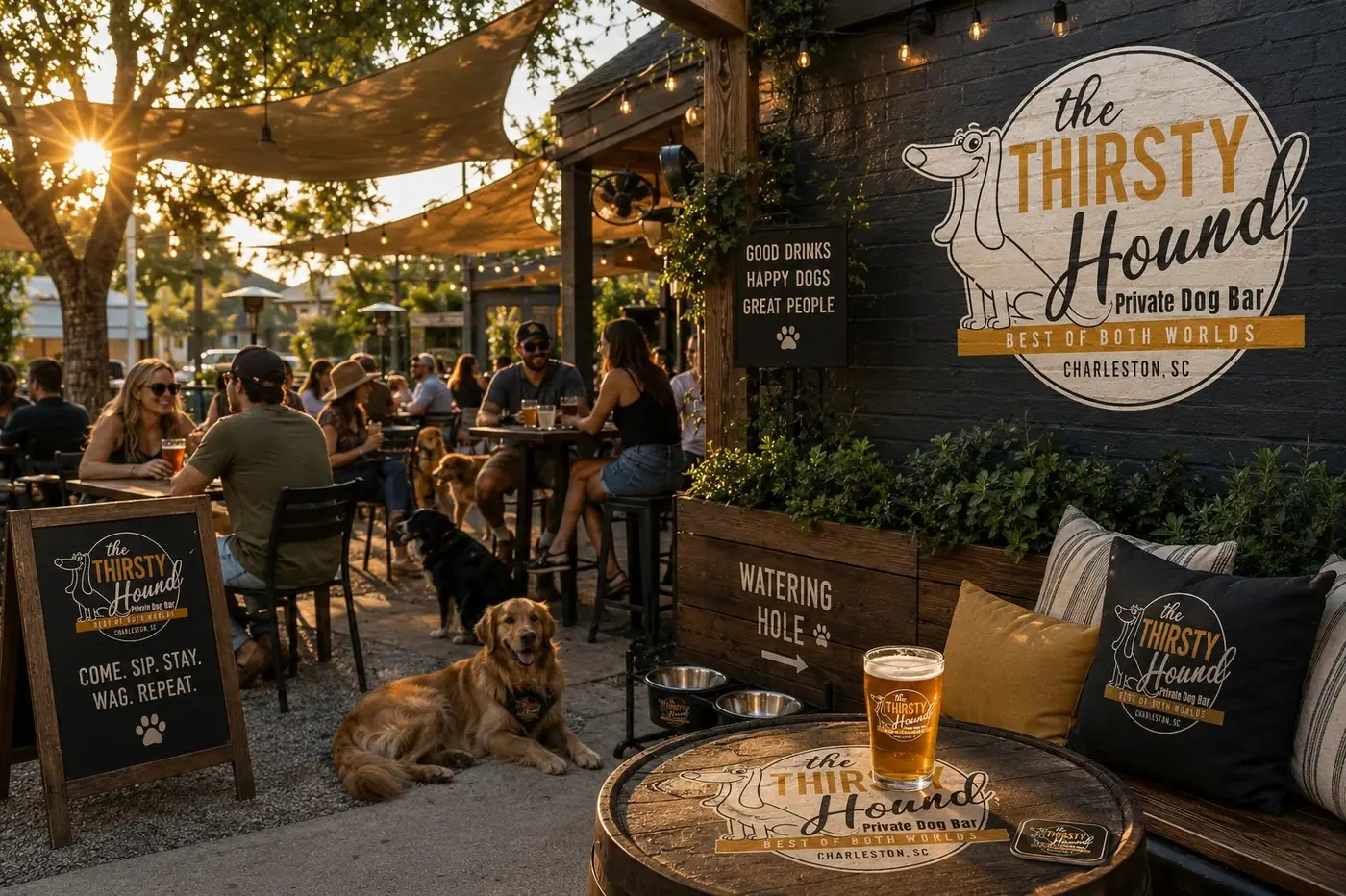
The badge was built to carry a layered signage system rather than one hero application. It works illuminated on the building, hanging perpendicular over the sidewalk for anyone walking past, and small on an A-frame at the door where the invitation to come, sip, stay and wag does the talking. That layering is what long established bars have and what one-off concepts almost never bother with.
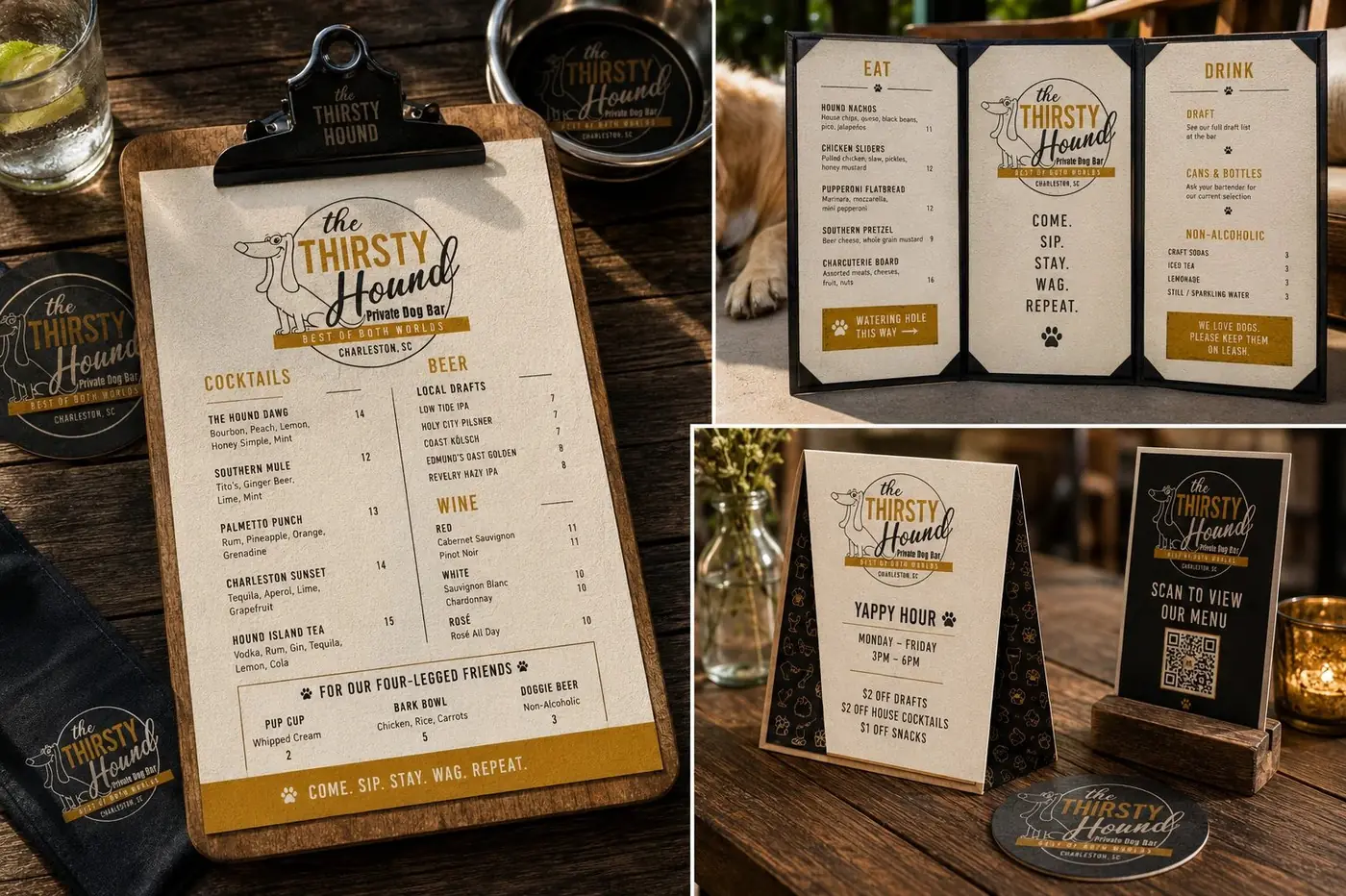
Amber and near black on a warm cream ground keep the whole thing feeling printed rather than produced, closer to a sign shop than a studio. The texture inside the badge is doing quiet work too, suggesting paint on wood that has already survived a few Charleston summers, which is the shortest route to looking like a fixture rather than an opening.
More work
More projects.



Have a project like this?
Tell me what you are building, changing or launching, and I will help you define the right scope and direction.