
Case study · Logo & Brand Identity
Waypoint
Healthcare Solutions Healthcare Brand Identity & Wayfinding System
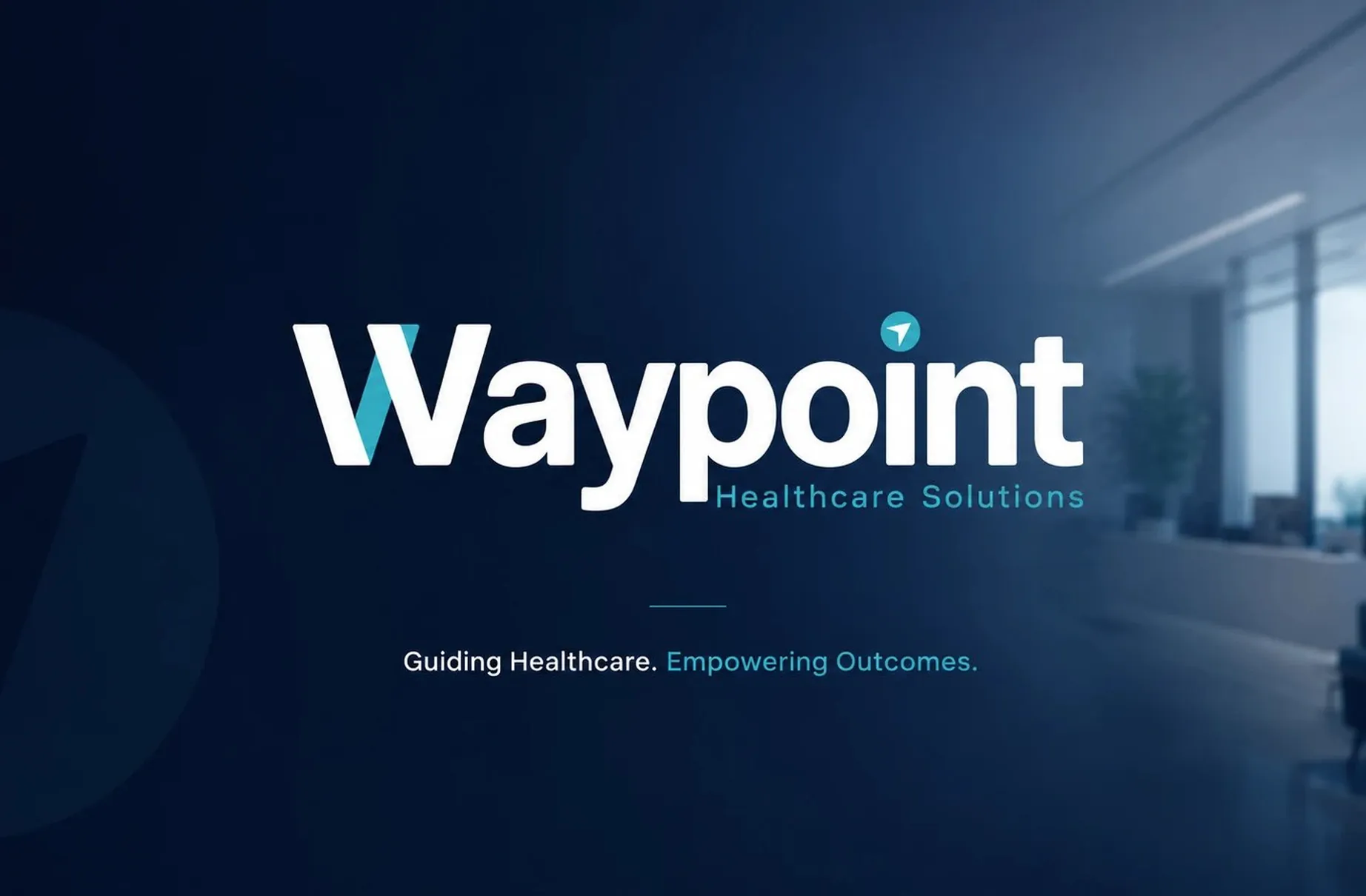
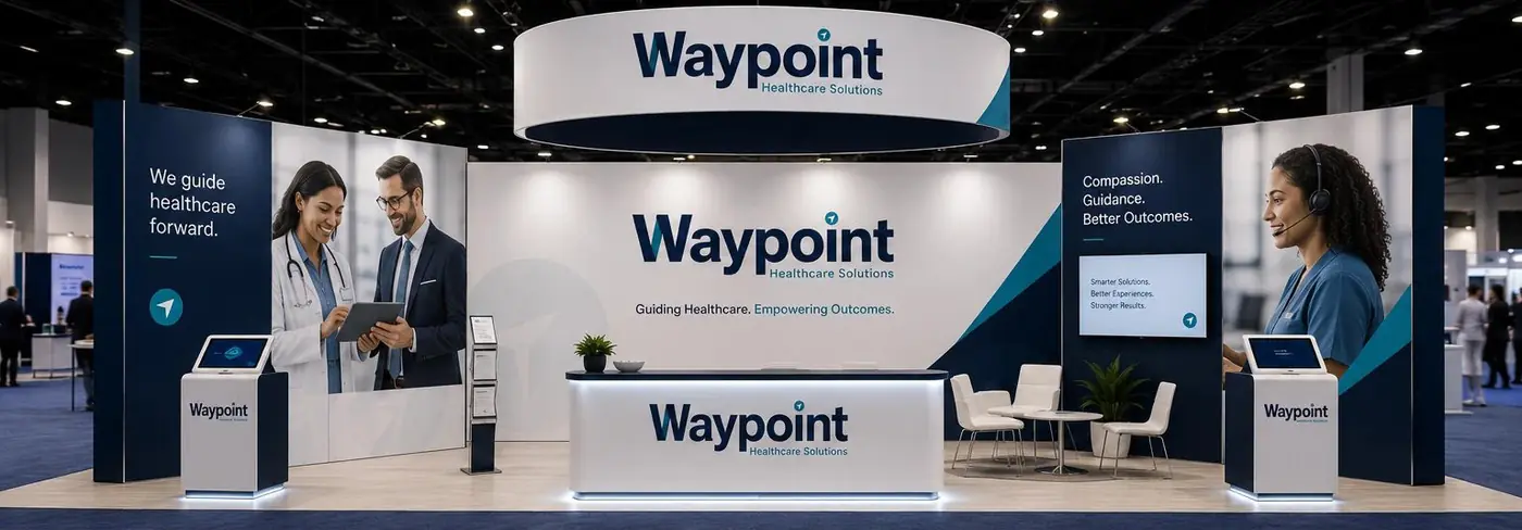
Waypoint Healthcare Solutions exists to get patients and visitors where they need to go without confusion. The identity takes that literally: the brand's job and the brand's mark are the same thing, guidance drawn into the letters.
01
The name doing its own work
Hospital signage is usually an afterthought, bolted onto a building once construction is finished and drawn by whoever is left. I wanted the opposite here, a mark that already contains the function so that wayfinding becomes an extension of the identity rather than a separate exercise in vinyl and arrows.
The direction is built into the W itself, where a teal stroke cuts through the letterform as a shaft angled upward, and it returns as a small navigation pointer sitting where the dot of the i would be. Two moments, both quiet. I kept the wordmark rounded and open because this brand talks to people who are anxious before they arrive, and a sharper, more corporate letterform would have read as administration rather than help.
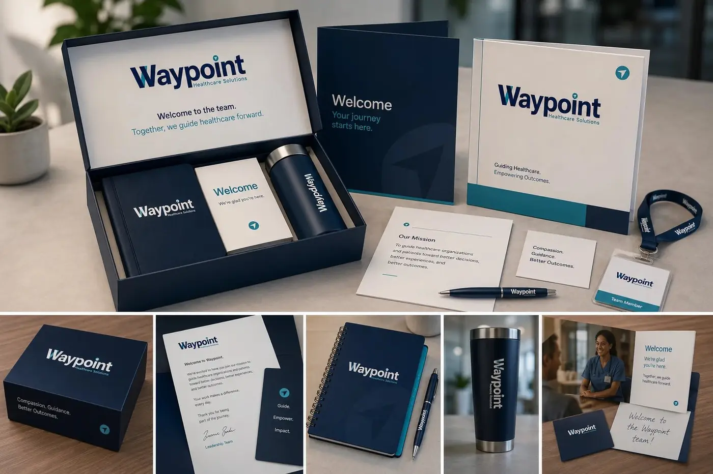
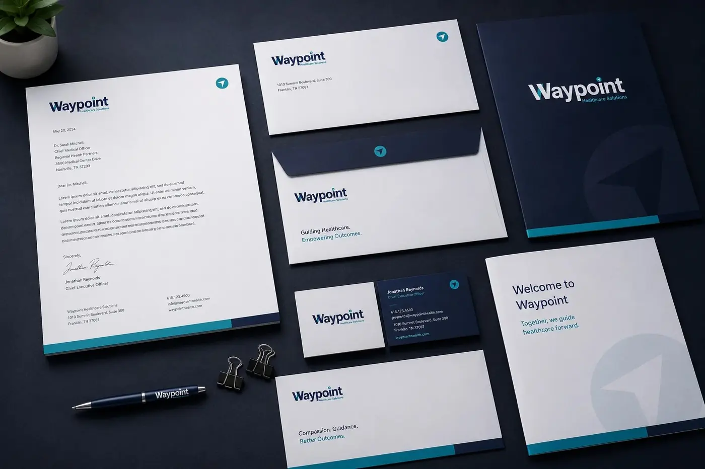
Navy and teal carry the system, navy for the ground the brand stands on and teal for anything that moves or points. That division is the whole logic. Once someone learns that teal means direction, every sign in the building is already teaching them how to read the next one.
02
One logic from parking lot to check in
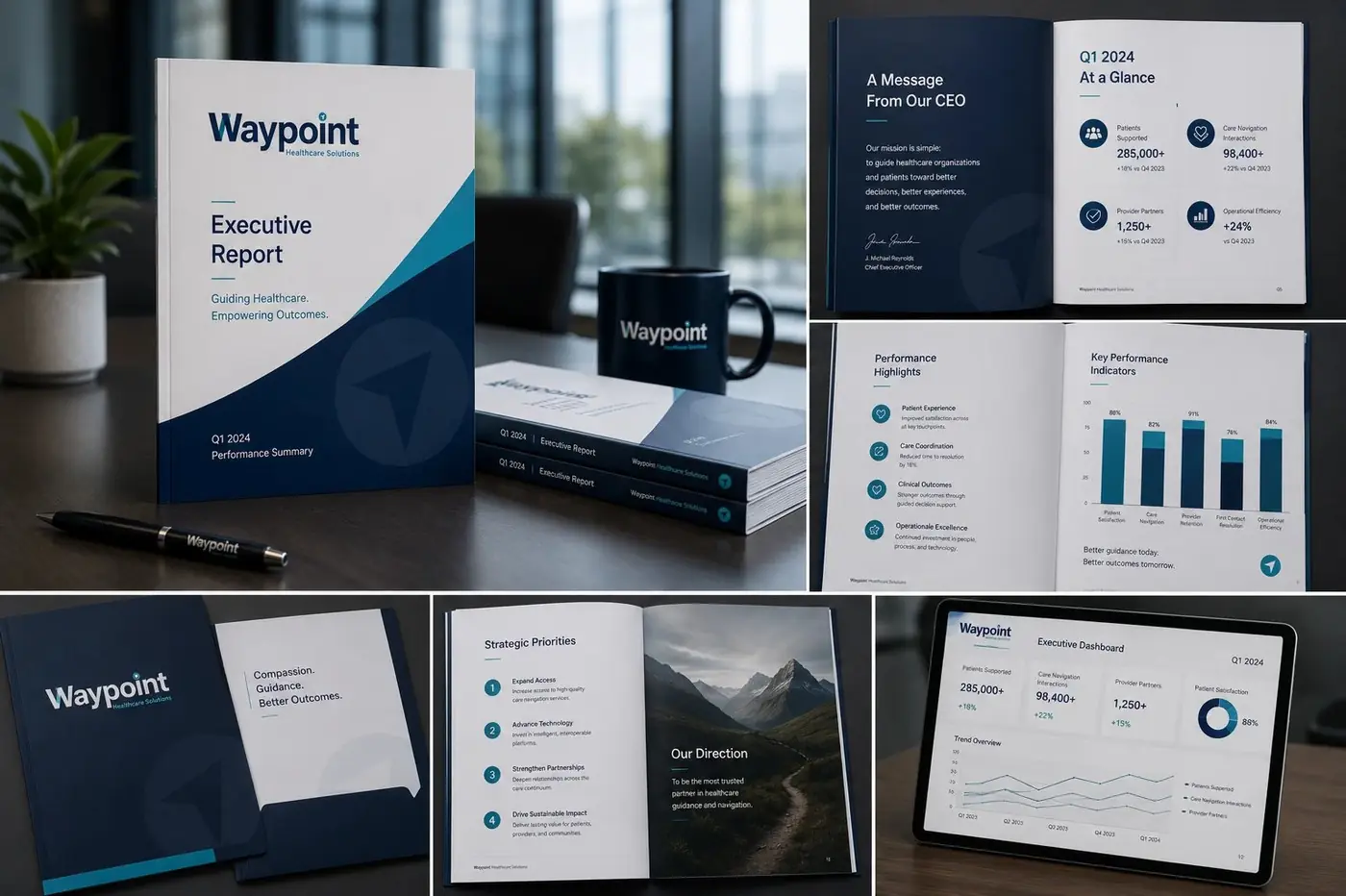
The test of a wayfinding identity is not a single sign, it is the chain. Interior wall panels, the reception desk, exterior building signage and the smaller decision points all use the same color coding and the same arrow language, so a visitor never has to relearn the system halfway through a corridor.
The tagline sits at those decision points on purpose. A person stopped in a hallway, unsure which way to turn, is at the exact moment the brand's promise means something, and putting the words there makes the signage carry the message instead of just the room number. That is the argument for treating wayfinding as identity work from the start.
More work
More projects.


Have a project like this?
Tell me what you are building, changing or launching, and I will help you define the right scope and direction.